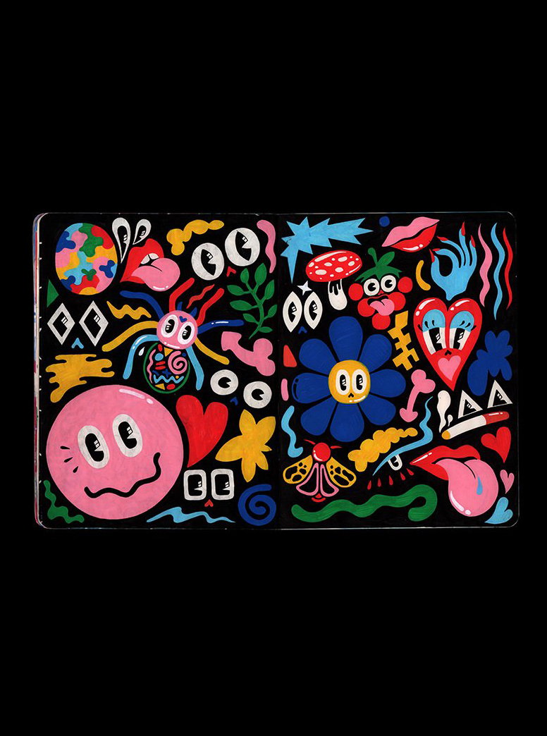
“They’re the only things I would save in a fire”: A peek inside Hattie Stewart’s marvellous sketch books
The queen of doodles talks us through the "sacred space" of her sketchbook practice, and the importance of taking time for personal development in a hectic creative work schedule.
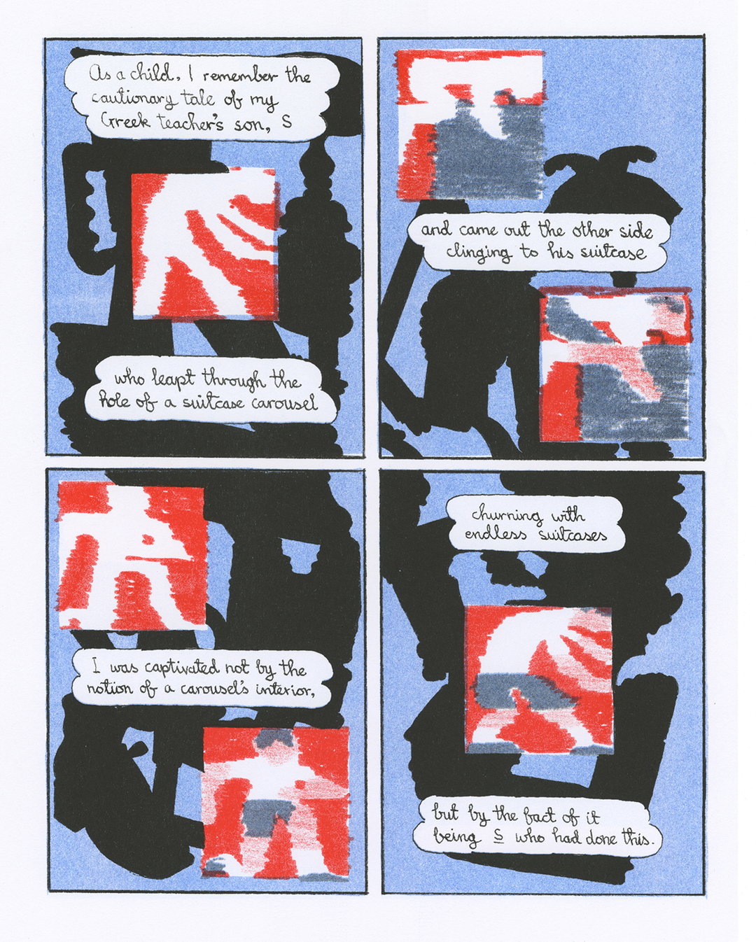
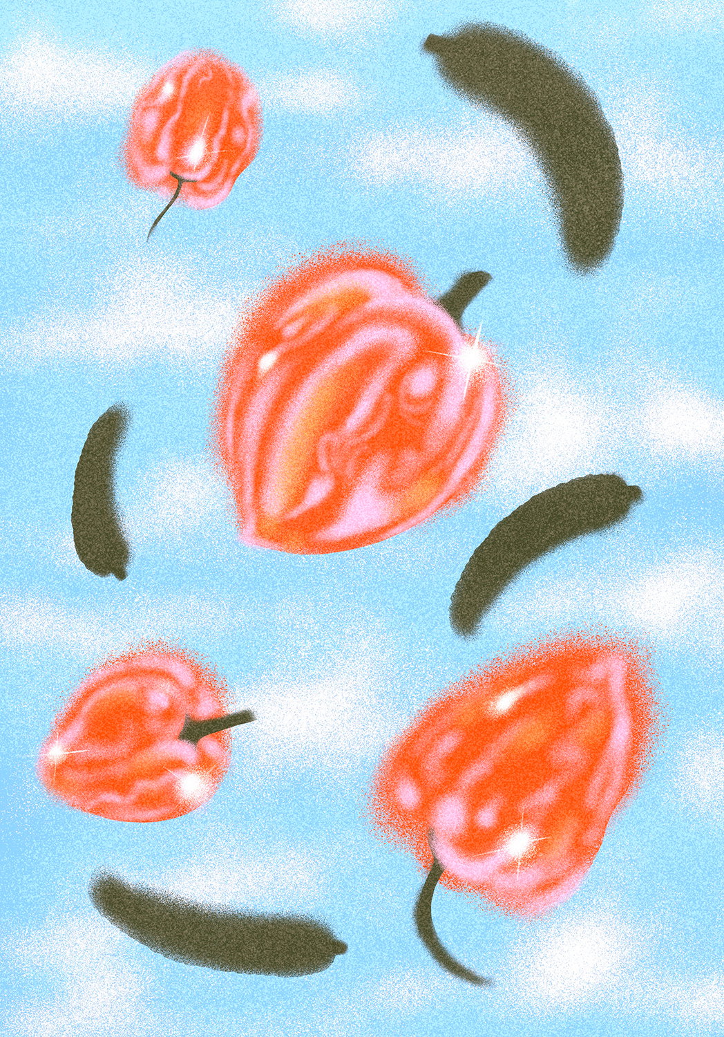
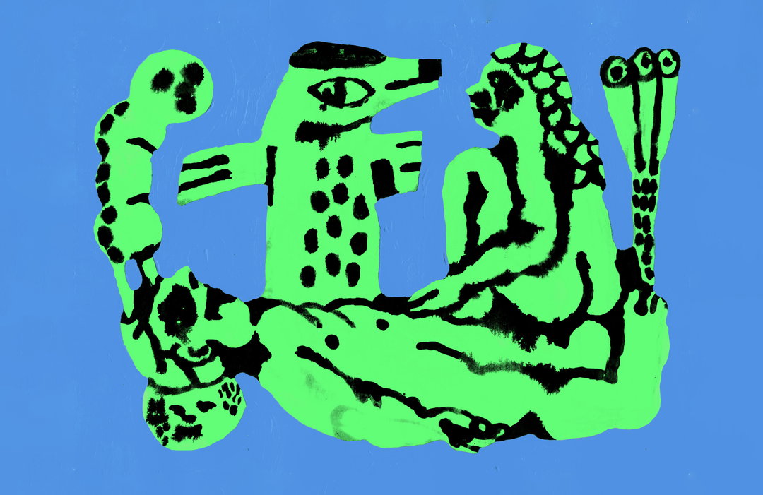
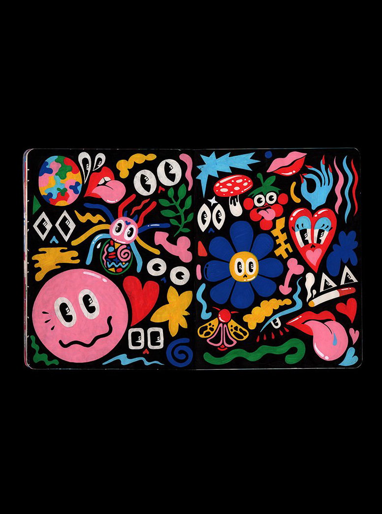
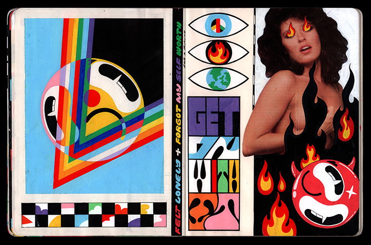
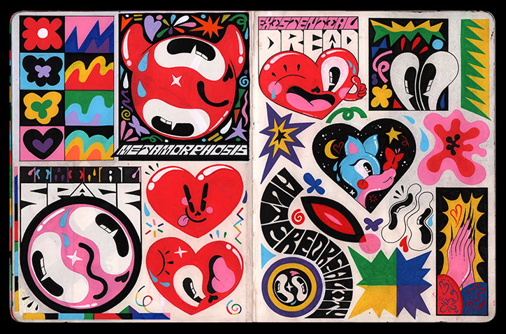
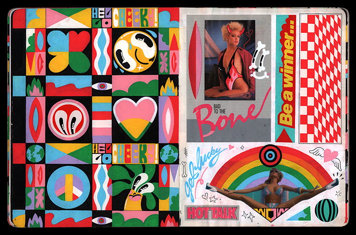
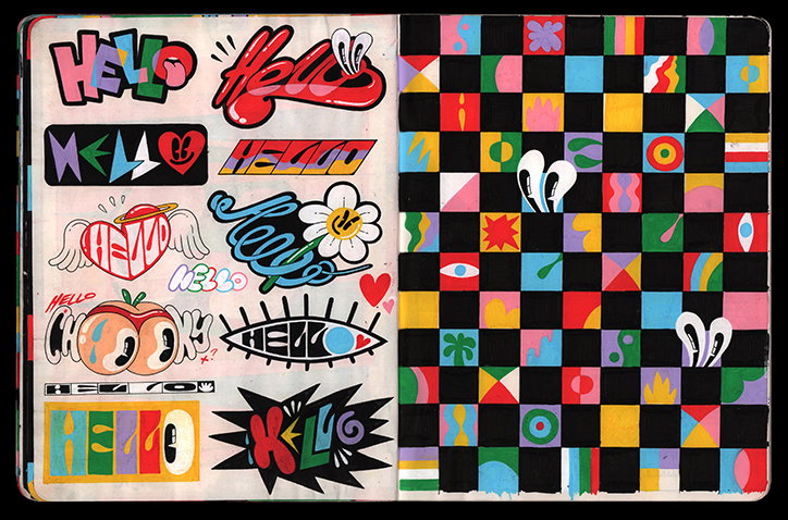
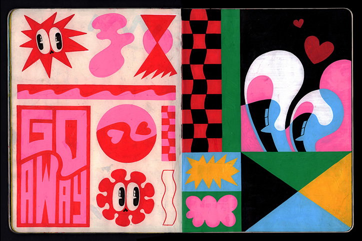
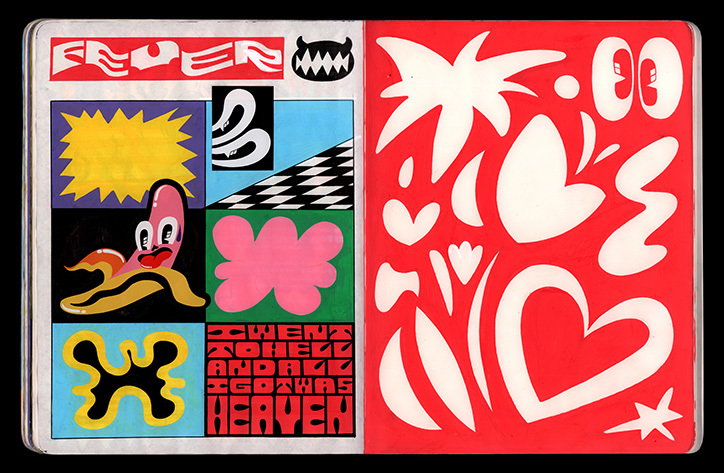
What a year it has been. Throughout the ups and downs (a lot of downs in 2019) at least we can still marvel at the joyous creativity of the likes of Hattie Stewart. Astonishingly, it’s been absolutely ages since we last wrote about the London-based illustrator. Too long in fact. It’s been a whopping four years! And since then, the queen of doodles has remained at the top of her game, working with the likes of Vogue, Fiorucci and even the dreamy Andrew Scott in a torrent of colour and pattern. Now, however, we’re treated to a glimpse into the renowned illustrator’s sketchbooks, which just so happen to be, as revealed by Hattie, “the most important thing to me!”
It’s also been a very busy last year for Hattie. She had to move studio and houses several times, “which has been chaotic,” she tells us, and she’s also been dealing with some big changes in her personal life. As a whole, 2019 has been a year for “a lot of organising and figuring things out” amidst the flow of great commissions and projects that have also come her way. “I started off my 30s by feeling a bit rocky and unsure of myself and my work," she tells It’s Nice That, "but you know, I’m feeling the most settled in myself than I have in a long time which is cool.”
Now more than ever, Hattie is valuing her own time. She takes the time to chill out, think, and is much better at saying no to work. All in all, for Hattie, it’s about giving time to herself so she can consider others more while not feeling overwhelmed by stress and anxiety. In the past, she’s come close to burning out, but by being a little kinder to herself, and allowing herself the time to spend an odd week here or there to just mess around in her sketchbook, Hattie has been able to work on arguably the most important aspect of creative life: personal development.
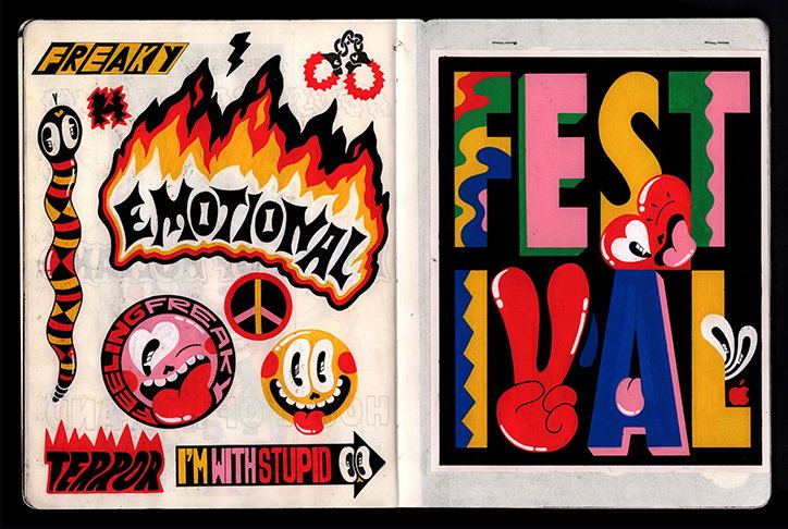
Hattie Stewart
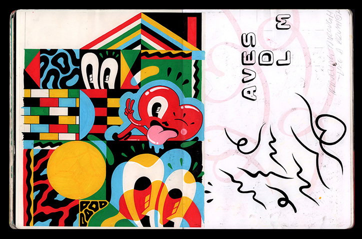
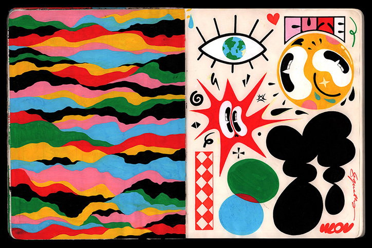
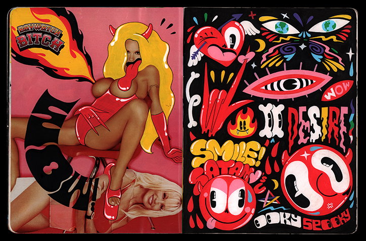
“I value my personal time with my work most highly as it informs almost all of my other work and projects,” she says on the importance of her sketchbook practice. Rather than adding to her sketchbooks every day like some illustrators, Hattie has “short creative bursts a couple of times a year for a week or so.” From these bursts, Hattie generates enough ideas and themes to keep her going for the next year or so. “My sketchbooks are sacred spaces to me – they represent my past, present and future, and help me take stock of where I’m at and where I want to go,” she goes on to say. “They are the only things I would save in a fire as they show the thread of my creative journey, like a diary, which is pretty cool.”
Her sketchbooks offer a space to be free from worry and overthinking, letting the fluidity of illustration take hold amidst the blank pages. “I just work things out in my head or have an idea, then I get drawing,” Hattie continues. “It’s quite meditative, clearing out the chaos of the mind to an ordered space on the page and helps me gather my thoughts, drawing up one idea which always leads to others.” It’s a space where her best ideas come into play, where she can explore the liminal space between “what was” and “the next.” As we’ve all experienced, the days or weeks or months can rush by so quickly, but drawing in sketchbooks allows Hattie to ground herself in the moment. Like “something ritualistic,” she adds, “not to sound too dramatic about it though.”
Continuously inspired by her best mates (who she’s also lucky enough to share a studio with), Hattie also cites vintage pornography as a key influence at the moment. “I’ve got a great stash,” she remarks, “I just love the design, the funny one-liners, the typography and the sexual freedom.” And looking to the future, the illustrator just wants to be able to continue to do what she loves, at a pace she can appreciate and enjoy a bit more. “Gonna keep working hard but gonna live a little more too,” she reiterates. She’s also working on a self-published book of all her sketchbook pages next year too, so if you’re a fan like us, keep a lookout!
GalleryHattie Stewart
Share Article
About the Author
—
Jynann joined It’s Nice That as an editorial assistant in August 2018 after graduating from The Glasgow School of Art’s Communication Design degree. In March 2019 she became a staff writer and in June 2021, she was made associate editor. She went freelance in 2022.