Launch Recite Me assistive technology
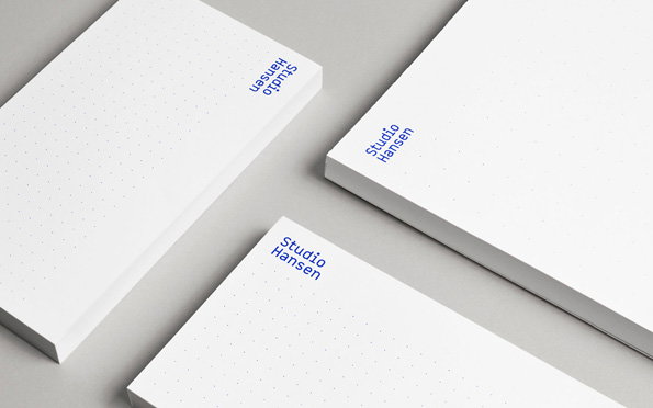
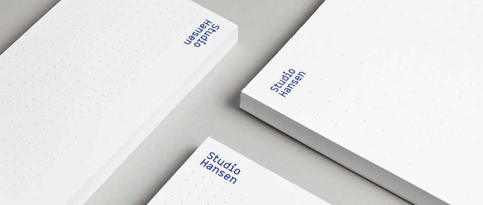
Three white dot-grid notebooks are arranged on a plain grey surface. Each cover features the “Studio Hansen” wordmark in blue.

How about some seriously crisp branding work from Norwegian studio Heydays

—
Date
17 January 2013

You already know how we feel about Norwegian studio Heydays; their clean, crisp design has prompted us to let them guest post on the site in previous years and we’ve featured enough of their work to give you an idea of just how good they are. So you won’t be surprised to find out that their identity for industrial designers Studio Hansen is another triumphant addition to an already sterling portfolio.

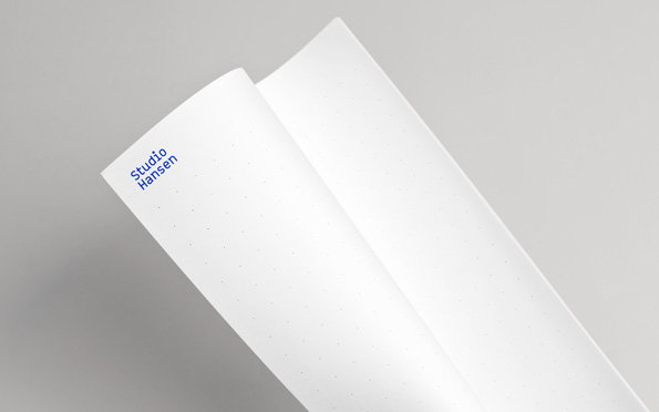
Hansen’s commitment to strong concepts and immaculate finishes is manifested through a simple grid of blue dots that spans the studio’s online and print collateral, providing the perfect background to their reductive geometric logo. While the identity as a whole is remarkably restrained it’s a loud proclamation that Studio Hansen approach each project with a blank canvas and are meticulous in their execution – which ultimately is everything you need from your identity.
The wordmark “Studio Hansen” appears in a purple sans-serif typeface. The text is centred against a plain, light grey background.
Above

Heydays: Studio Hansen Identity

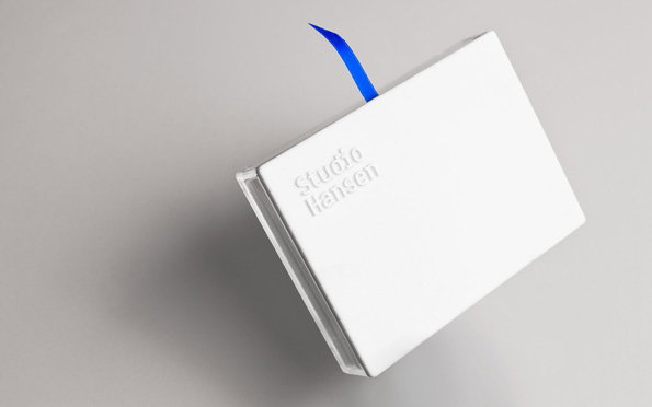
A white hardcover book rests on a grey background, viewed from an angle. The words “Studio Hansen” are embossed on the cover, and a bright blue ribbon bookmark pokes out from the top.
Above

Heydays: Studio Hansen Identity

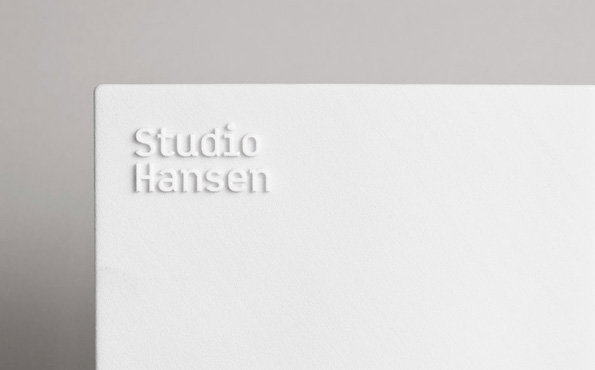
A close-up of a white business card with the words “Studio Hansen” embossed into the paper. The card is set against a plain grey background.
Above

Heydays: Studio Hansen Identity

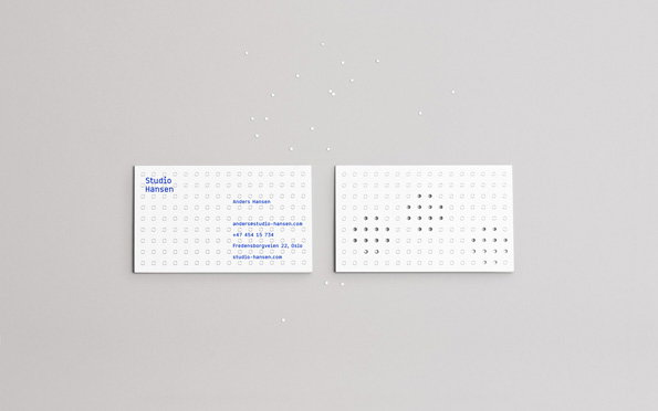
Two white business cards lie side by side on a grey surface. The left card features blue text reading “Studio Hansen” and contact details for Anders Hansen, while the right card is blank except for a pattern of raised dots.
Above

Heydays: Studio Hansen Identity

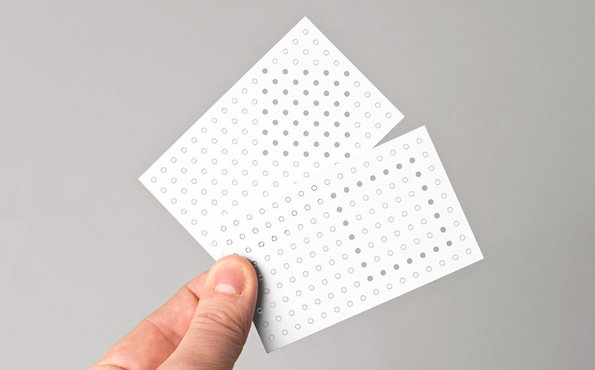
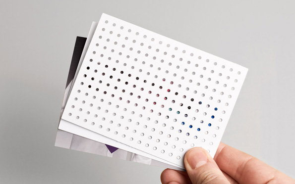
A person holds a white card featuring a grid of small, perforated holes. The card is folded in half against a plain grey background.
Above

Heydays: Studio Hansen Identity

A person holds a stack of cards, with the top card featuring a grid of small circular perforations. Some of the holes are filled with dark and blue colours to create a pixelated pattern.
Above

Heydays: Studio Hansen Identity

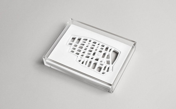
A white 3D-printed lattice structure sits inside a clear acrylic box. The intricate, web-like form is displayed against a plain white background.
Above

Heydays: Studio Hansen Identity

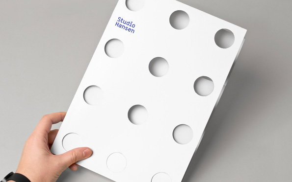
A person holds a white book or folder featuring a grid of circular cut-outs. The words “Studio Hansen” are printed in blue in the top left corner.
Above

Heydays: Studio Hansen Identity

Three white dot-grid notebooks are arranged on a grey surface. Each cover features the blue wordmark “Studio Hansen” in the corner.
Above

Heydays: Studio Hansen Identity

An open, dot-grid notebook lies against a plain grey background. The words “Studio Hansen” are printed in blue on the top left page.
Above

Heydays: Studio Hansen Identity

Share Article

Further Info

About the Author

James Cartwright

—

James started out as an intern in 2011 and came back in summer of 2012 to work online and latterly as Print Editor, before leaving in May 2015.


It's Nice That Newsletters

Fancy a bit of It's Nice That in your inbox? Sign up to our newsletters and we'll keep you in the loop with everything good going on in the creative world.