Horah Inc lets its love for Pokémon and typography soar in identities for spiced rum, trading cards and book design
Horah Inc really wears its inspirations on its sleeve, that’s why you’ll see vintage-styled cartoons, warm colours and retro typography referenced across its wide-ranging portfolio.
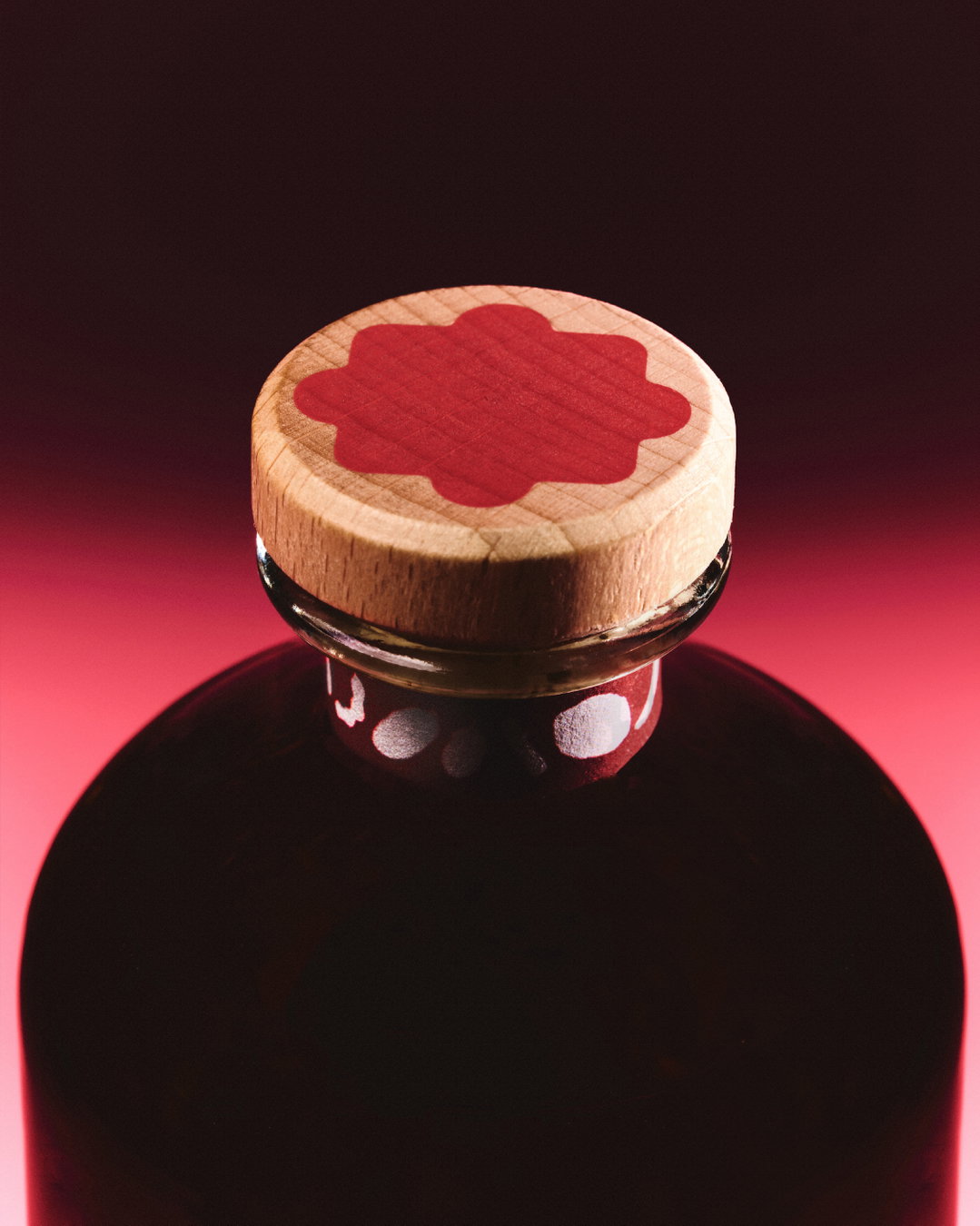
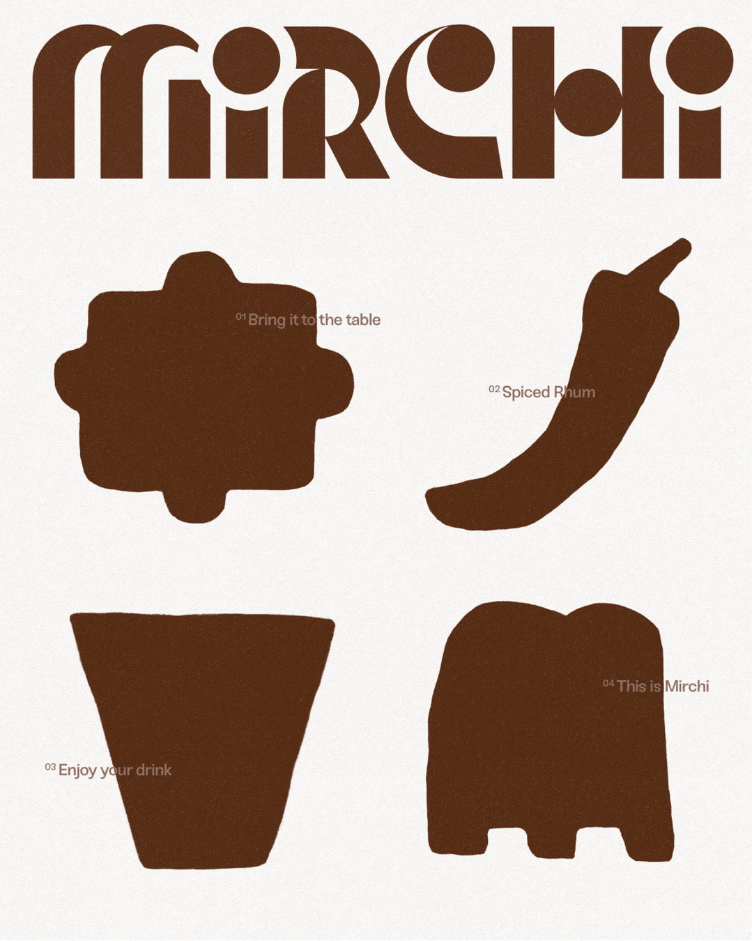
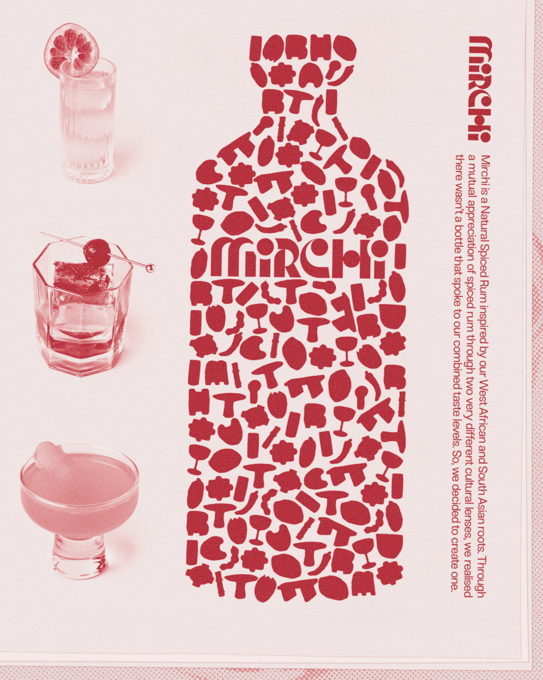
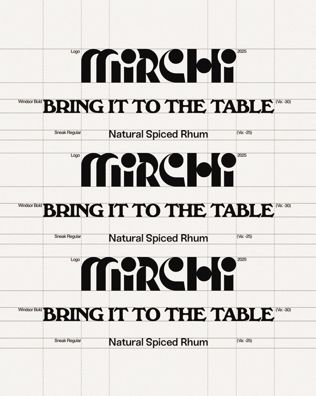
Horah Inc is a multidisciplinary creative studio working across art direction, graphic design, 2D and 3D motion – from the organic and hands-on to the digital, experimentation is in the studio’s creative blood. Vintage aesthetics are a recurring influence through its graphic design work, prioritising the feeling of movement and a warmth of retro aesthetics – just take a look to its work for Mirchi, a British spiced rum brand. The inspiration behind the project came from the drink itself, warm, spicy, classical – utilising the language of bold shapes and colours inspired by the ingredients, Horah Inc intelligently puts the character of the rum at the heart of the brand through block-like printing, letting the drink spring free from the bottle along with its aroma through quaint pictograms.
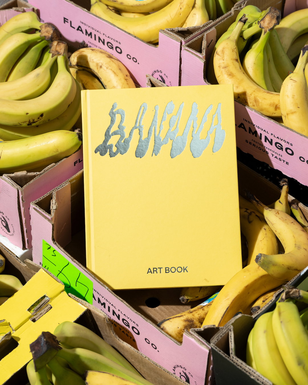
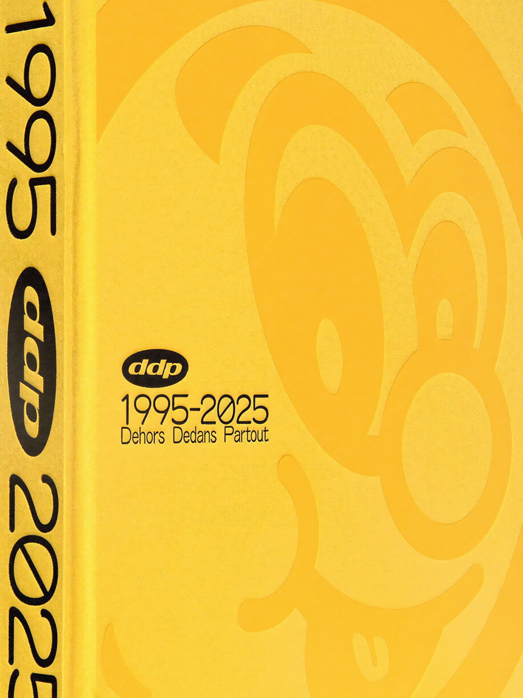
With only four people in the studio, the circle of interests are specific and feed naturally into the work, from football to film titles and posters from the 60s to 80s, other inspirations come from Deftones, Oneohtrix Point Never and Stereolab. For “Dehors Dedans Partout’s 30th anniversary, an admiration for Wim Crowel’s typography informed Horah Inc’s book design, paying homage to the digital sensibility he brought in his era. DDP has always had a rebellious attitude towards rules,” says Théotim Hunaut, creative director at Horah Inc. “And we wanted that spirit to run through the pages, mixing 1970s-inspired typefaces with more contemporary ones, playing with outlines, shadows and vivid colours.”
Pokémon and Digimon served as creative starting points for Horah Inc’s visual identity for On Running, in a series of “athlete trading cards” that showcased each athlete’s performance through the familiar language of collectible cards. The studio experimented with textures and reflective finishes, combining photography with quotes, layering and expressing typography – in typical fashion, the studio uses everything at its disposal in order to let ideas and inspirations soar.
Horah Inc: Mirchi (Copyright © Horah Inc, 2026)
Horah Inc: Mirchi (Copyright © Horah Inc, 2026)
Horah Inc: Mirchi (Copyright © Horah Inc, 2026)
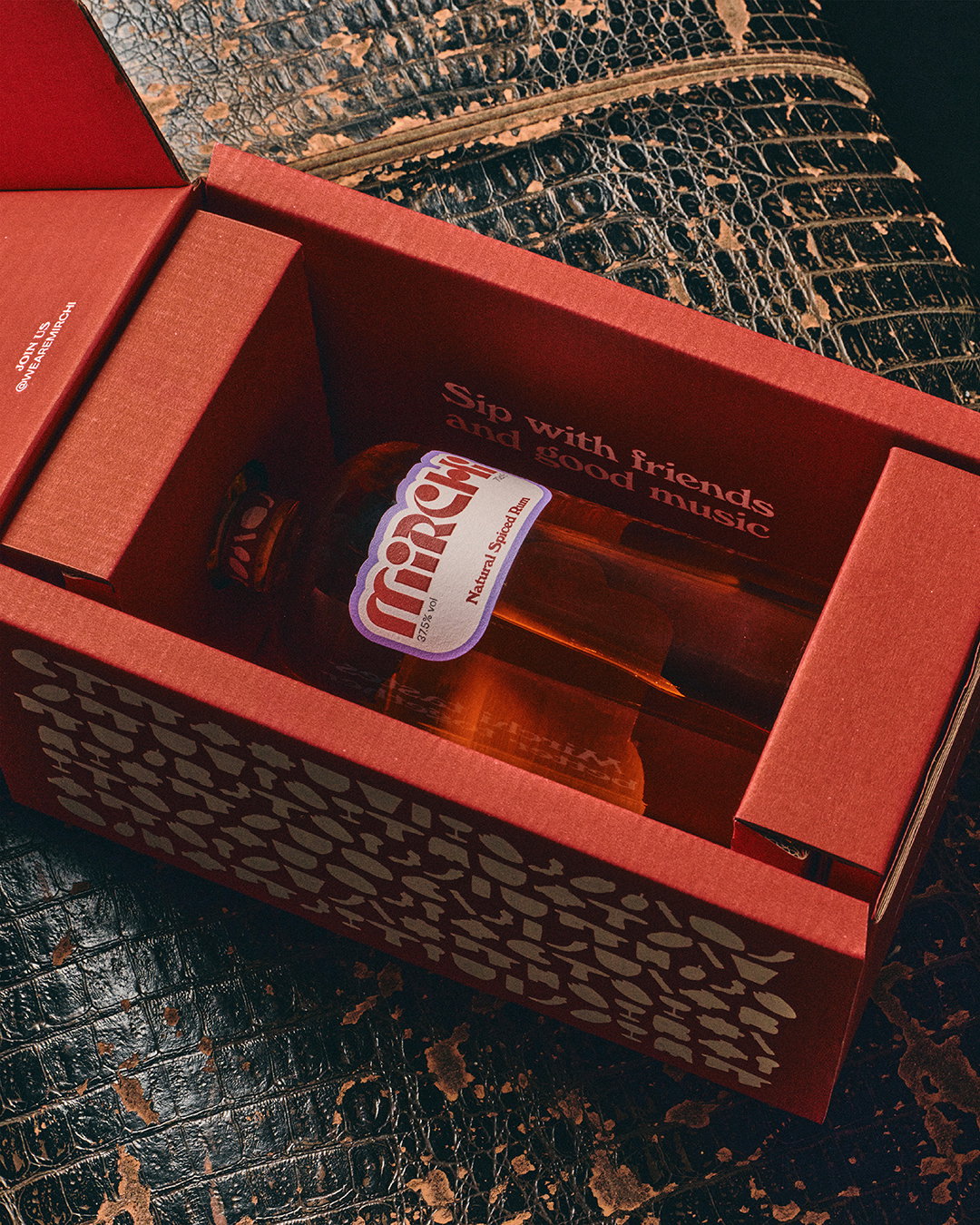
Horah Inc: Mirchi (Copyright © Horah Inc, 2026)
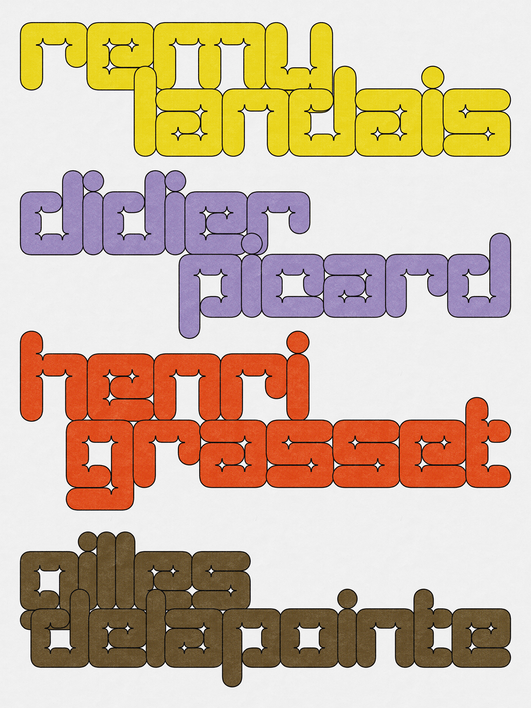
Horah Inc: DDP (Copyright © Horah Inc, 2026)
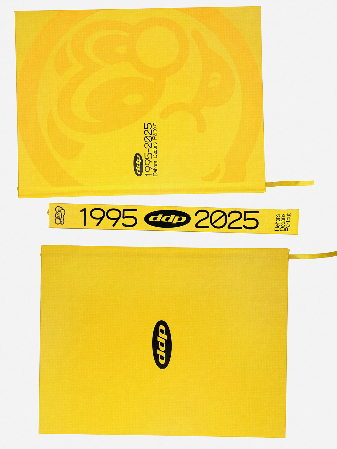
Horah Inc: DDP (Copyright © Horah Inc, 2026)
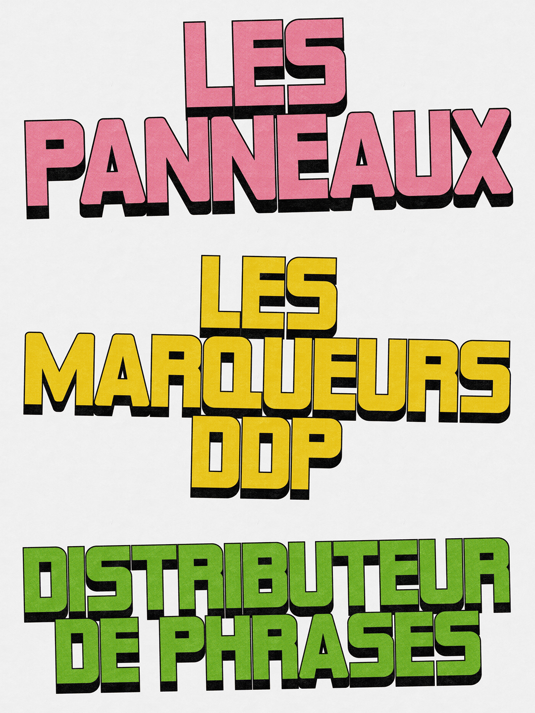
Horah Inc: DDP (Copyright © Horah Inc, 2026)
Hero Header
Horah Inc: Mirchi (Copyright © Horah Inc, 2026)
Share Article
Further Info
About the Author
—
Paul M (He/Him) is a Junior Writer at It’s Nice That since May 2025. He studied (BA) Fine Art and has a strong interest in digital kitsch, multimedia painting, collage, nostalgia, analogue technology and all matters of strange stuff. pcm@itsnicethat.com
To submit your work to be featured on the site, see our Submissions Guide.