Big Cartel’s big rebrand by How&How throws caution to the wind
Tasked with reimagining the legacy e-commerce platform, the international design studio embraced the tactility and warmth of its creative users.
Design agency How&How has rebranded Big Cartel and wildly reimagined the independent business-first e-commerce platform, repositioning the company as the new go-to for small businesses, artists and creatives. “Since 2005, countless creatives have launched their businesses with Big Cartel,” creative director at How&How Chris Clayton says, “we were brought in to help Big Cartel do what it does best for others: sell itself.”
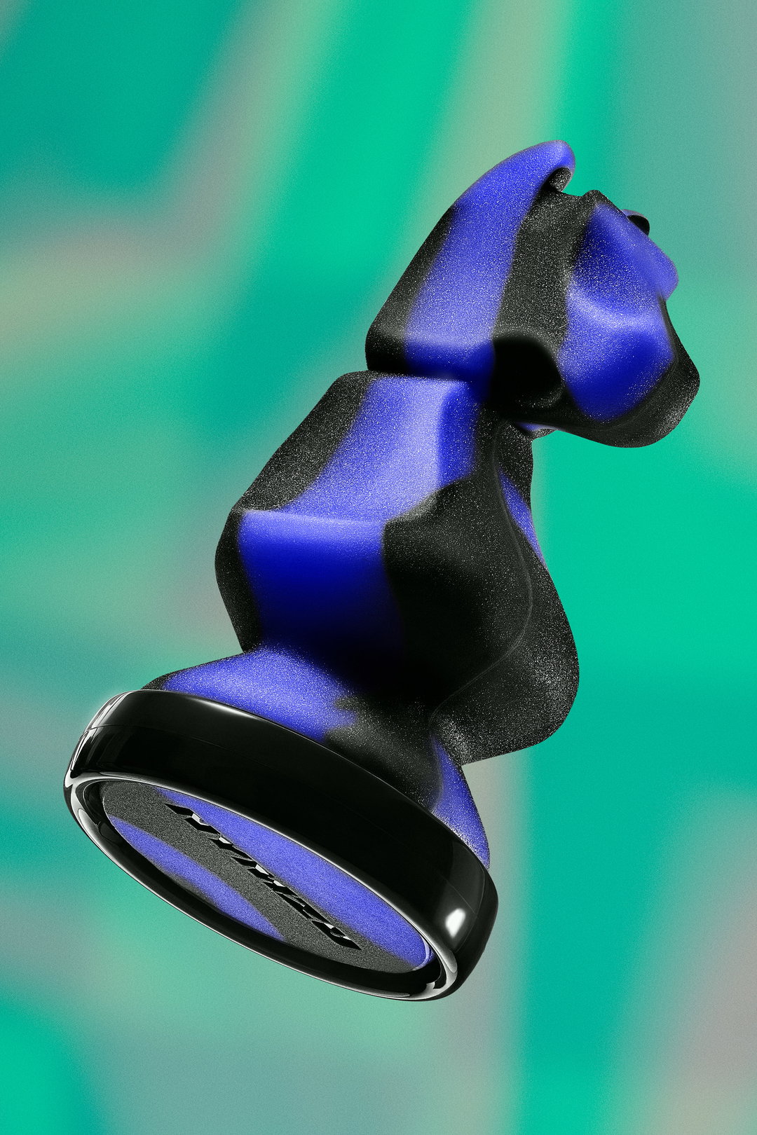
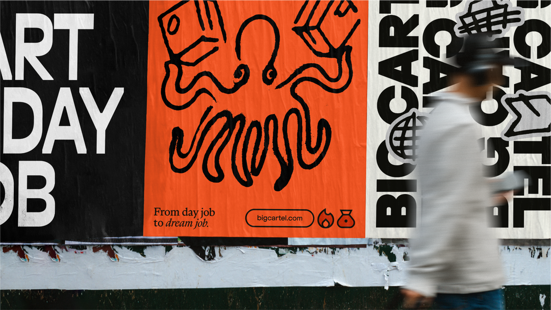
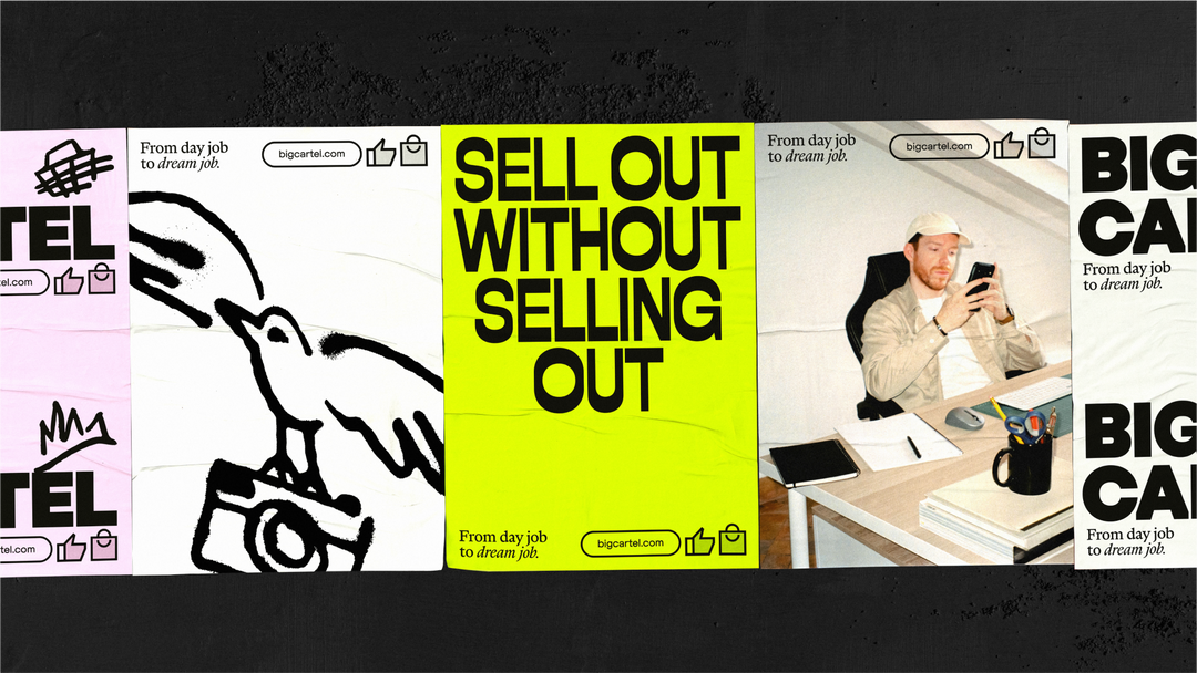
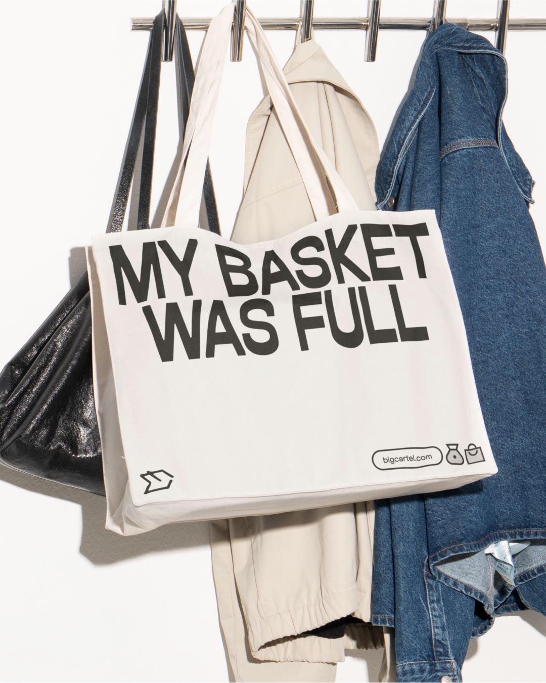
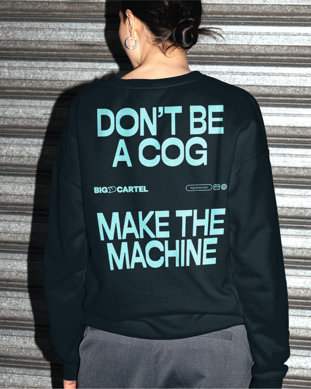
To do so, How&How took a big swing, approaching Big Cartel’s visual identity with the intention of making something distinctly not Shopify. “We set out to create something that reflected Big Cartel’s indie roots,” Chris says, opting for a more analogue, soulful tone, manifesting in imperfect printed textures and hand-rendered illustrations. “The goal was a self-made, personality-driven look, that makes space for a new generation of sellers,” he says. “We repositioned Big Cartel from a niche indie platform to a launchpad for aspiring entrepreneurs.” The identity is led by the notion ‘Goodbye Caution’ – influencing both the visual identity and the studio’s creative approach to the project.
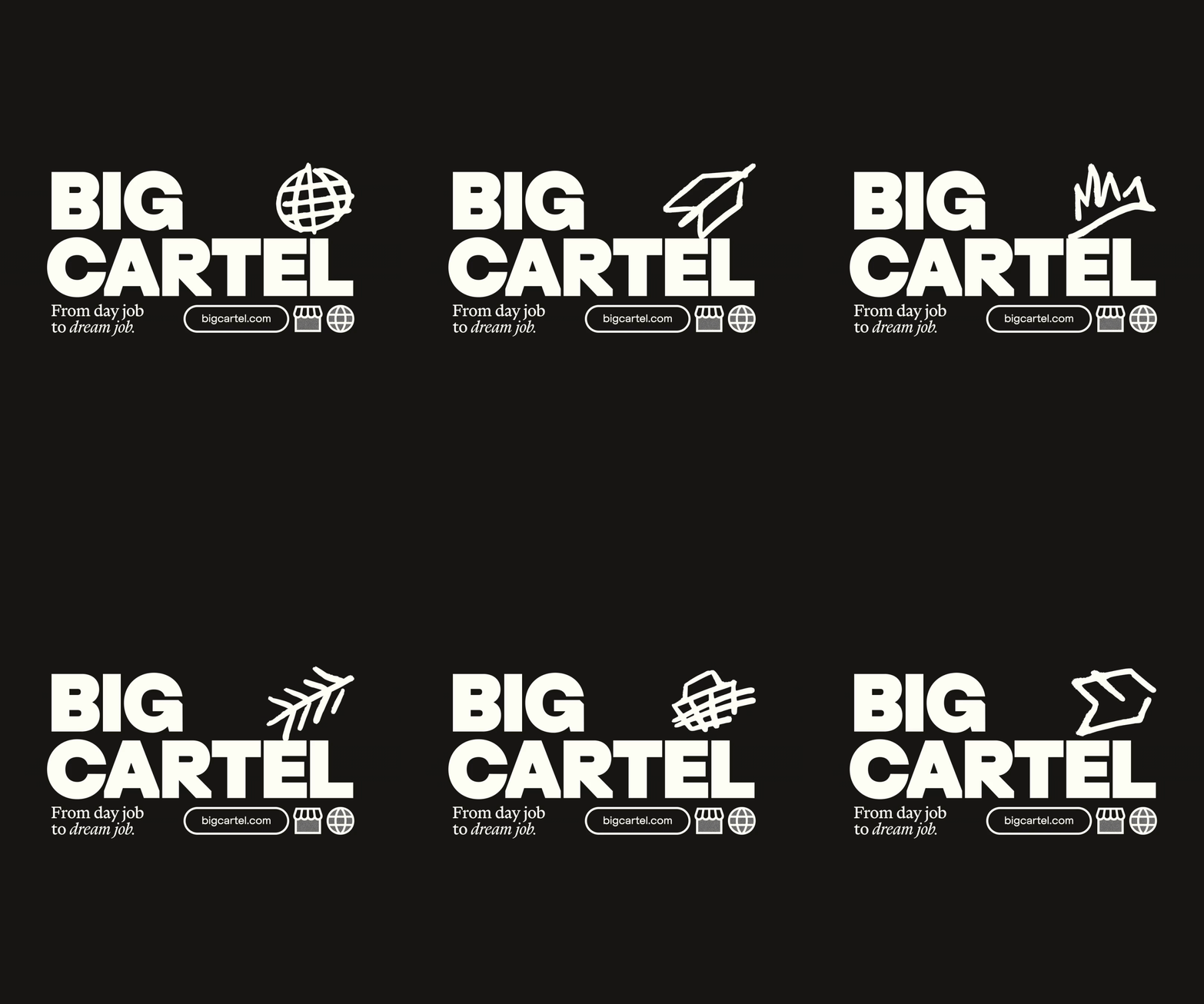
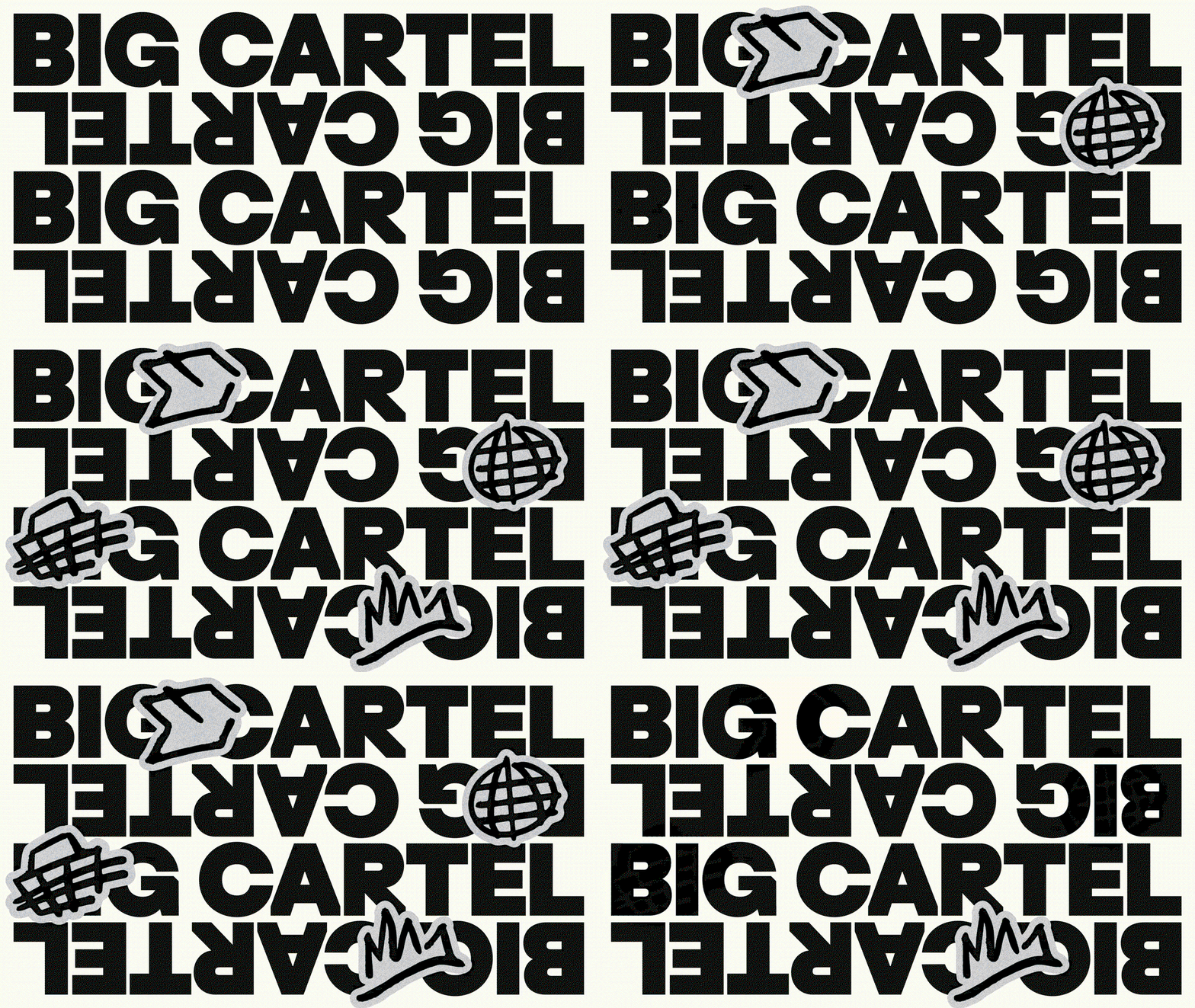
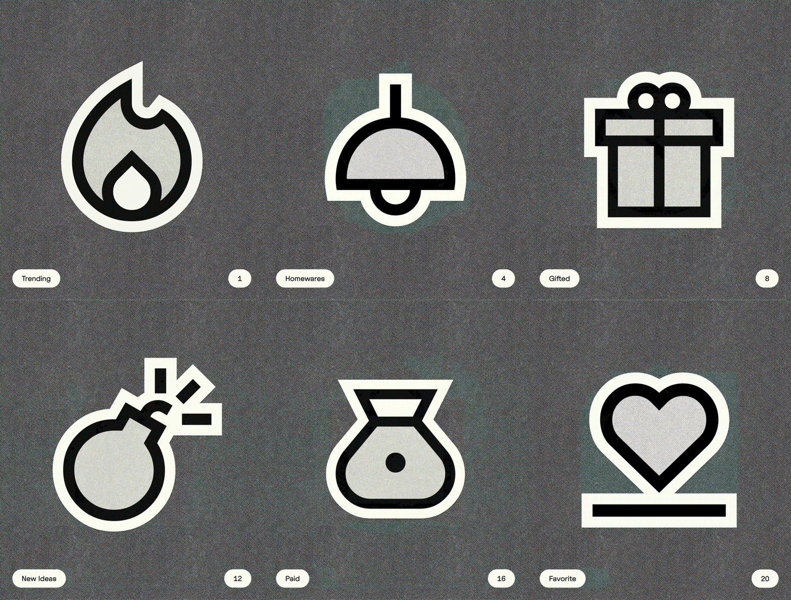
The result is a brand that’s audacious and unapologetic, across its voice and its vibe, it seeks to empower its users. “We aimed for something distinctive yet relatable, bold yet simple,” Chris explains, “every element is designed to stand out individually, but work effortlessly together.” The team practiced restraint in the context of playful, tactile texture and type. Alongside Dinamo’s ABC Marist as the secondary supporting typeface, the typographic approach across the brand is led by Extraset’s ED Replan – an idiosyncratic variable sans serif utilised as the primary font and its logotype. “When we discovered Extraset sells their merch on Big Cartel, they became the perfect partner to craft a custom wordmark,” Chris recalls. “The result is a distinctive, digital-first mark: heavy, expressive, and paired with a hand-drawn icon,” the appearance of which continually shifts, forging a logomark that encapsulates the brand’s defiant tone of voice.
Looking back over the project, having been faced with a hefty challenge – especially considering the legacy of the brand – Chris explains how there was one thing that kept the project on track. “While parts of the original brand were beloved and change was met with hesitation,” (including the logo), “collaboration was key,” says Chris. In focusing on preserving the independence of the brand whilst broadening its audience, How&How worked very closely with the team at Big Cartel to craft something forward-thinking yet authentic. “The process was iterative, guiding them through what was possible,” Chris ends, “and how far the brand could evolve without losing its essence.”
GalleryHow&How: Big Cartel (Copyright © How&How, 2025)



Hero Header
Share Article
Further Info
How&How: Big Cartel (Copyright © How&How, 2025)
About the Author
—
Hailing from the West Midlands, and having originally joined It’s Nice That as an editorial assistant in March 2020, Harry is a freelance writer and designer – running his own independent practice, as well as being one-half of the Studio Ground Floor.