Launch Recite Me assistive technology
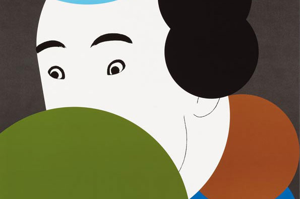
An illustration of a person with black hair and wide eyes, looking over a large green curve. A brown circular shape sits to the right against a dark grey background.

Looking back at the ultra-prolific Ikko Tanaka and his stunning graphic design

—
Date
13 August 2012

If Shigeo Fukuda was the king of Japanese graphic design then consider Ikko Tanaka the monarch Fukuda usurped. Two years Fukuda’s senior, Tanaka never quite gained the universal acclaim afforded his peer, but was equally instrumental in the development of Japanese graphic design, evolving it into a powerful visual language still widely referenced today.

Tanaka’s work is renowned for its modernist simplicity, utilising strong geometrical forms as the basis for bold, communicative imagery with a distinctive Japanese twist. His poster designs in particular frequently make reference to traditional Japanese art forms, from the painted faces of geishas to the dextrous markings of calligraphic brushwork. This fusion of eastern and western design is Tanaka’s greatest legacy, paving the way for a slew of young designers following in his footsteps.

Later in his career Tanaka was responsible for creating the brand ethos for the now universal homeware manufacturers Muji, bringing the restrained aesthetics of Japanese homes to a vast global market.
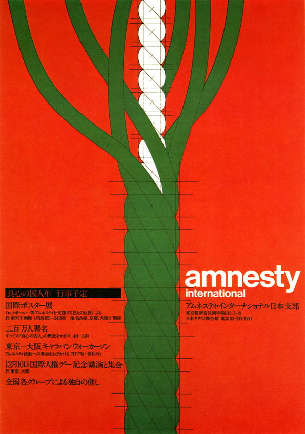
A graphic poster on a red background featuring a thick, braided rope of green and white strands. The rope is bound by thin black horizontal lines, suggesting it is tied or restrained. The bottom right features the “amnesty international” logo in white. To the left, several blocks of Japanese text list event details and dates.
Above

Ikko Tanaka: Amnesty International

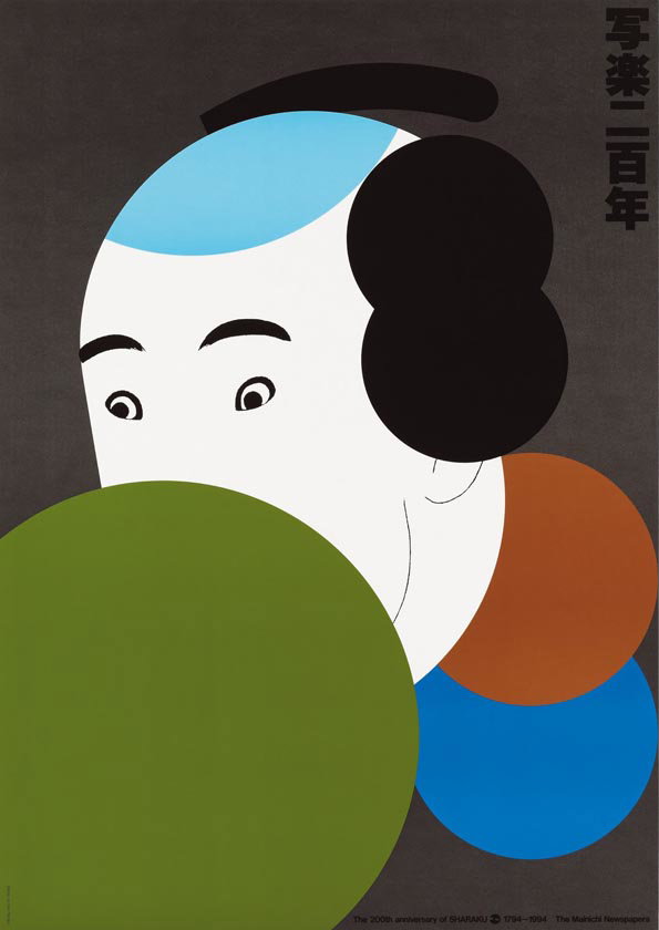
An illustration of a stylised face peering from behind a large green circle. The figure has a shaved blue scalp and a black hairpiece, set against a dark grey background with vertical Japanese text. Small text at the bottom reads “The 200th anniversary of SHARAKU 1794–1994 The Mainichi Newspapers”.
Above

Ikko Tanaka: Tanaka Sharaku

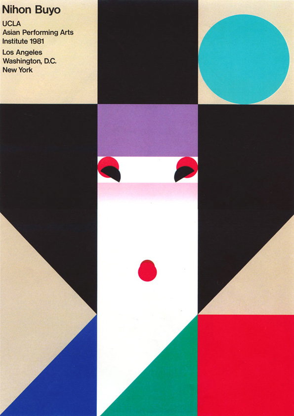
A geometric poster for “Nihon Buyo” featuring a stylised face in the centre. The face is composed of a white rectangle with a red circle for a mouth and two red and black shapes for eyes. The composition uses bold blocks of black, red, blue, green and beige, with a teal circle in the top right. Text in the top left reads “Nihon Buyo”, “Ucla Asian Performing Arts Institute 1981” and lists the cities “Los Angeles”, “Washington, D.C.” and “New York”.
Above

Ikko Tanaka: Nihon Buyo

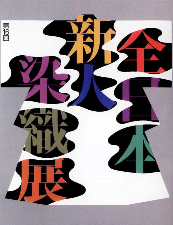
A graphic poster featuring bold, stylised Japanese characters in orange, purple, blue and green. The characters are set against irregular black shapes on a white background.
Above

Ikko Tanaka: Kimono Exhibition

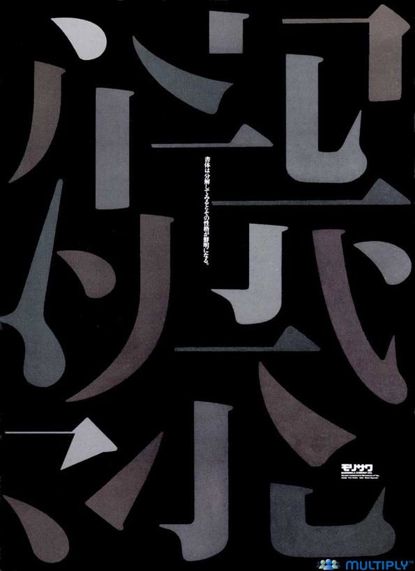
A graphic design featuring large, abstract Japanese characters in shades of grey and purple against a black background. Small vertical text is positioned in the centre, with a logo and the word “Multiply” at the bottom.
Above

Ikko Tanaka: Imagination of Letters

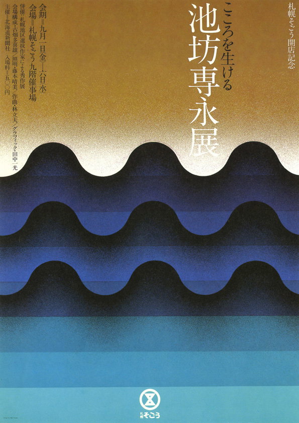
A graphic poster featuring a series of undulating, wave-like bands in shades of deep blue, black and teal. Vertical Japanese text is aligned to the right, with smaller columns of text on the left and a circular logo at the bottom.
Above

Ikko Tanaka: Flower Arrangement

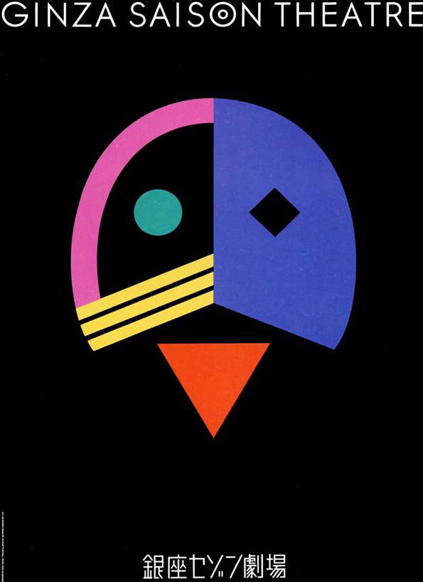
A graphic poster on a black background reads “GINZA SAISON THEATRE” at the top. A central abstract face is composed of a pink and blue semi-circle, yellow stripes, and an orange triangle.
Above

Ikko Tanaka: Ginzo Saison Theatre

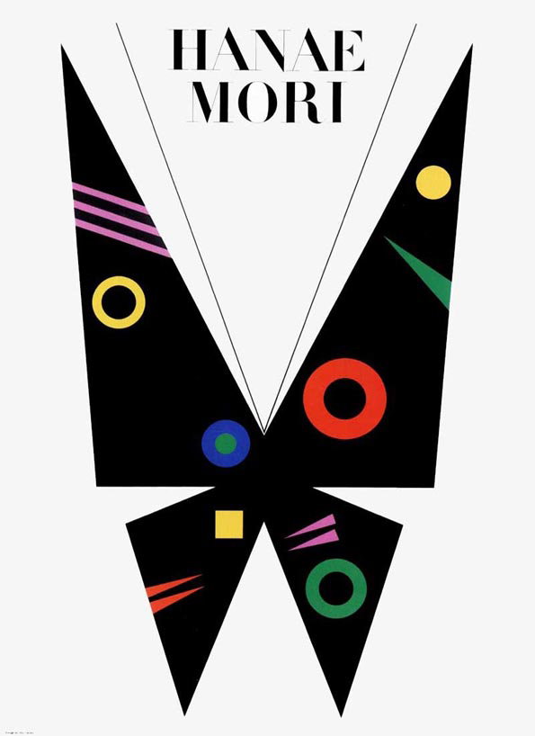
A graphic poster featuring a black butterfly silhouette against a white background. The wings are decorated with colourful geometric shapes, including circles, stripes and a square. Above the butterfly, the text reads “Hanae Mori”.
Above

Ikko Tanaka: Hanae Mori

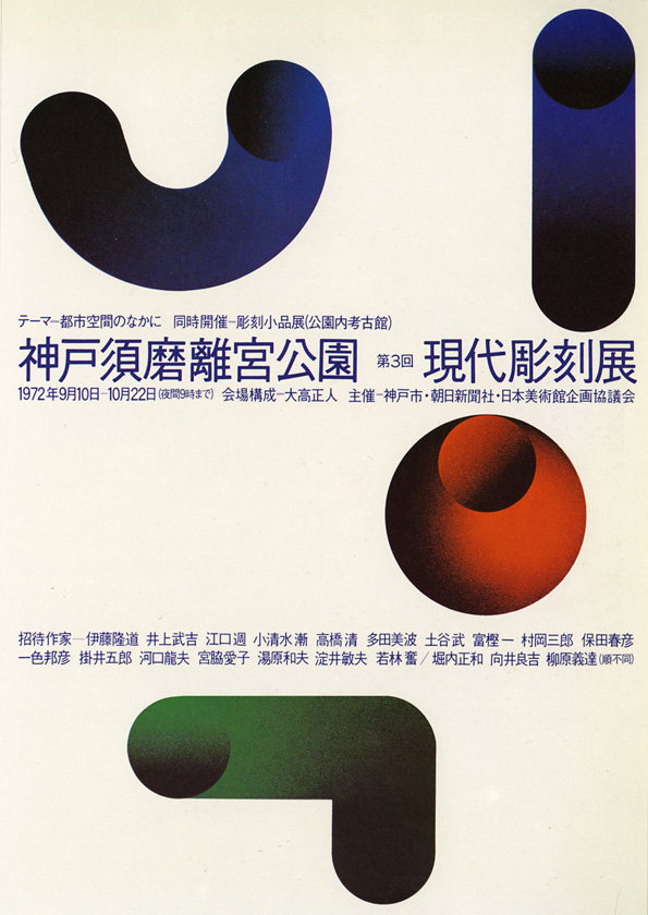
A graphic poster featuring three large, rounded 3D shapes in blue, red and green against a white background. Japanese text across the centre announces the “3rd Modern Sculpture Exhibition” at Kobe Nunobiki Palace Park in 1972.
Above

Ikko Tanaka: Kobe Biennial

Share Article

Further Info

About the Author

James Cartwright

—

James started out as an intern in 2011 and came back in summer of 2012 to work online and latterly as Print Editor, before leaving in May 2015.

It's Nice That Newsletters

Fancy a bit of It's Nice That in your inbox? Sign up to our newsletters and we'll keep you in the loop with everything good going on in the creative world.