Jacob Wise releases WT Skrappa 2.0 with the help of a flight simulator
The Rotterdam-based designer’s remodel comes with a variable font allowing you to control width, slant and tracking.
- Date
- 26 January 2024
- Words
- Yaya Azariah Clarke
Share
Since the launch of Jacob Wise’s typeface WT Skrappa in 2019, the designer has seen it used across publishing, editorial and rebrands. It carries Arthur Jafa’s name on his Magnumb monograph, it’s the window for the masked image design on the cover of Owen Hopkins’ tome The Brutalists, and it was used for the titling of Robot Building, a survey on architecture in the age of automation. Its foundations can be found in Ken Garland’s letter for his First Things First manifesto (published in 1964), standing out because of its “rigid geometry,” Jacob explains. “It was almost screaming out to be extended – it’s been shackled as a condensed style for far too long, if you ask me.”
The launch of Skrappa also marked the founding of Jacob’s type foundry, WiseType, which was a particularly rocky period as he simultaneously switched to freelancing full-time. And since, the designer has fostered his love for typography and also his desire to learn, which has led him to embark on a masters in specialised type and media at the Royal Academy of Art in The Hague. “That was a wild year – a breakneck typographic bootcamp, which you leave with a 1,000-yard stare, but also a well-refined eye and nous for critiquing all manner of letterforms,” he says. Since graduating, and putting his focus back on WiseType, he’s seen an opportunity to refine the typeface, a journey he’s been on since extending it as a custom typeface for the Utah Jazz in 2020. “By that point I could see a myriad of things I’d like to change if I were to extend it again,” he tells us. And now he has an update, redrawn and motivated by the beauty of its geometry and potential as a variable font.
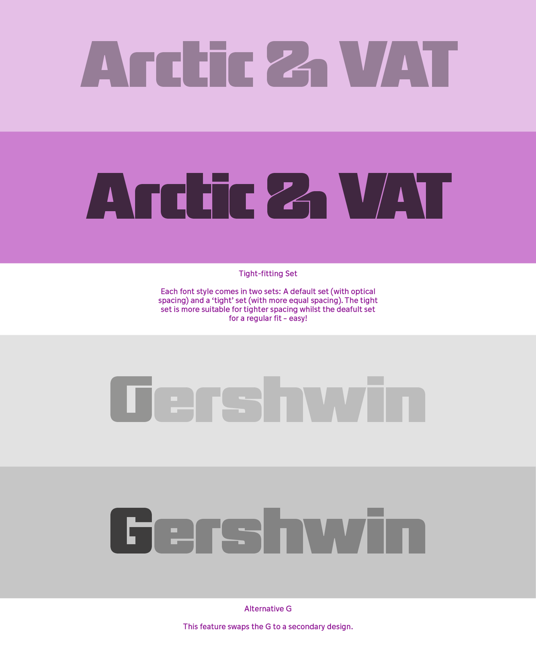
Jacob Wise: WT Skrappa (Copyright © Jacob Wise, 2024)
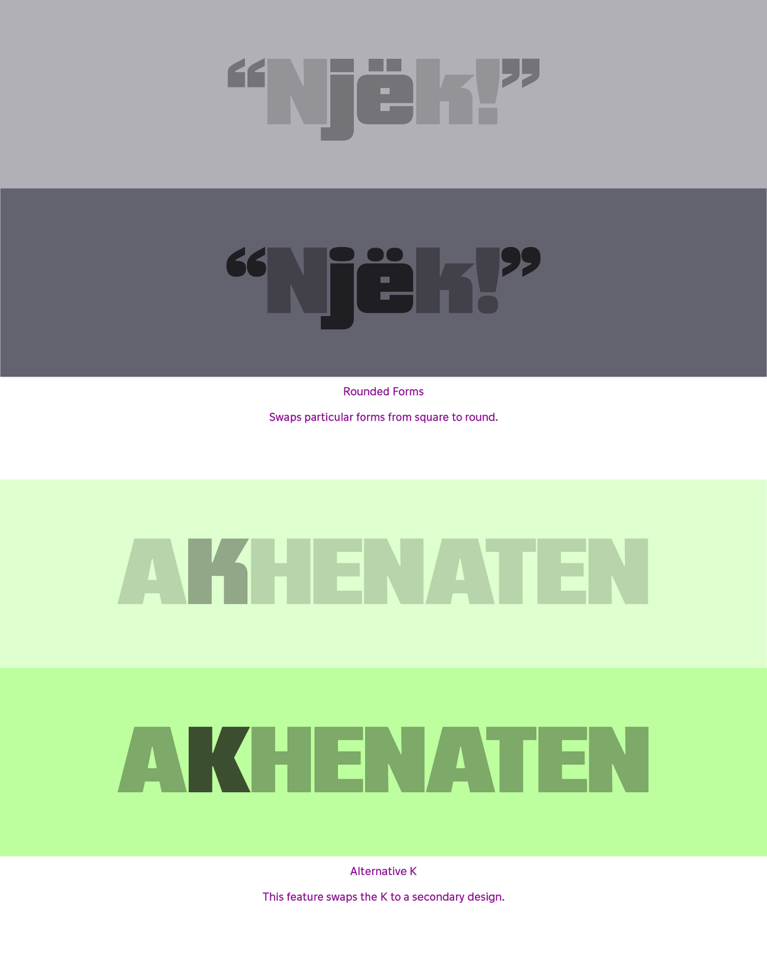
“When returning to the project, it was necessary to go back to square one,” says Jacob. The designer first started with planning out the design space of the typeface, including “all the possible masters and variable axes I wanted to build into it”. The process included him testing all of these elements on a smaller scale, and making adjustments to make it work within a variable space, before expanding on the number of alternative glyphs and other features, including a wider character set that would cover Vietnamese. Adding some fun into the process, Jacob also created the default set with optical spacing and added a tight set for hairline tracking. When it came to presenting this update, the designer and his brother, Harvey Wise, imported it into a flight simulator, enlarged it to a “concrete-clad beast,” and parked it atop a city centre. “It just felt like the logical thing to do,” he says.
With Skrappa 2.0 being released into the world, Jacob sees its potential to expand but intends to “give it a rest” for the foreseeable future. He hints at going full-speed on WiseType projects. “It’s slowly transitioning from what was a low-key side hustle to more of a serious endeavour.” As for Skrappa 2.0, and the possibility of a new lease of life for his beloved typeface, he wants to see its new variable axes in use throughout design projects. “It’s quite rare to see a typeface used to its full potential, but when you do notice these hidden features being deployed, you feel the extra struggle was worthwhile.”
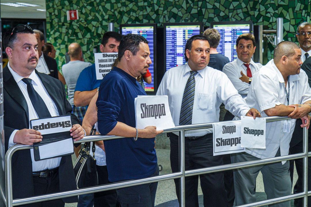
Jacob Wise: WT Skrappa, Airport Taxi (Copyright © Jacob Wise, 2024)
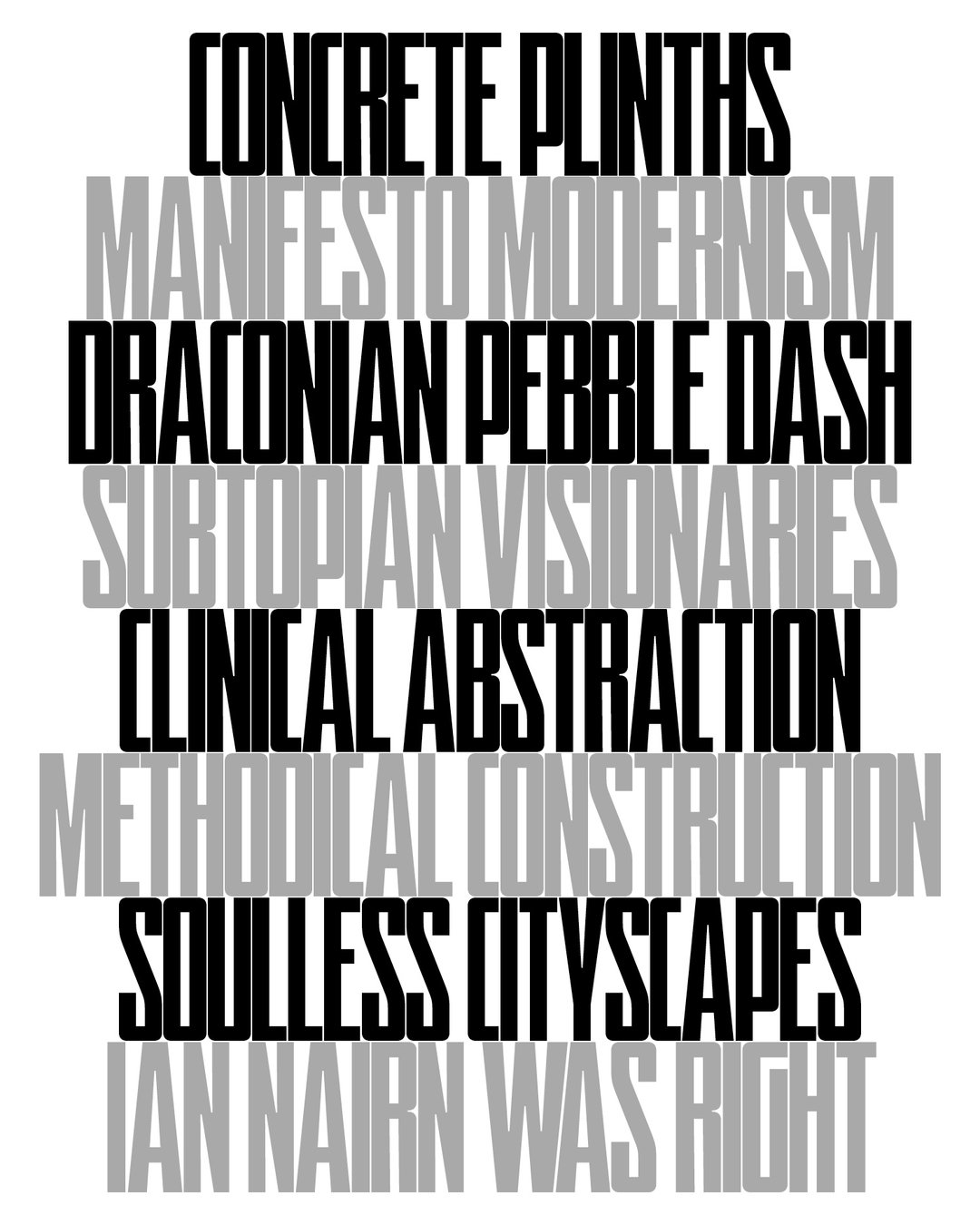
Jacob Wise: WT Skrappa (Copyright © Jacob Wise, 2024)
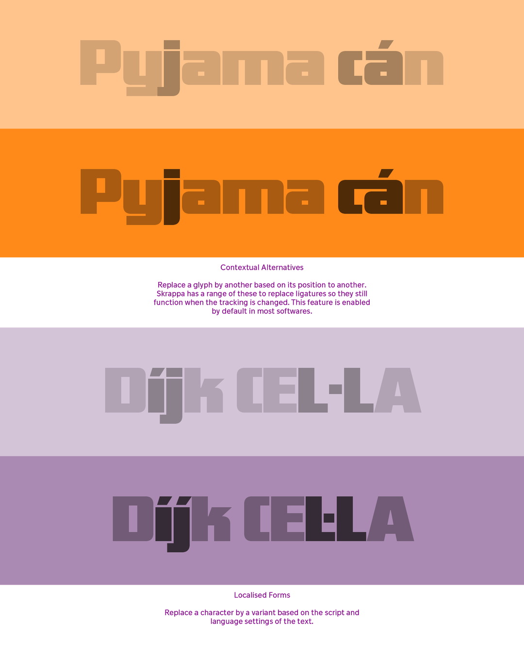
Jacob Wise: WT Skrappa (Copyright © Jacob Wise, 2024)
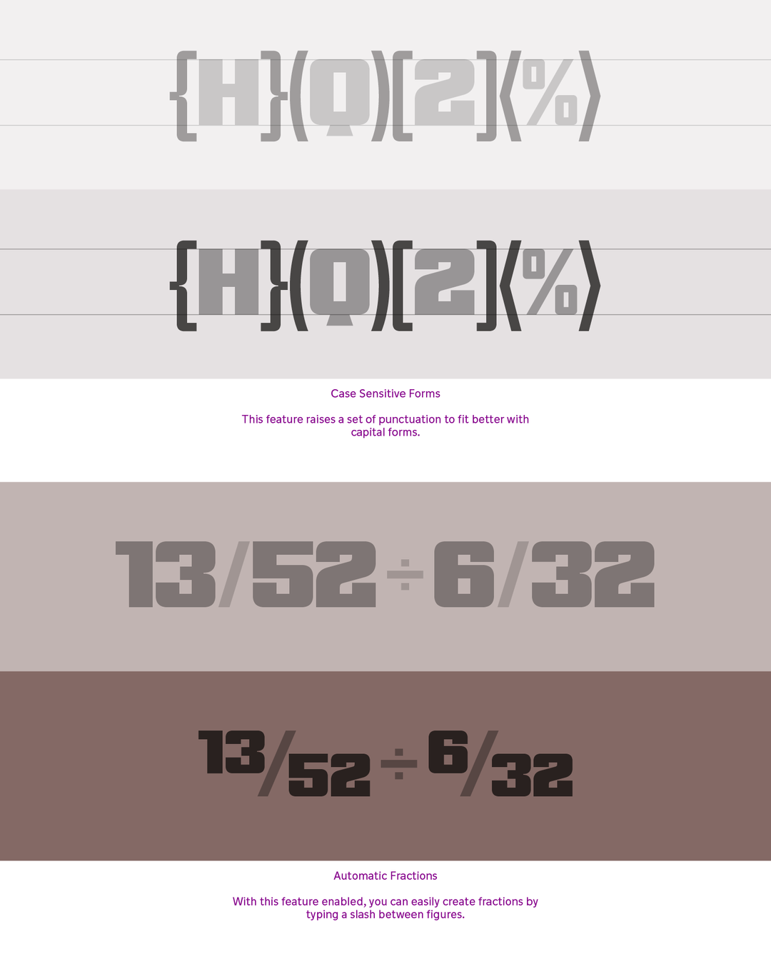
Jacob Wise: WT Skrappa (Copyright © Jacob Wise, 2024)
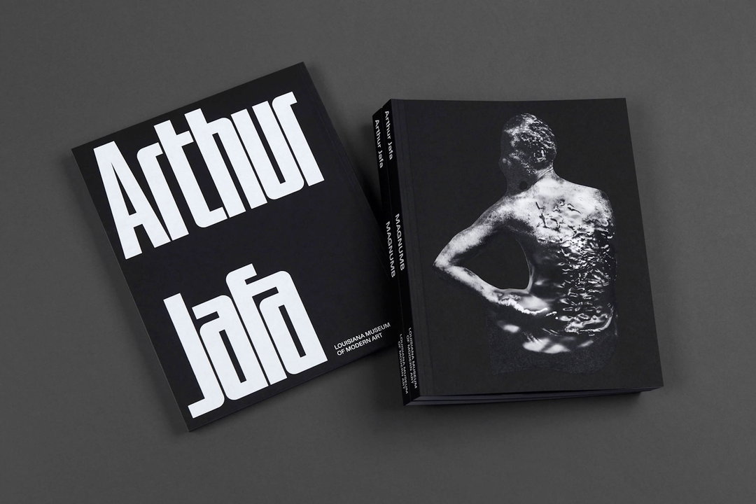
Arthur Jafa: MAGNUMB (Exhibition catalogue at Louisiana Museum of Modern Art), 2021. Design by: Studio Claus Due
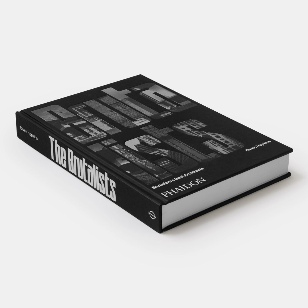
The Brutalists: Brutalism’s Best Architects, 2023. Design by Studio Joost Grootens, published by Phaidon Press
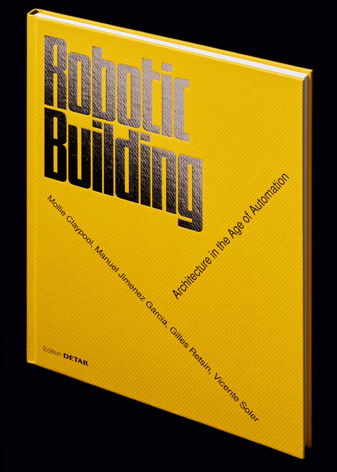
Robotic Building: Architecture in the Age of Automation, 2019. Design by Wiegand von Hartmann
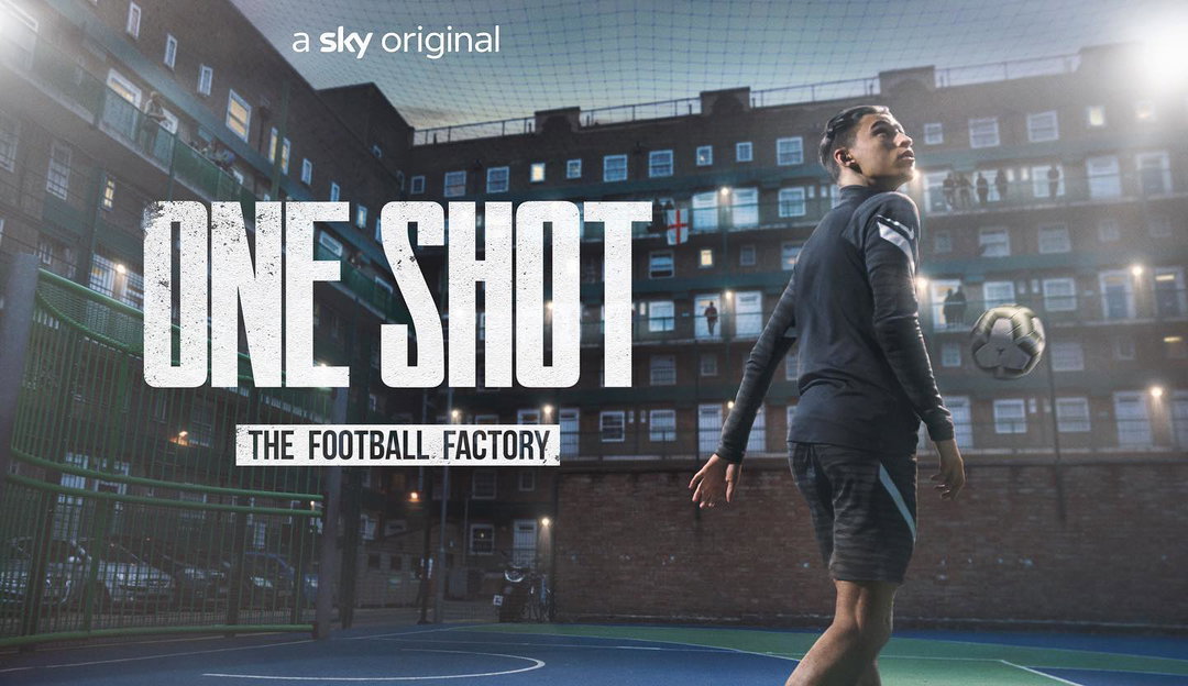
Sky: One Shot, The Football Factory, 2022. Design by Sky Creative
Share Article
Further Info
About the Author
—
Yaya (they/them) was previously a staff writer at It’s Nice That. With a particular interest in Black visual culture, they have previously written for publications such as WePresent, alongside work as a researcher and facilitator for Barbican and Dulwich Picture Gallery.