




Graphic designer Jad Hussein on ten years of genre-bending work for MAC Lyon
Parisian designer, editor, and teacher of typography and editorial design Jad Hussein shook up exhibition catalogue design back in the summer with his carnival-coloured work on Jamaica Jamaica at Philharmonie de Paris.
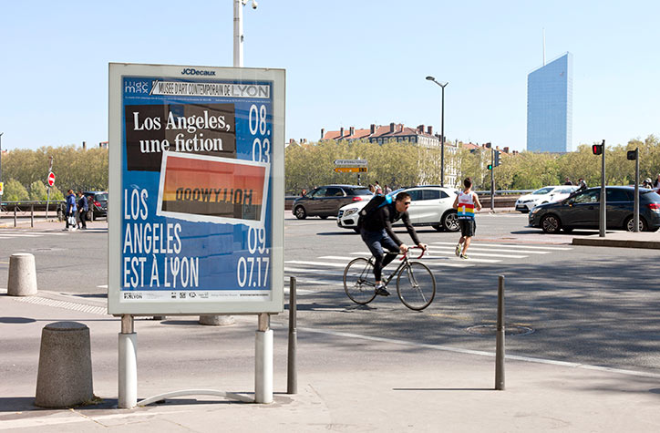
Since, Jad has been finessing the website of his studio Look Specific, which he tells us has been the culmination of many years work. Now launched, the website is a deep dive into Jad’s consciously playful approach to graphic design. Challenging as it may be to single out one project, we were particularly captivated by Look Specific’s work for Musée d’art Contemporain de Lyon AKA Lyon’s Museum of Contemporary Art. On the decade anniversary of Jad’s relationship with the museum, we contacted him to discover the stories of the ten-year collaboration.
How did your relationship with Musée d’art Contemporain de Lyon begin, and when?
It’s a quite fun story. In 2007, the museum wanted to change its identity including the logo, signage and all exhibition documents. At that time, I was a student on holidays after an internship in Paris. I can’t remember where I found the call for entries but I started thinking about it and designed some stuff for around a month. I put together a big dossier with a logotype, a lot of designs and all these boring administrative documents. I didn’t mention I was a student, used some internship projects as references, sent everything early September and went back to school for my second to last year. Then, one morning I was walking to school and got a call. It was the museum and I was the laureate of the competition. I was really happy and freaked out at the same time, but it worked out fine. I kept this story secret for a while and only told them the truth recently. Not sure they would have given the keys to a third year student if they would have known. It was fun.
Look Specific
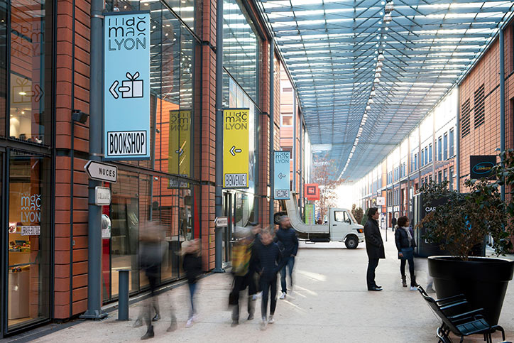
Image: Ghislain Mirat for Look Specific
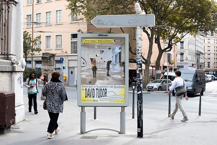
Image: Ghislain Mirat for Look Specific
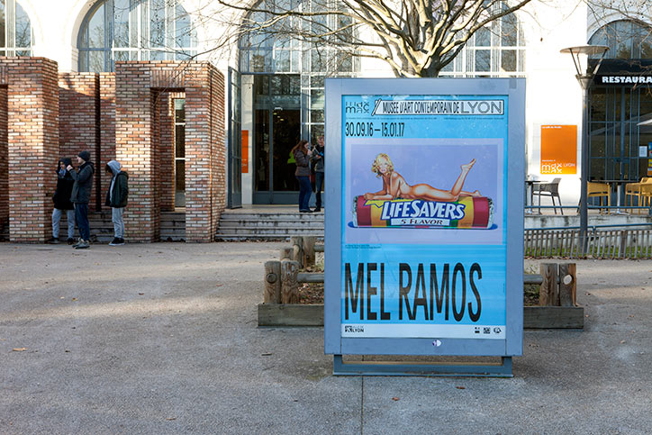
Image: Ghislain Mirat for Look Specific
Tell us about the work you’ve made for them across the last decade.
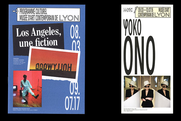
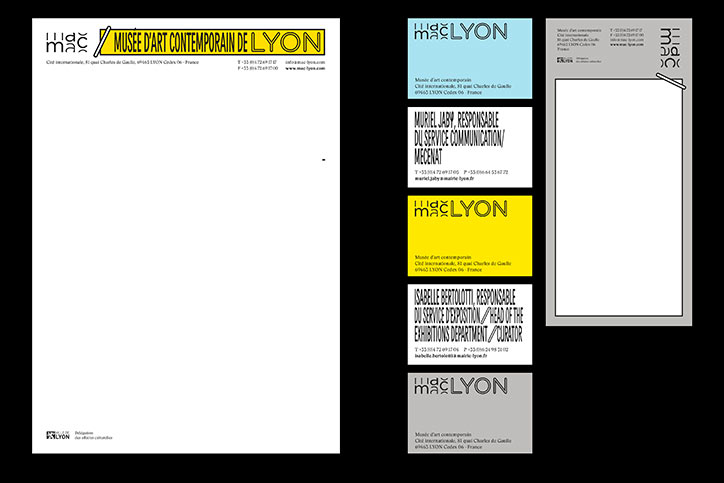
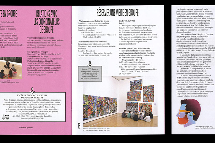
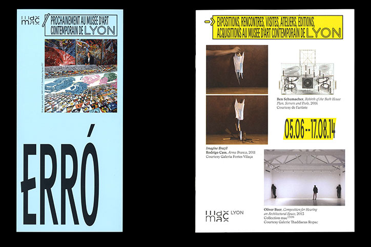
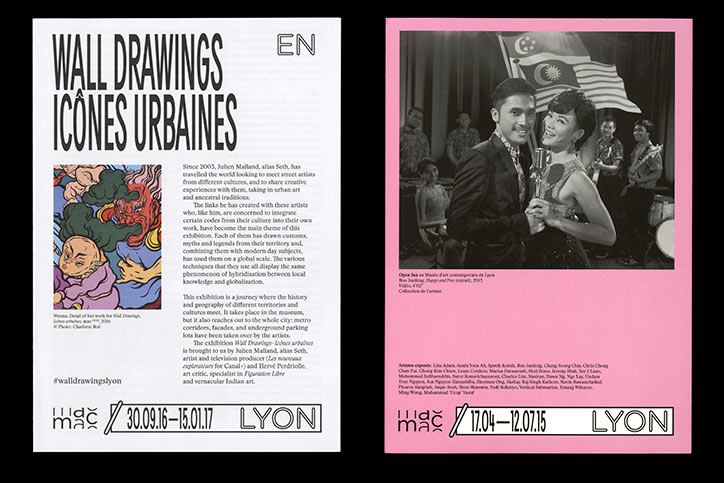
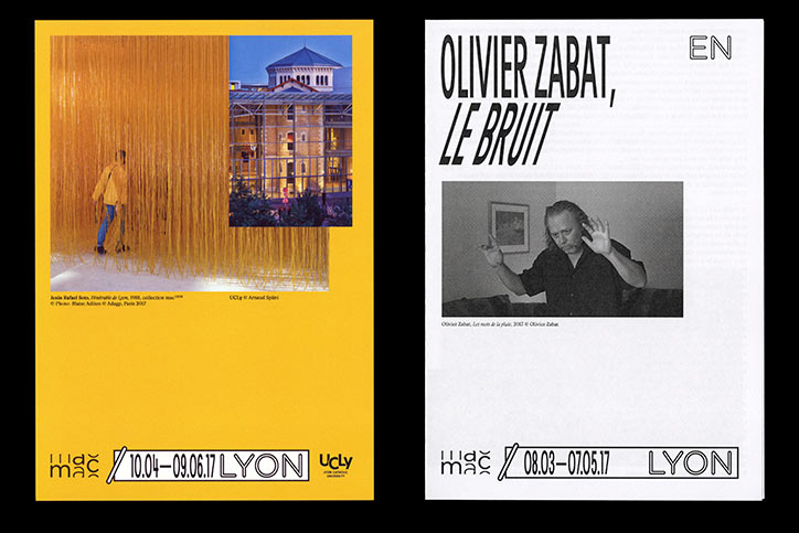
In 2007, the museum needed to reaffirm its identity after some years of one shot exhibition campaigns and I designed the whole identity keeping this in mind. The idea was to make it clean, strong, and consistent, which was essentially what I’d been taught at school. The museum has this fun sliding-walls system to rearrange the exhibition spaces so I used this simple idea for the logo and the whole layout system. Everything was sliding, the font in one way, the pictures in another, offering various possibilities but keeping it simple. One fun thing was that the past logo was literally built into the museum’s facade and I didn’t know how to approach this subject with them. Moreover the museum is a Renzo Piano building and it seems you can’t really touch even the slightest bit of the facade. I put this problem aside and never mentioned it with them because it seemed too shameless for my student self to say anything about it.
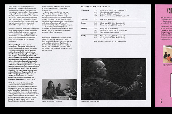
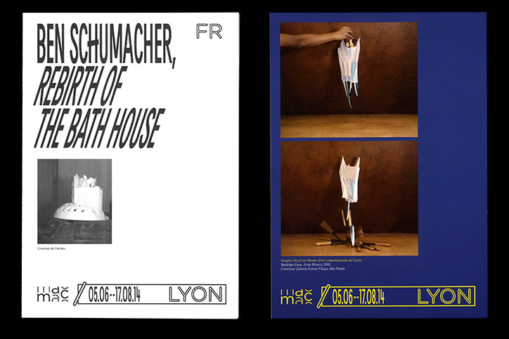
So it worked like that for five or six years and it did the job I think. As it was rigorous it started to become a bit boring and in 2013, the museum asked for an evolution, something different. Knowing the museum (and my job) better, I went for a new approach. Something more playful and less square. We designed a font for this new identity and I went for bold colours. It’s also much less about layout rules and more about free composition using identity elements, which makes it a bit harder to work with because of the freedom it allows. I used to design 15-20 poster options with the 2007 identity before deciding on a final version, now it’s more like 100-150 iterations. I think that not constraining an identity is more interesting because it keeps things lively, evolving, it respects complexity and allows creativity, and still produces a very coherent visual language. I like it more that way because it’s more fun to design and brings about bold comments : “I like it a lot!” and “I can’t decide if it’s futuristic or kitsch or whatever, anyway it’s really awful.”
Which has been your favourite project to work on with MAC Lyon so far? Why?
I take on all the exhibition campaigns with enthusiasm and I don’t think I have a favourite project with them so far. Again and again, it’s always a pleasure to see the documents printed out and the posters displaying everywhere in Lyon. I feel very lucky in this adventure with MAC Lyon and I’m trying to enjoy every campaign as if it were the last one.
Do you have any projects in the pipeline with the museum for the rest of the year?
Right now it’s the Lyon Biennale so the museum has a lot of events going on and we will start working on the next exhibition around January. The artist is Adel Abdessemed and it’s quite fun because the first exhibition catalogue I worked on was a monograph about him. It was in 2007, I was a student doing an internship in Paris. Ha!
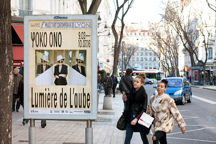
Image: Ghislain Mirat for Look Specific
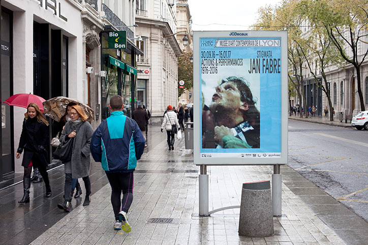
Image: Ghislain Mirat for Look Specific
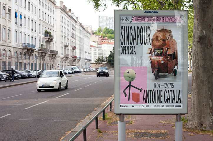
Image: Ghislain Mirat for Look Specific
Look Specific
Look Specific
Look Specific
Look Specific
Look Specific
Look Specific
Look Specific
Share Article
Further Info
About the Author
—
Bryony joined It's Nice That as Deputy Editor in August 2016, following roles at Mother, Secret Cinema, LAW, Rollacoaster and Wonderland. She later became Acting Editor at It's Nice That, before leaving in late 2018.



