Launch Recite Me assistive technology
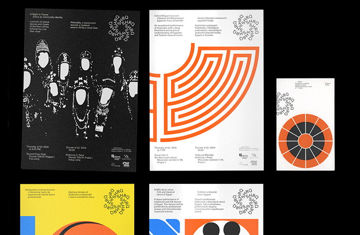
A series of four graphic posters with a consistent layout, featuring a mix of photography, abstract geometry and typography. One poster shows a high-contrast black and white image of figures in traditional dress, while others use bold orange circular and linear patterns.

An innovative approach to typography and ace use of monochrome from Prague's Parallel Practice

—
Date
10 May 2016

Parallel Practice is Prague-based graphic design and art direction double act, headed up by Michal Landa and Jan Brož. Together, the pair creates a wonderful line in printed materials, posters and identities for mostly cultural clients. The work is characterised by an experimental approach to typography, inverting or warping texts to create unusual and unexpected outcomes. Elsewhere, the text itself is arranged in jarring geometric chunks and arranged to create new patterns. The mix of type and graphic symbols makes for a portfolio that feels brave, modern and makes superb use of the power of monochrome.
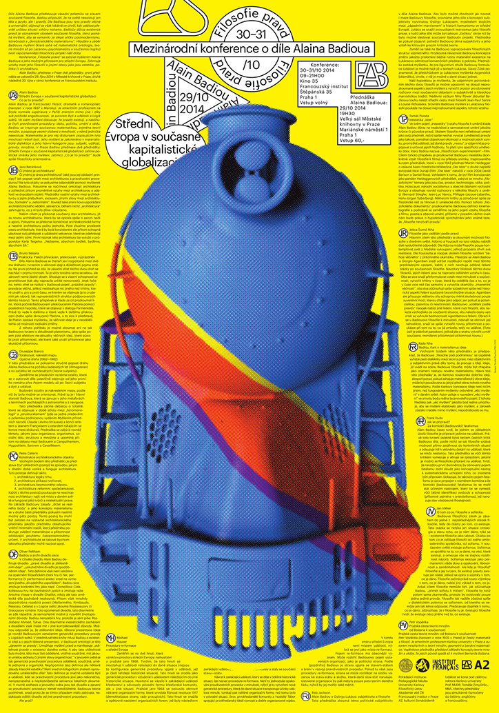
A graphic poster for a conference on Alain Badiou, featuring a large, blue 3D render of a futuristic, ribbed vessel. The central figure is surrounded by dense columns of text and a header that reads “Mezinárodní konference o filósoe Alaina Badiou”.
Above
Left

Parallel Practice: Posters

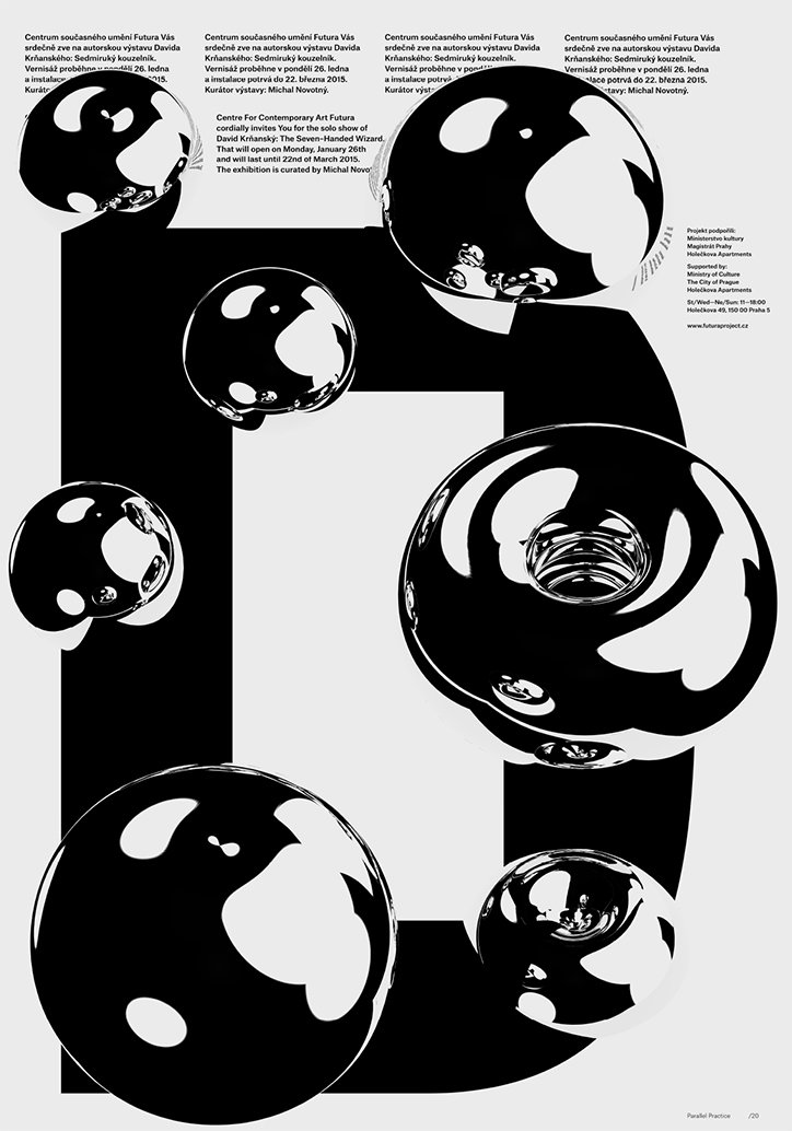
A black and white poster featuring three glossy, distorted spheres that form a large, abstract letter “O”. English text at the top invites viewers to a solo show by David Krbashin titled “The Green-Haired Wizard”.
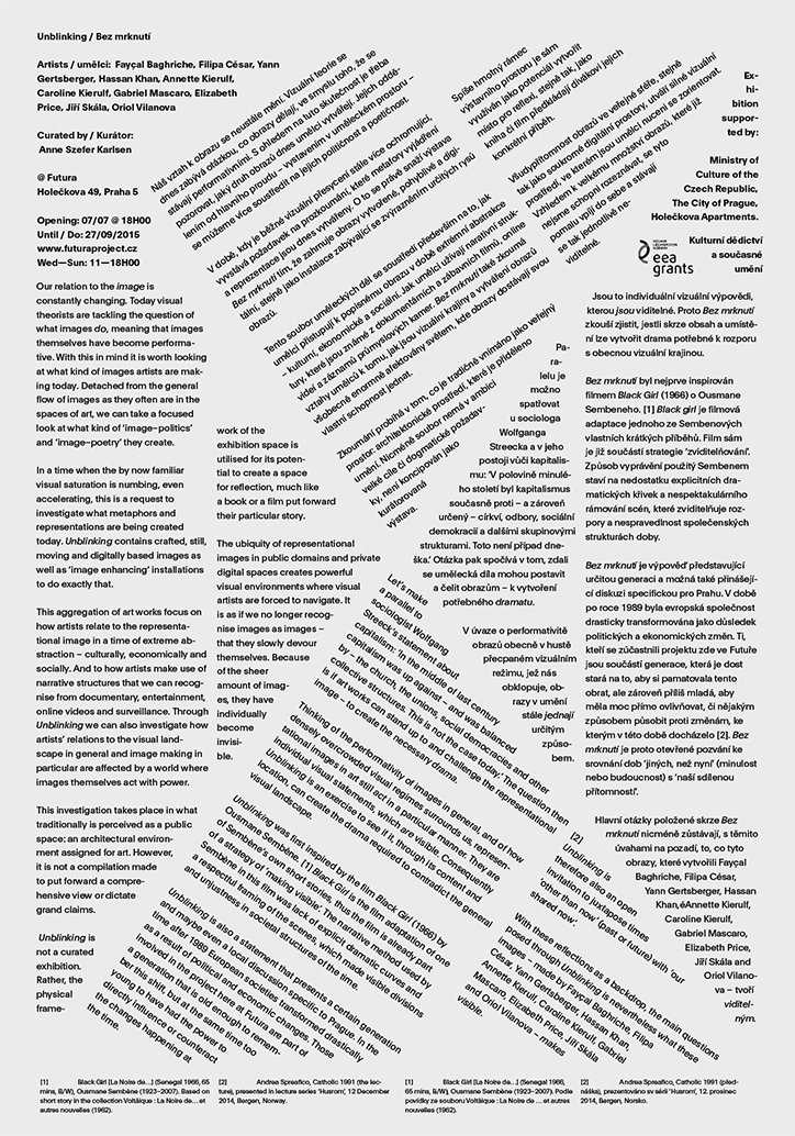
A printed exhibition guide with two columns of text in English and Czech. The layout is clean and minimalist, featuring a small black-and-white photograph of a person's face partially obscured by a hand.
Above
Left

Parallel Practice: Posters

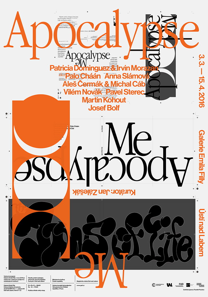
A typographic poster in orange, black and white reads “Apocalypse”. The word is repeated and mirrored across the page, accompanied by a list of names including “Patricia Dominguez” and “Irvin Morazan”. The right edge lists the dates “3.3. – 15.4.2016” and the venue “Galerie Emila Filly, Ústí nad Labem”. At the bottom, a dark grey band contains the phrase “Sense of Life” in a distorted, fluid script.
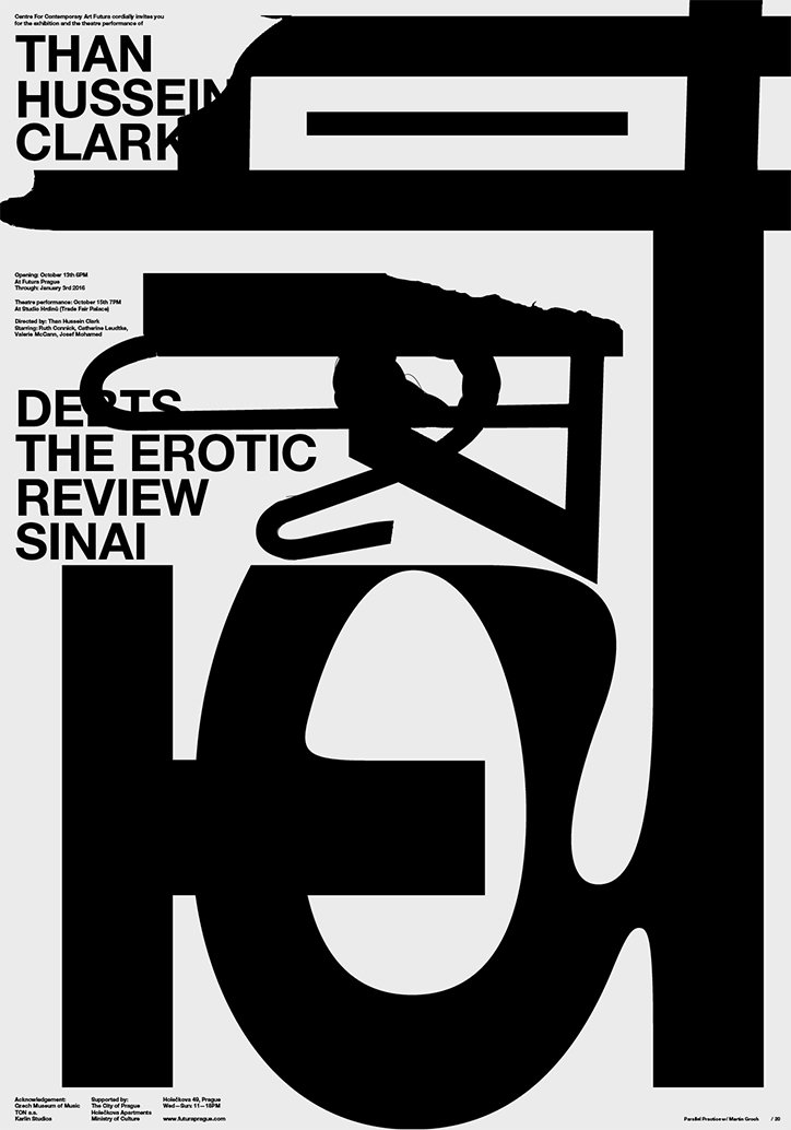
A black and white typographic poster featuring bold, distorted lettering. Large text at the top reads “THAN HUSSEIN CLARK”, while text further down reads “DERTS THE EROTIC REVIEW SINAI”.
Above
Left

Parallel Practice: Posters

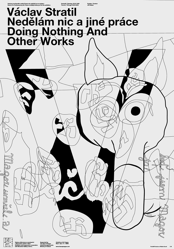
A black and white poster for an exhibition by Václav Stratil. Bold text at the top reads “Václav Stratil Nedělám nic a jiné práce Doing Nothing And Other Works”. Below the text is a complex, abstract illustration of overlapping line drawings and heavy black shapes.
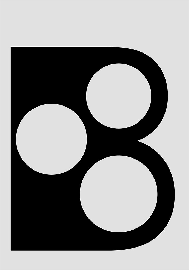
A bold black graphic of a capital letter “B” on a light grey background. Three white circles are cut out of the letter, creating a geometric, perforated effect.
Above
Left

Parallel Practice: Posters

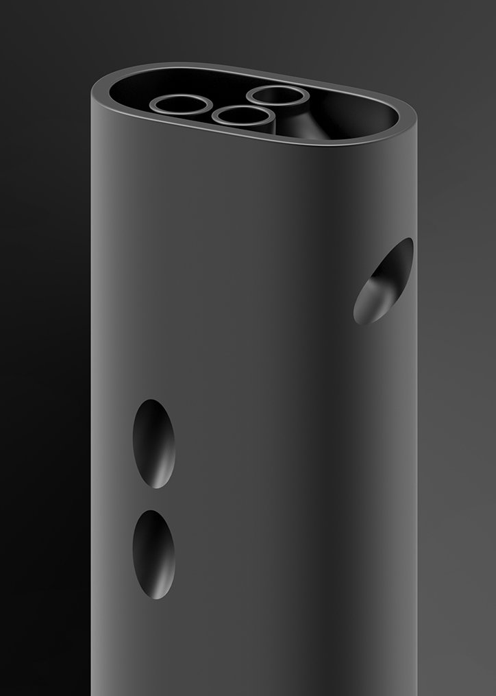
A 3D render of a matte black cylindrical object with a rounded top. Several circular holes are cut into the top and sides of the form.
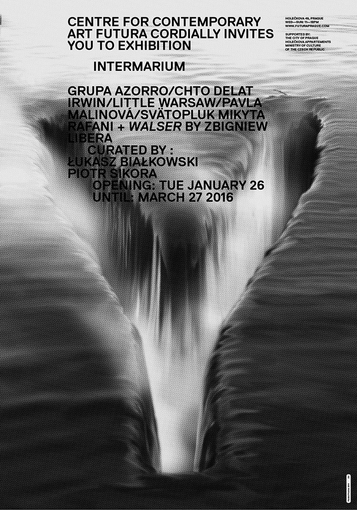
A black and white poster for an exhibition titled “Intermarium”. The background is a blurred, high-contrast image of a deep, V-shaped void or canyon. Text at the top invites the viewer to the Centre for Contemporary Art Futura. It lists several artists, curators and the dates “Tue January 26” until “March 27 2016”.
Above
Left

Parallel Practice: Posters

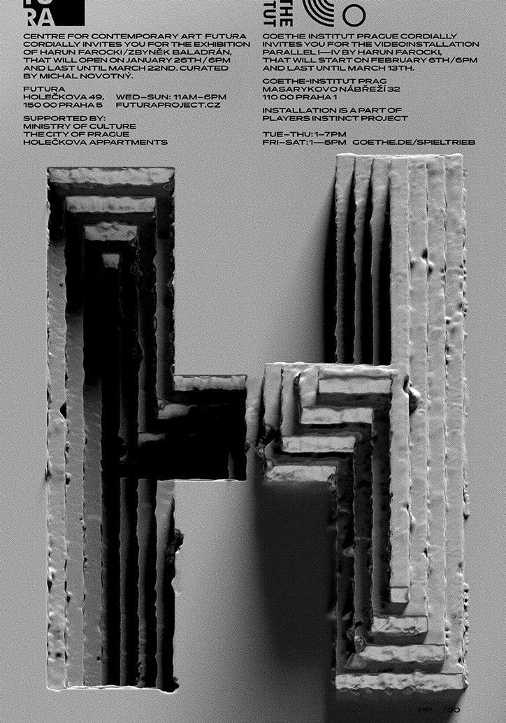
A black and white image of a textured, sculptural form resembling a capital “H”. The structure has a rough, layered appearance like carved stone or cast concrete. Above the form, two columns of text provide exhibition details for Futura and the Goethe-Institut Prague.
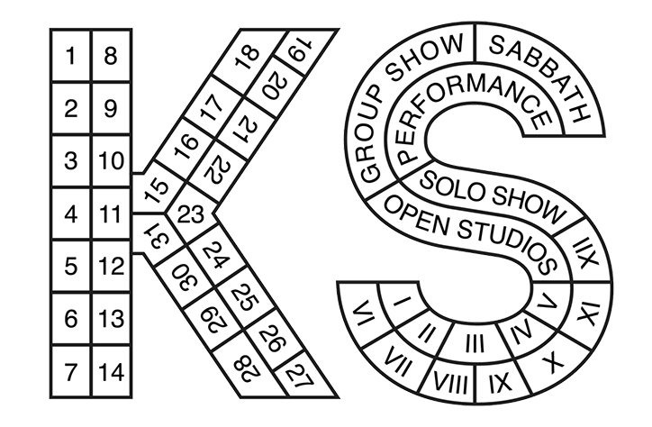
A black and white illustration of the letters “K” and “S” designed as a game board. The letters are divided into numbered and labelled segments, including “Group Show”, “Performance”, “Solo Show” and “Open Studios”.
Above

Parallel Practice: Posters

Share Article

About the Author

Emily Gosling

—

Emily joined It’s Nice That as Online Editor in the summer of 2014 after four years at Design Week. She is particularly interested in graphic design, branding and music. After working It's Nice That as both Online Editor and Deputy Editor, Emily left the company in 2016.


It's Nice That Newsletters

Fancy a bit of It's Nice That in your inbox? Sign up to our newsletters and we'll keep you in the loop with everything good going on in the creative world.