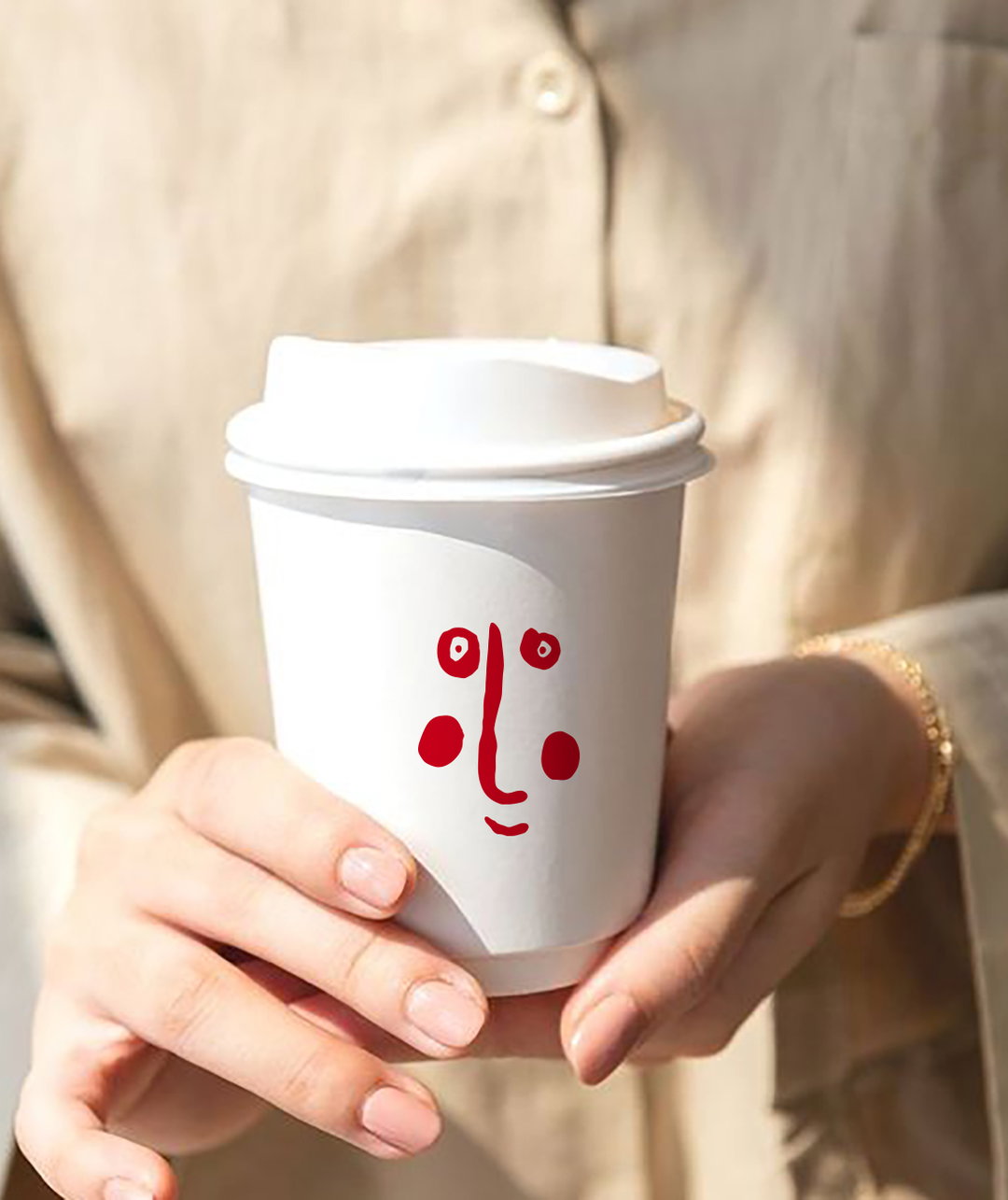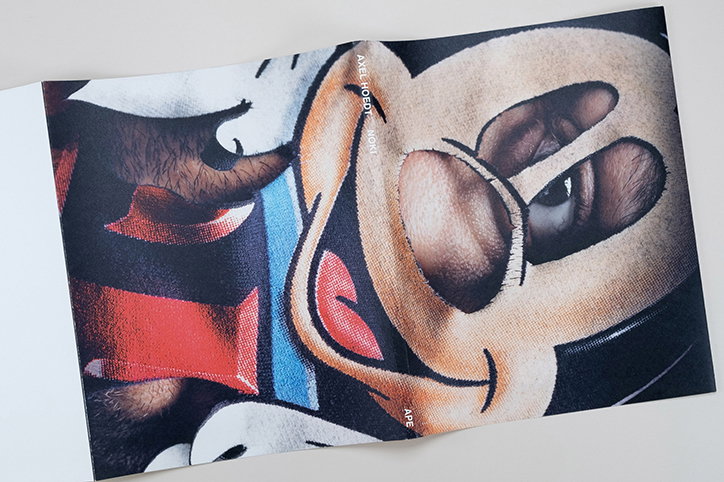
Art direction, exhibition or editorial design: you name it, Jurgen Maelfeyt has done it
With a variety of visual outcomes in a multitude of media, the portfolio of Jurgen Maelfeyt is one that reminds you just how exciting graphic design can be. Based in Ghent, Jurgen runs a design studio called 6’56” and a publishing house called Art Paper Editions, while also teaching graphic design at Kask.
Jurgen began 6’56” in 2005 and the studio’s output encompasses everything from art direction, editorial design, and graphic design, to web design and development, workshops and lectures. Its name derives from an early influence of Jurgen’s: music. “At the age of 16 I was listening to The Sex Pistols, The Exploited, etc… 6’56” refers to the length of the first song on the album Daydream Nation by Sonic Youth called Teenage Riot.” It’s no wonder then, that over the years, Jurgen has developed strong ideas about graphic design, and how it should be approached.
When asked what he thinks the most exciting aspect of the medium is, he responds, “I think the speed is the most interesting part. Both in the making and the disappearing of it.” As a medium which often produces work attached to a specific moment; an event, for example, it provides designers with numerous opportunities to be experimental. On the inverse of that, however, “the search for a timeless design to oppose that speed makes this medium a challenge,” Jurgen adds.
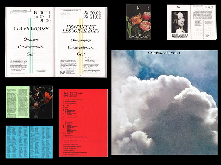
Jurgen Maelfeyt: Kask
In terms of his inspirations, Jurgen makes reference to artists like Richard Prince and Hans-Peter Feldmann, exposing his conceptual understanding of graphic design. This is made all the more clear when Jurgen weighs in one of his most recent projects, the visual identity for Eurotopie. The identity, which 6’56” titled Optimisation of the Real, was made for the Belgian Pavilion at the Venice Architecture Biennale which consisted of a sanctuary where citizens were able to build a new Europe.
“For this identity,” Jurgen explains, “we skewed the European logo by 10 per cent, and all the fonts used. The new emblem refers to the propagandistic visualisation of a flag and puts ‘Eurotopie’ on the frontline. We believe that by creating this visual identity, we encourage the visitor to think and reflect. Chrome is the primary colour and refers to the materials used in the European Quarter in Brussels: glass and metal.” Extending the concept of a new Europe even further, 6’56” scaled the DIN format “down 10 per cent into a new EUR format.”
Some of Jurgen’s other work includes a series of posters for Kaskcinema which he’s been creating for almost ten years, as well as multiple artist books with the likes of Camille Vivier, Paul Kooiker, Arian Christiaens, Gijs Assman, “to name just a few”. What rings true throughout all of Jurgen’s work, no matter the output, however, is an innate curiosity; a research-led, investigative practice which produces intriguing results, underpinned by strong concepts.
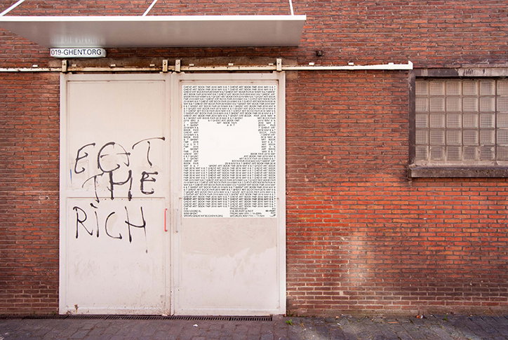
Jurgen Maelfeyt: Ghent Art Book Fair
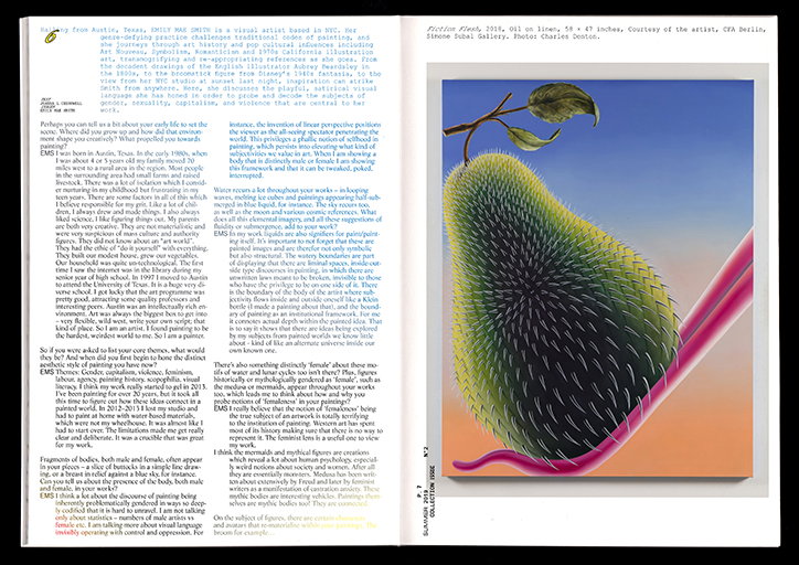
Jurgen Maelfeyt: Collection
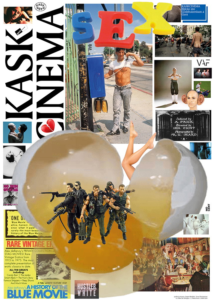
Jurgen Maelfeyt: Kaskcinema
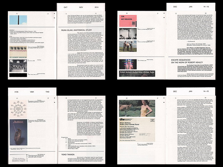
Jurgen Maelfeyt: Kask
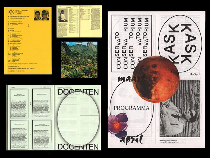
Jurgen Maelfeyt: Kask
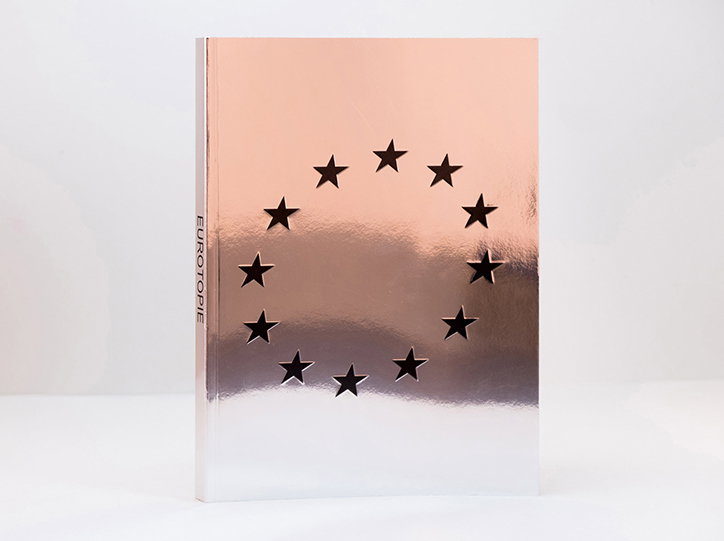
Jurgen Maelfeyt: Eurotopie
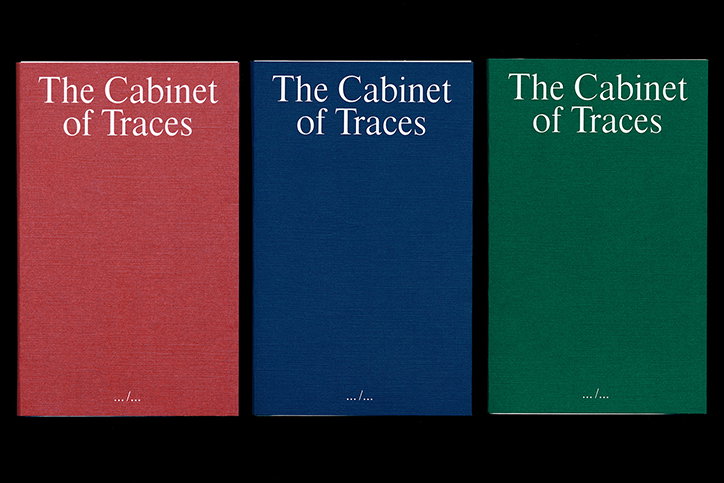
Jurgen Maelfeyt: The Cabinet of Traces. Published by Art Paper Editions
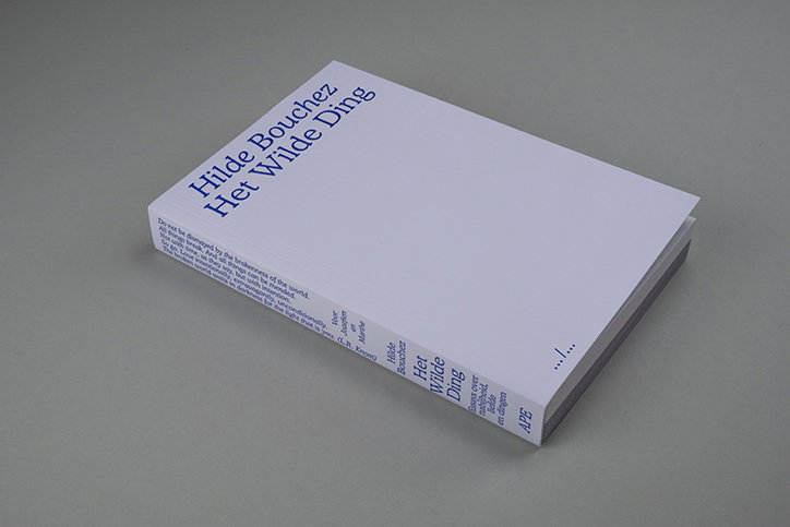
Jurgen Maelfeyt: Hilde Bouchez, AWildThing. Published by Art Paper Editions
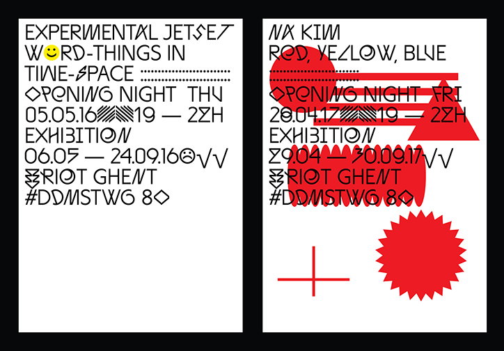
Jurgen Maelfeyt: Riot, font designed by Josse Pyl
Share Article
Further Info
About the Author
—
Ruby is Senior Creative at It's Nice That, overseeing our visual output across platforms and projects. Before that, she was associate editor on the editorial team, after joining in September 2017 following graduation from Central Saint Martins.