




Karina Yazylyan wants typography to reach wider circles, rather than just designers
Only graduating from HSE School of Art and Design this past year, Russian graphic designer Karina Yazylyan’s portfolio made us sit up and stare at her vibrant, typographic works. Concentrating on graphic design within the remits of her multimedia design degree, Karina initially started the course thinking she’d work on developing her career as an illustrator, until a tutor showed her the blog of renowned graphic designer David Rudnick.
“Graphic design somehow seemed very boring to me,” Karina tells It’s Nice That of her initial opinion of the medium. Rudnick’s work, on the other hand, offered excitement and a totally new visual aesthetic. “His work and approach really inspired me to do graphic design particularly,” Karina explains. “I wanted to do something fresh and modern, while at the same moment keeping an eye on the past, since I have always loved the visual style of the 80s and 90s,” an area of inspiration clearly seen in her works.
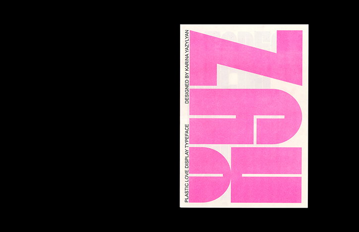
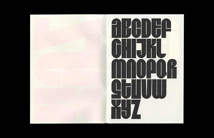
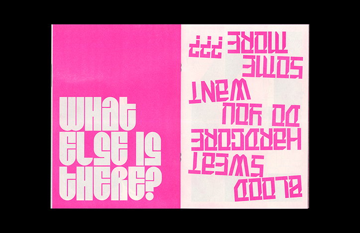
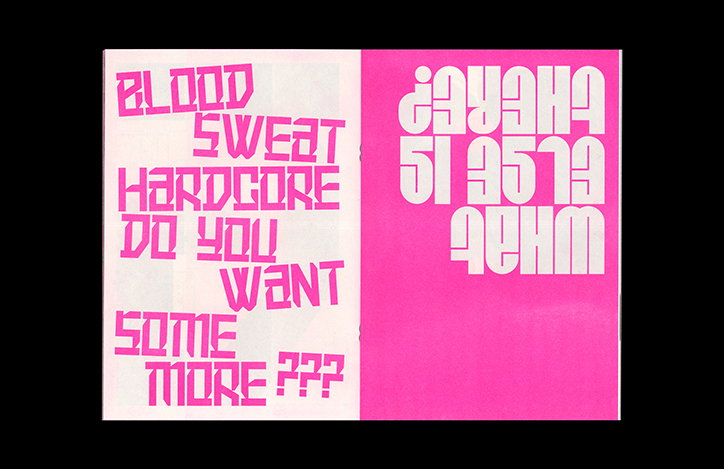
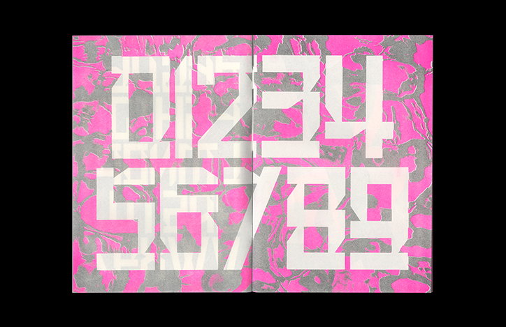
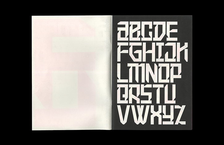
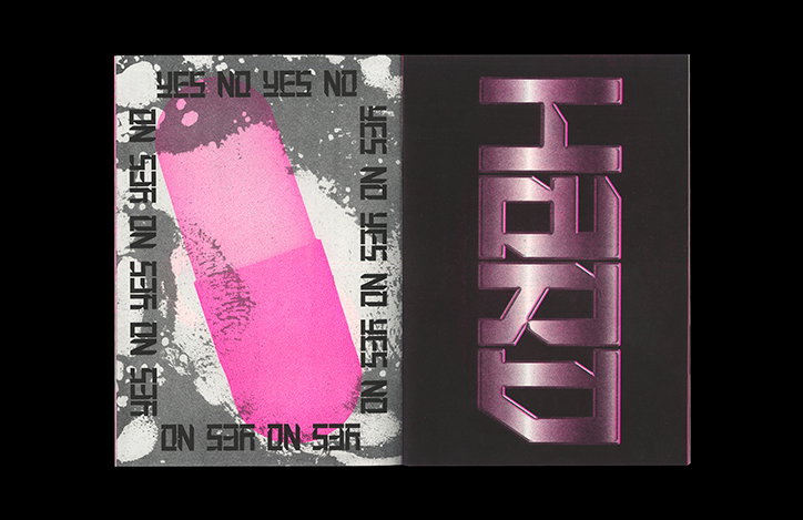
Since concentrating on typography during her studies, Karina has made two fonts, Plastic Love and New Order, which communicate her references in their forms full of personality. Going against the advice of her tutors when creating these fonts – who didn’t “understand why I have specifically decided to create fonts without them being tied to something particular like a brand” – Karina has already taken the stance as a designer who believes a “font can be an independent product”. Another reason for funnelling her creative output into creating fonts was due to her course “paying very little attention to typography,” encouraging Karina to form her own font-focused curriculum.
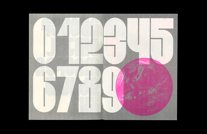
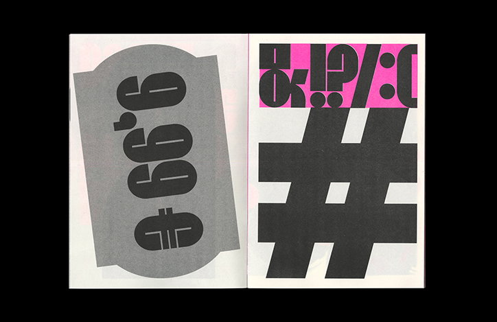
Making both of the fonts from scratch, first in Illustrator and then Fontlab, Karina communicates their uses and inspirations in a printed specimen. A multi-faceted example of how her fonts can be utilised (the specimen includes a zine, posters, a short video and scarves) Karina wanted to show a type specimen book “that won’t be just dry information about a font, but more of a zine format so that the book would be interesting not only for those who know something about fonts, but a wider circle of people.”
In doing so Karina has also opened up the possibilities of how her fonts can live in the world too, noting how they could “be great for projects related with music, fashion, culture or education,” she tells It’s Nice That. But, in her efforts to be as communicative as possible with her work (as graphic designers should be, in our eyes) Karina also wants designers “to find them for different and unexpected uses” soon to be uploaded to her Behance for free, personal uses.
Karina Yazylyan
Karina Yazylyan
Karina Yazylyan
Karina Yazylyan
Karina Yazylyan
Karina Yazylyan
Karina Yazylyan
Karina Yazylyan
Share Article
Further Info
About the Author
—
Lucy (she/her) was part of the It’s Nice That team from 2016–2025, first joining as a staff writer after graduating from Chelsea College of Art with a degree in Graphic Design Communication, eventually becoming a senior editor on our editorial team, and most recently at Insights, a research-driven department with It’s Nice That.