




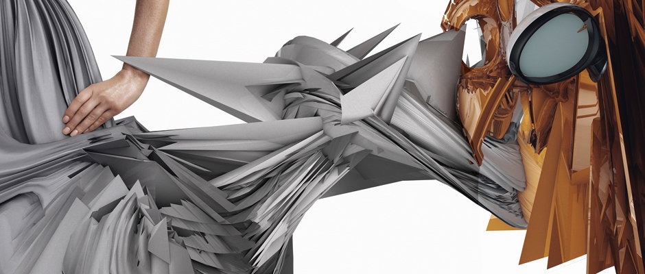
After three years, design extroverts karlssonwilker have a new site
A good time well-spent on karlssonwilker’s new portfolio site confirms three things: 1. They are still making as varied and variegated work as we hoped they were. 2. They are still independent and excellently open about their practice (and having a director style commentary navigating you through and contextualising projects is totally great). 3. They have been very, very busy.
It way back for Issue Two of our magazine that we last spoke to Hjalti Karlsson and Jan Wilker about their practice and studio and now, seeing as this is their first portfolio site for three years, we thought we’d say a quick hullo again.
Portfolio sites for such established studios is a funny one; we know who they are, we are always delighted to see their names attached to great work in the real world, they have kudos – something with a totally unique, digitally deconstructed aesthetic – and they acheive all this without taking up space on the internet.
Hi Hjalti, hi Jan. Considering how long it’s been, it’s likely that a lot of our readers would be unfamiliar with the sorts of projects that you guys do so why launch it now?
The last time we updated our site with new work was 2006. Then we took it all down three years ago, replacing it with a .gif of a “turning blob” and our contact information – that led to us forgetting all about it. Over time, more and more people wanted to see what we were doing and emailing out pdfs and links to case studies became more and more tedious.
A year ago we started to seriously work on a new site — obviously on and off — and here we are now, with a new site. Let’s see how it works out for us — we can always take it down, the “turning blob” is always within reach.
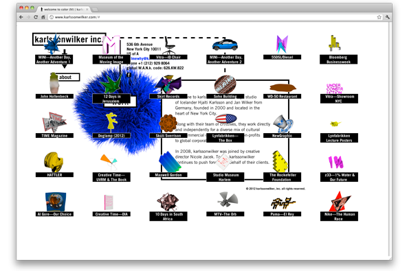
karlssonwilker: new site
You’re a multi-design studio with many facets to your practice that includes education, so did you have any particular selection process for the work going up in terms of how you want to be perceived?
We put up our favourite projects. I think it’s over 60, “work” and “archive” combined. We kept our work all on the same one level—which is how we approach our own work — CD packaging is just as important to us as a new identity or way-finding design for a museum, 3D animations for Nintendo, a road trip with MINI, a t-shirt for Diesel or a book.
So we’re not making it easy to pick and choose the projects, athough we had thought of filtering by categories, but our categories would have been too many to make sense.
How do you expect people to engage with your site (there are quite a few special features)?
We want people to put some effort in it — we don’t have a quick overview function for the busy people of this world – and there are more things than just our work on there.
There’s audio commentaries available for certain projects (and we will add more over time); “project related files” (our old digital sketches basically) for sale through a dedicated store (for you to have a look at our strictly digital design process); then you can browse through 172 images; we brought back the SPOKEN PORTFOLIO® (it has been with us for so long, we had to bring it back. It features the soothing voice of our dear friend and design colleague Paul Sahre — he did an amazing job); added a song; a hidden special; few more things and more to come.
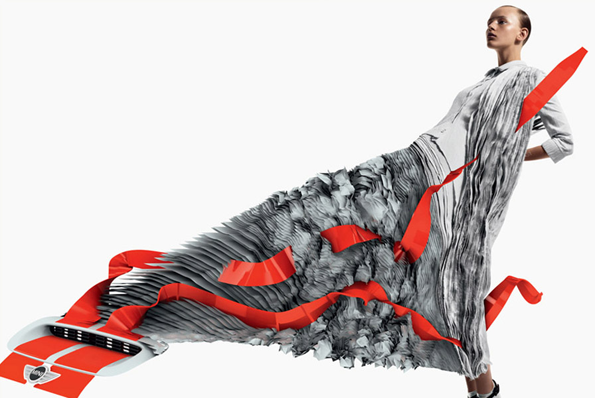
karlssonwilker: MINI—Another Day, Another Adventure 1, with Dazed & Confused
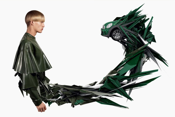
karlssonwilker: MINI—Another Day, Another Adventure 1, with Dazed & Confused
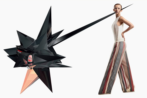
karlssonwilker: MINI—Another Day, Another Adventure 1, with Dazed & Confused
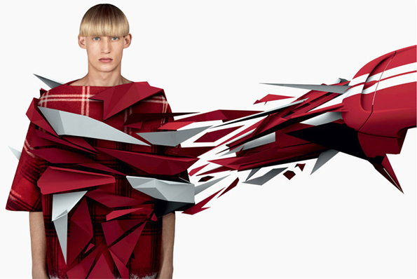
karlssonwilker: MINI—Another Day, Another Adventure 1, with Dazed & Confused
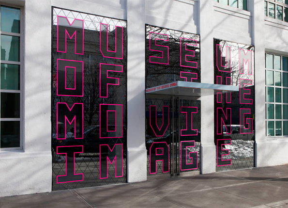
karlssonwilker: Museum of the Moving Image
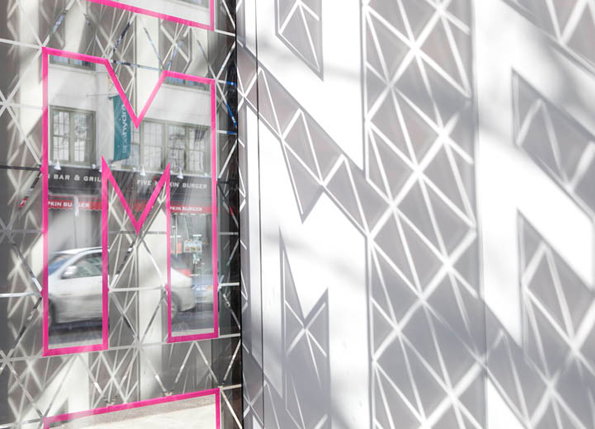
karlssonwilker: Museum of the Moving Image
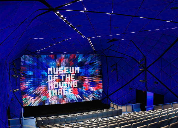
karlssonwilker: Museum of the Moving Image
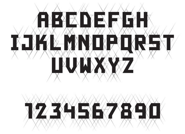
karlssonwilker: Museum of the Moving Image
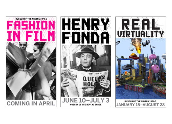
karlssonwilker: Museum of the Moving Image
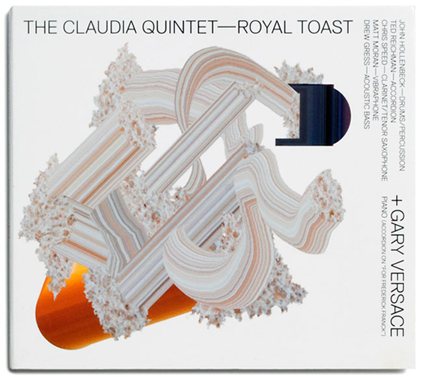
karlssonwilker: The Claudia Quintet: “Royal Toast”
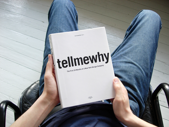
karlssonwilker: tellmewhy book
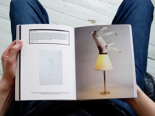
karlssonwilker: tellmewhy book
Share Article
Further Info
About the Author
—
Bryony was It’s Nice That’s first ever intern and worked her way up to assistant online editor before moving on to pursue other interests in the summer of 2012.

