Design studio KauKau’s dynamic typography comes from closely studying its subjects
The Shanghai-based studio shares its recent work which combines a reflection on methodology while trying to find their role in this industry.
Shanghai-based design studio KauKau has been refining its typography-heavy designs this past year. The studio has been involved in a range of projects which required it to be less rigid, delving into motion design, brand identities, printing experiments and typeface design to achieve its design goals. “We are trying to apply a more flexible process to commissions from different collaborators,” say co-founders Kekfeng Lee and Zifei Li. “We’d like to push more boundaries, bring type design forward and include a wider variety of mediums in our works.” This typography-first approach is actually preceded by a significant amount of research before any design elements ever make it to the drawing board.
The studio tells us that despite working on projects in a multitude of different cultural fields, from audiovisual brands to typeface designs for artists, the studio doesn’t usually define its plans for the near future. “We don’t usually have certain plans, but would like to challenge ourselves by learning and experiencing new stuff,” the two founders note. “Especially in this complex year, with potential and new visual products booming, we still need to find out our role within the range of our industry.”
One recent project that the studio worked on since we last covered them is a poster commissioned by Creater Shanghai, a series of co-working spaces that aims to highlight the cultural diversity of Yuyuan Road. The area is a historical street in west Shanghai and home to a number sites, including a five-acre garden that dates back to the sixteenth century. “We collected and studied the data of vernacular typography on the street and translated them into a set of typefaces using a method called Type Cooker,” the studio describes.
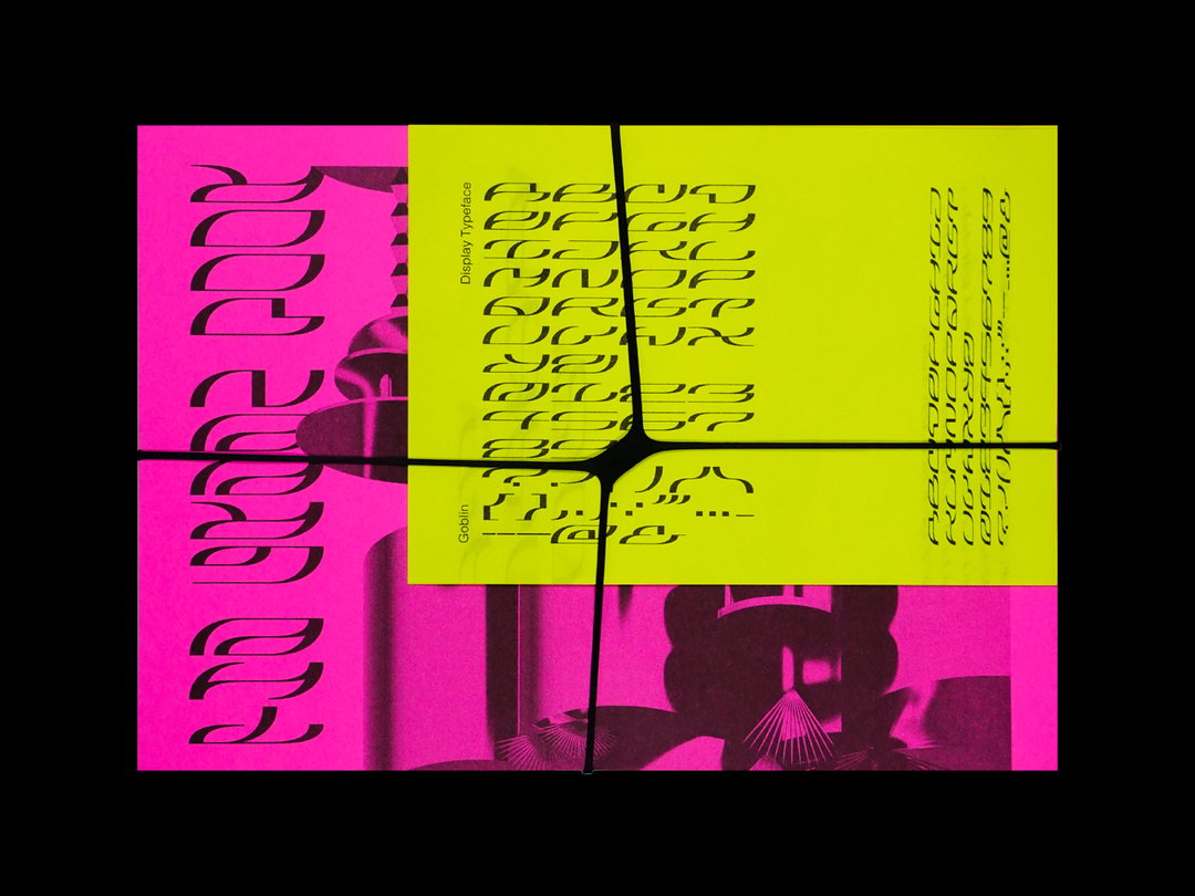
KauKau: Goblin (Copyright © KauKau, 2020)
The studio has also been working on a project for Eindhoven-based artist Jing He who commissioned the group to create a visual identity system including custom typography to reflect the artist’s approach. “We wanted to show the working methodology of the artist whose art practice is based on re-empowering daily objects,” the studio describes. “We took the concept of construction and destruction as the starting point, then built a typography system that reflected her artwork.” The resulting logotype blended English and Chinese characters to reflect Jing He’s own cultural background. The English characters are stencil-like and segmented, creating a parallel with the stroke-based Chinese characters that take on a rounded form with elements reiterated to create new characters.
This research-based approach is also reflected in their work with Beijing-based lifestyle brand Ampey. The studio’s visual identity for the brand was created after long discussions built upon research on the industry. “The decision-making process was not an easy task,” the studio said about this collaboration. “But it was still interesting to see that we saw things from different perspectives. We accepted suggestions from other industries. It was a great experience to work with other designers and learn new ways of thinking.”
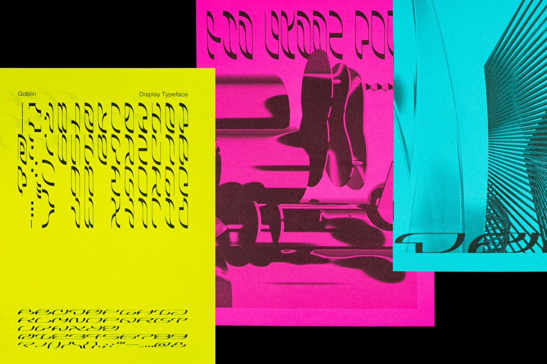
KauKau: Goblin (Copyright © KauKau, 2020)
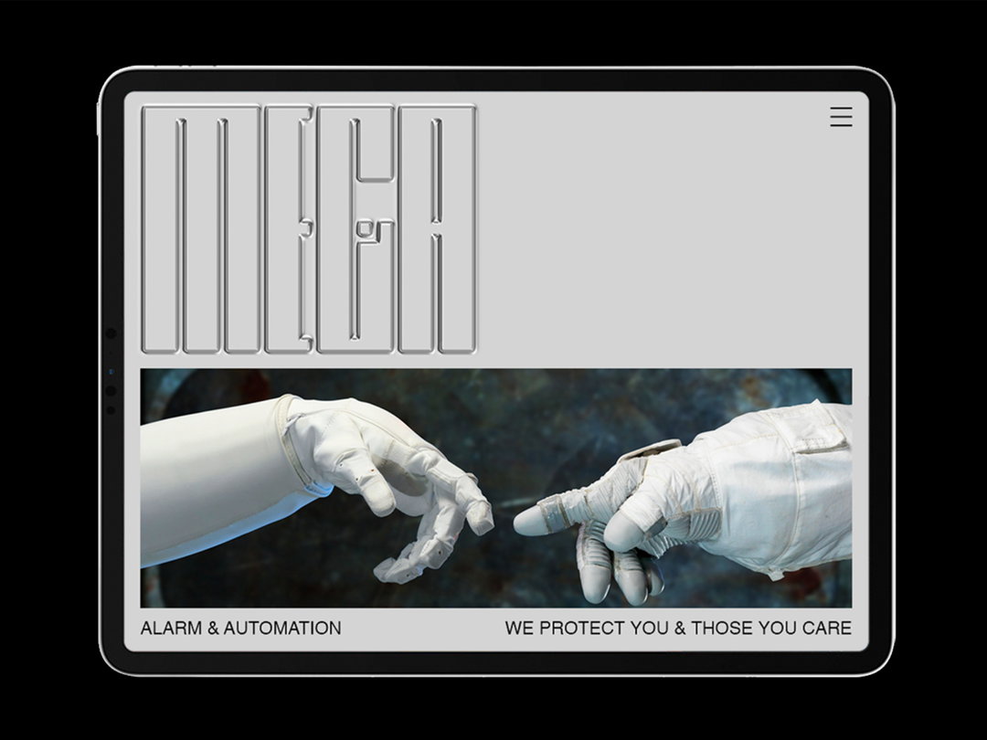
KauKau: Mega (Copyright © KauKau, 2020)
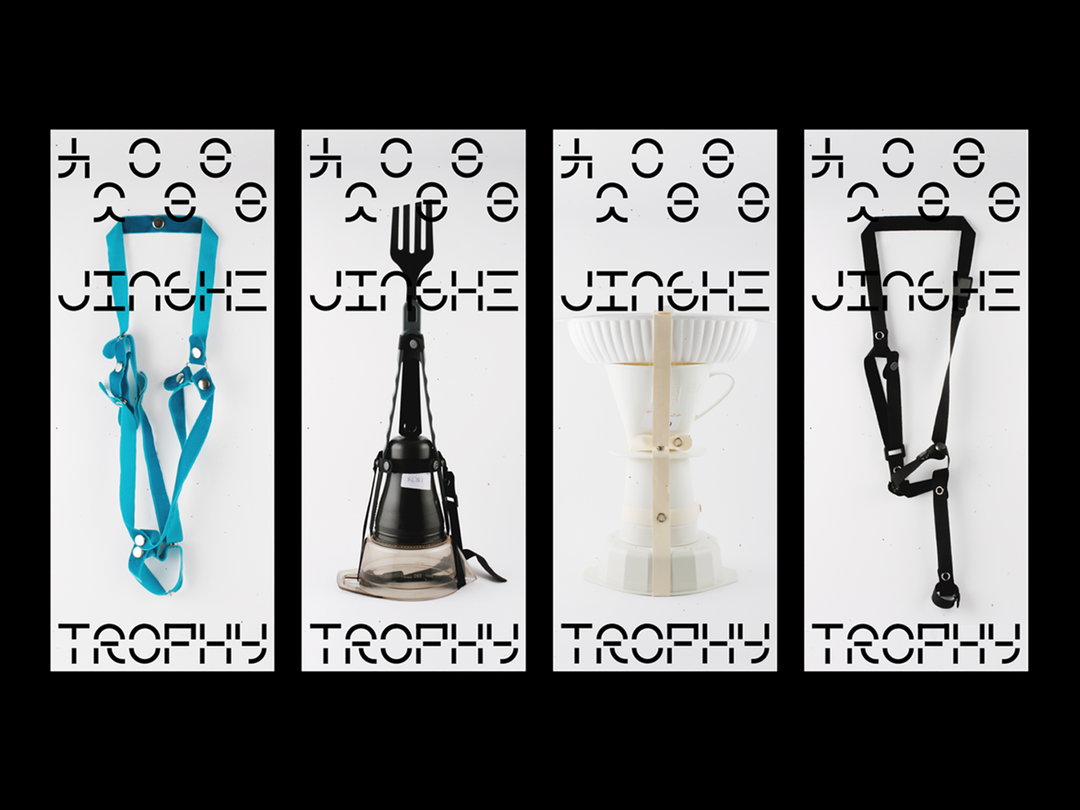
KauKau: Jing He (Copyright © KauKau, 2020)
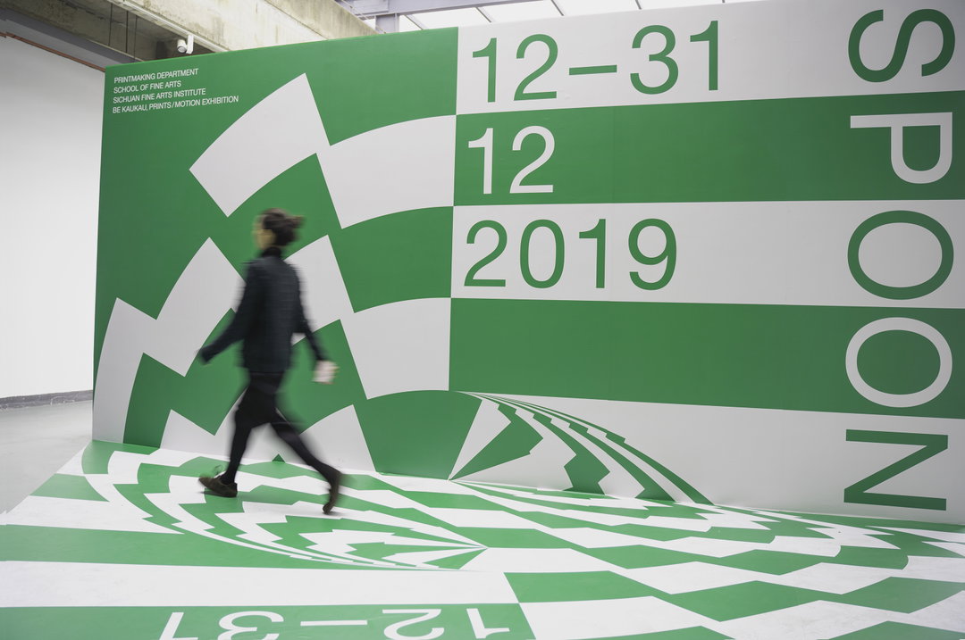
KauKau: Spoon (Copyright © KauKau, 2020)
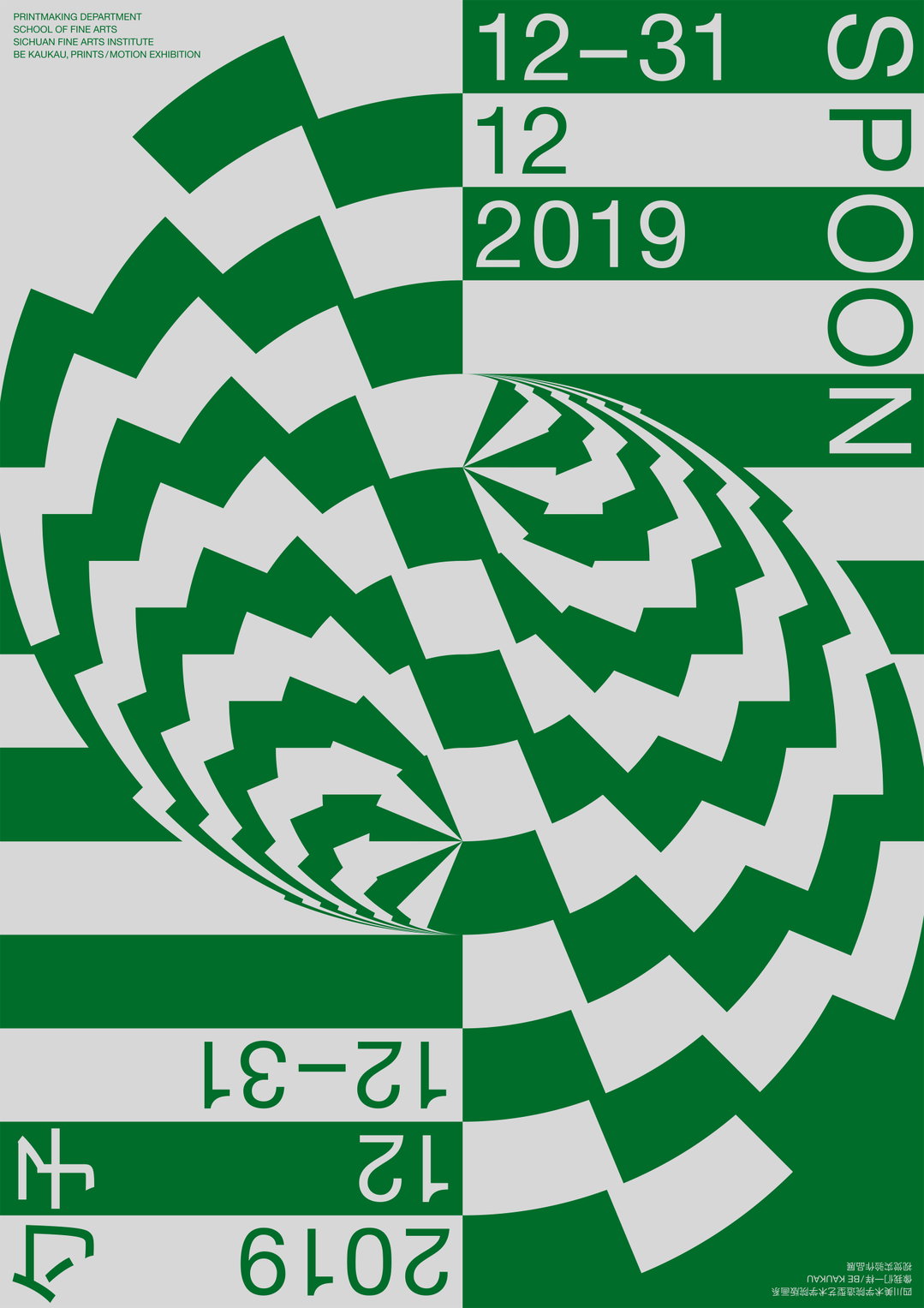
KauKau: Spoon (Copyright © KauKau, 2020)
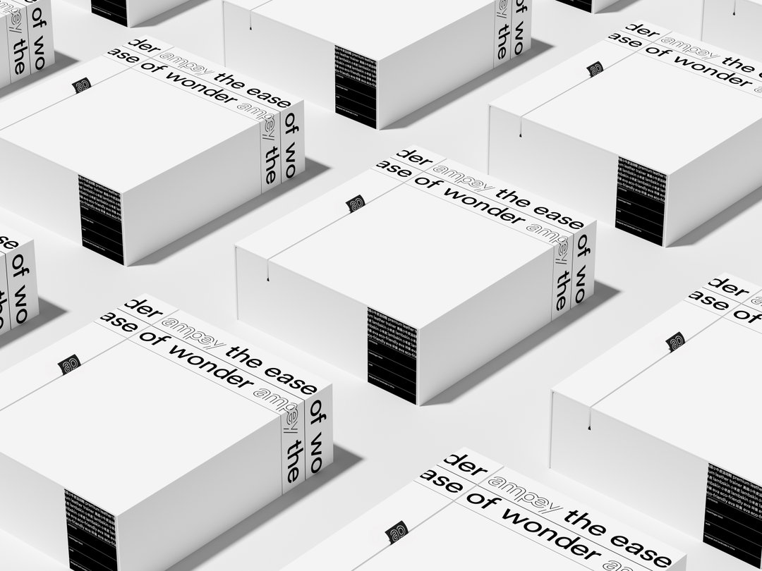
KauKau: Ampey (Copyright © KauKau, 2020)
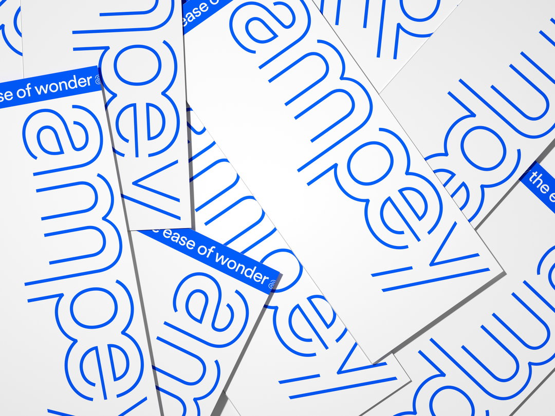
KauKau: Ampey (Copyright © KauKau, 2020)
Hero Header
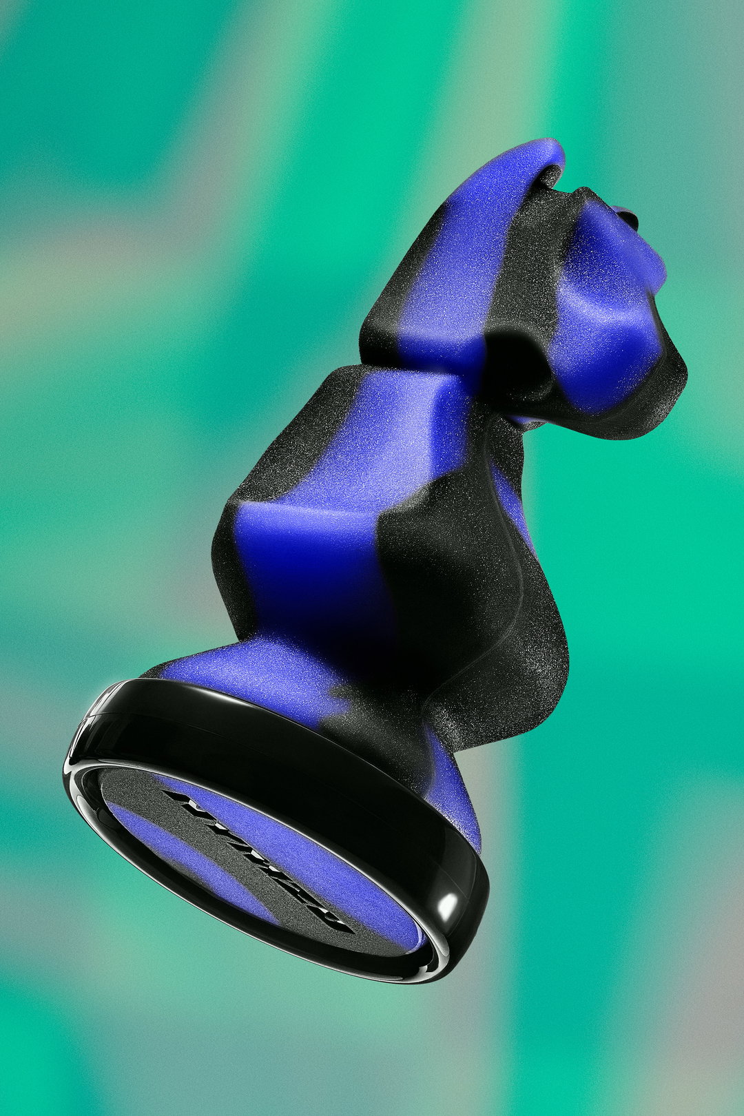
KauKau: Mega (Copyright © KauKau, 2020)
Share Article
Further Info
About the Author
—
Alif joined It's Nice That as an editorial assistant from September to December 2019 after completing an MA in Digital Media at Goldsmiths, University of London. His writing often looks at the impact of art and technology on society.