




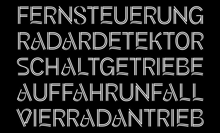
Type designer Kia Tasbihgou on how “knowing cool designers and nice fonts isn’t enough”
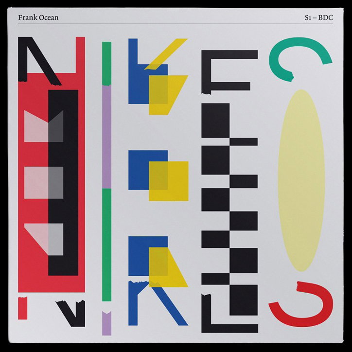
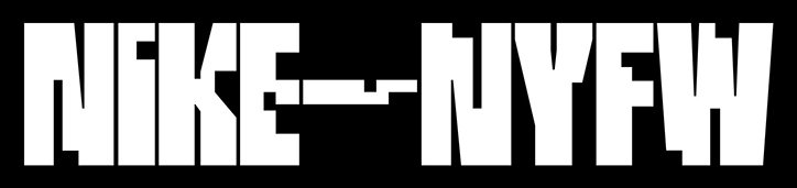
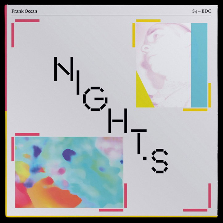
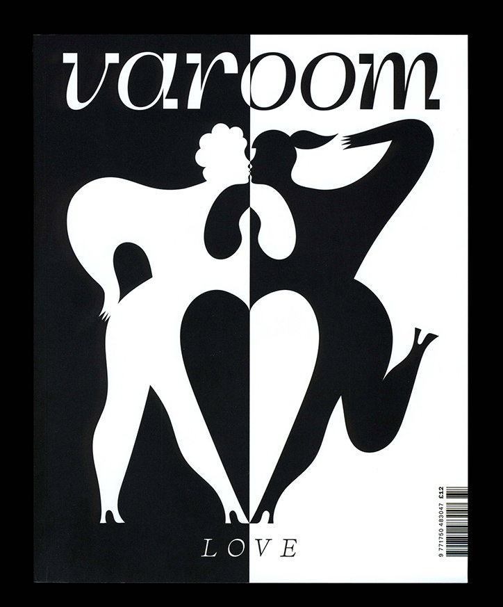
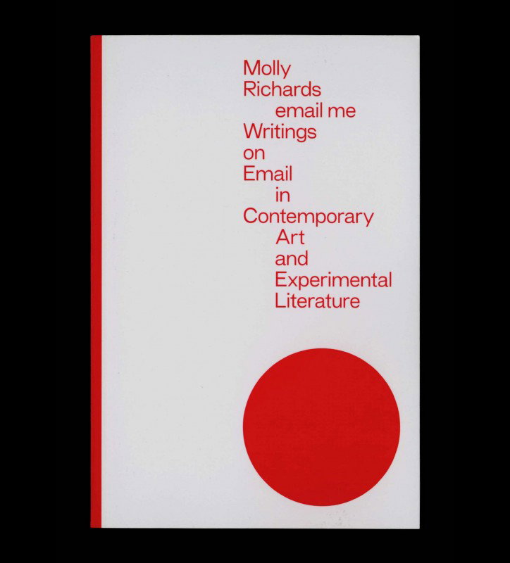
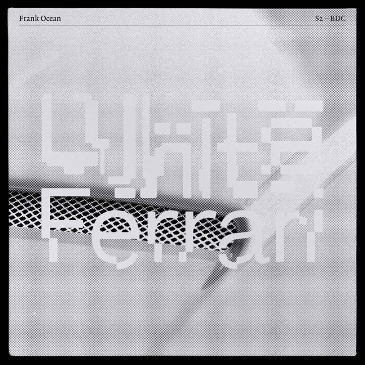
As a graphic designer and custom type designer, Kia has worked with the likes of Nike, Christie’s and Vanity Fair. His type designs are original and contemporary, embodying the distinct personality of each client while maintaining a sense of Kia’s effortlessly quirky style.
Kia’s type designs initially start as sketches inspired by small ideas such as: “How could I fit a perfect square into every single character?” The designer’s creative process involves "writing rules for a typeface… I’ll do research into the historical precedents that inspire my type sketches and group together certain idiosyncrasies that inform this new drawing”, Kia tells It’s Nice That. “Then, through the digitising process, I see how thoroughly I can enforce, bend and break those rules. After this, I’ll begin refining the drawings, making sure the metrics make sense, essentially sanding away at the letterforms and creating a uniform piece of work”.
Kia’s rigorous design process is evident in his drop caps work for Christie’s Magazine, commissioned by B.A.M.. “This was a particularly fun commission, as B.A.M. insisted I do my own thing”, explains Kia. The brief asked for something “unusual, contemporary and elegant” resulting in an open inline sans-serif. The typeface originated from a three-line drawing inspired by Addison Dwiggins’s stencil illustrations and frescoes. “The inline structure of the letterforms felt familiar, almost touching on fashion brand sensibilities and leaning into commercial elegance. However, the construction and strokes of some of the letterforms (‘V’, ‘A’, ‘E’ in particular), feel unpredictable and ‘new’ despite their inspiration being decades old”, says Kia. This Christie’s project demonstrates that “as long as you’re honest and maintain the truths of your inspiration without being wilfully ‘trendy’, a piece of type design can feel successful without necessarily breaking new ground”.
Vanity Fair’s art director Tonya Douraghy, commissioned Kia to expand on his commercial typeface Jeder for the iconic publication, “one of its selling points is that the first stylistic set transforms the typeface from a traditional grotesque with some humanist elements to a neo-grotesque”, explains Kia. The type designer cites the significance of this particular commission as “it illustrates the importance of working with a designer that has a strong vision for a particular typeface and its use”.
Kia’s approach to type design is meticulously thorough while being unconventional and innovative. He considers the minutiae of a letterform’s function and experiments with the anatomy of type in order to create happy accidents within a playful design process. He advises “not to pay homage to other works or designers”, instead, “ask yourself why they make their design decisions and why do they exist in that form, challenge those decisions and put your own original thoughts into action”. Ever-wise, Kia reveals how “the most important thing for me was finding my most natural process of working. Moving outside of the computer opened up my drawing and researching styles immeasurably”. Finally, Kia accurately points out that “knowing cool designers and nice fonts isn’t enough”.
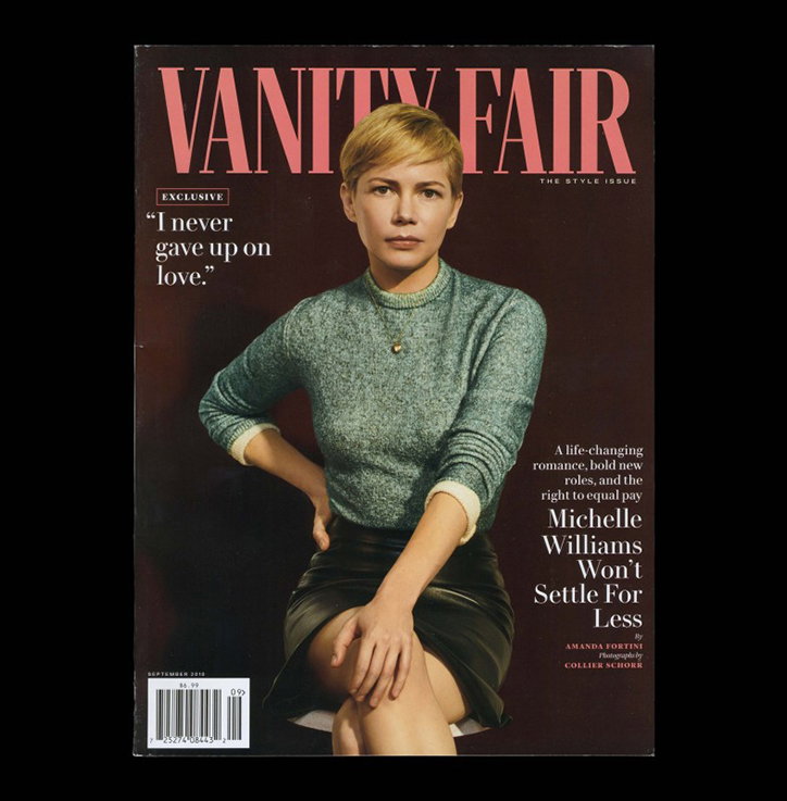
Kia Tasbihgou: Jeder
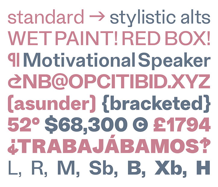
Kia Tasbihgou: Jeder
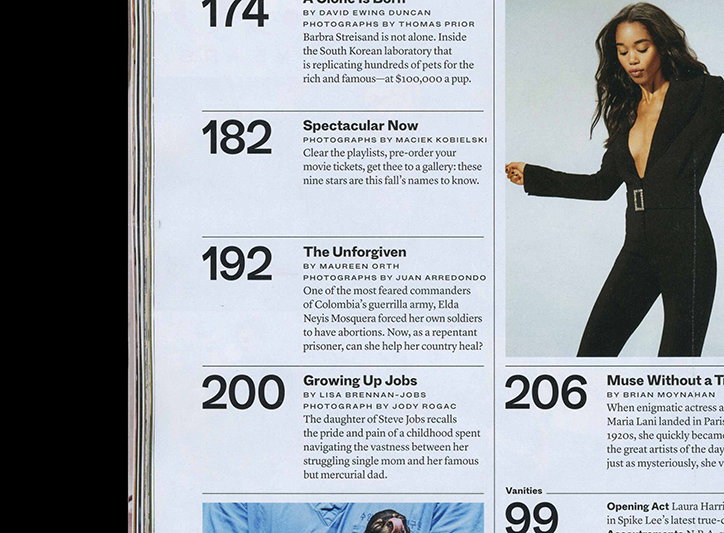
Kia Tasbihgou: Jeder
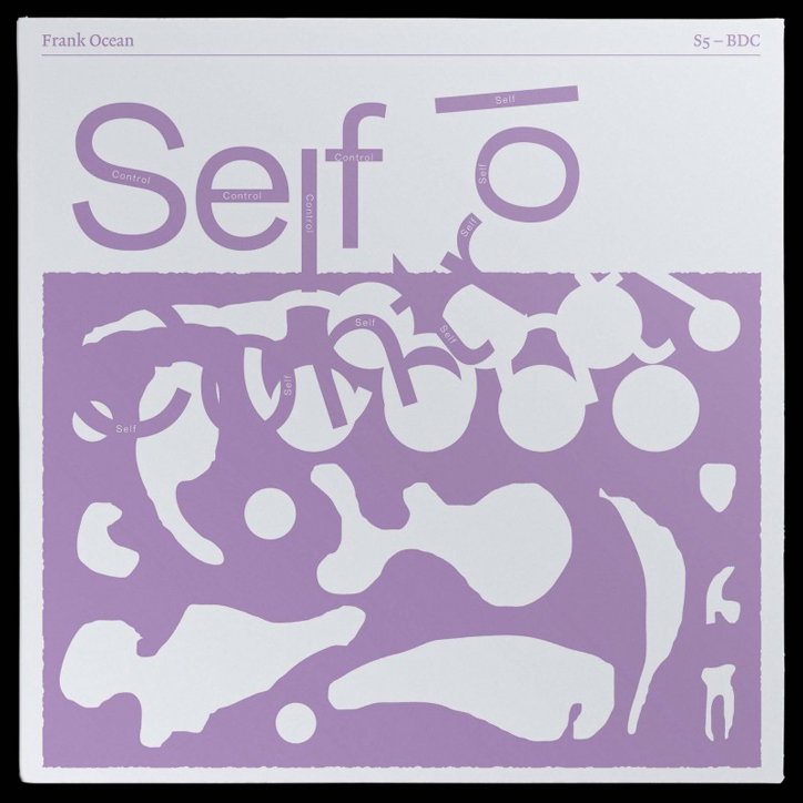
Kia Tasbihgou
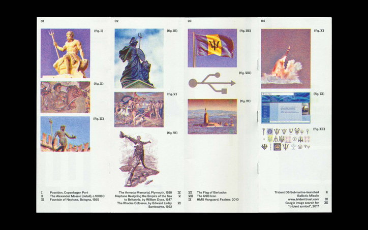
Kia Tasbihgou
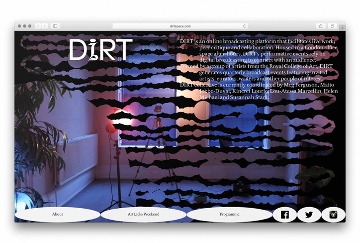
Kia Tasbihgou
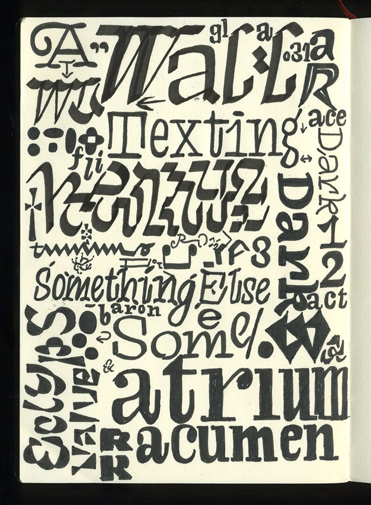
Kia Tasbihgou: Sketchbook
Kia Tasbihgou
Kia Tasbihgou: Nike NYFW 2017
Kia Tasbihgou
Kia Tasbihgou: Varoom Magazine
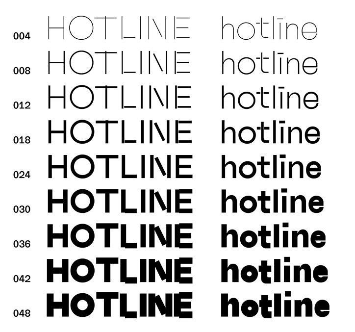
Kia Tasbihgou: HOTLINE
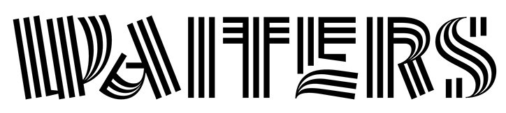
Kia Tasbihgou: Christie’s Magazine drop caps with B.A.M.
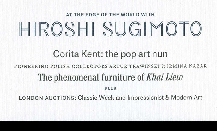
Kia Tasbihgou: Christie’s Magazine drop caps with B.A.M.
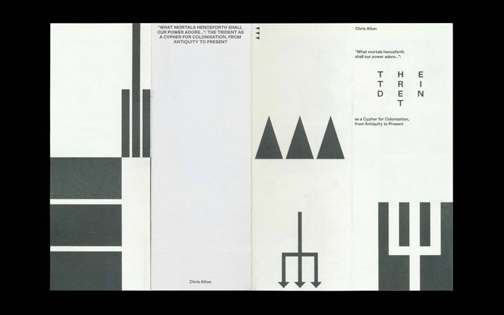
Kia Tasbihgou
Kia Tasbihgou
Kia Tasbihgou
Share Article
Further Info
About the Author
—
Jynann joined It’s Nice That as an editorial assistant in August 2018 after graduating from The Glasgow School of Art’s Communication Design degree. In March 2019 she became a staff writer and in June 2021, she was made associate editor. She went freelance in 2022.

