This typeface answers a key question: What if Indian typography refused to play ‘catch-up’ with the west?
Kshitij Gotiwale’s research into Indic digital numerals interrogates “who’s voices are represented in technology and whose are ignored.”
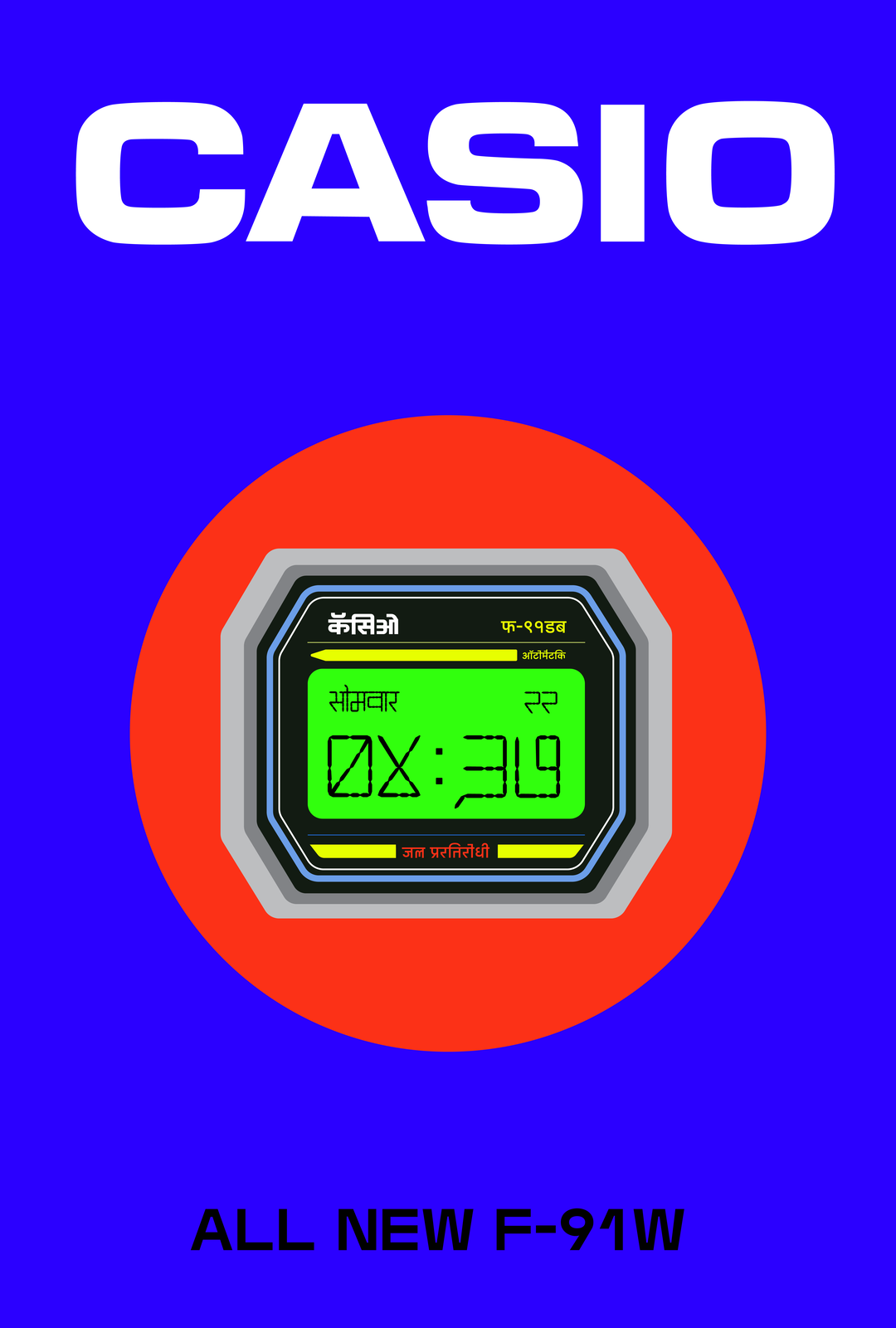
Growing up between Mumbai and Bhopal and being fairly type obsessed, graphic designer Kshitij Gotiwale couldn’t help but notice the lack of legible, regionally rooted digital numerals there were specifically made for Devanagari, the Hindi script he grew up surrounded by. “It didn’t reflect the reality around me,” says Kshitij, “the shop signs, the regional packaging, even something as humble as a loaf of Wibs bread in Bombay, which carried a Devanagari version of Cooper Black felt more alive than anything on my computer.” He continues: “This discovery still blows my mind, because it showed me that all the expressiveness was already there, just not in the digital space.”
The designer first became aware of this gap as a very young child, as he became captivated by the digital clocks in his home: “I’d stare at them, fascinated by the way time flickered into being through segmented numbers. But they never spoke in our script. My grandmother couldn’t read them, so she’d often ask me for the time,” he says. What began as a simple desire to read the time in his own script was later fed with the space to explore this curiosity in a research project on his type design course at The University of Illinois.
Kshitij Gotiwale: 12:40 (Copyright © Kshitij Gotiwale, 2024)
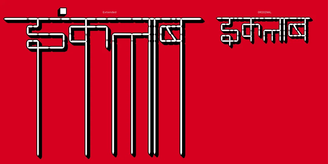
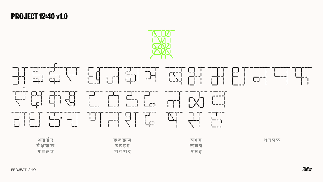
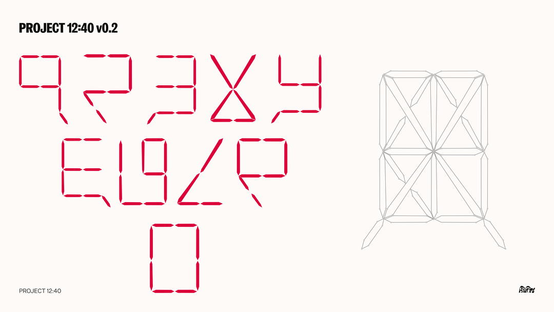
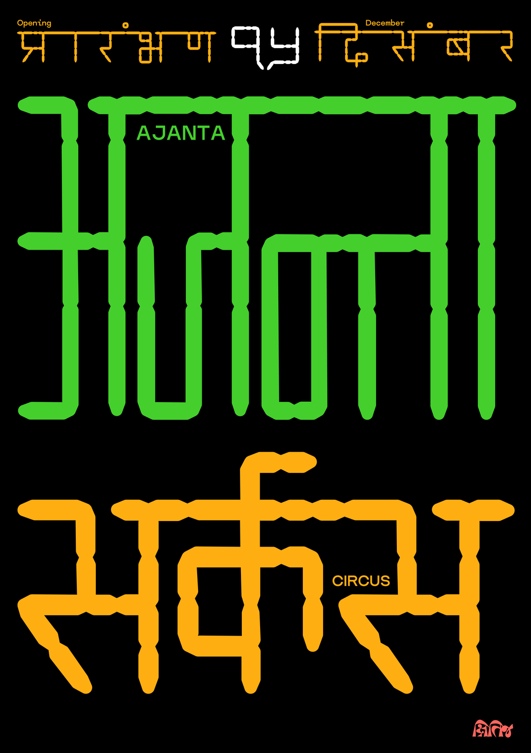
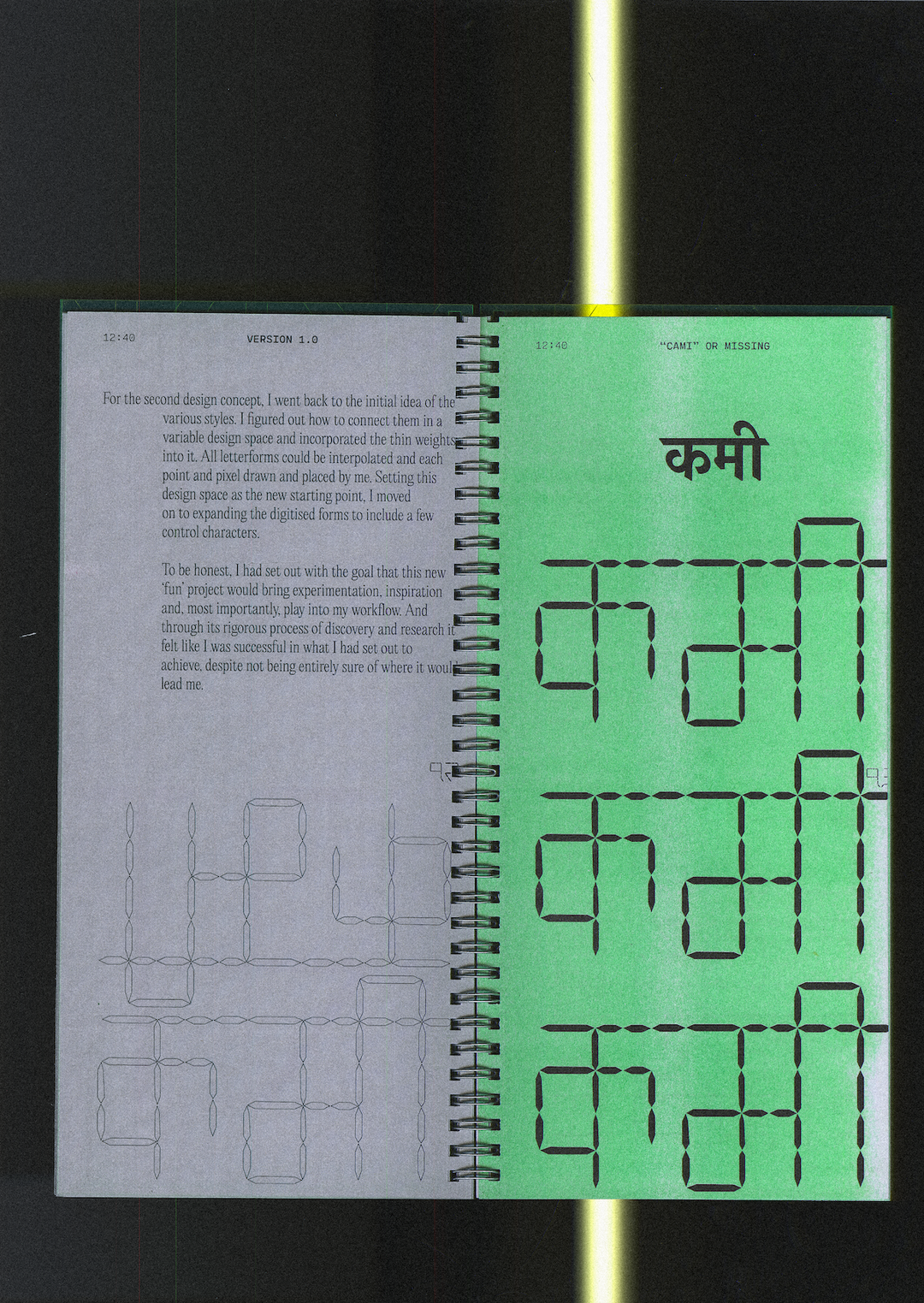
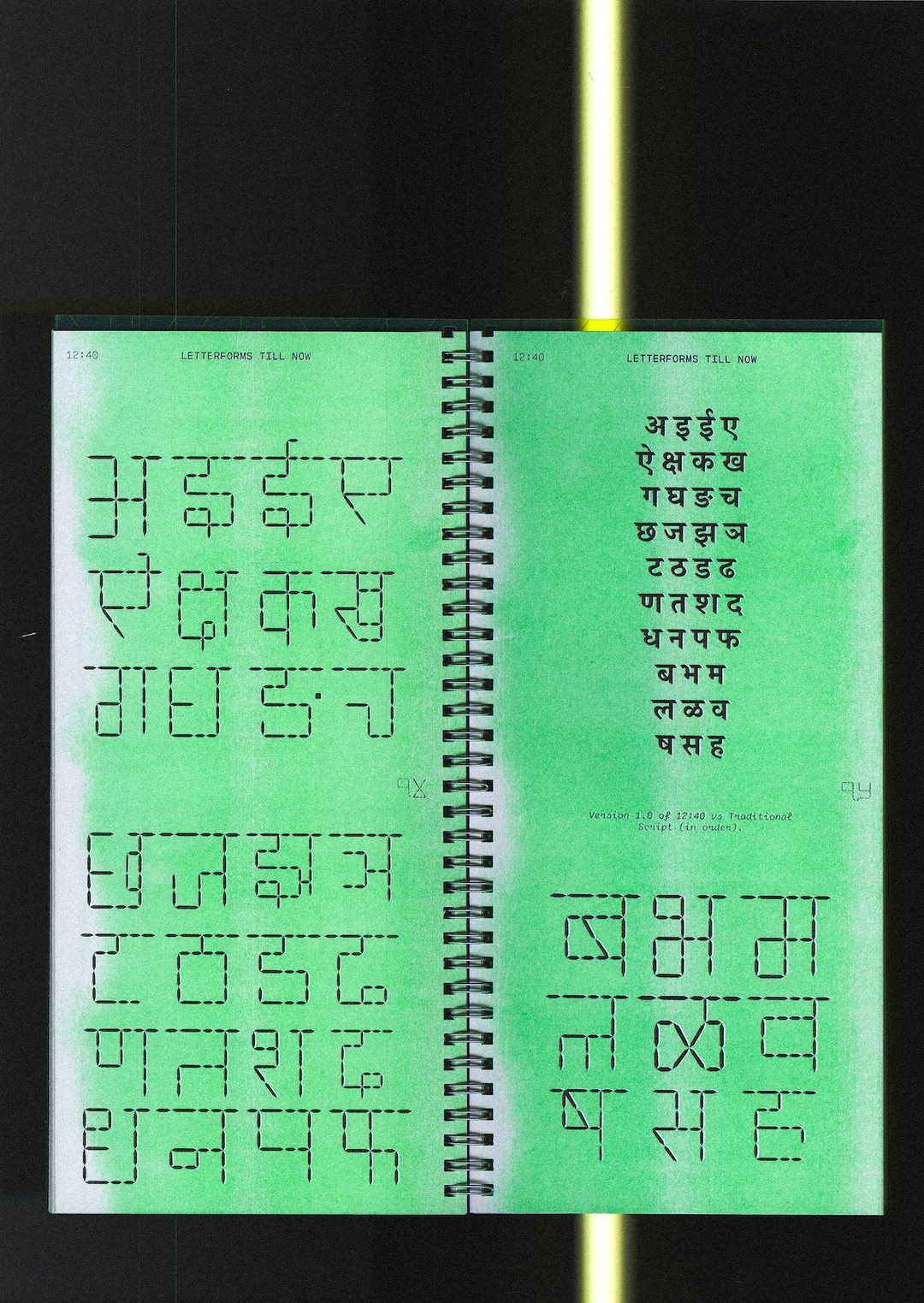
Kshitij began to investigate this overlooked gap in Indic typography surrounding digital numerals and modular type systems during his undergraduate degree, which led him to create 12:40, a monolinear typeface built on a grid that unites Latin, Devanagari and Urdu without erasing their individuality. Inspired by “old technologies and segmented displays” like those on the early digital clocks of his childhood, Kshitij turned the idea of constraint into a space for experimentation and a new set of letterforms.
“I also drew inspiration from blogs like ManVsType, designers like Shiva at November, Indian Type Foundry, Mota Italic and Universal Thirst for the project, all of them proving that Indic type design could be as rigorous and experimental as anything coming out of the West,” he shares. “I’ve always wanted to treat the everyday, lived typography of India, with the same seriousness and respect as Swiss posters or western modernism.”
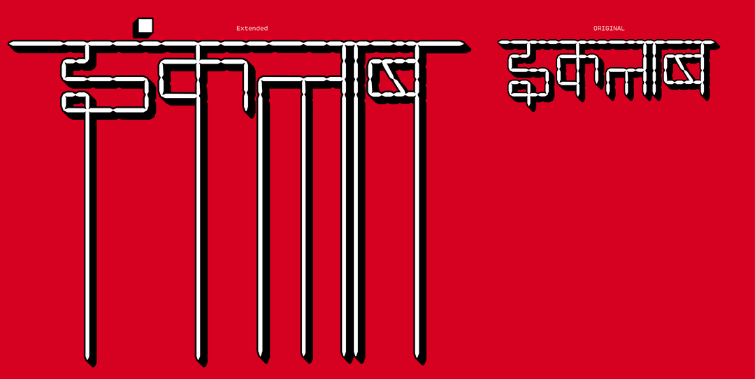
In order to draw his segmented letterset and numerals, Kshitij had to walk the line between the strict clarity of the modernist grids – those that control the appearance of digital fonts – and the energetic and visceral dynamic of Devanagari lettersets, which are for the most part seen off screen, on busy streetsides. The two contrasting styles at times felt worlds apart: “Latin letters are usually quite narrow; Devanagari tends to be wider”, Kshitij explains. “I deliberately broke the śirorekhā (the horizontal headline) in many letters, so the headstroke doesn’t fully connect. Figuring out these alternate glyphs and keeping the overall texture readable was hard work.” Rather than one script or system reigning superior over the other though, the goal throughout the design process was always to truly understand which influences to apply when and why.
Kshitij Gotiwale: 12:40 (Copyright © Kshitij Gotiwale, 2024)
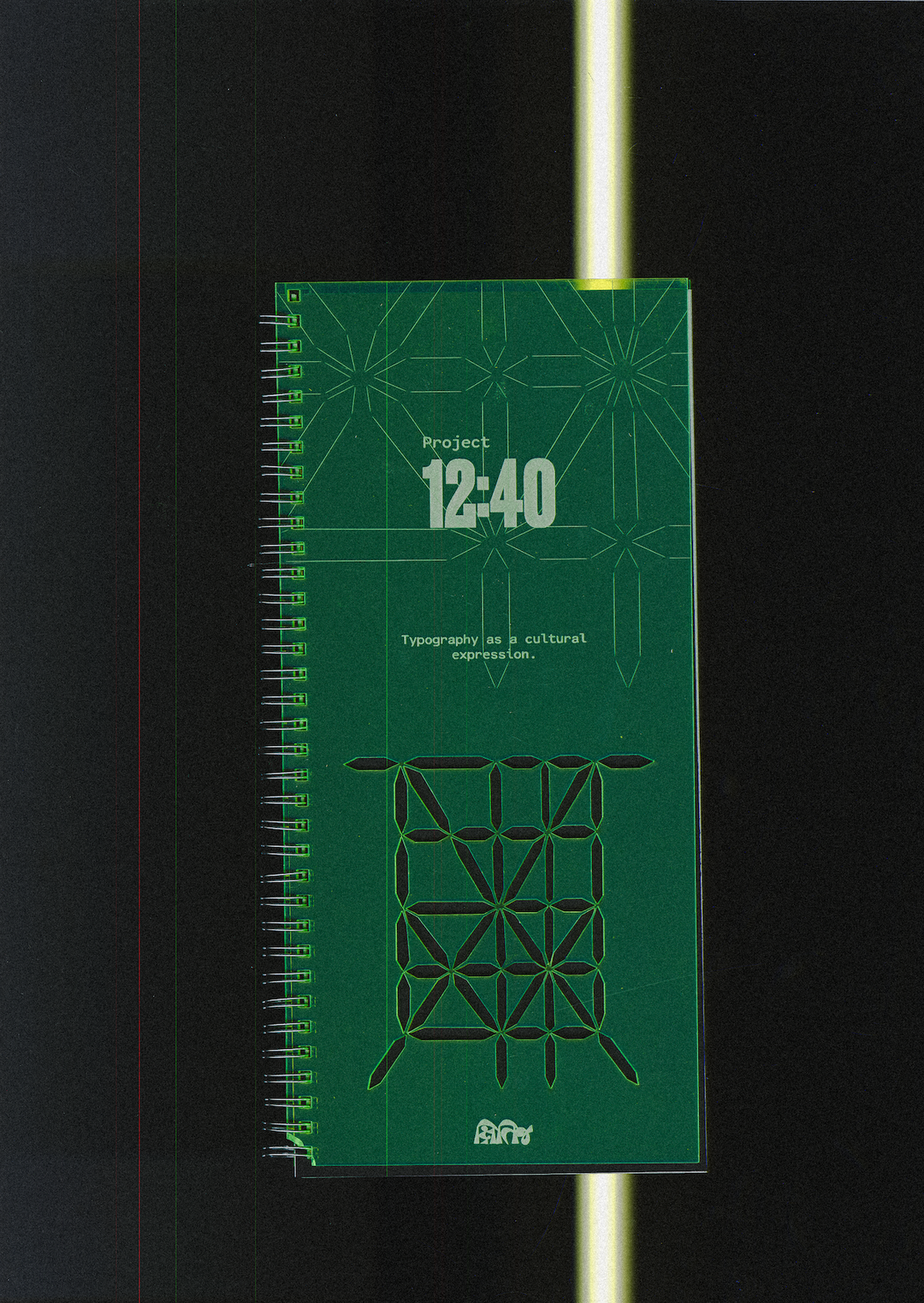
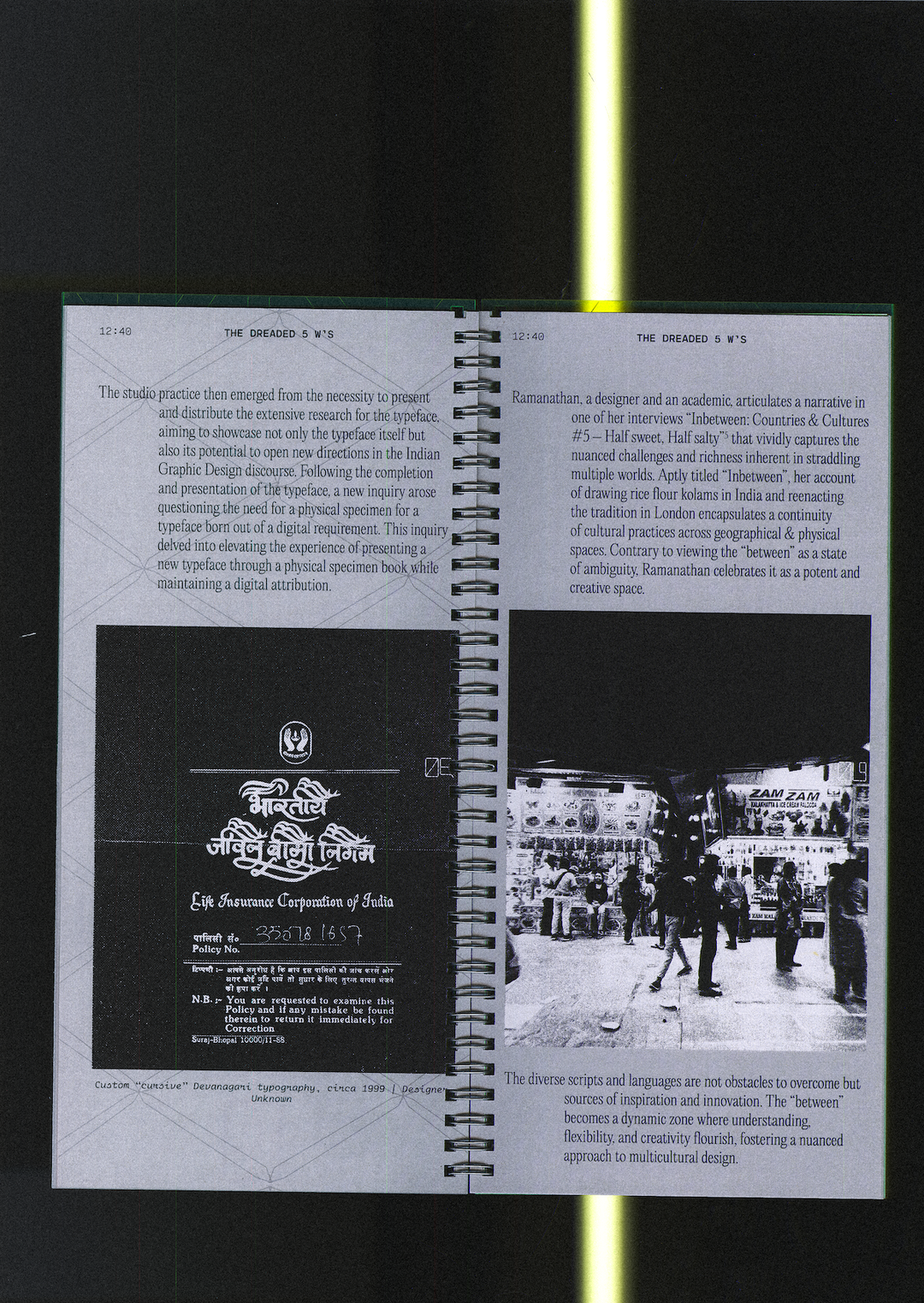
12:40 began as a typeface, but the project grew to be more than just a font. Despite the projects roots standing firmly in the digital space in order to fill the void in Indic modular type and numerals, Kshitij decided to create a printed specimen book, “because I felt the project needed to live in the physical world, to be held and read, not just seen on a screen”, he shares. Print was a rather deliberate continuation in the type design process to bring the font back to its roots: “On screen, the typeface would risk being seen as just another digital experiment. On paper, in a book, it feels grounded, contextualised, almost archival,” Kshitij says. This publication serves as an important artefact and a tool for the preservation of his research beyond its digital use.
Whilst it raises questions about decolonisation in design and centring latin scripts, 12:40 is also about the new possibilities that can come from interrogating traditional shapes and “obsolete technologies”. In the endless tweaking and kerning of his monolinear strokes, Kshitij posed the question: “whose voices are represented in technology, and whose are ignored?” Kshitij ends: “Project 12:40 began from that quiet want, to make a digital clock in Devanagari for my grandmother, but grew into a larger exploration of how design could honour multiple voices equally”.
GalleryKshitij Gotiwale: 12:40 (Copyright © Kshitij Gotiwale, 2024)

Hero Header
Kshitij Gotiwale: 12:40 (Copyright © Kshitij Gotiwale, 2024)
Share Article
About the Author
—
Ellis Tree (she/her) is a staff writer at It’s Nice That. She joined as a junior writer in April 2024 after graduating from Kingston School of Art with a degree in Graphic Design. Across her research, writing and visual work she has a particular interest in printmaking, self-publishing and expanded approaches to photography. ert@itsnicethat.com
To submit your work to be featured on the site, see our Submissions Guide.