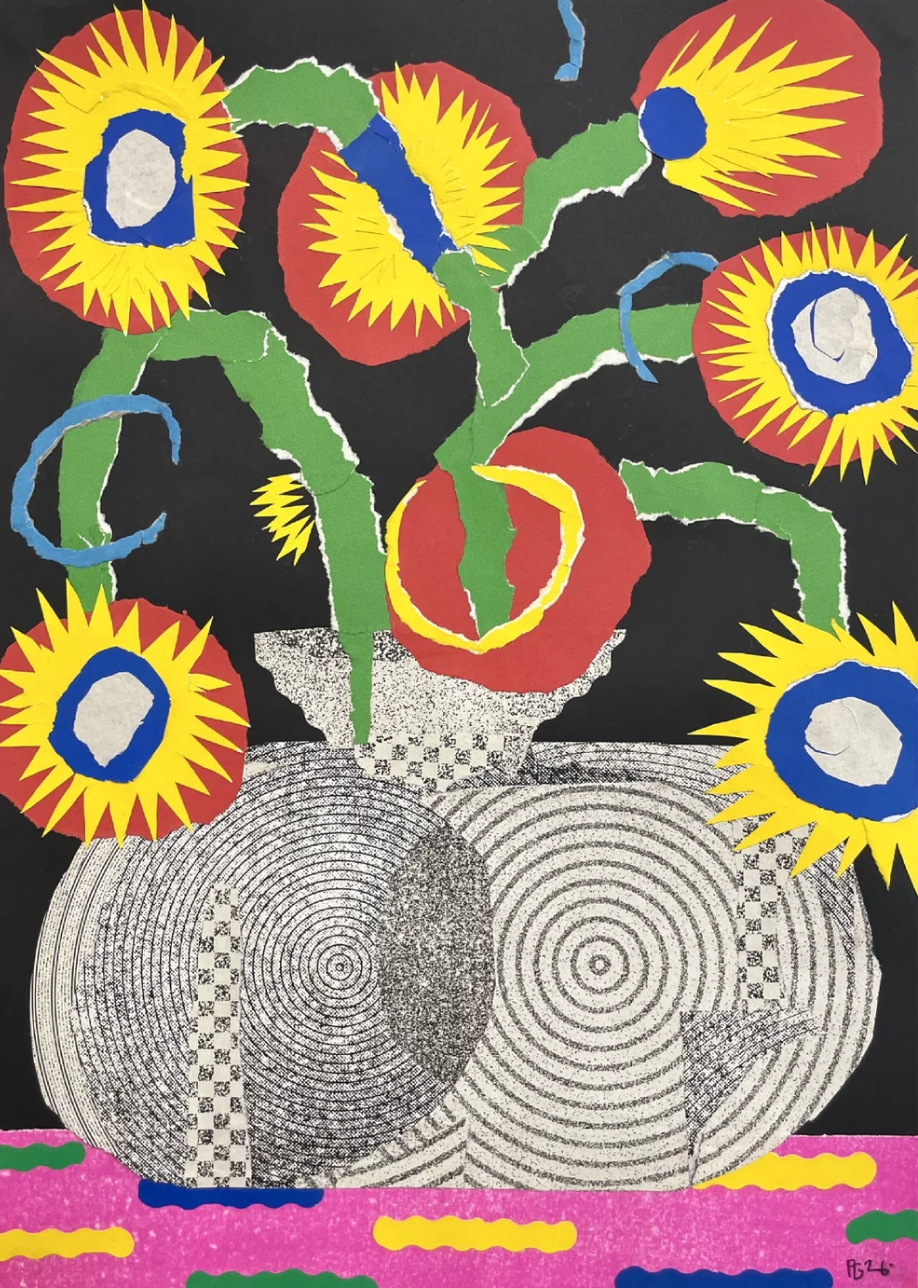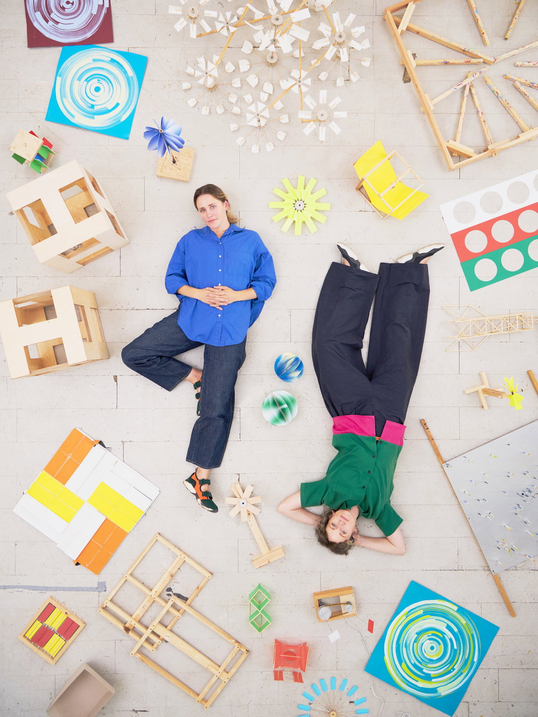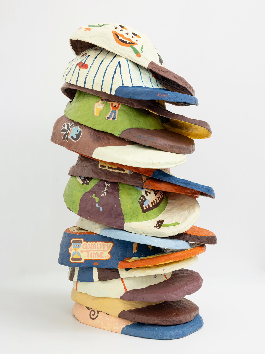
Laura Hilbert’s graphic design looks digital, until you realise it’s made of clay
Three principles guide the Frankfurt-based graphic designer’s practice: unusual methods, experimentation and a “good amount of inventiveness”.
Share
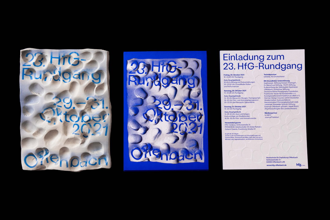
Here at It’s Nice That, we love when work that looks like one thing when it’s actually something else, and a unique creative process. So when we saw a recent identity by Laura Hilbert for the annual group exhibition 23. HfG-Rundgang, we were instantly on board. The title of the design work, Hands On!, tells you most that you need to know; in collaboration with designer Sarah Stendel, Laura aimed to build an identity you can “feel and build with your hands”. “In the end, we decided to use the technique of printing on clay,” Laura tells It’s Nice That. Every part of the visual identity is made out of screen-printed clay, deformed, photographed and digitally edited. The result is viscerally smushed, pressed, pulled, thumbed and full of streaky ink – in short, fantastic.
Held at the Hochschule für Gestaltung Offenbach, Rundgang was cancelled in 2020 due to the pandemic and was postponed again in 2021 till later in the year. For the identity marking its IRL return, Laura and Sarah wanted to counteract the overwhelming presence of digital spaces in our lives during lockdown. “We started to think of aspects that we missed about real life exhibitions and collected them,” Laura says. “Among other aspects, we finally focused on the lack of haptics and gave the Rundgang the motto ‘Hands On’.” To reference the notion of touch, they shaped the screen-printed clay with different materials like wooden blocks, producing around 50 physical objects. These works gave one-dimensional exhibition assets – including invitation cards, billboards, and posters – “a three-dimensionality”, says Laura. Although, the process was not without its problems; “the analogue process is very time-consuming,” she adds, “but it strengthens your decision making and leads to unexpected results that wouldn’t have been possible digitally.”
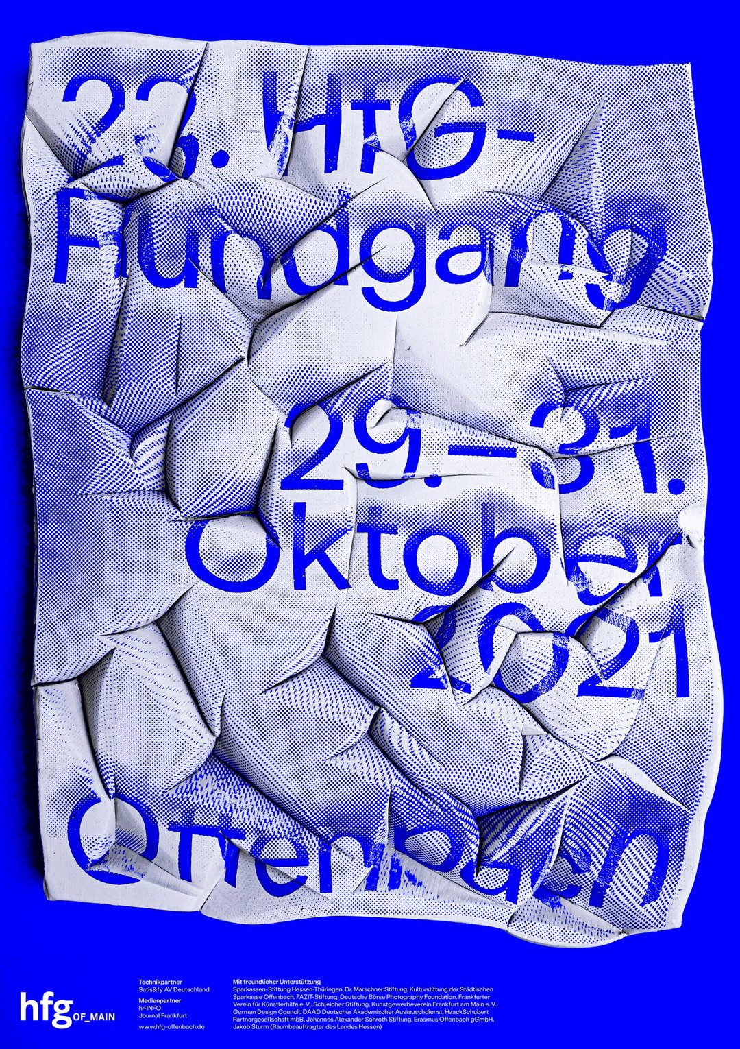
Laura Hilbert, Sarah Stendel: Hands On! (Copyright © Laura Hilbert, Sarah Stendel, 2021)
Analogue methods and tactility are mainstays throughout Laura’s portfolio. In Typografischer Spielplat, a project which explores the principles of play in a playground and adapts it to typography, texture, twigs and monkey bar-like structures are transferred expertly into type. Another project, 24 Stunden (24 Hours), is perhaps even further invested in how design interacts with the physical world; it is a book that attempts to both visualise time and allow you to physically count it. The project saw the designer make 24 circular books, connected cover to cover on a ring, to represent the 24 hours in each day, with each page in the book representing one second in an hour. Laura explains the books can function as a calendar or “a kind of stopwatch or timer, as it takes about as long to turn a page as the time indicated on each page.”
For those that can’t tell by Laura’s experimental back catalogue, the designer confirms: “I’m especially satisfied with my work when I come up with something new, new methods, new looks that haven’t been there before.” For those looking to move their practice in a similar direction, Laura leaves us with a final gem of wisdom. “Just thinking about the project and coming up with ideas doesn’t always lead to a good result. Sometimes you need to get into the process of making.”
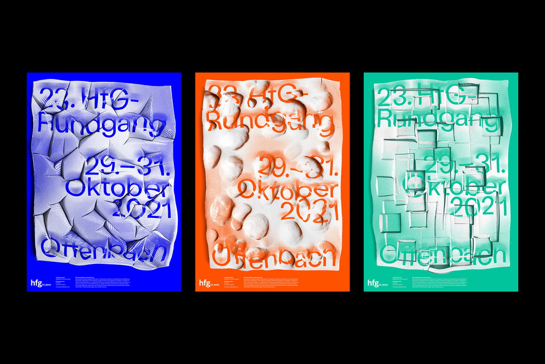
Laura Hilbert, Sarah Stendel: Hands On! (Copyright © Laura Hilbert, Sarah Stendel, 2021)
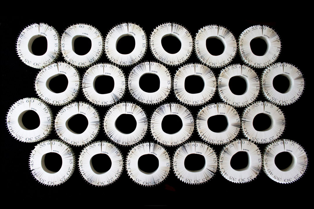
Laura Hilbert: 24 Stunden (Copyright © Laura Hilbert, 2021)
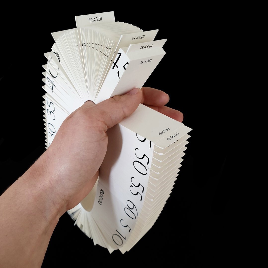
Laura Hilbert: 24 Stunden (Copyright © Laura Hilbert, 2021)
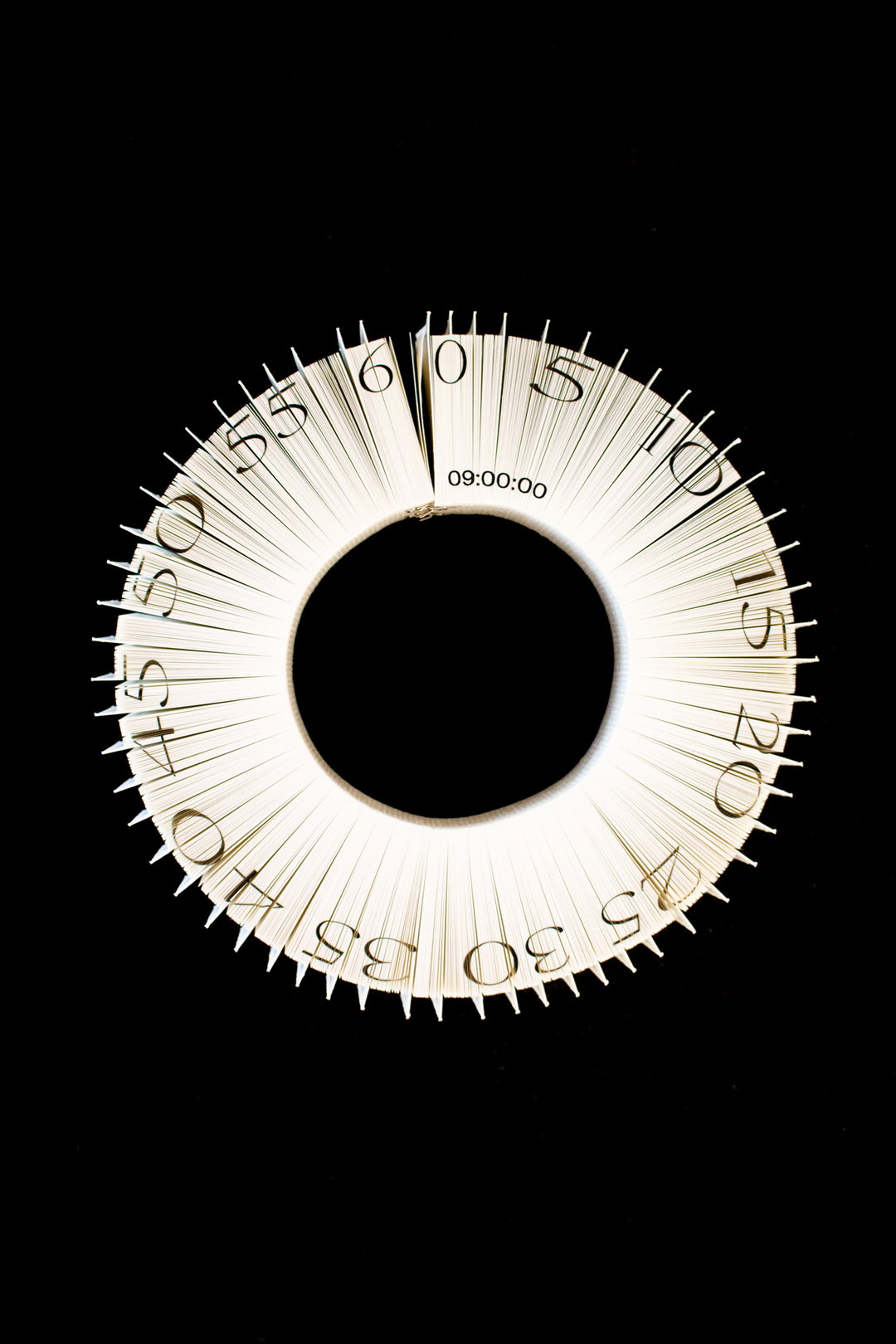
Laura Hilbert: 24 Stunden (Copyright © Laura Hilbert, 2021)
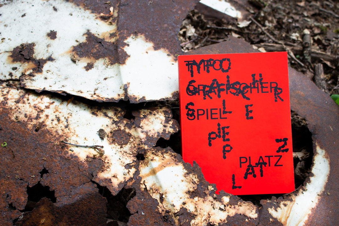
Laura Hilbert: Typografischer Spielplatz (Copyright © Laura Hilbert, 2020)
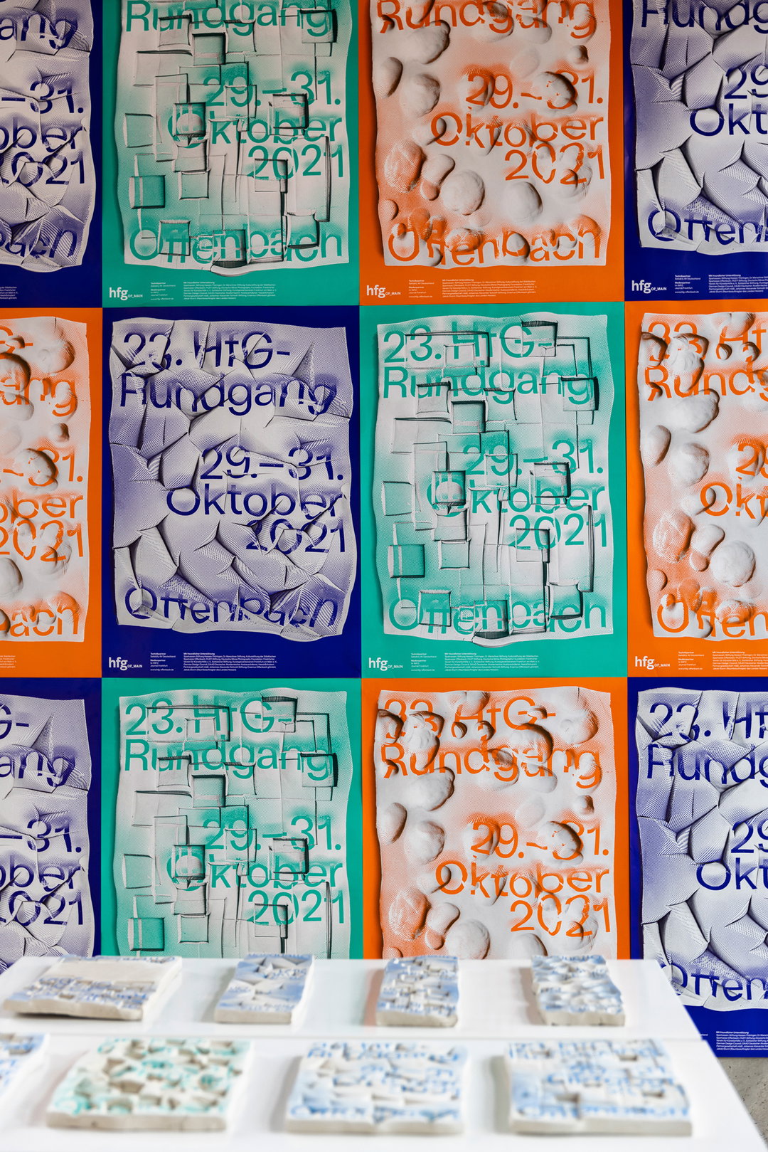
Laura Hilbert, Sarah Stendel: Hands On! (Copyright © Laura Hilbert, Sarah Stendel, 2021)
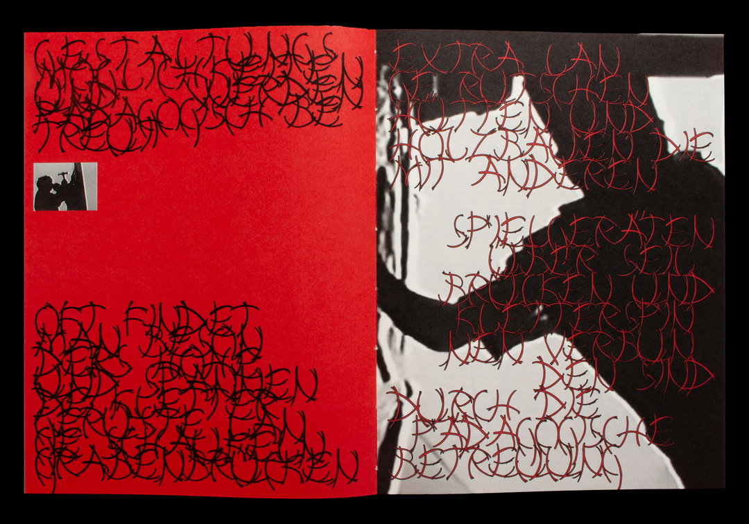
Laura Hilbert: Typografischer Spielplatz (Copyright © Laura Hilbert, 2020)
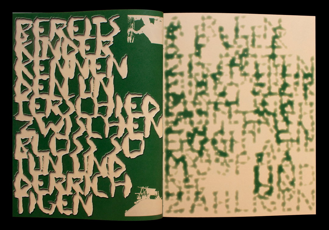
Laura Hilbert: Typografischer Spielplatz (Copyright © Laura Hilbert, 2020)
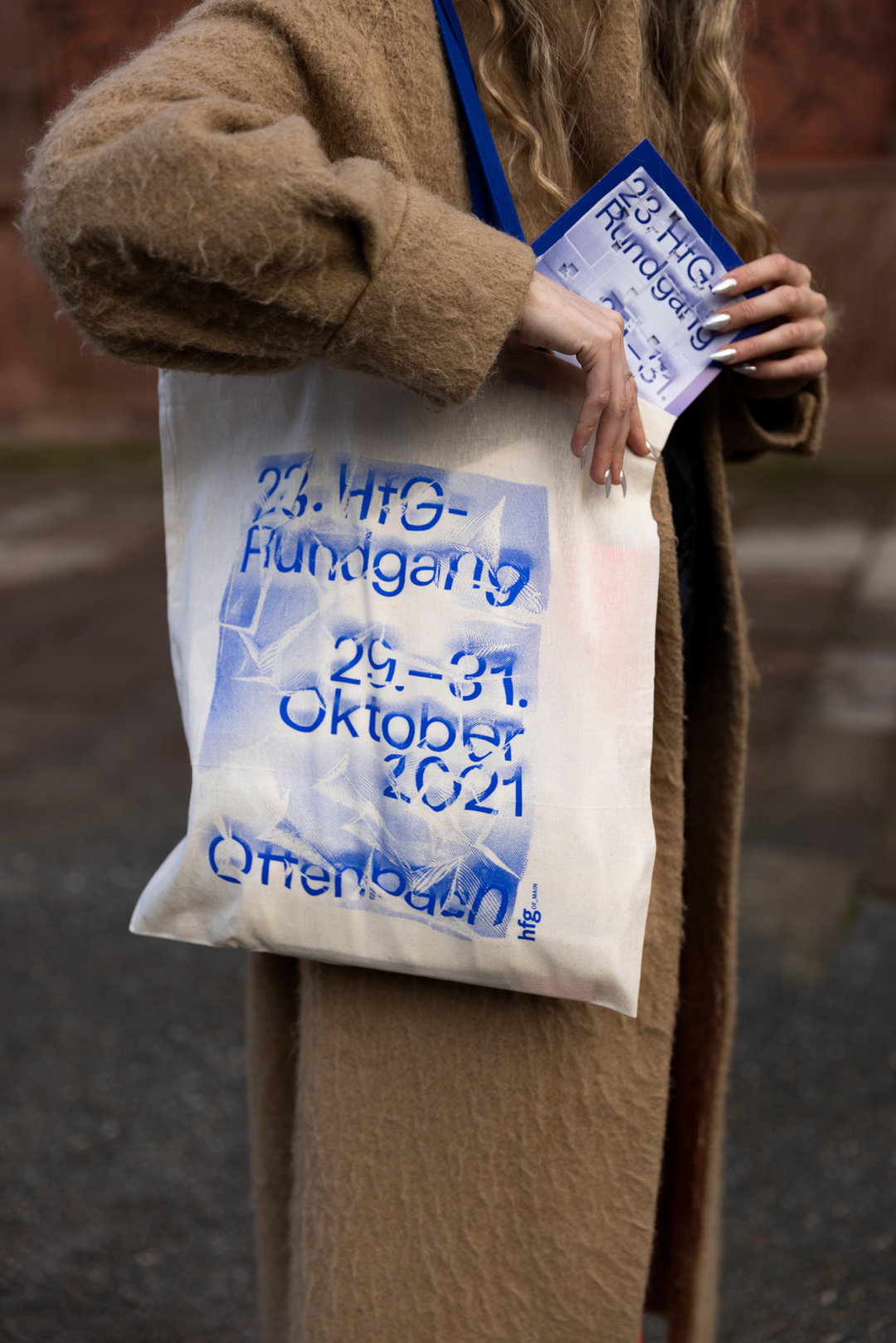
Laura Hilbert, Sarah Stendel: Hands On! (Copyright © Laura Hilbert, Sarah Stendel, 2021)
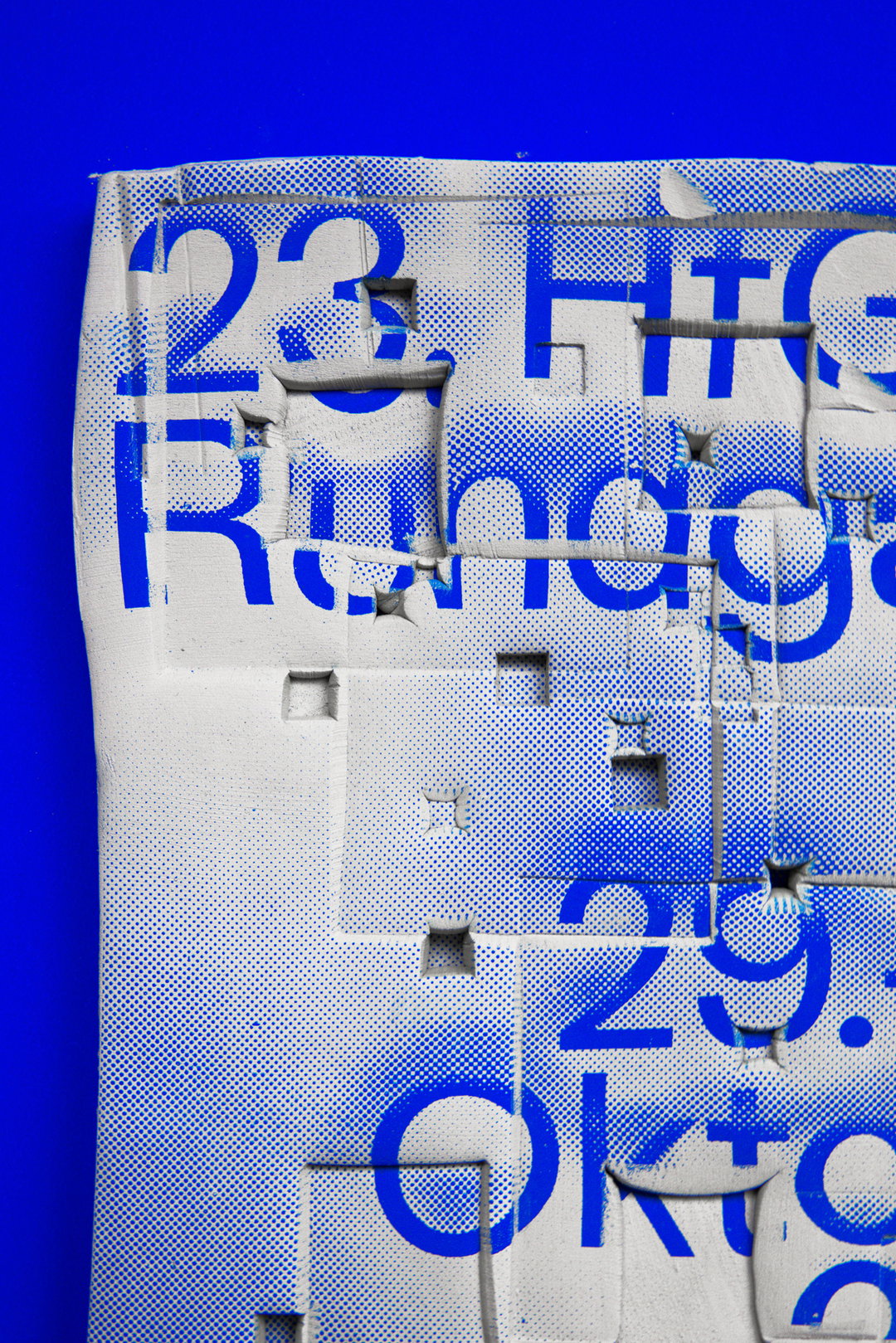
Laura Hilbert, Sarah Stendel: Hands On! (Copyright © Laura Hilbert, Sarah Stendel, 2021)
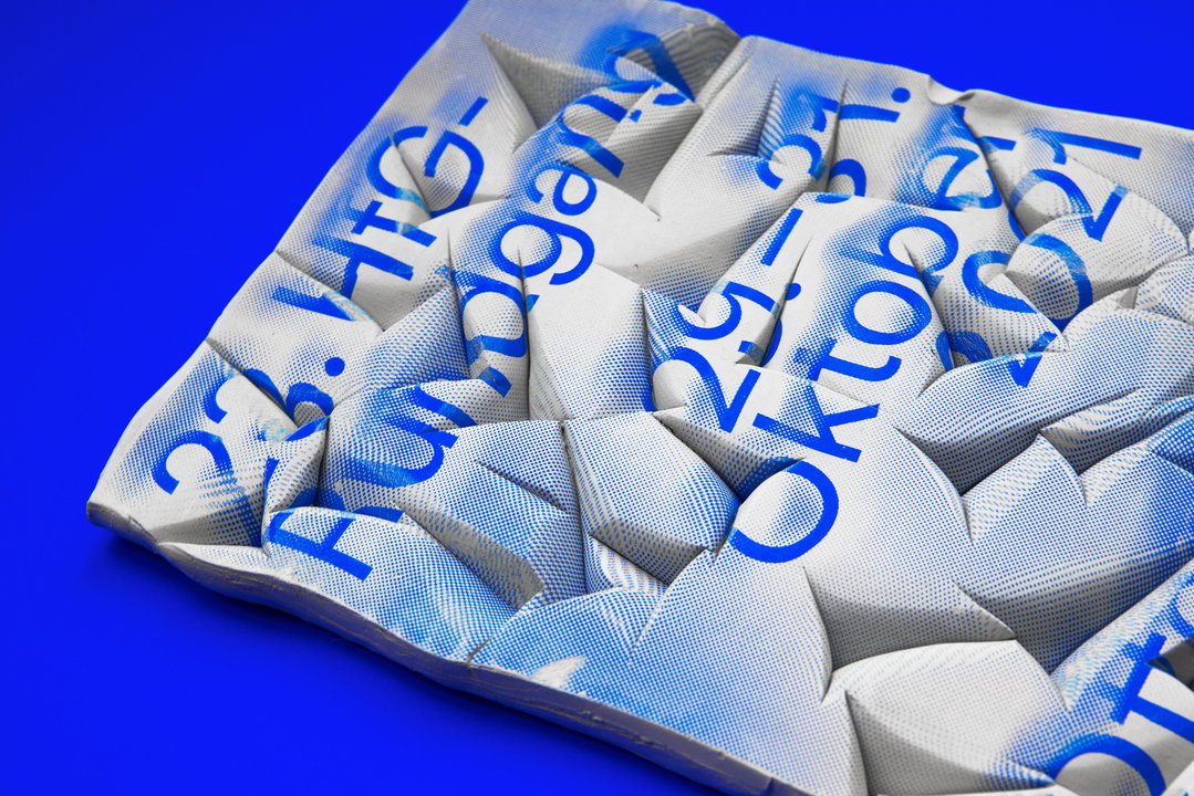
Laura Hilbert, Sarah Stendel: Hands On! (Copyright © Laura Hilbert, Sarah Stendel, 2021)
Hero Header
Laura Hilbert, Sarah Stendel: Hands On! (Copyright © Laura Hilbert, Sarah Stendel, 2021)
Share Article
About the Author
—
Liz (she/they) is the senior editor at Insights, a research-driven department within It’s Nice That. They previously ran the news section of the website. Get in contact with them for potential Insights collaborations or to discuss Insights’ public-facing reports.