

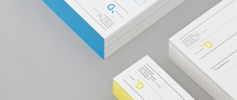
Pure unadulterated stationery porn from Swedish studio Lundgren Lindqvist
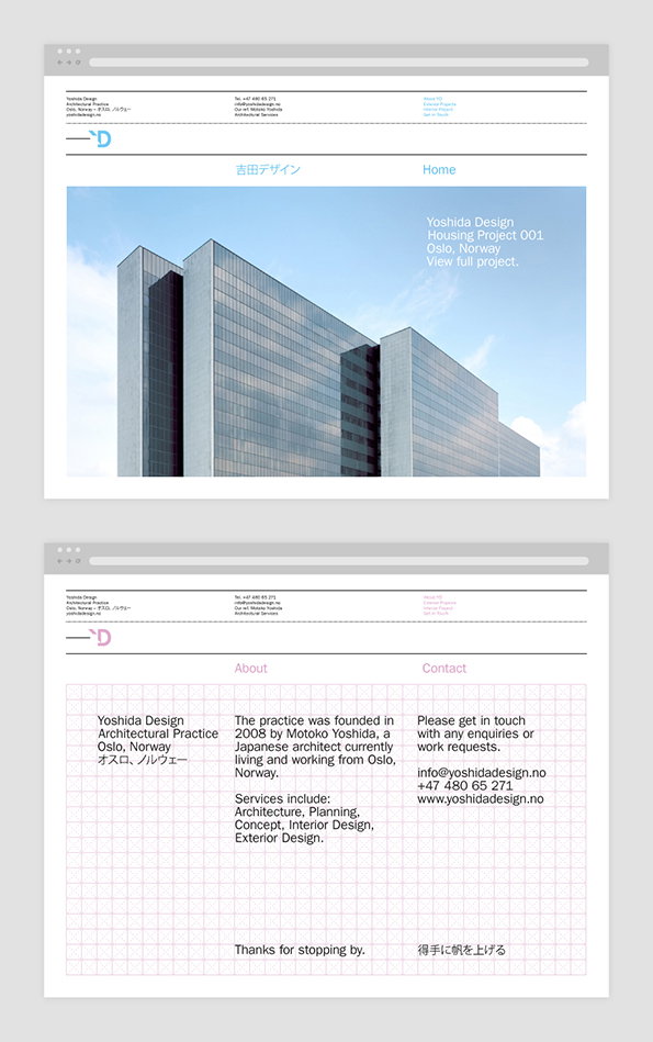
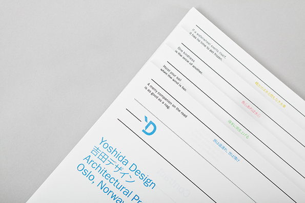
It’s no secret that we’re total suckers for exceptional stationery, but this new work for Swedish-Japanese architecture practice Yoshida Design is on another level. Created by Lundgren Linqvist, the identity utilises clean lines and four carefully chosen accent colours to wonderful effect, aiming to emulate the practice’s architectural aesthetic. There’s also a delicate balance between Franklin Gothic and kanji characters that echoes the firm’s dual nationality.
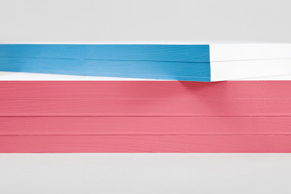
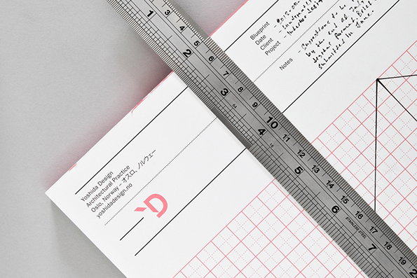
The stationery package includes two sets of gridded sketchpads (regular and isometric) on which the firm can draft ideas on a daily basis. For a day-to-day working tool these pads are particularly desirable, offering the perfect surface to take down ideas and useful time, date and client slots for easy archiving. If Lundgren Lindqvist fancied knocking us up some similarly sleek writing pads we’d certainly not complain.
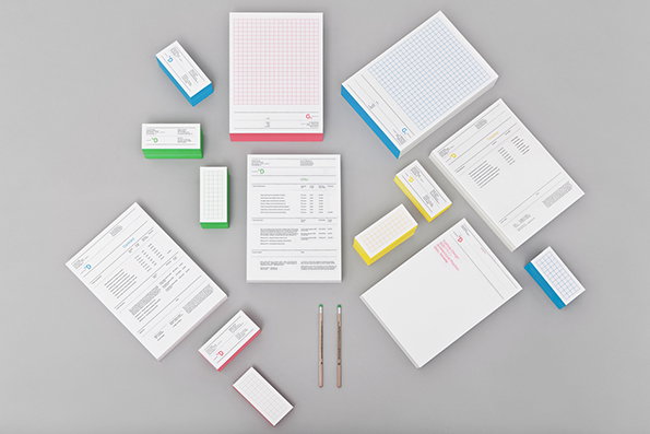
Lundgren Lindqvist: Yoshida Design identity
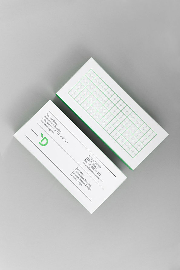
Lundgren Lindqvist: Yoshida Design identity
Lundgren Lindqvist: Yoshida Design identity
Lundgren Lindqvist: Yoshida Design identity
Lundgren Lindqvist: Yoshida Design identity
Lundgren Lindqvist: Yoshida Design identity
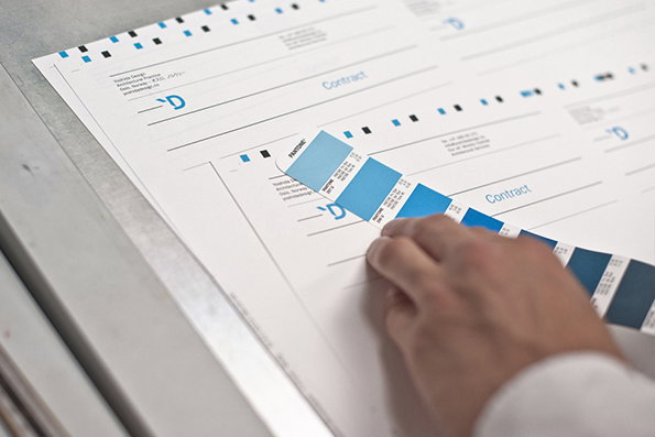
Lundgren Lindqvist: Yoshida Design identity
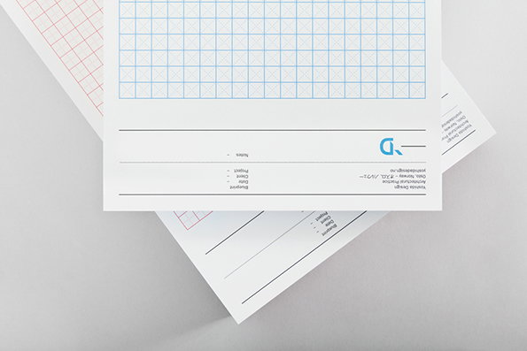
Lundgren Lindqvist: Yoshida Design identity
Share Article
Further Info
About the Author
—
James started out as an intern in 2011 and came back in summer of 2012 to work online and latterly as Print Editor, before leaving in May 2015.