Launch Recite Me assistive technology
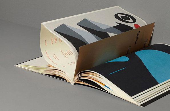
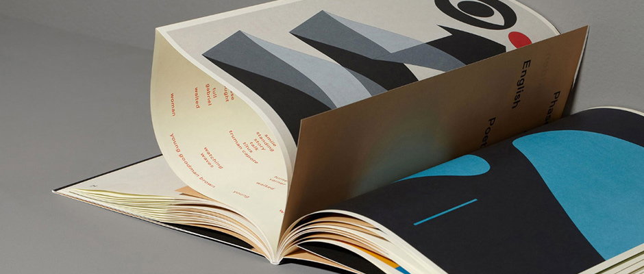
An open book displays a spread with a bold, grey geometric illustration and a list of names in small red and yellow text. The page is curved, revealing the words “English Poetry” on the opposite side.

Graphic Design: Phenomenally slick design from Amsterdam's Main Studio

—
Date
31 October 2013

We’ve spoken about this before – in fact we sometimes think we go on about it too much – but the documentation of graphic design is often as important as the design itself when trying to communicate your practice through digital media. Witness the phenomenally documented portfolio of Amsterdam’s Main Studio. These guys not only produce some of the finest work going across print, digital and branding, for art, architecture and fashion clients, but their website is an exercise in polish and restraint. They never give you too much visual information, but what they do looks incredible and presents them as one of the foremost practitioners of their craft. Doubtless they’ve employed a terrific photographer to capture the images for them, but if you’re one of the best design studios around why not splash out on someone who’s equally good with their lens? Seems sensible to us…
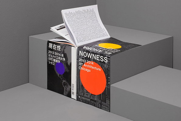
An open book rests on a grey concrete plinth, its pages fluttering. The cover features a bold orange circle and the text “NOWNESS 2013 2014 IIT Architecture Chicago”.
Above

Main Studio: Nowness iit architecture Chicago
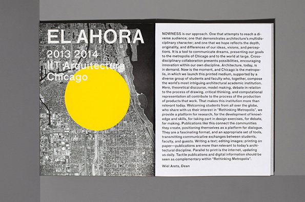
A black and white poster for “El Ahora” features a large yellow circle over a cityscape of Chicago. Beside it, a white text panel contains a manifesto on architecture and the “Rethinking Metropolis” project, signed by Dean Wiel Arets.
Above

Main Studio: Nowness iit architecture Chicago
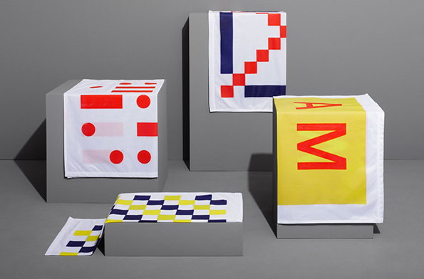
Four white fabric cloths with bold geometric patterns and letters are draped over grey rectangular plinths. The designs feature red, blue and yellow shapes, including a large red “M” on a yellow background.
Above

Main Studio: The Transcontinental Express
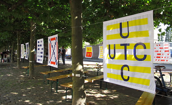
A row of graphic banners hangs from a line between trees in a cobbled courtyard. The closest white banner features yellow stripes and the letters “U UTC C” in blue.
Above

Main Studio: The Transcontinental Express
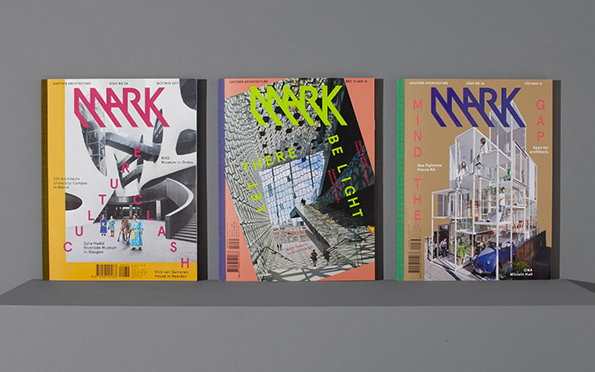
Three issues of Mark magazine stand side by side against a grey background. Each cover features a different architectural project and bold, stylised typography.
Above

Main Studio: Mark Magazine

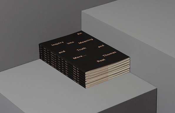
A stack of black books rests on a grey geometric plinth. The cover of the top book features gold text that reads “An Inquiry Into Meaning and Truth and More...” followed by the name “Thomas Raat”.
Above

Main Studio: An Inquiry into Meaning
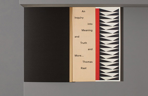
An open book shows a title page with the text “An Inquiry into Meaning and Truth and More... Thomas Raat”. To the right, a graphic pattern of black and white triangles sits beside a bold red vertical stripe.
Above

Main Studio: An Inquiry into Meaning

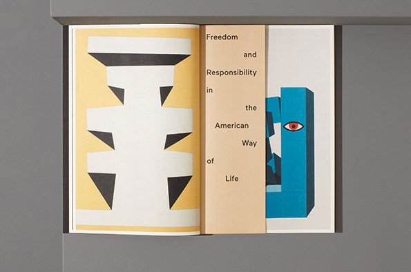
An open book featuring a bold graphic layout. The left page shows a white geometric shape on a yellow background, while the right page displays a blue 3D form with a single red eye. A central cream strip reads “Freedom and Responsibility in the American Way of Life”.
Above

Main Studio: An Inquiry into Meaning

An open book displays bold, abstract geometric shapes in black, grey and blue. One page curves upwards, showing a grey form and a black circular eye-like shape.
Above

Main Studio: An Inquiry into Meaning

Share Article

Further Info

About the Author

James Cartwright

—

James started out as an intern in 2011 and came back in summer of 2012 to work online and latterly as Print Editor, before leaving in May 2015.


It's Nice That Newsletters

Fancy a bit of It's Nice That in your inbox? Sign up to our newsletters and we'll keep you in the loop with everything good going on in the creative world.