




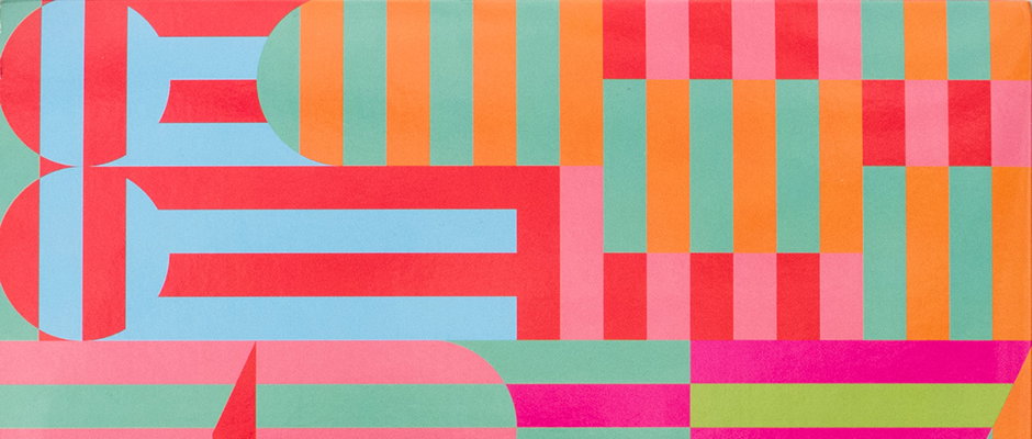
We chat with the man behind Panda Bear's incredible graphics, Marco Papiro
Adoring pretty much anything Panda Bear-related (his amazing interactive website, his brilliant music, his very lovely hair), we felt it was high time we shed some light on the man behind his wonderful record sleeve designs, Marco Papiro.
Marco is a graphic designer and musician living in Basel, Switzerland, who balances teaching at an art school with creating these stunning graphics, which marry typographical experimentation with geometric forms to brilliant effect. For us, the boldness and bright, earnest palette of the designs made the record itself take on a new feel, one that was more open and vivid than the more pared-back aesthetic of Panda Bear’s other albums. But it seems that wasn’t necessarily the intention of Marco, who ended up creating the designs having worked on a tour poster for Panda Bear and their mutual friend Sonic Boom a couple of years back.
“I didn’t know his music very well, and I didn’t even try to let it inspire me,” he says. “In my experience that leads to results that are too obvious and boring. Maybe it’s just me. Noah [Lennox, Panda Bear’s real name] gave me inputs about the colours (candy bar minty green), that was helpful. I usually think in monochrome.”
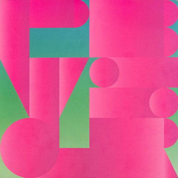
Marco Papiro: PBVSGR
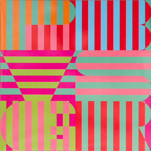
Marco Papiro: PBVSGR
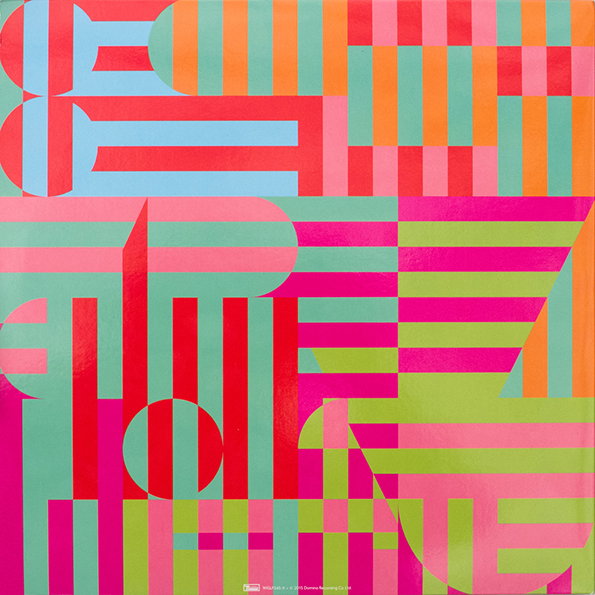
There’s a great deal of technical skill and a very keen compositional eye behind the typography, but Marco is equally nonchalant about that side of things. “No big ideas really, just trial and error with the letters PBVSGR,” he says. “[I sent him] a lot of proposals, and some of them resurfaced on the website, as I allowed him to use them at his own risk.”
Marco’s other work further demonstrates his wonderful way with type, offering more subdued colour-ways but equally skilled experiments with letterforms, be it on other sleeves, music promo or a series of posters created on fax paper.
“The given words and letters inspire a typographic system, with fixed simple elements (mostly basic geometric forms) and rules for the arrangement,” he explains. “The result is only visible at the end, I never know how things will look like when I start.”
On his site, Marco describes himself as a “graphic designer, violin player, modular musician. DJ on Demand. 39 other things too.” God knows what the 39 other things are, but if he’s half as good at them as he is at graphic design, we’ve got a bonafide polymath on our hands.
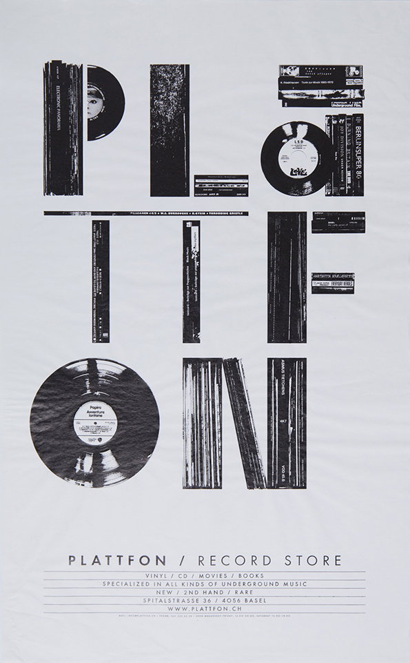
Marco Papiro: Plattfon
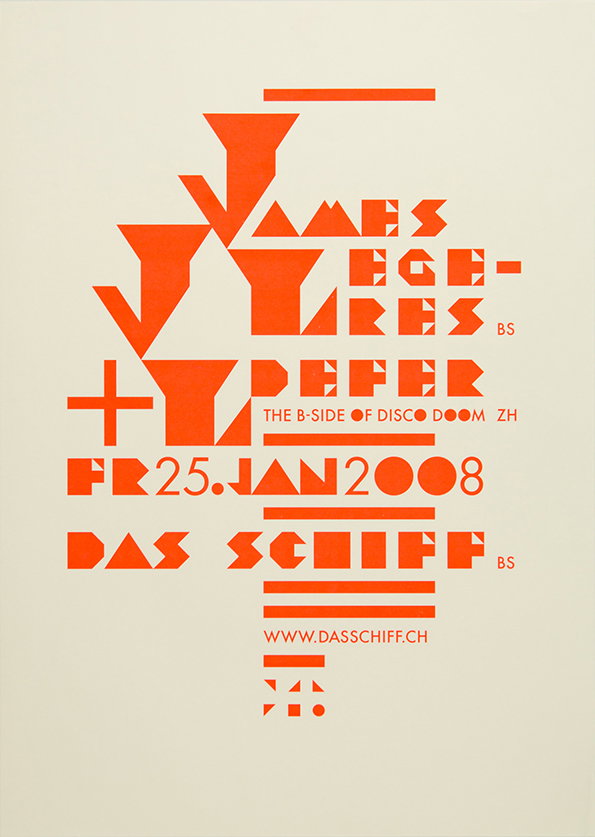
Marco Papiro: Poster
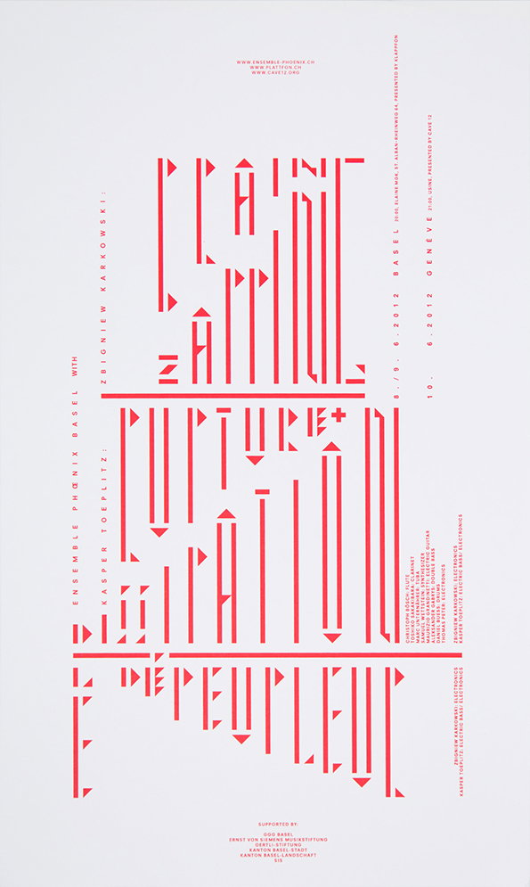
Marco Papiro: Karkowski
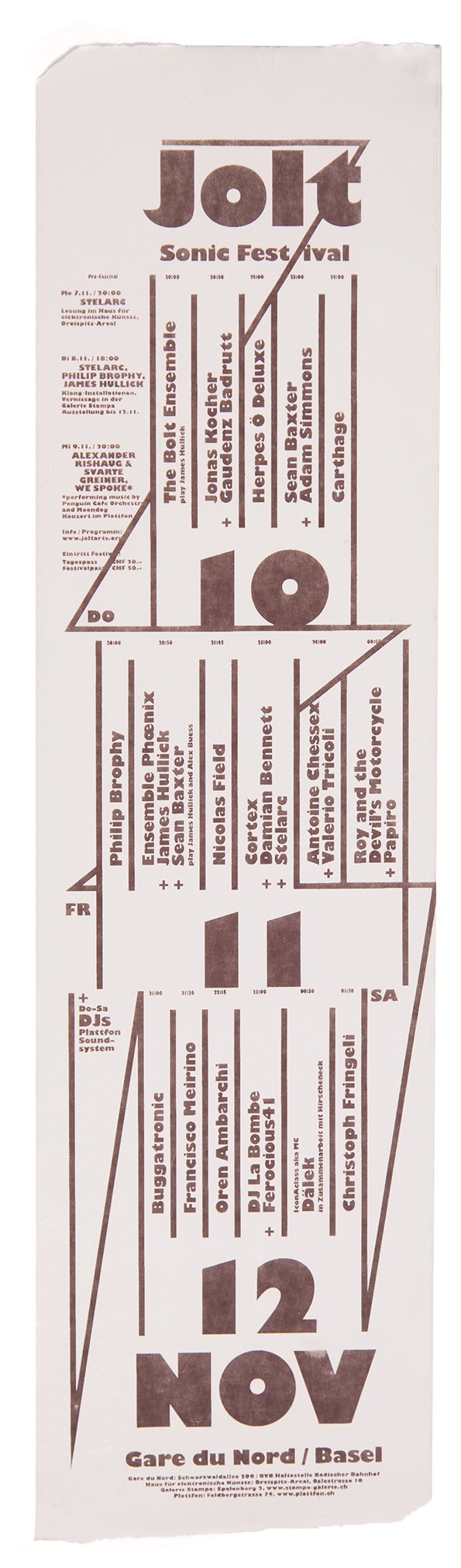
Marco Papiro: Fax Jolt
Share Article
Further Info
About the Author
—
Emily joined It’s Nice That as Online Editor in the summer of 2014 after four years at Design Week. She is particularly interested in graphic design, branding and music. After working It's Nice That as both Online Editor and Deputy Editor, Emily left the company in 2016.



