




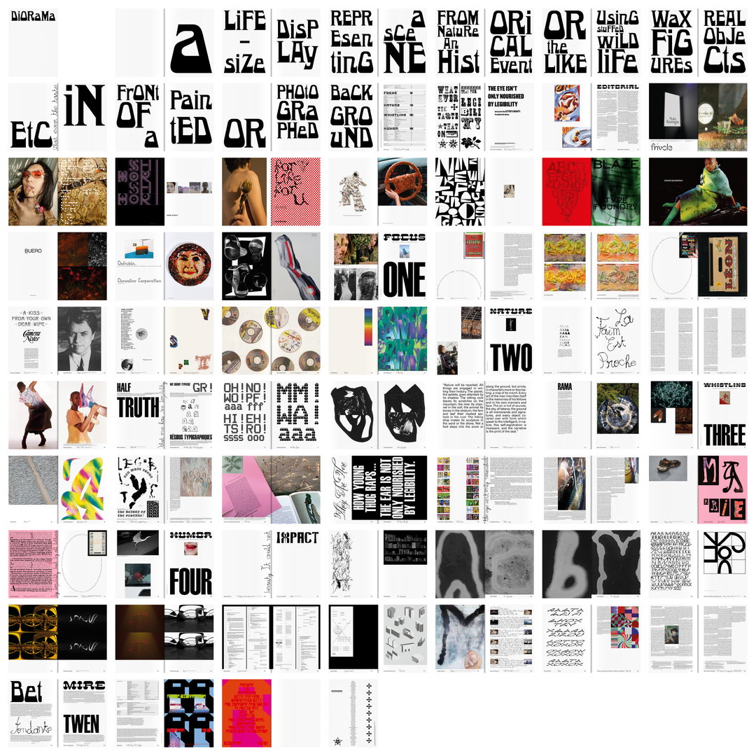
Marie-Mam Sai Bellier’s approach to graphic and type design is steeped in history
Few designers pull together such a range of diverse references, from medieval books to 20th century American and Japanese pop art.
Coming from a family of artists, Marie-Mam Sai Bellier was unsure as a younger creative whether to venture into the fashion industry or into cinema. In the end, it was actually typography that felt like “the perfect juncture between these two fields, opening opportunities through producing and storytelling”. Looking through her portfolio, which spans publications, identities, specific typeface designs and more general creative work, it’s clear there is a strong narrative feel to a lot of the work.
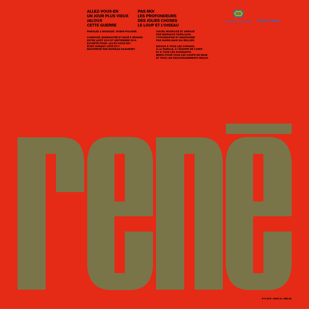
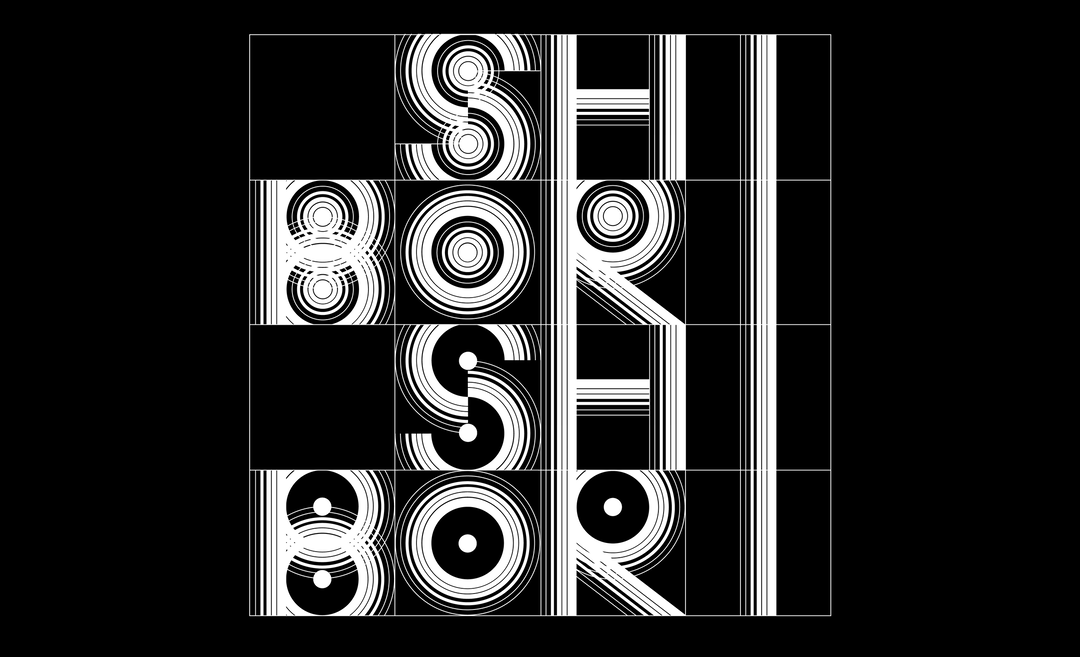
For Marie-Mam Sai, typography is “a historical medium that can create the mood of iconic or forgotten times” and a tool to “revive stories through old shapes”. She even thinks of her “fonts as characters”, again emphasising the storytelling aspect of her portfolio.
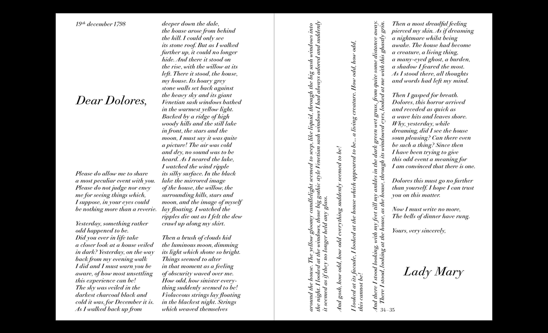
When it comes to layout design, the designer explains that her approach is about “finding the right balance between antique references and contemporaneity”. When designing layouts for magazines or books, for instance, she can be found searching far back, finding inspiration through medieval books in particular. Alongside type design and layout design, her third “omnipresent focus”, as she puts it, sees her work as both an editor and curator, linking “people together through book design, typography, and the physical qualities of the book”. A home for this is her publishing house, which she runs together with Guillaume Sbalchiero, where the pair “constantly work with the idea of collections”.
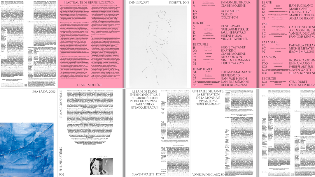
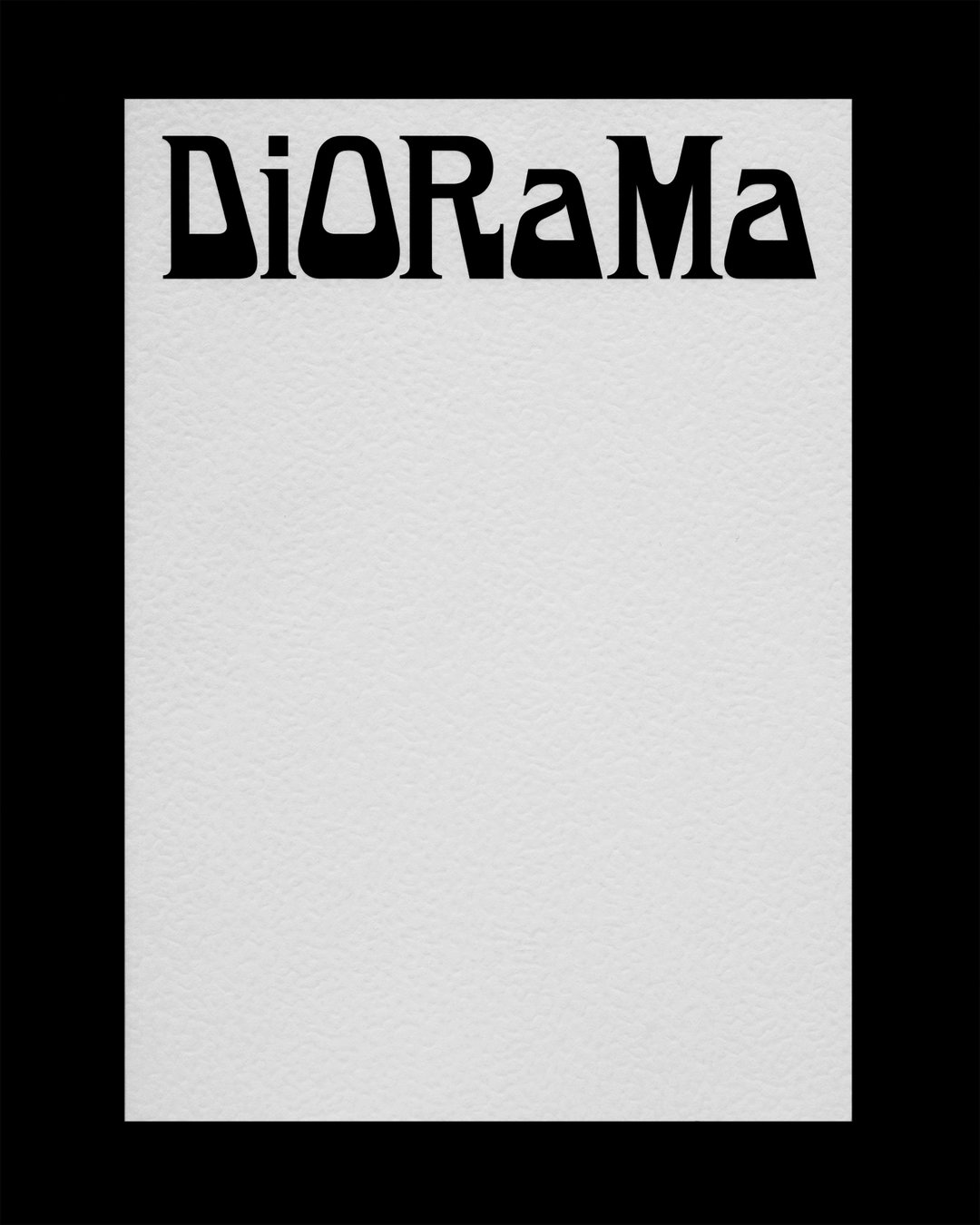
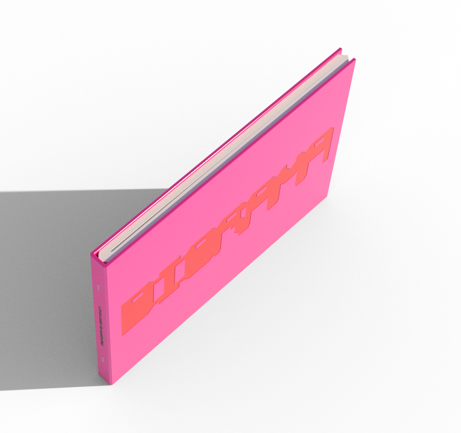
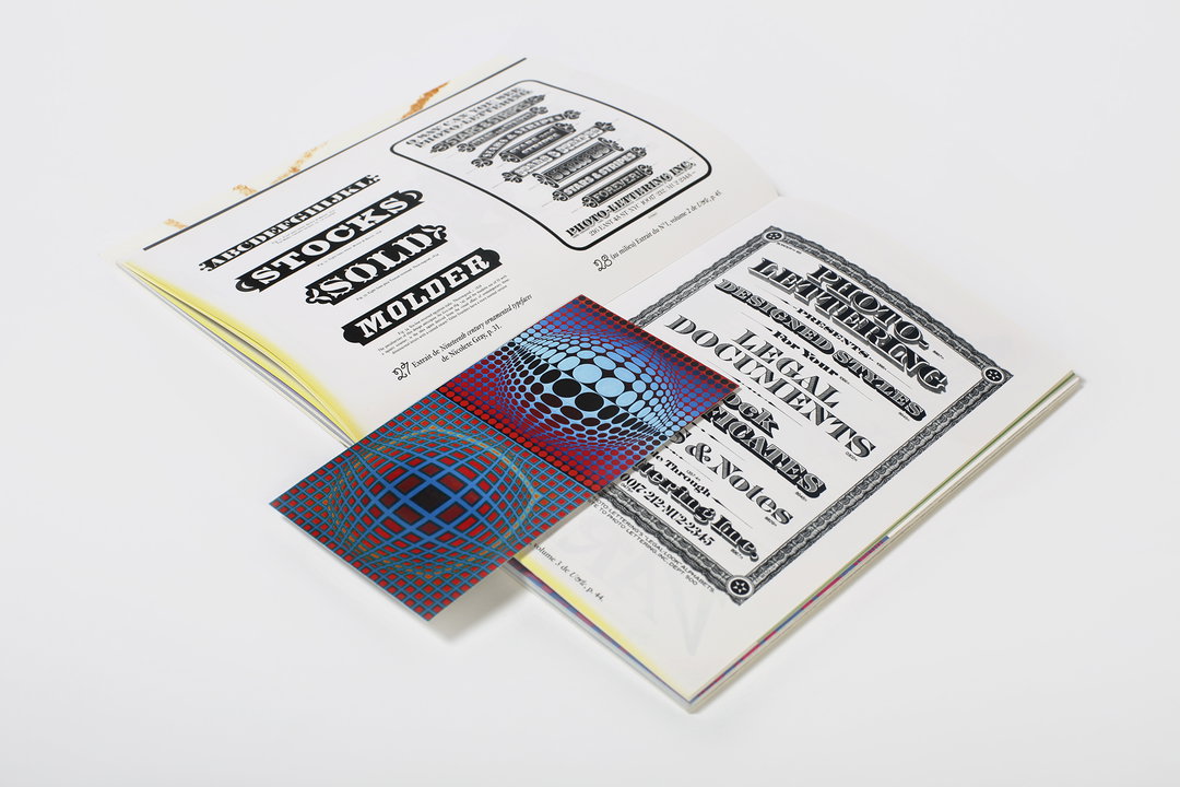
The embodiment of this idea is the Revue Diorama, a publication the pair release “triggered by the start of multiple epistolary conversations”, building a publication around a number of documents collated together alphabetically. Currently the pair are working on their second issue, entitled Geometric City, and will also present the Diorama Type Foundry, “an anthology of what I like the most in practicing type design,” she adds.
But no matter the outcome, it is a historical and well-researched approach to design that sets Marie-Mam Sai’s work apart from others, and makes it so uniquely interesting. It’s very rare to speak to a designer whose favourite references are simultaneously “the end of the 19th century and the 70s”. This is then coupled with pop references, largely from America and Japan, juxtaposed with “medieval and gothic layout design inspired by fantasy in the fields of gaming and fashion”, not to mention a passion for “ornamental typography”.
With references even more broad and diverse than her work, the future is full of ambitions for the designer. Asked what she would like to do next, a long list begins, with the desire to work with more brands and develop her approach to identity designs “because I love it”. But she also lists a desire to become a historian and write a thesis, to develop an art space in her family’s home in the west of France, to learn Japanese to continue an interest in oriental alphabets, and continue to form abilities in digital fields, like gaming and animation. If even just a few of these elements come to life, we can’t wait to see what Marie-Mam Sai’s intelligent approach creates next.
GalleryAll work by Marie-Mam Sai Bellier

Share Article
Further Info
About the Author
—
Lucy (she/her) was part of the It’s Nice That team from 2016–2025, first joining as a staff writer after graduating from Chelsea College of Art with a degree in Graphic Design Communication, eventually becoming a senior editor on our editorial team, and most recently at Insights, a research-driven department with It’s Nice That.

