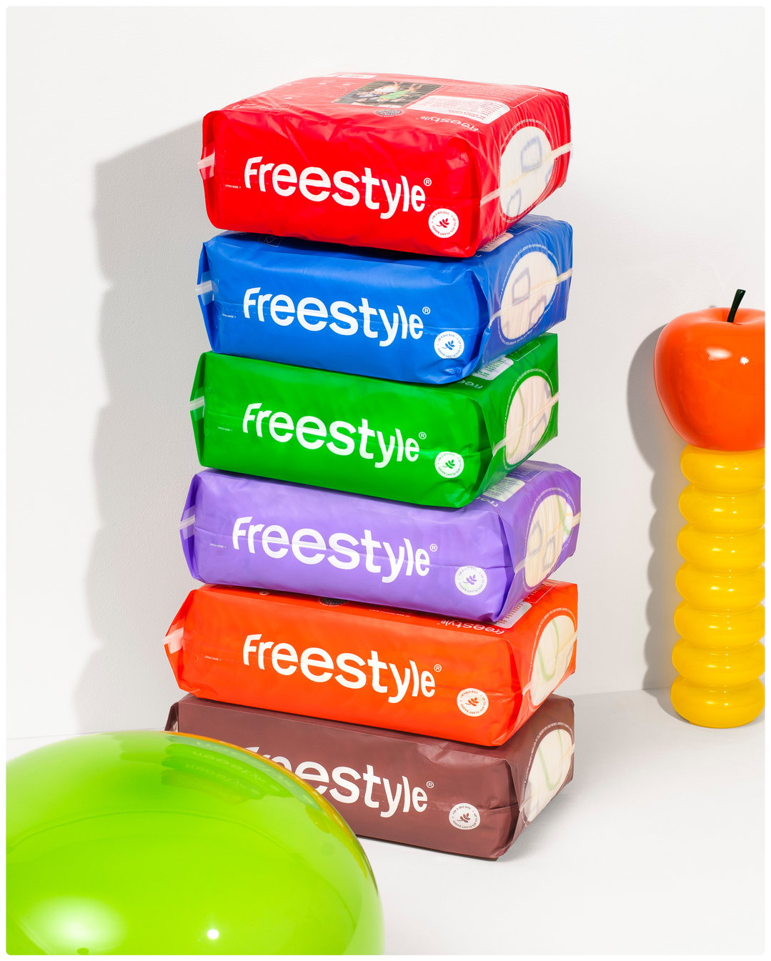
Freestyle is the nappy brand binning muted tones and stock imagery
Designer Marina Veziko explains how she struck a balance when creating a brand that wanted to be fun, but also needed to be reputable.
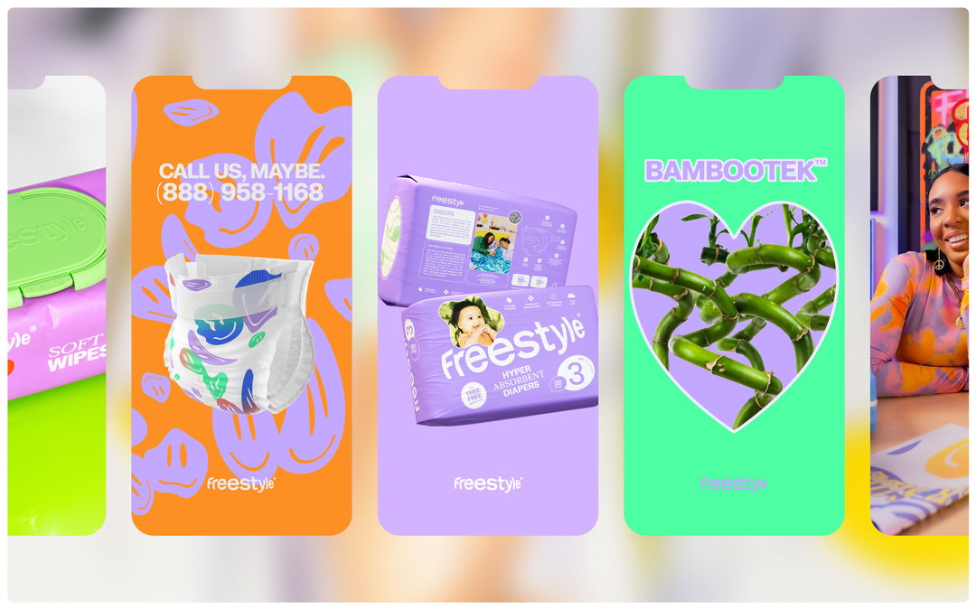
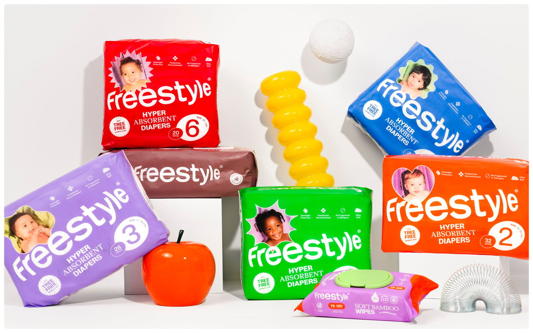
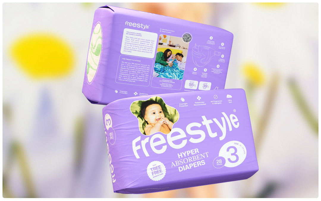
While babies might be one of the cutest things, changing their nappies isn’t. So why not at least make the packaging nice to look at? Freestyle is the wipes and diaper brand that is breaking away from typical baby-care branding, embracing a more modern, eco-friendly and trendy approach. The Finnish designer Marina Veziko has led Freestyle’s branding, packaging design and art direction and under her hand, bland visuals, stock imagery, muted tones and dinosaur prints are out, and bold colours, playful photography, and artist collabs are in.
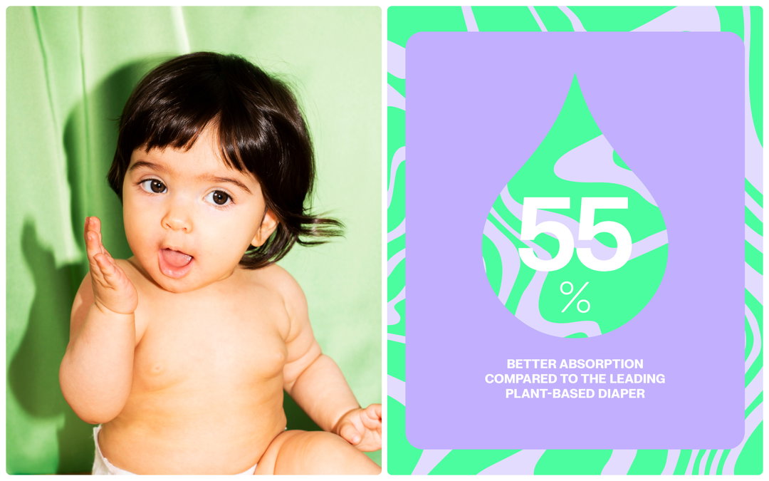
As more of the Gen Z population became parents, Freestyle wanted to tap into values the generation held close, such as sustainability. Freestyle uses 100 per cent tree-free bamboo core, as opposed to the wider industries use of wood pulp and plastic; bamboo regrows in as little as six months and breaks down much quicker than wood pulp, with wood pulp also contributing deforestation.
The packaging needed to be something that Gen Z parents would enjoy having on the changing table or taking out and about with them, without being too ‘out there’. “Cute branding can only go so far; in the diaper market, communicating aspects like exceptional performance, softness, and non-toxic ingredients is crucial,” says Marina. “Additionally, it was essential to understand that Freestyle isn’t a niche product for a niche consumer base of ‘cool parents’ but aims for broad appeal.”
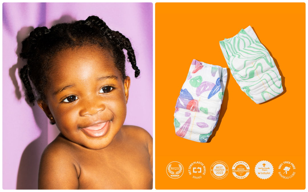
Marina Veziko: Freestyle (Copyright © Marina Veziko / Freestyle, 2024)
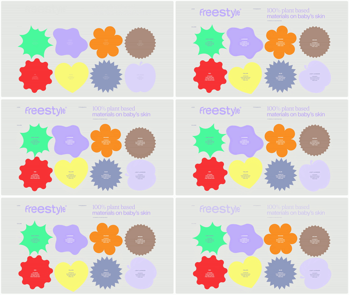
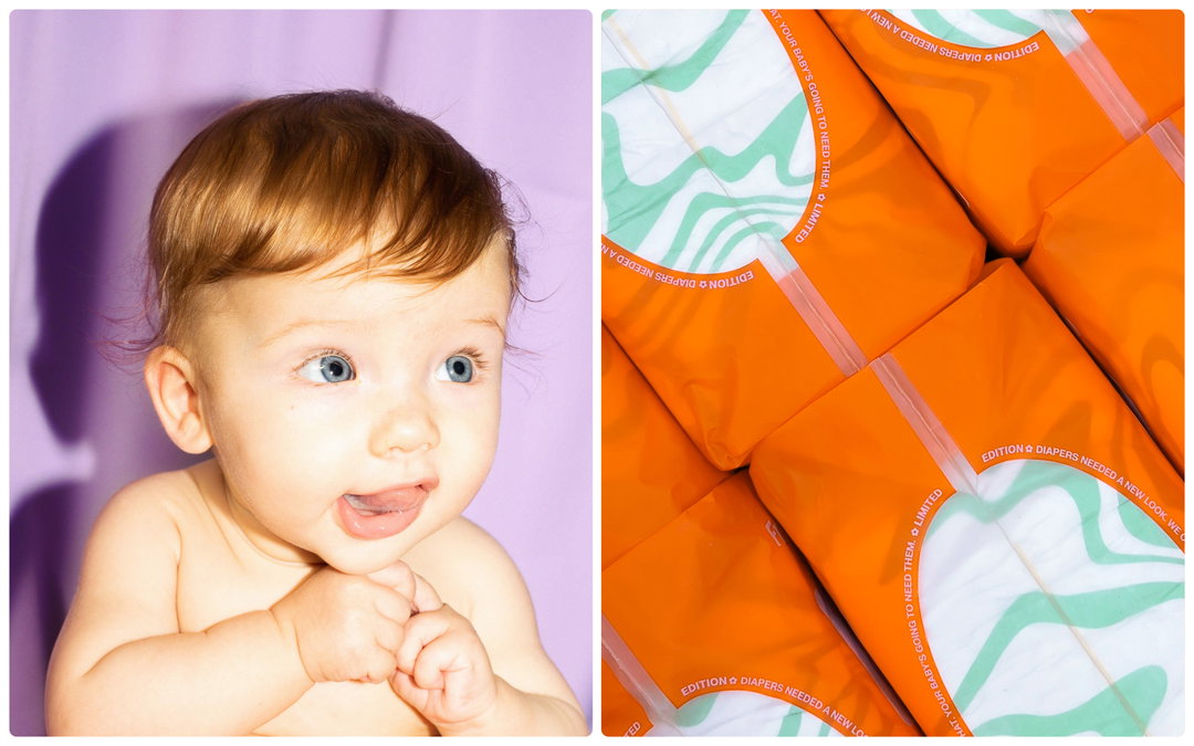
One of Freestyle’s founding ideas is that parenthood is “the ultimate creative act”. To emphasise this point Marina enlisted the help of an artist for each drop, “giving them free rein to visually interpret the concept of parenthood” through illustration, says Marina. For the first release designer Janine Rewell created a series of abstract designs that symbolise the ease and fluidity of waves to promote a sense of lightness; for the second, the artist Cristina Martinez conjured a series of illustrative flower faces, which nodded to the cycle of nature.
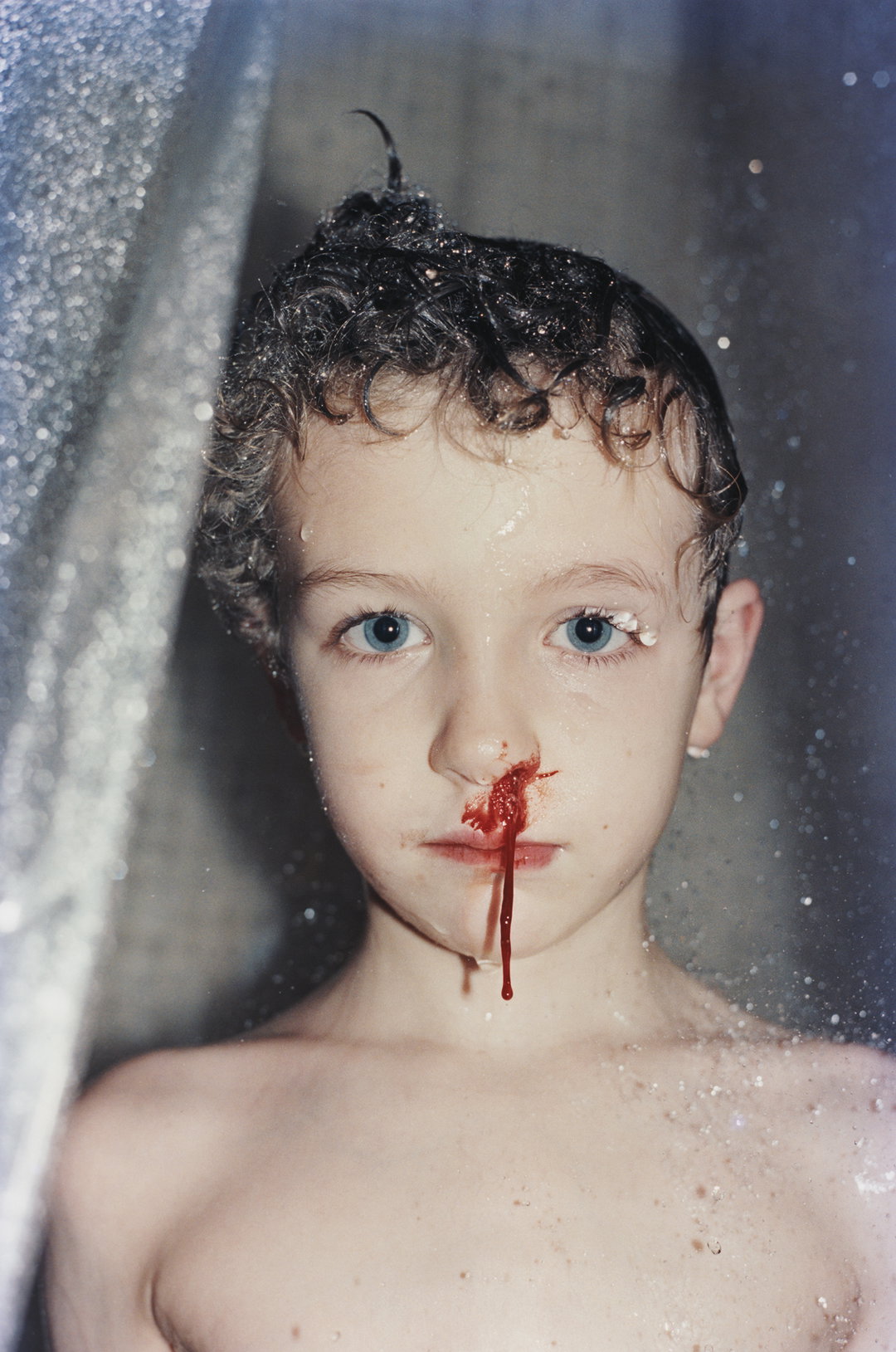
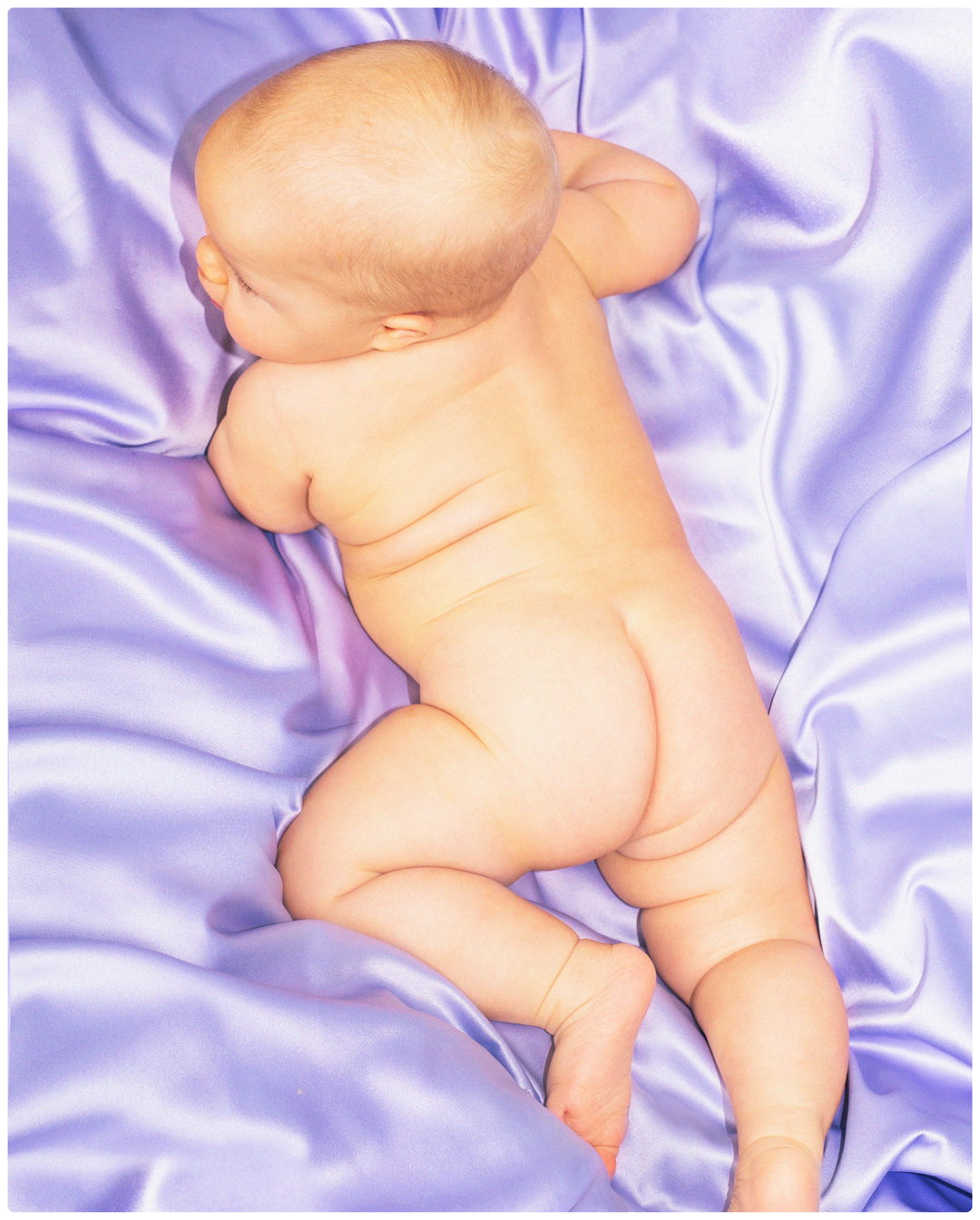
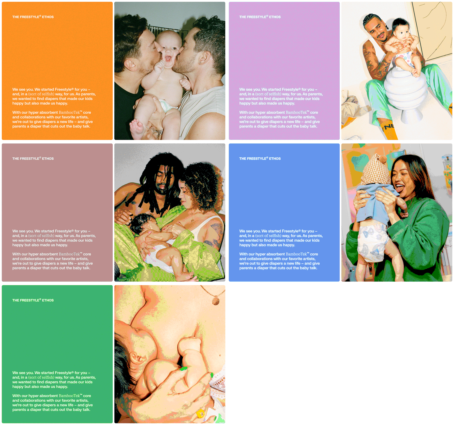
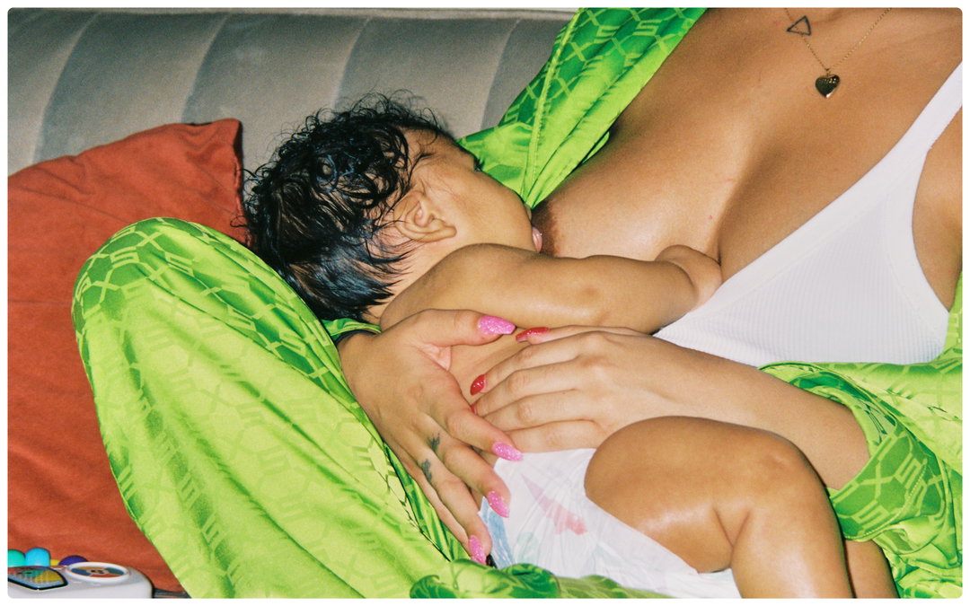
Where Freestyle most stands out from other nappy brands is its photography. “Baby-care brand photography is quite stock-image like and clichéd – think of ethereal newborn and baby bump photoshoots and you’ll get the picture,” says Marina. “However, there are many modern parents who find this sort of generic white picket fence-family storytelling unrelatable.” Early into the project, Marina came across the work of Sofia Okkonen – specifically, a series of baby photos that proved her perfect for the job. With Sofia on board, the Freestyle team moved away from the studio setting, applying strong, high-exposure flash to dynamic moments of parenting – babies being swaddled, breastfed, etc.
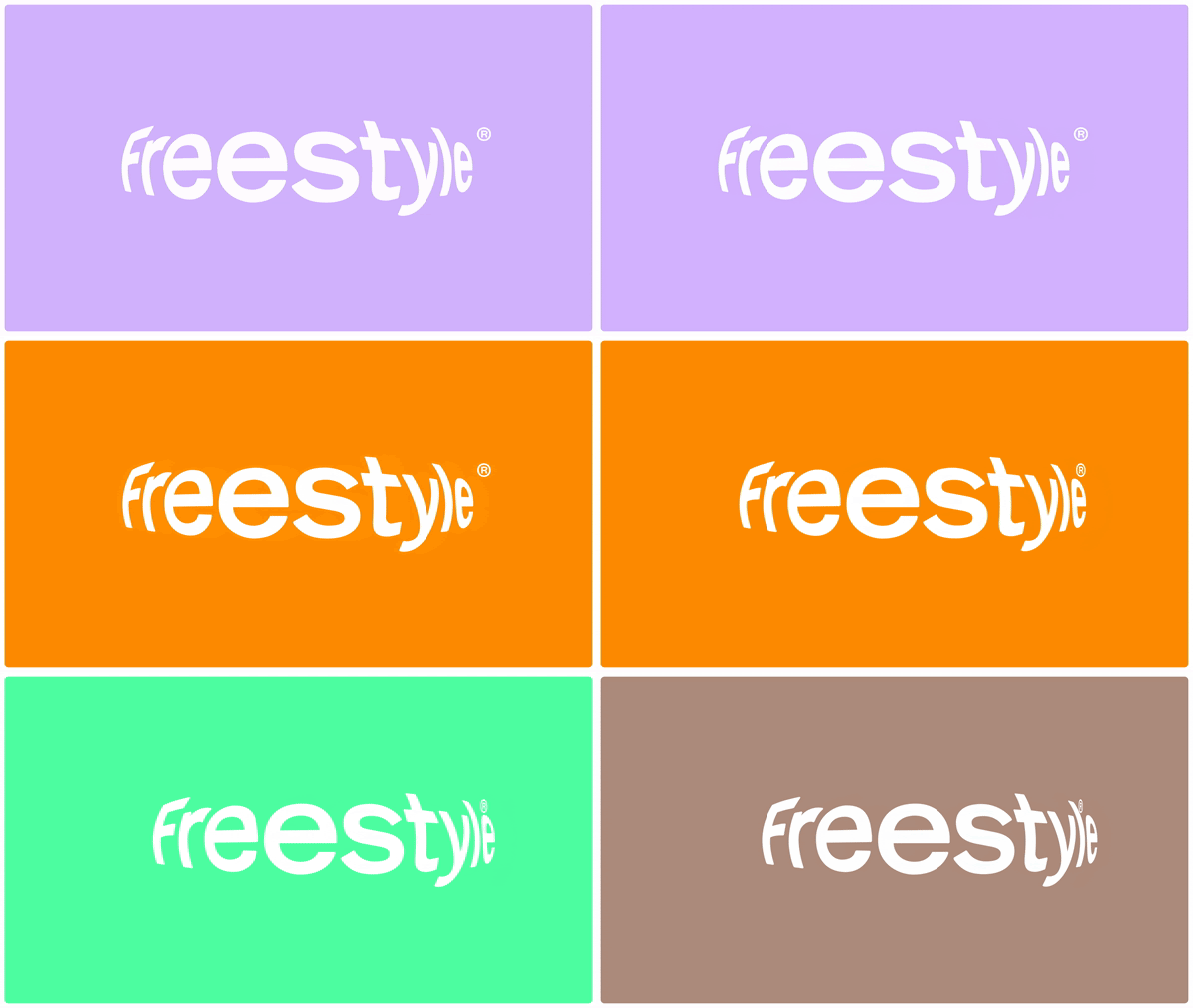
When it came to typography, Marina quashed the impulse to go for something cute and childlike, bouncy and rounded. Instead Marina wanted something timeless, “to balance out the colourful packaging, crazy patterns and vibrant photography”. Initially this led the designer down the “super minimal” Swiss design route, before realising it was a mismatch. We’re left with an expressive wordmark, that’s given some character with a stretch-effect to mimic the rounded flex of a nappy.
Since disposable diapers hit the shelves in 1948 little progress has been made in making them more eco-friendly or eye-catching. Freestyle is a brand upgrading both of these aspects at once, hoping to tap into the tastes and values of modern parents.
GalleryMarina Veziko: Freestyle (Copyright © Marina Veziko / Freestyle, 2024)
Hero Header
Marina Veziko: Freestyle (Copyright © Marina Veziko / Freestyle, 2024)
Share Article
Further Info
About the Author
—
Olivia (she/her) is associate editor of the website, overseeing the day-to-day editorial projects as well as Nicer Tuesdays events. She joined the It’s Nice That team in 2021. ofh@itsnicethat.com
To submit your work to be featured on the site, see our Submissions Guide.