




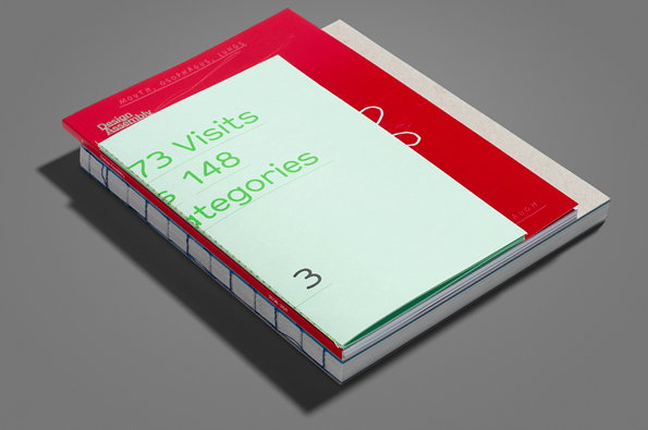
An interview with Matt Judge about his award-winning Design Assembly book
When the Design Assembly discussion forum closed, founder Matt Judge was determined it should’t sink without trace. The book he produced to mark its passing was one of the most eye-catching publications to appear last year and has rightly been recognised by various awards panels. We spoke to Matt about the process of commemorating a blog in print, his attitude to awards and the pressures of designing a book aimed at design afficianados…
How did the idea for the book come about?
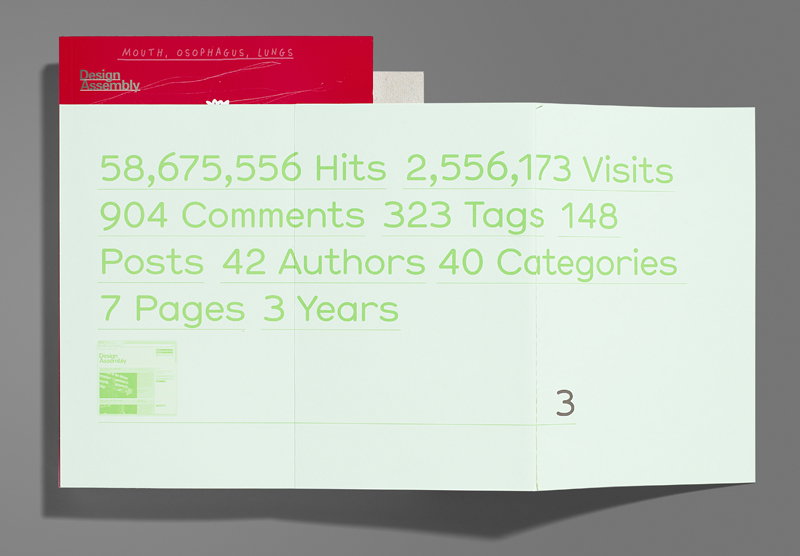
Ask anyone who runs a blog and they’ll tell you it’s a pretty thankless task. We weren’t interested in turning it into a commercial venture, in part for fear of losing the integrity of its voice, so it was fuelled purely by the passion of its authors, and their desire to make a difference. Design Assembly had been pretty prolific for the first 18 months but as our authors moved up the professional ladder their priorities naturally changed, and writing thought-provoking content became more and more of a challenge that time didn’t permit.
After all the energy and effort that had gone into making the platform I would have been devastated to just pull it down, but equally would have hated for it to just become forgotten because of the growing infrequency of its posts.
Then in late 2010 I lost my dad to cancer. It had a profound effect on me, forcing me to question what I wanted from my life and career. With Design Assembly we had been trying to make a difference to fellow creatives, by challenging their perception of design and showing them how important our role is to greater society. What better example of that than to donate all that time, energy and content to a far greater cause — fighting cancer.
Matt Judge DA3
Matt Judge: DA3
Why did you decide to structure it in the way you did?
The number three became a recurrent theme throughout the project. Three years with of Design Assembly being the starting point, and the frightening statistic that one in three of us will be diagnosed with some form of cancer in our lifetime being the motivation.
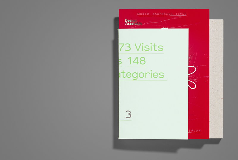
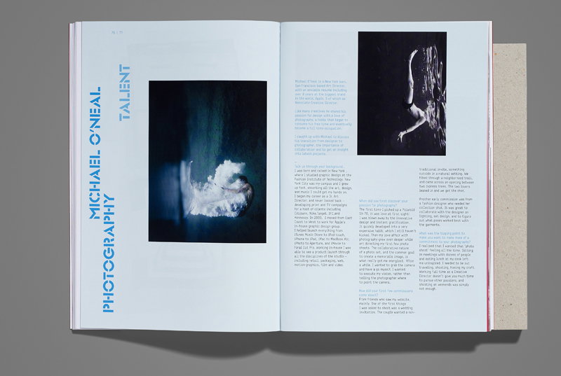
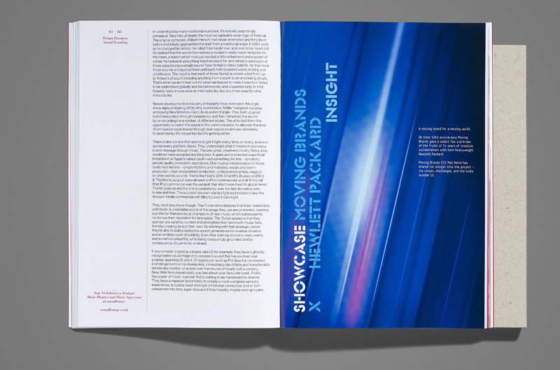
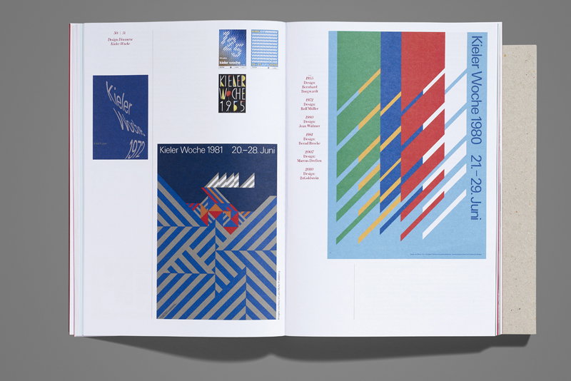
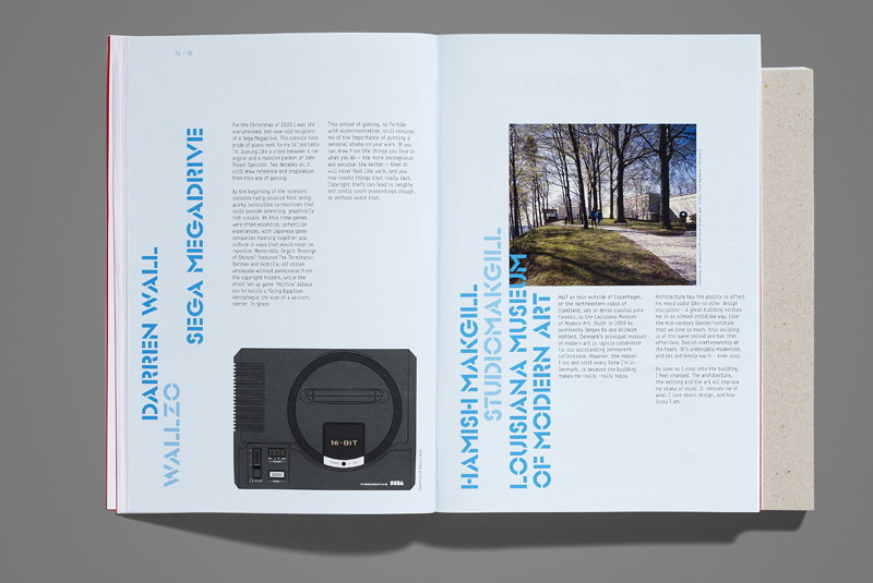
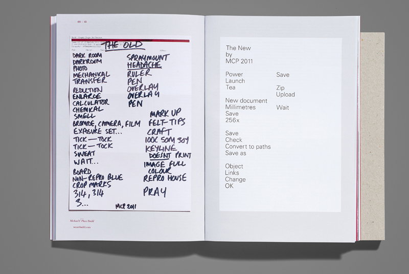
It made sense to split the content into three sections — an introduction to Design Assembly and the cause the project supported (book 1), the new content I had commissioned exclusively for the printed publication (book 2) and an archive of the website forming the bulk of the publication (book 3).
Because each section was unique in content, each was unique in design, size, binding, which was way more work than I imagined, and added huge complications to the production process, but gave DA3 a unique selling point, which I felt was crucial in a fairly congested design-publishing market.
All profits from the sale of the book are being split between three charities with a combined global reach, rounding off the theme of three nicely.
Matt Judge: DA3
Matt Judge: DA3
How much pressure was it to design a book about a design site – knowing it would be pored over by design buffs?
I am my harshest critic, always have been, so could feel no greater pressure than that which I put myself under.
How pleased were you with the end result?
Delighted. Considering the time frame it was put together in, the limited budget to work within and the problems I encountered (paper sponsorship being withdrawn two weeks prior to print was amongst the worst) I’m surprised it happened at all! When you see someone go through something as destructive as cancer it helps give you some perspective, and what may have seemed like a brick wall a few years ago started looking more like speed bumps.
"Producing something physical is a great way of placing a stake in the ground — we were here."
Matt Judge
You won the Creative Circle award recently for best publication – how do designers feel about these kinds of awards?
I’m a pretty big award sceptic. Unless it’s based on something tangible (increased revenue or subscription, for example) it’s just down to personal taste. The best work can be dismissed because the judging panel have a different aesthetic, so the entry fee becomes a gamble some people just won’t take (often the smaller agencies doing the most progressive, compelling work).
But I knew a little of the Creative Circle from my time at This is Real Art, and knew it was highly regarded in advertising circles, which was interesting because I thought it may help give the book exposure to a different audience. Having Micheal C Place as head of the design judging panel also gave it real credibility. I hold Build’s work in such high regard, so to have a real ‘design buff’ you respect and admire single your work out for praise is incredibly humbling.
Matt Judge: DA3
Matt Judge: DA3
Matt Judge: DA3
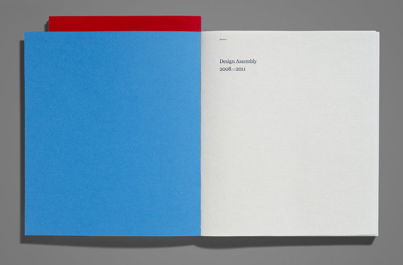
Matt Judge: DA3
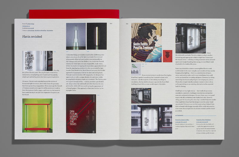
Matt Judge: DA3
Share Article
Further Info
About the Author
—
Rob Alderson is a freelance writer, editor and strategist. He was previously editor-in-chief of It’s Nice That and WePresent, and editor of Design Week. He publishes the newsletter Undo, which tries to make sense of how AI is changing design work, the design process and the design industry.

