Risograph printing is pushed to its best in Michiel Schuurman’s new book
Risograph printing is internationally loved by artists and creatives for its vibrant qualities that bring out some of the best colour and texture you can find in print. As part of the Magical Riso biennial this month, at the renowned Van Eyck Institute, independent publishers, artists and presses from around the world took part in the Magical Riso 2018. The event demonstrated how creatives at the forefront of the Risograph printing industry are pushing the medium to its furthest extremes, continuing to surprise Risograph-lovers with unexpected colour combinations and a sense of depth that is only achievable in stencil-based printing methods.
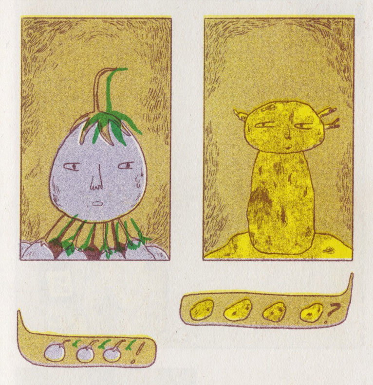
The graphic artist Michiel Schuurman was invited to the festival due to the fact that “there are some things that [he] doesn’t like about Riso.” Michiel is sceptical about the technique, he says, “it seems to be a fantastic machine for artist books and comics but its power ends there for me”. He adds, “I hate that the ink never really dries… There is also something about the way all Riso prints look alike. It’s hard to make something that really takes this ‘look’ into a new dimension”. Nevertheless, the end result produced incredible 3-dimensional effects, which in fact, demonstrates the versatility of the medium.
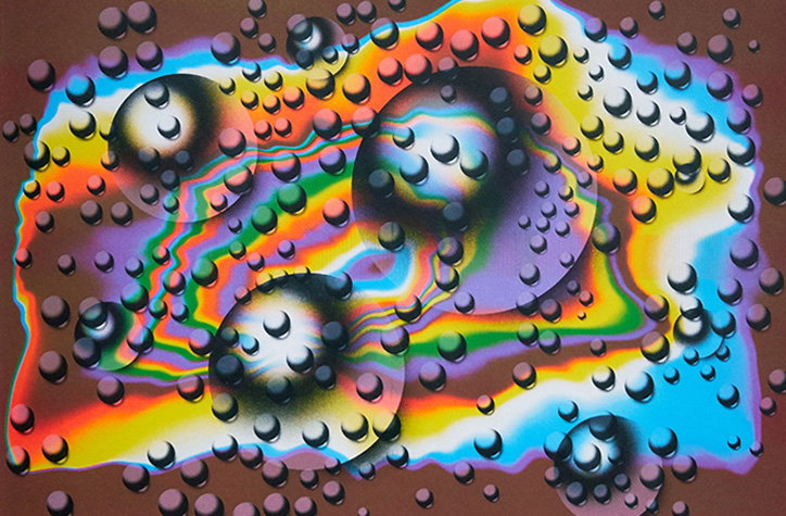
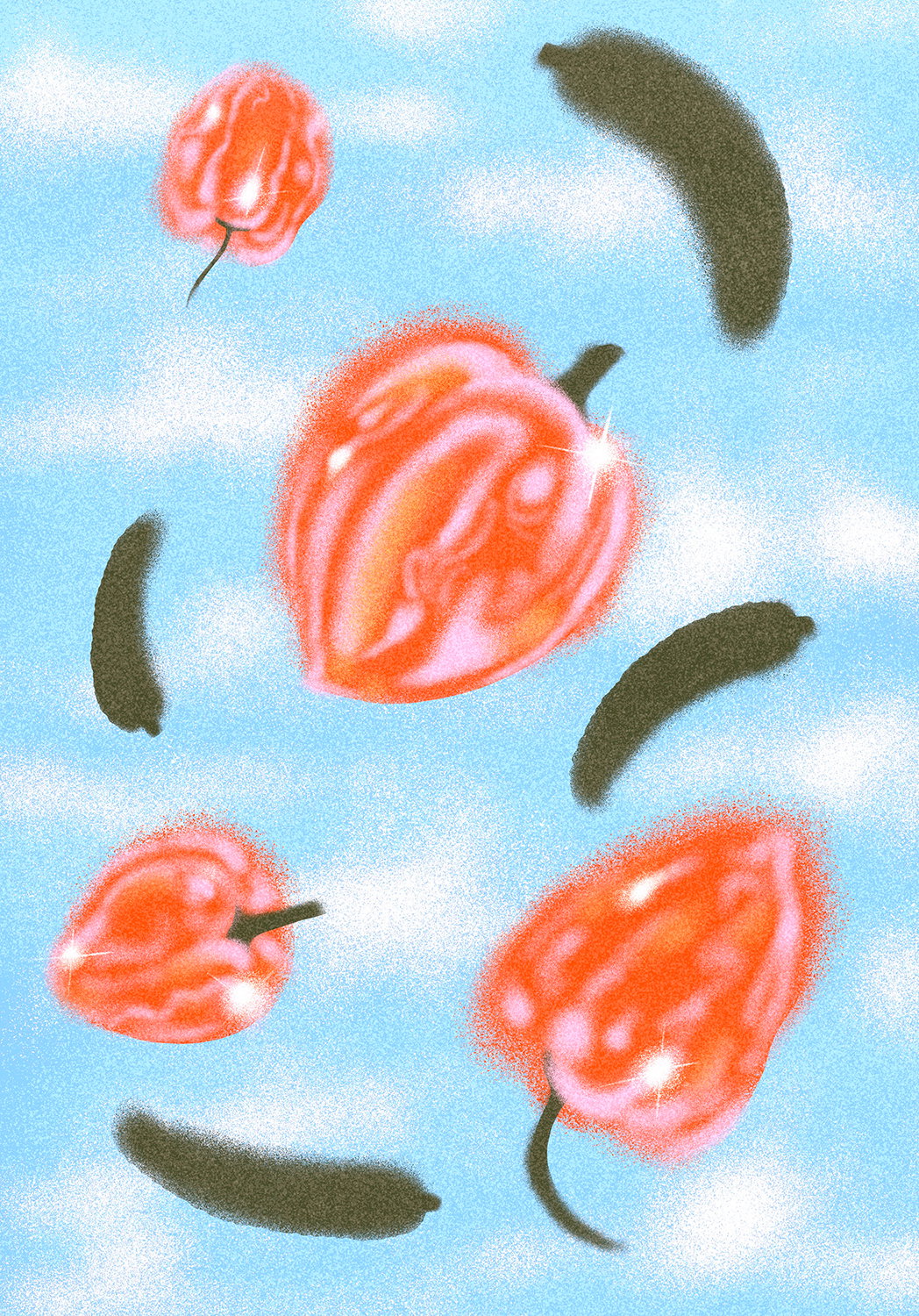
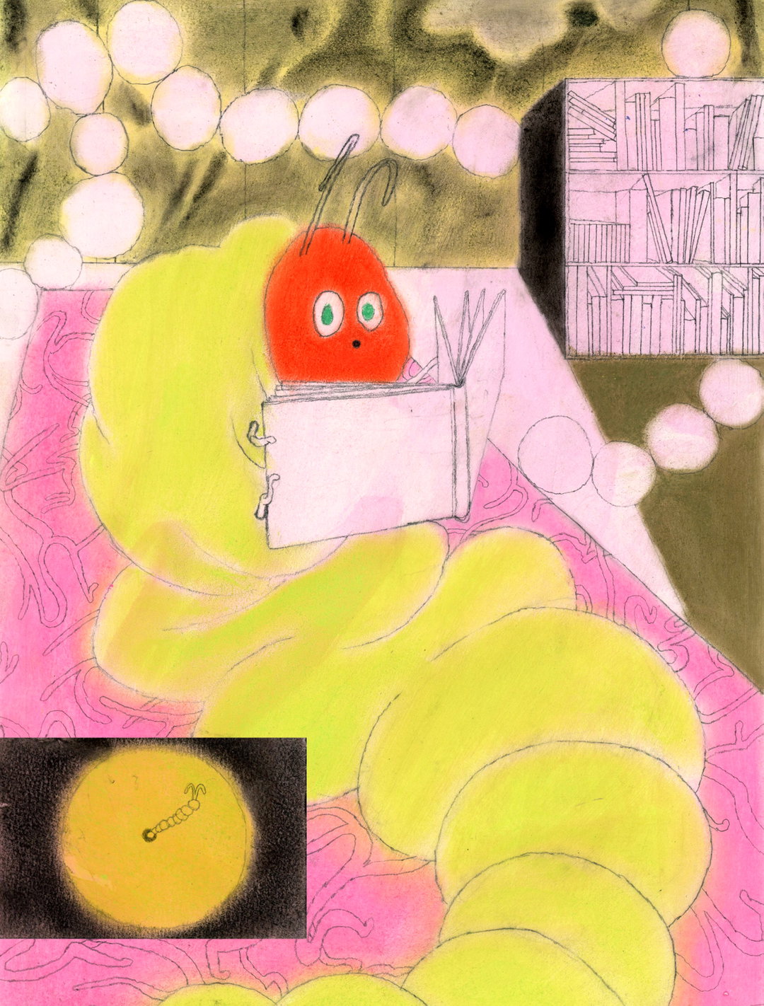
Michiel Schuurman: Master Waster
Speaking to It’s Nice That, the graphic artist says how “The Riso machine is a great tool for improvisation.” In some ways, the machine has a mind of its own, allowing for a “intuitive building of layers” that encourages experimental thinking and always produces a visually intriguing print. “There were almost no planned layers in the process, I just kept on printing layers over layers”.
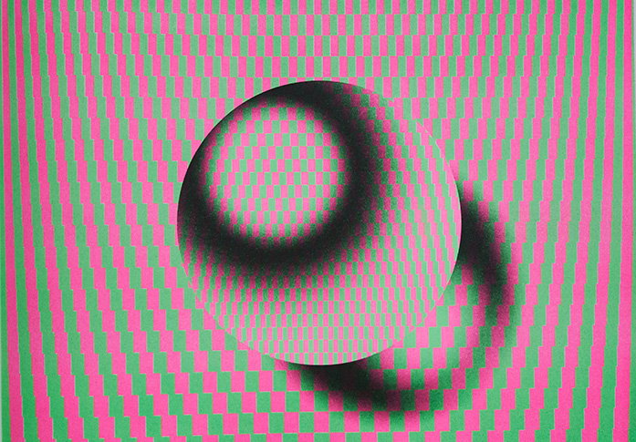
The book was produced in seven days. To create similar effects through screen printing “would have easily cost two months” due to the time-consuming preparations as well as more money in terms of human labour and acrylic paint. The book is titled, Master Waster, rooted in experimentation with the machine that Michiel felt unsure about. Starting out with some simple tests, as the days went by, Michiel realised that he should examine the printing process by repeatedly adding more and more layers. The intuitive, creative process explores “how light hits certain objects”. The prints are “all about optics and optical phenomena”, a recurring fascination for Michiel over the past few years.
The prints evoke a powerful sense of depth and creates an illusion of movement that is rarely seen in Risograph books. It comes as a result of Michiel’s powerful ‘weapon’ in the form of “beautiful powdery gradients” that the Risograph machine emits. The graphic artist adds, “I never use outlines so these kinds of gradients help make convincing photographic effects”, evidently seen in Master Waster that sees the medium of Risograph printing excelling to new heights.
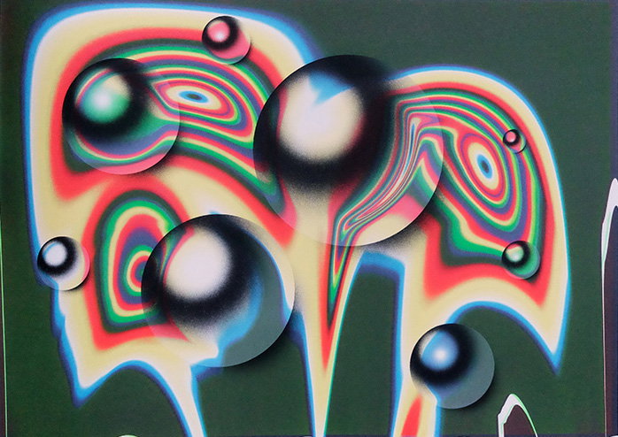
Michiel Schuurman: Master Waster
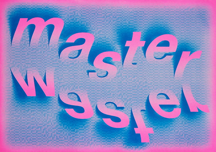
Michiel Schuurman: Master Waster
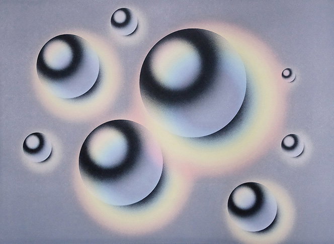
Michiel Schuurman: Master Waster
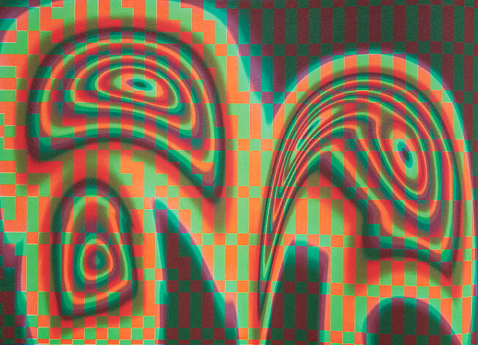
Michiel Schuurman: Master Waster
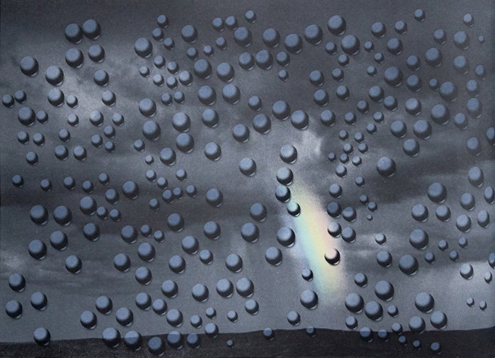
Michiel Schuurman: Master Waster
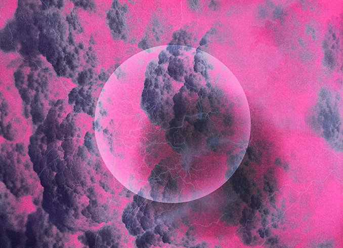
Michiel Schuurman: Master Waster
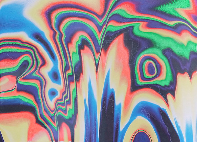
Michiel Schuurman: Master Waster
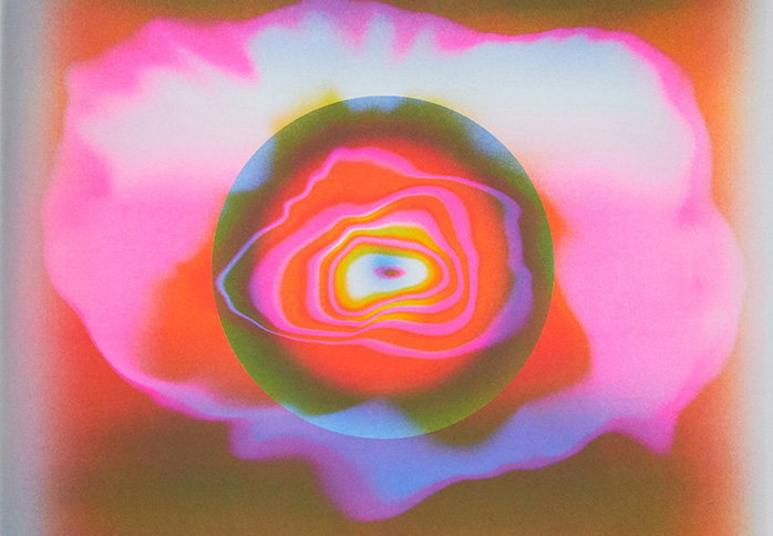
Michiel Schuurman: Master Waster
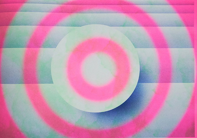
Michiel Schuurman: Master Waster
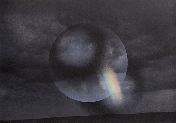
Michiel Schuurman: Master Waster
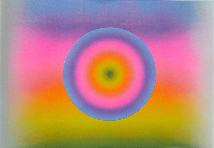
Michiel Schuurman: Master Waster
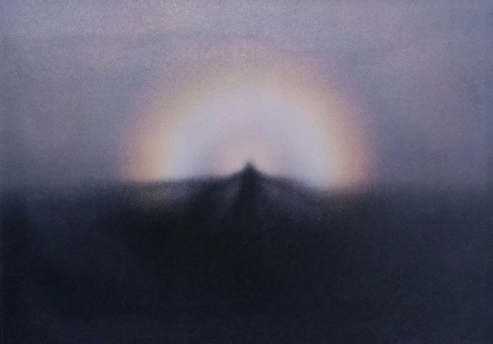
Michiel Schuurman: Master Waster
Share Article
Further Info
About the Author
—
Jynann joined It’s Nice That as an editorial assistant in August 2018 after graduating from The Glasgow School of Art’s Communication Design degree. In March 2019 she became a staff writer and in June 2021, she was made associate editor. She went freelance in 2022.