Launch Recite Me assistive technology
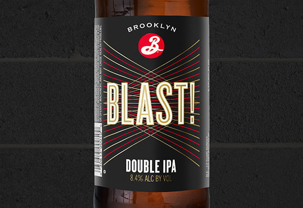
A close-up of a black beer bottle label featuring the word “Brooklyn” above a red circular logo. Below, the word “Blast!” appears in large, bold gold lettering against a backdrop of radiating red and gold lines.

Milton Glaser creates new look for Brooklyn Brewery's BLAST! IPA

—
Date
13 March 2015

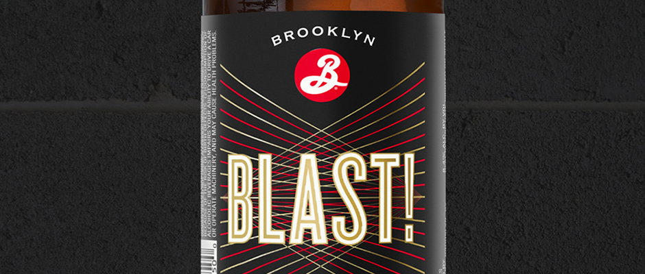
Milton Glaser has designed a new look for Brooklyn Brewery’s BLAST! IPA, working with his senior art director Sue Walsh on the project. Milton created the original designs for the bottles last year, and the new look aims to “capture more of the true energy of the beer,” according to the brand. It reckons the beer “deserved a little more oomph,” and we reckon Milton has given it just that.
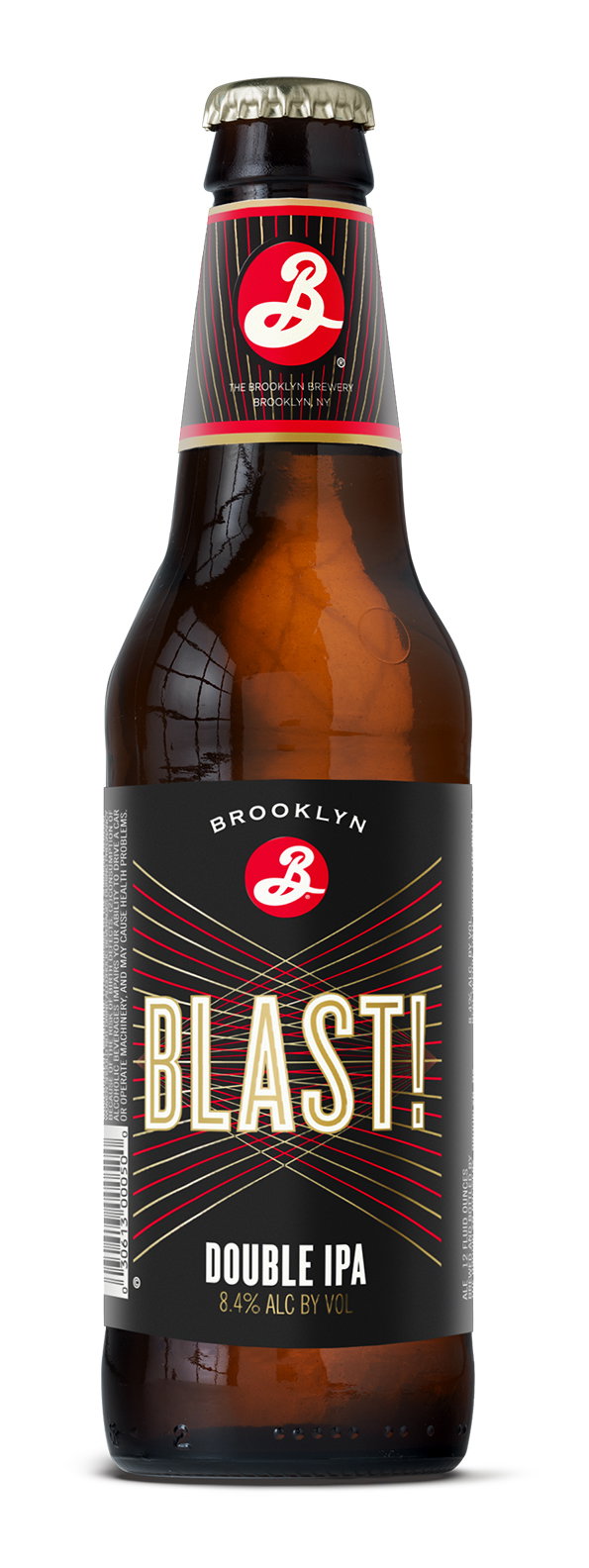
A bottle of Brooklyn Brewery “Blast!” double ipa. The black label features bold, gold typography and a red logo.
Above

Milton Glaser: Brooklyn Blast

A bottle of Brooklyn Brewery beer with a black label. The label features the word “BLAST!” in bold, cream lettering over a red and gold sunburst pattern, with “DOUBLE IPA” written below.
Above

Milton Glaser: Brooklyn Blast

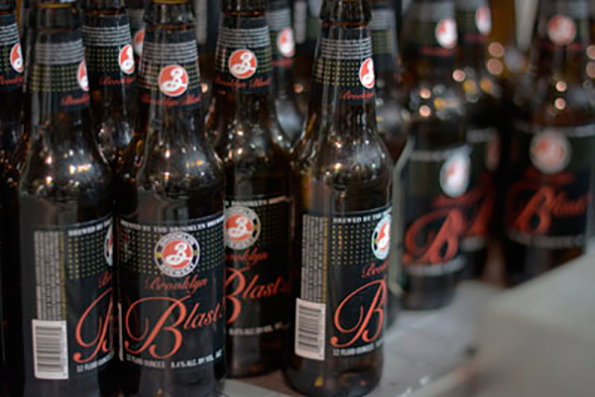
Rows of brown glass beer bottles stand closely together. The labels feature a red and white logo and the words “Brooklyn Blast”.
Above

Milton Glaser: Brooklyn Blast (old look)

Share Article

About the Author

Emily Gosling

—

Emily joined It’s Nice That as Online Editor in the summer of 2014 after four years at Design Week. She is particularly interested in graphic design, branding and music. After working It's Nice That as both Online Editor and Deputy Editor, Emily left the company in 2016.


It's Nice That Newsletters

Fancy a bit of It's Nice That in your inbox? Sign up to our newsletters and we'll keep you in the loop with everything good going on in the creative world.