Outfry’s story-driven rebrand is led by two poultry protagonists
Five years since the delivery-only Korean fried chicken brand’s founding and meteoric rise, Outfry turned to Monopo London for a lore-heavy revamp.
Share
The Korean fried chicken outfit Outfry aims to appeal to the younger generation whilst standing out in an ever-increasingly competitive market. And so, recently, it realised it needed a visual identity that packed a punch and offered a brand as desirable as grub it serves. As such, design studio Monopo London opted to imagine the chain as more of an entertainment brand than a hospitality one. “We love to imagine brands as a deconstructed film or TV series,” says Mélanie Hubert-Crozet, creative director at Monopo. “With Outfry’s heart and flavour in Korea, we saw this as a perfect opportunity to connect with the entertaining and immersive world of K-culture and inject it into Outfry.”
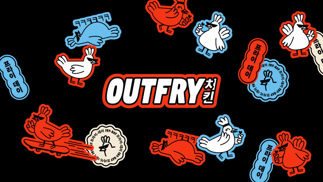
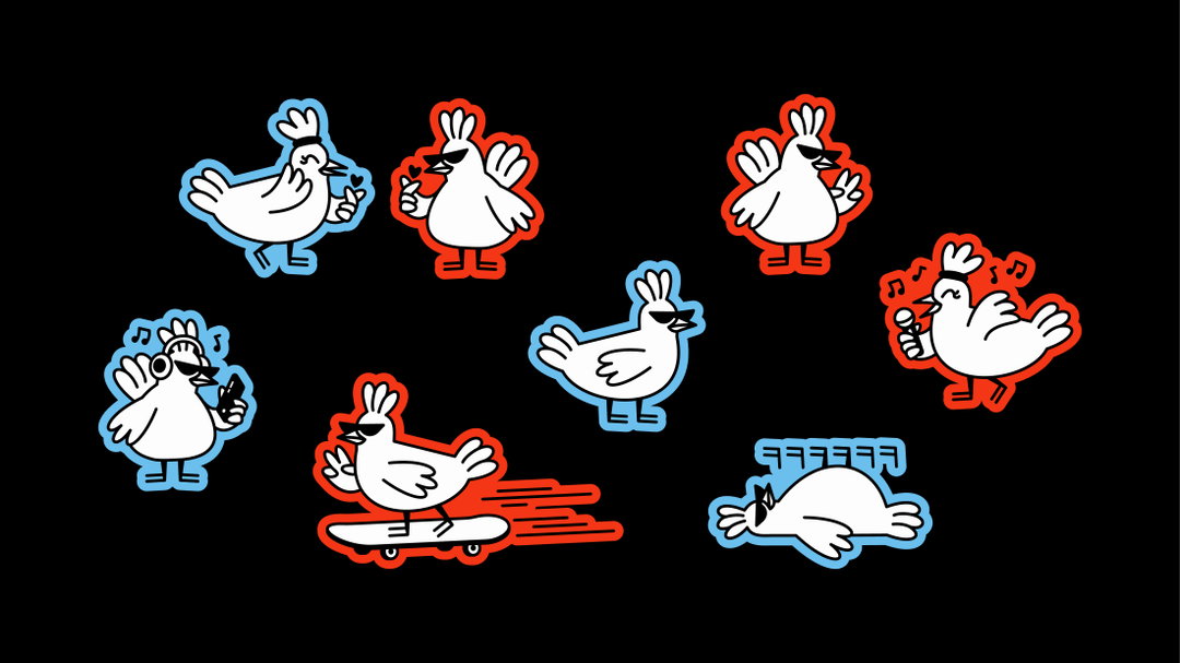
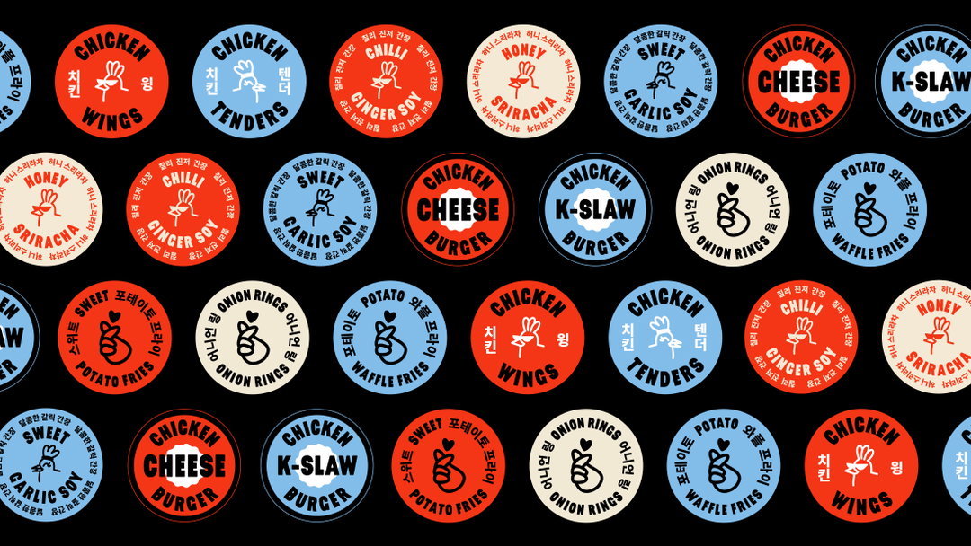
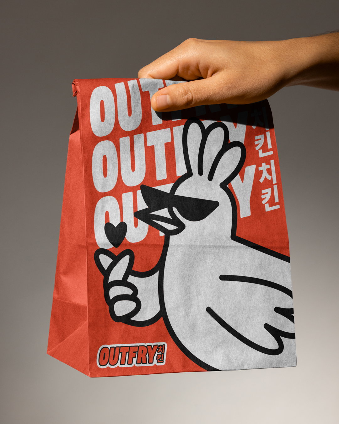
The result is a brand that feels fun and buzzy, creating a colourful energy through lively, kinetic typography, Seoul nightlife-inspired colours and stickers, and the introduction of Chuck and Cherry – Outfry’s very own mascots. “Chuck and Cherry both have distinctive attitudes,” Mélanie says. “Chuck is pretty nonchalant and effortlessly cool, whilst Cherry wears her heart on her sleeve.” The studio constructed and crafted a robust world of assets for Outfry to populate their outlets with, offering a plethora of bubbly creative expressions. “Even their feet use the ‘ㅋㅋ’ symbol,” Mélanie adds, “that indicates laughter in Korean.”
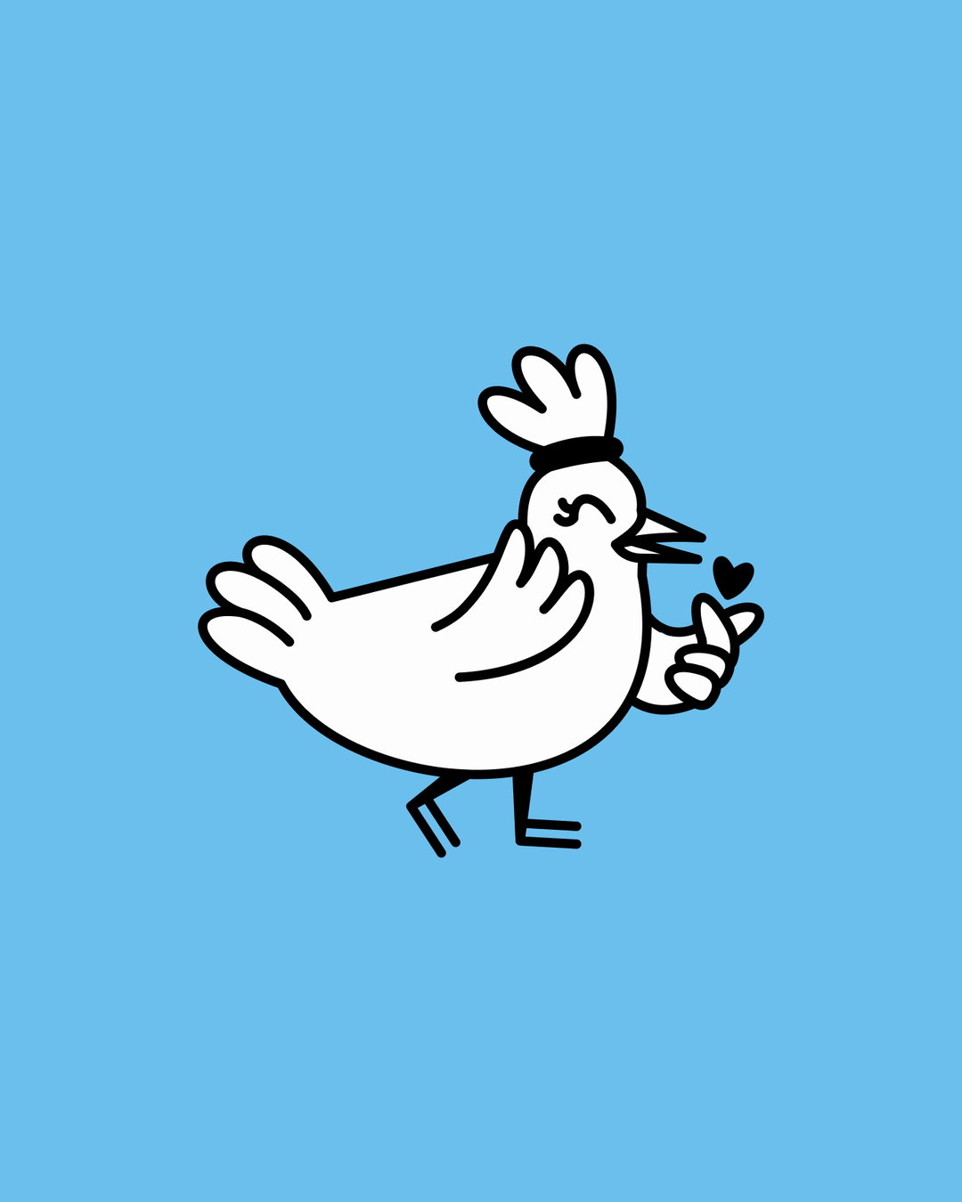
Monopo London: Outfry, Cherry (Copyright © Monopo London, 2024)
Monopo London: Outfry, Chuck (Copyright © Monopo London, 2024)
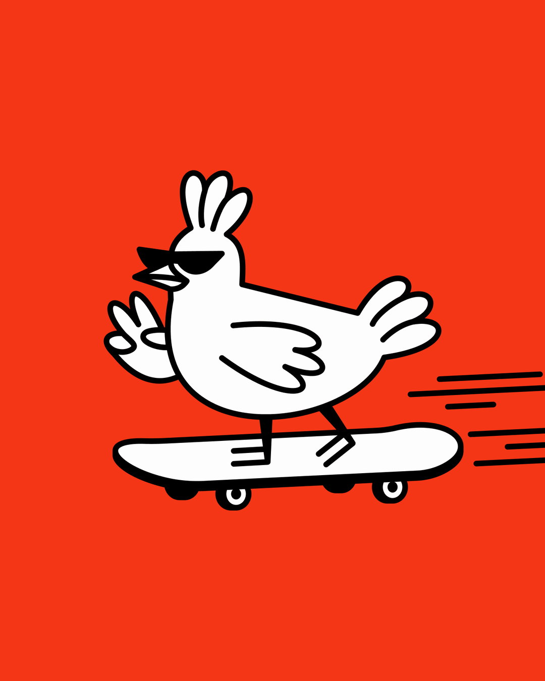
Monopo London: Outfry, Chuck (Copyright © Monopo London, 2024)
Recalling the process of Chuck and Cherry’s creation, Mélanie says, “creating a brand is a lot more than choosing a colour palette and a typography, and creating a brand that should be loved is a lot more than selling good products.” As for Outfry’s poultry protagonists, they needed to become more than just something fun for Instagram. This philosophy led the studio to challenge themselves, asking what a fictional universe for Outfry would look like. “Even if most of the lore is hidden for the actual audience, it’s a fertile ground for us, the brand and any collaborators to dream up new ideas.”
The Chaucer of our time, the story of Chuck and Cherry focuses on their travels – specifically the pair’s exploration of Korea in search of the tastiest fried chicken flavours. “They met on a summer rainy evening in the bustling streets of Hongdae in Seoul,” Mélanie says, “after finding refuge in a Korean fried chicken restaurant on a rainy day,” finding themselves in the last two available seats. “When their orders arrived mixed up, they realised they had completely opposite tastes, but united always in a love for the best fried chicken.”
Big, confident, and colourful, Outfry’s visual identity alongside the neon-soaked brand universe Monopo London created, is an interesting example of how brand storytelling doesn’t need to be uber-serious and can in fact benefit from the opposite. The fun Monopo had in its creation really comes through in the final result. “Building the visual and narrative foundations for Outfry has been hugely rewarding,” Mélanie ends. “We’re excited to see where Chuck and Cherry will go.”
GalleryMonopo London: Outfry (Copyright © Monopo London, 2024)
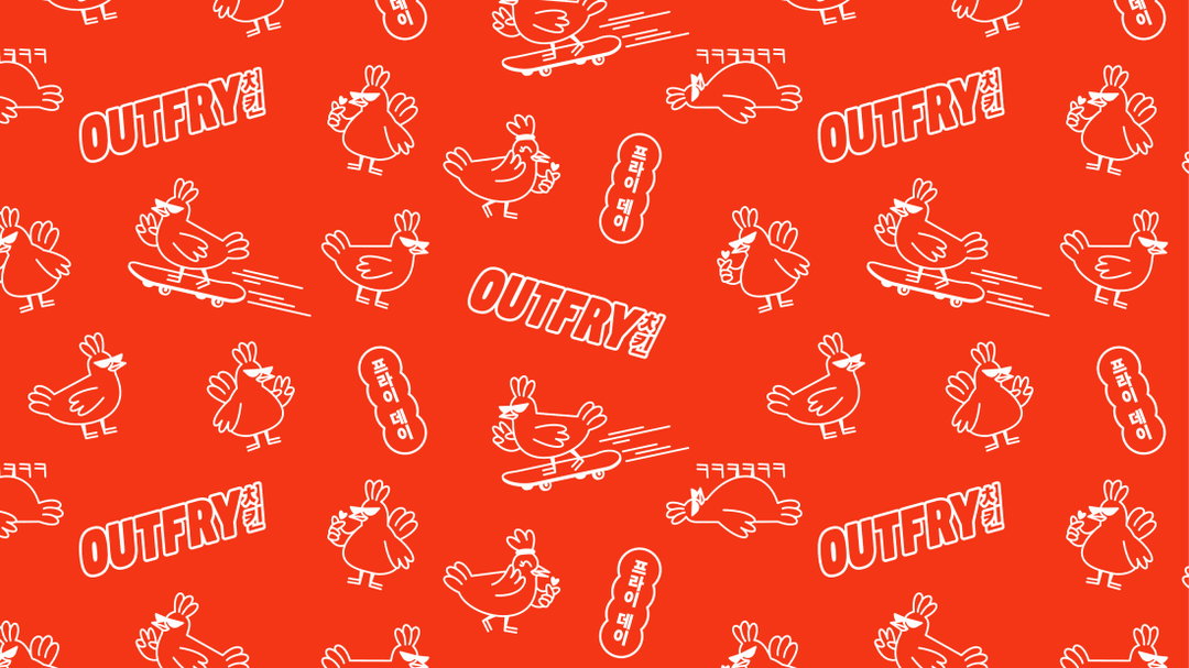
Hero Header
Monopo London: Outfry (Copyright © Monopo London, 2024)
Share Article
Further Info
About the Author
—
Hailing from the West Midlands, and having originally joined It’s Nice That as an editorial assistant in March 2020, Harry is a freelance writer and designer – running his own independent practice, as well as being one-half of the Studio Ground Floor.