



Launch Recite Me assistive technology
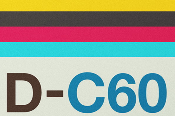
A graphic featuring horizontal bands of yellow, dark grey, magenta and cyan. Below the colours, the text “D-C60” is printed in a bold sans-serif typeface.

Graphic Design: Neil Stevens pays homage to cassette graphics in his prints

—
Date
24 June 2013

Nostalgia for the musical formats of decades past is a preternaturally powerful force, as we’re all well aware. Tapping into our lust for this kind of thing, Neil Stevens’ series of prints Don’t Forget The Cassette celebrates the aesthetics of the age of the mixtape, turning their bold colours and simple typography into really nice prints. Looking at them, it’s startling how quickly you are pulled back to your teenage bedroom, hunched over your stereo as you try and stop the tape at just the right moment to cut off the DJ’s voice. Simple, beautiful and memory-rich – we’ll take the whole lot Neil.
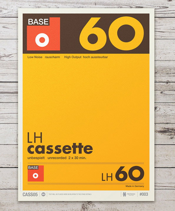
A graphic poster inspired by a cassette tape sleeve in yellow, orange and brown. Bold text reads “BASE”, “60” and “LH cassette”, with smaller details including “unrecorded 2 x 30 min.” and “Made in Germany”.
Above

Neil Stevens: Don’t Forget The Cassette
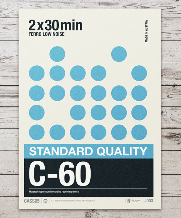
A graphic poster featuring a grid of light blue circles on a cream background. Text at the top reads “2x30 min” and “FERRO LOW NOISE”, while a blue banner below reads “STANDARD QUALITY”. A large black block at the bottom contains the text “C-60” in bold white letters.
Above

Neil Stevens: Don’t Forget The Cassette
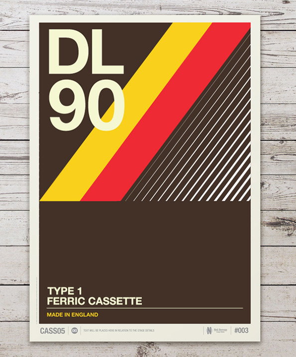
A graphic poster with a brown, yellow and red colour palette. Bold text at the top reads “DL 90”, while the bottom section reads “TYPE 1 FERRIC CASSETTE” and “MADE IN ENGLAND”.
Above

Neil Stevens: Don’t Forget The Cassette
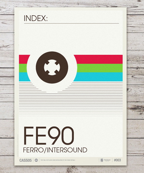
A graphic poster featuring a central white circular shape containing a brown abstract symbol. Red, green and blue horizontal bands stretch across the middle, above a series of thin grey lines. The bottom of the page reads “FE90” and “FERRO/INTERSOUND”, with “INDEX:” written at the top.
Above

Neil Stevens: Don’t Forget The Cassette
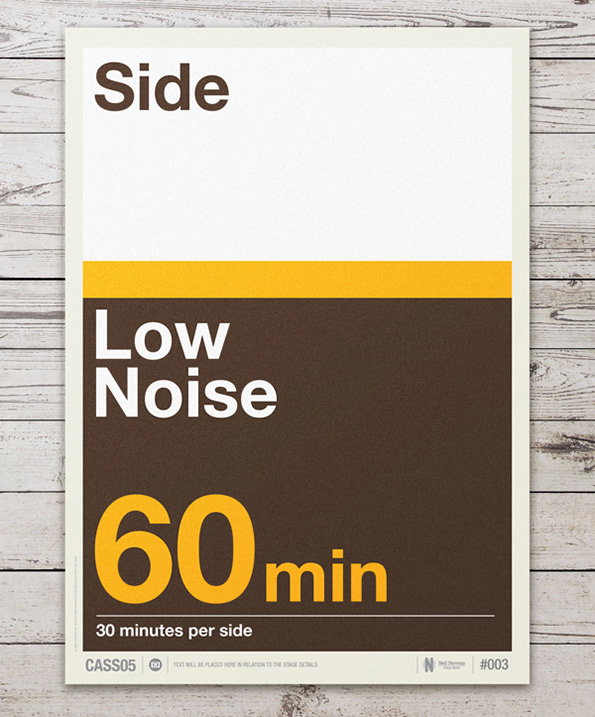
A typographic poster with a white top half and a dark brown bottom half, separated by a yellow stripe. Bold text reads “Side”, “Low Noise” and “60 min”, with a smaller line below stating “30 minutes per side”.
Above

Neil Stevens: Don’t Forget The Cassette
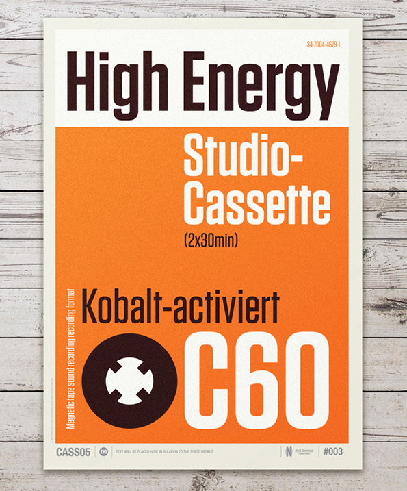
A graphic poster for a “High Energy Studio-Cassette” in orange, white and dark brown. The text includes “(2x30min)”, “Kobalt-activiert” and a large “C60” next to a cassette tape reel.
Above

Neil Stevens: Don’t Forget The Cassette
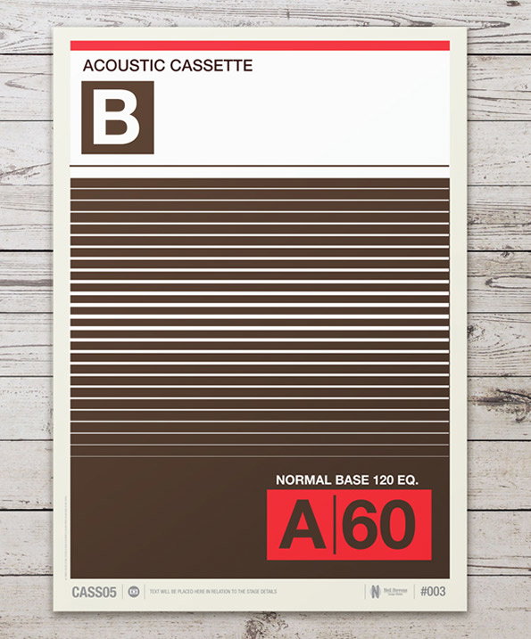
A graphic poster designed to look like a cassette tape label. It features a brown and white colour palette with the words “ACOUSTIC CASSETTE” and a large letter “B” at the top. The centre is filled with horizontal brown and white stripes. A red block at the bottom contains the text “NORMAL BASE 120 EQ.” and “A 60”.
Above

Neil Stevens: Don’t Forget The Cassette
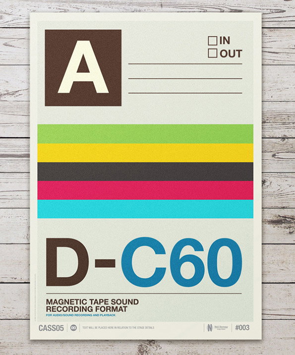
A graphic poster designed to look like a cassette tape label. It features a large letter “A”, checkboxes for “IN” and “OUT”, and a series of colourful horizontal stripes. Bold text at the bottom reads “D-C60” and “MAGNETIC TAPE SOUND RECORDING FORMAT”.
Above

Neil Stevens: Don’t Forget The Cassette

Share Article

About the Author

Rob Alderson

—

Rob Alderson is a freelance writer, editor and strategist. He was previously editor-in-chief of It’s Nice That and WePresent, and editor of Design Week. He publishes the newsletter Undo, which tries to make sense of how AI is changing design work, the design process and the design industry.


It's Nice That Newsletters

Fancy a bit of It's Nice That in your inbox? Sign up to our newsletters and we'll keep you in the loop with everything good going on in the creative world.
