




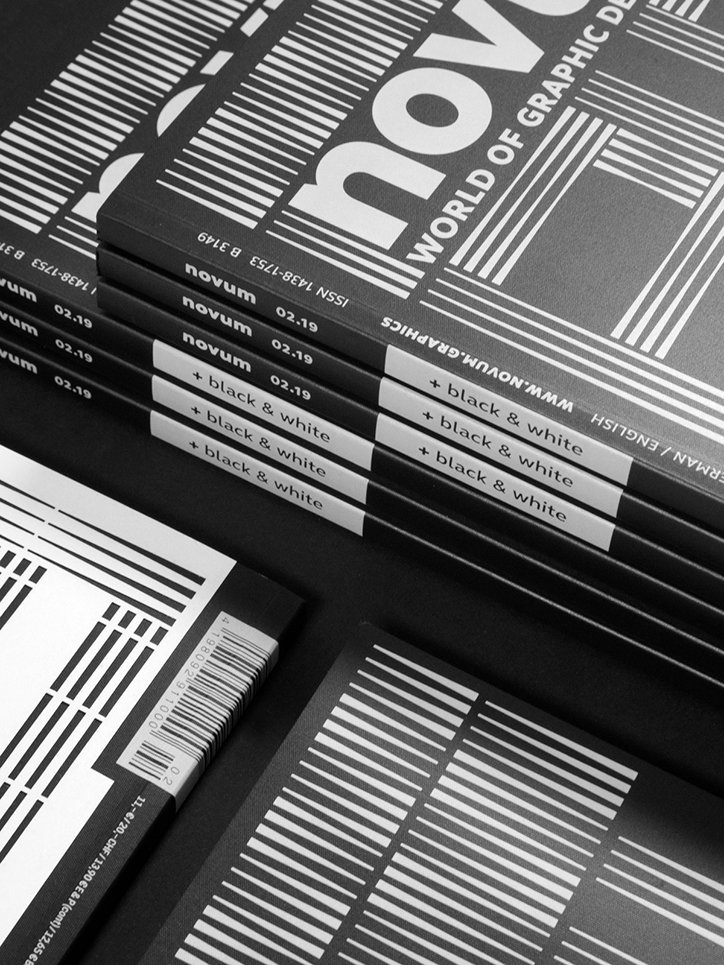
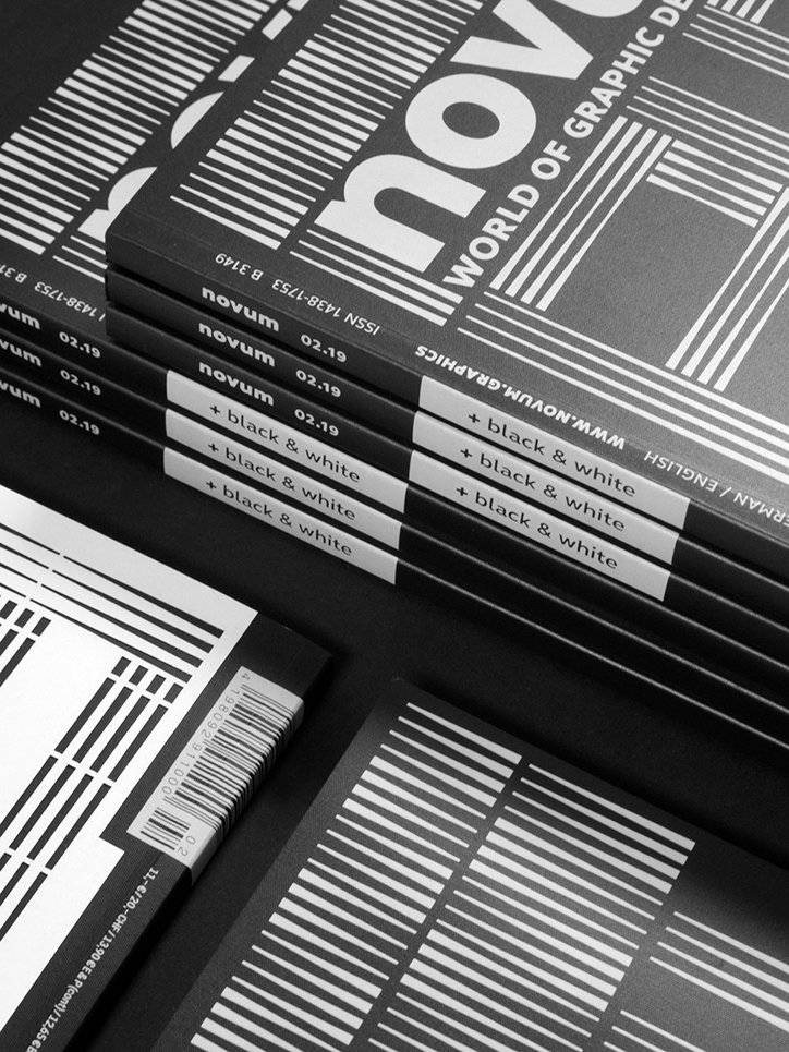
Novum magazine goes “back to basics” with a black and white handmade cover
It may come as a surprise to some, that the art and design magazine, Novum, has been running since 1924 and, somehow, we’ve never written about it. First conceived under the title Gebrauchsgraphik, the long-standing magazine is regarded as “one of the leading design magazines,” presenting works from corporate and packaging design to illustration and graphic design.
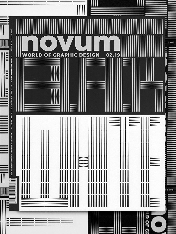
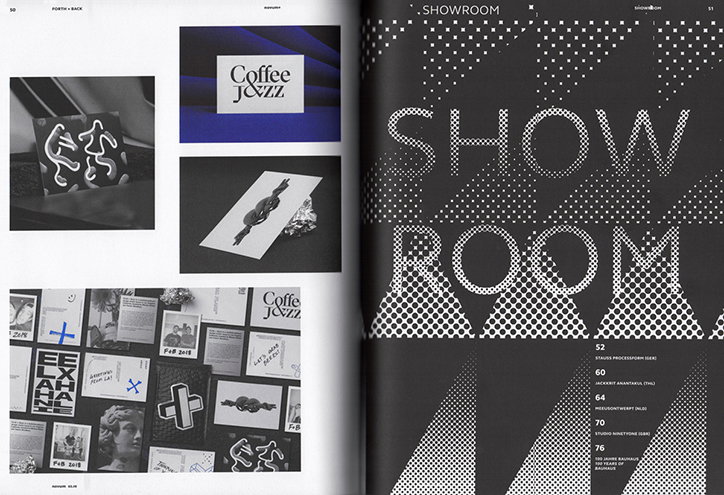
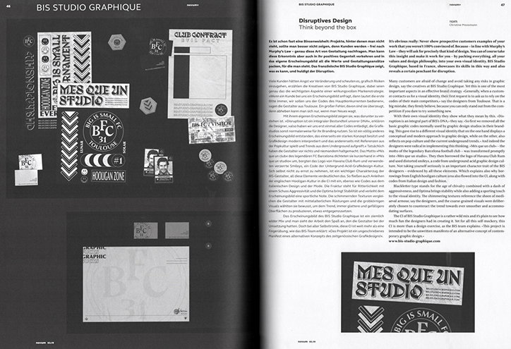
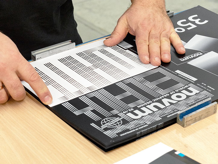
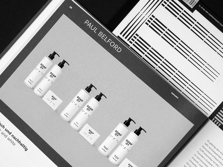
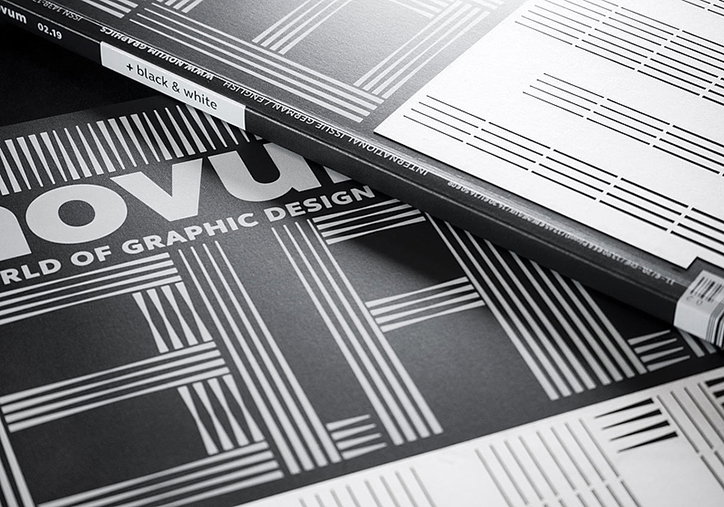
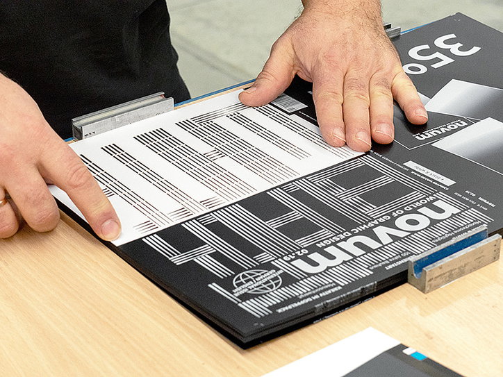
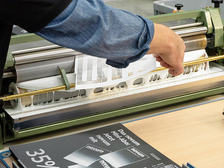
In its latest issue, published this month, Novum focuses on the bold and ever-popular black and white design aesthetic. The magazine commissioned Munich-based studio Melville Brand Design to design the front cover; emphasising the monochromatic contrast with a handmade cover for the entire print run. On the handmade cover, designer Lars Harmsen tells It’s Nice That: “The challenge was enormous. Would it even be possible to laser-cut an artwork on a cover, not for a single production, but for a large print run?”
With a lot of planning, the designers came up with the following solution. “First, the logo and word ‘black’ was printed in white on a 350 gsm AstroKing black cardboard. Laser-cutting directly onto the board would have produced too much black dust, so we opted to produce the second half of the cover by laser cutting the word ‘white’ into a 250 gsm AstroKing white paper.” The two delicate layers were then laminated together, again all by hand, to produce a highly personalised magazine cover.
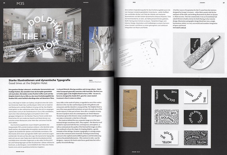
“The mostly hand-finished cover plays with contrast in multiple ways,” further explains Lars. The relationship between the handmade and the computer-generated adds to the distinction between black and white. Within the magazine’s contents, Novum features well-designed examples of black and white products. For instance, an old edition of Mary Shelley’s Frankenstein illustrated by Martin Stark, as well as a visual identity for the Dolphin Hotel, not to mention black and white brand packaging for a soap company designed by Paul Belford.
Lars ends by saying: “Black and white is a timeless duo. It means going back to basics and focuses on the power of reduction.” The cover creates a strong, negative space-inspired design which in turn, “refers to the space around and within the design”. With a visually impactful cover, crafted with care and by hand, Novum’s latest issue exemplifies the understated power of black and white and showcases why studios around the world will never stop using it.
Novum Magazine
Novum Magazine
Novum Magazine
Novum Magazine
Novum Magazine
Novum Magazine
Novum Magazine
Novum Magazine
Novum Magazine
Share Article
Further Info
About the Author
—
Jynann joined It’s Nice That as an editorial assistant in August 2018 after graduating from The Glasgow School of Art’s Communication Design degree. In March 2019 she became a staff writer and in June 2021, she was made associate editor. She went freelance in 2022.