Optical Arts is a design studio that deals in optical illusions, in-camera worlds and unobvious choices
Rooted in physicality and driven by a desire to push the 3D space to its maximum, this studio proves why many creative brains are much better than one.
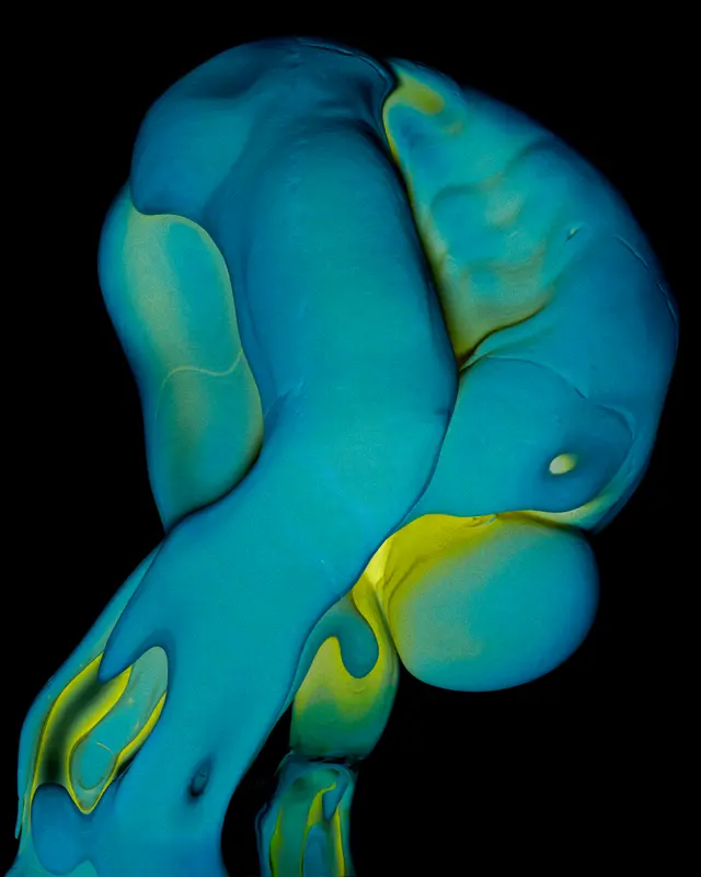
Optical Arts is one of the slickest collaborative studios in London, specialising in CGI and motion design for clients such as Apple, Channel 4, Nike and Dyson. Whether creating idents for television or advertisements for Australia’s largest phone network Telstra, Optical Arts opt for unexpected choices by animating cancer cells, inflatable office desks and the meticulous deconstruction of a hair wrap (in a tasteful ‘apricot topaz’ colourway, it must be mentioned). Creative directors Fabrice Le Nezet and Joe Jackson spoke to It’s Nice That about the beauty of creating motion design for such giant clients, especially the studio’s work in collaboration with 4Creative, Art Practice and Lovesong, directing new idents for Channel 4.
The four ‘scenes’ the studio delivered for Channel 4’s rebrand were created in response to the overall project themes of ‘identity’, ‘love’, ‘release’, ‘system’ and the ‘the land’. The studio created scenes titled: Shattering Room, Chemicals, Digital tracking and Robotic fulfilment centre; every looping scene (of which there’s 25 created by 17 different creatives), blends effortlessly together to create a coherent master ident, representing different elements of British life and in turn, the broad spectrum of the British creative scene.
“Among all the commercial projects I’ve worked on, the one for Channel 4 remains particularly special to me. As a director, it’s actually quite rare to work alongside other directors on the same piece. At first, I was a bit worried that the result might feel patchy. In fact, the opposite happened, the juxtaposition of different voices and styles is precisely what makes the project so beautiful,” says Fabrice. “Each director focused on their own segment and was largely unaware of what the others were doing. When I first saw the final ident, elevated by that beautiful voiceover, I found it surprisingly deep and emotional.”
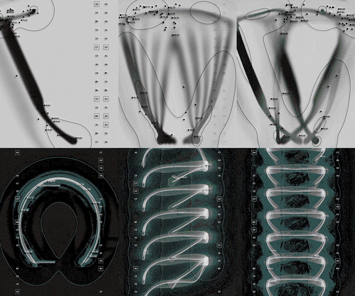
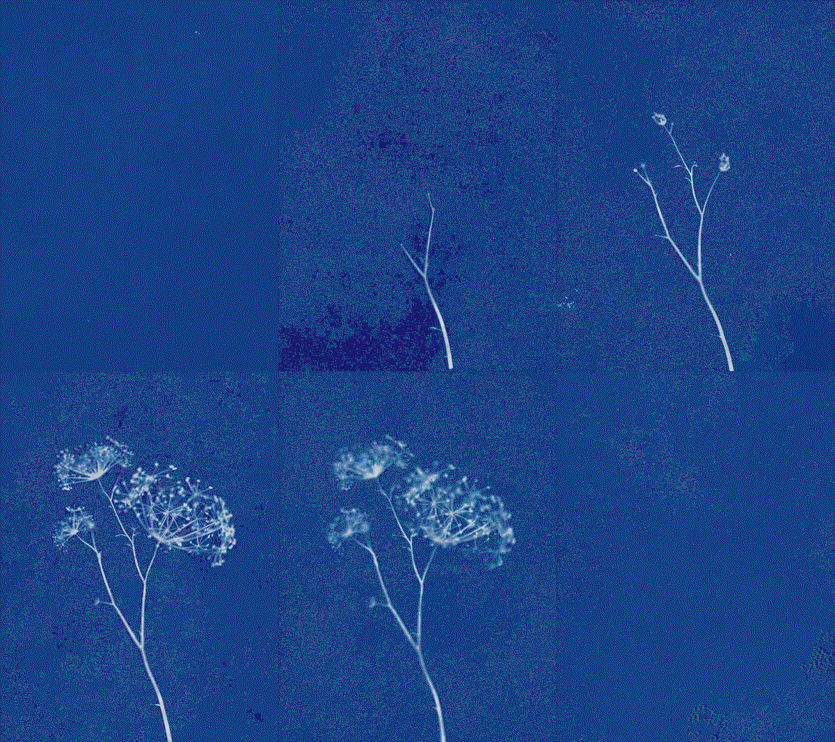
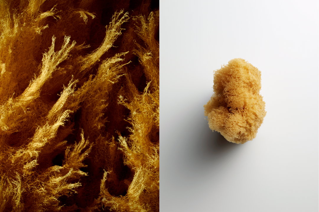
Whereas the Channel 4 idents were a massive collaborative effort, other projects are self-initiated studio projects, such as what Joe calls the “textural studies” in Ignis and Odyssey. The studio takes a moment to use any free time during commercial projects as a space to experiment. “I’m forever in awe of what the artist can create from an empty screen and the freedom from physical constraints – but I’m most at ease in the studio with physical objects, textures, cameras and lighting,” says Joe. This is what fuses the studio’s creative visions together, a love for 3D spaces and digital artistry alongside physical photography and filmmaking. In the studio’s most recent design work creating the Apple TV animated logo, Joe is strong to his word, as everything you see is in fact captured in-camera using real glass and lights, shot in the studio and fine tuned in post production. “I get excited by a brief that has a problem to solve with time to research and develop the solution, a luxury that is getting rarer and rarer for all creatives, I think,” says Joe.
The studio looks for references in classical paintings, sculptures, film, illustration in an attempt to avoid the algorithmic feedback loop of seeing the same image references everyone else does – so it makes sense that, in the Channel 4 idents, Fabrice took inspiration from automated warehouses, microscopic cell footage and crowd-tracking software. “I love looking at images that weren’t designed with aesthetic intent, working at extracting the inherent beauty within them to build a visual language,” says Fabrice. With the Apple TV project, the cinematic potential of the camera was the primary influence, with Odyssey, Ignis, and Order in Space, influences include Hiroshi Sugimoto’s multi-decade spanning concept of “theaters” and Berenice Abbott’s scientific photography.
“Design and lighting are truly the backbones of our practice. These elements drive most of our decisions and strongly shape our visual language,” says Fabrice, with Joe adding: “For us, there is huge importance in making our work feel tactile with foundations in reality. Every element needs a reason to be there; a camera move is used to enhance and not to hide; three lights can be reduced to one considered light placement. In an environment where everything is clambering for our attention, I think there is a beauty in simplicity, and an edit that lingers on a shot a little bit longer, an idea that makes the viewer work a little bit harder to understand what they are viewing.”
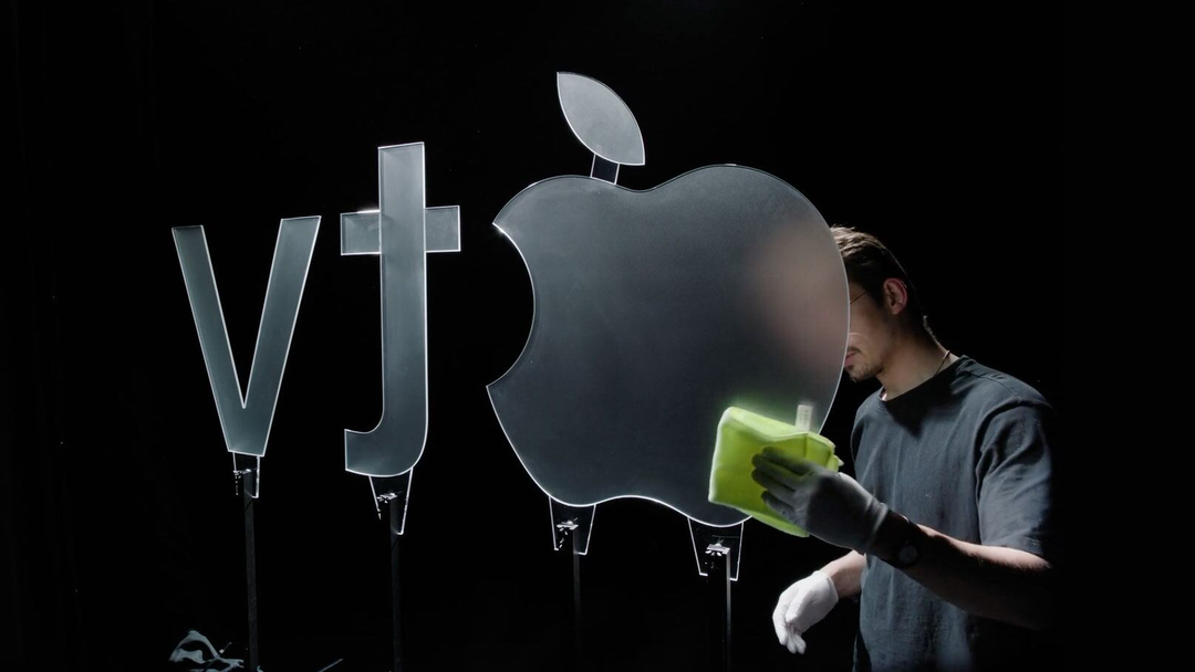
Optical Arts: Apple TV (Copyright © Optical Arts, 2026)
GalleryOptical Arts: Works (Copyright © Optical Arts, 2026)

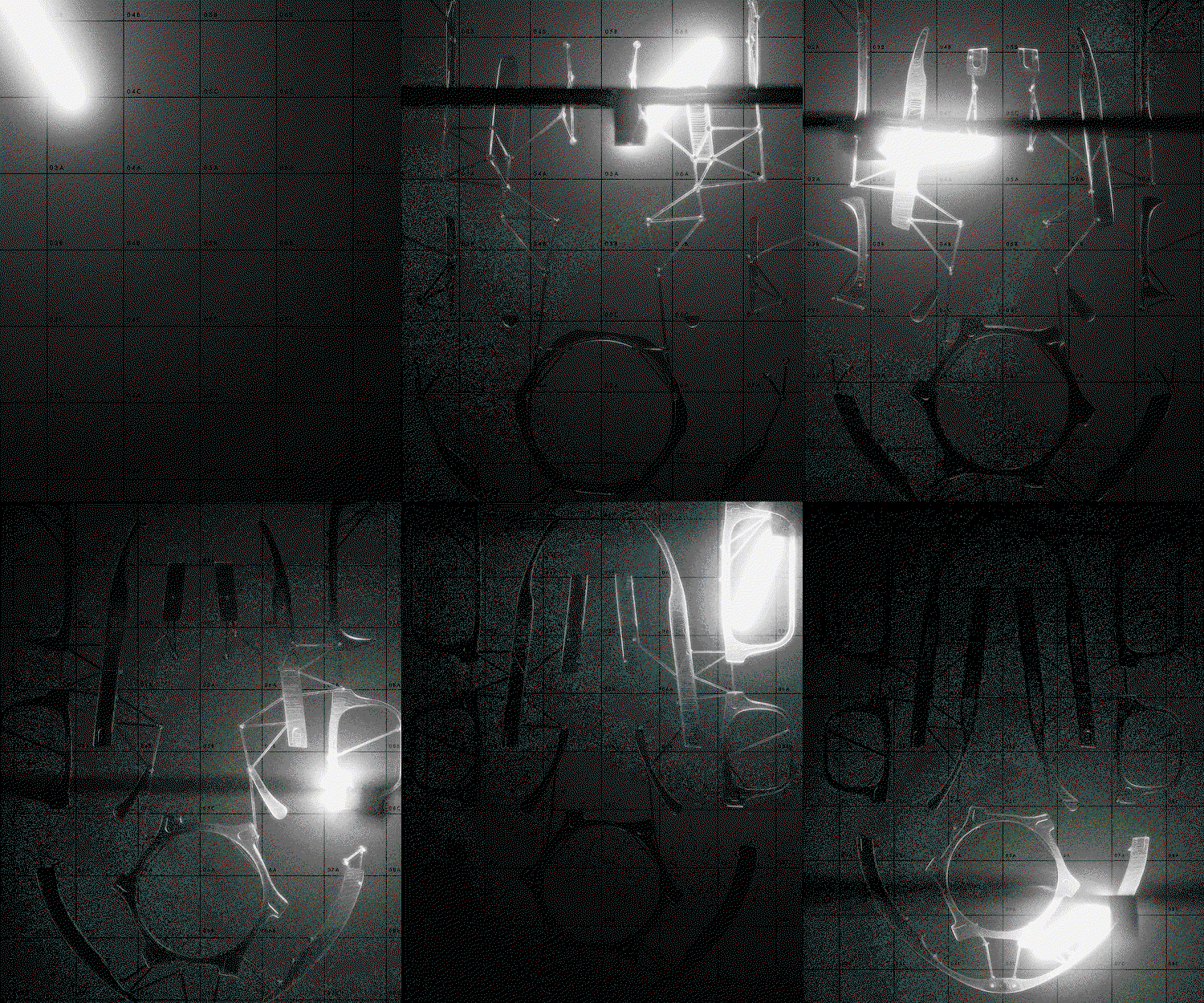
Hero Header
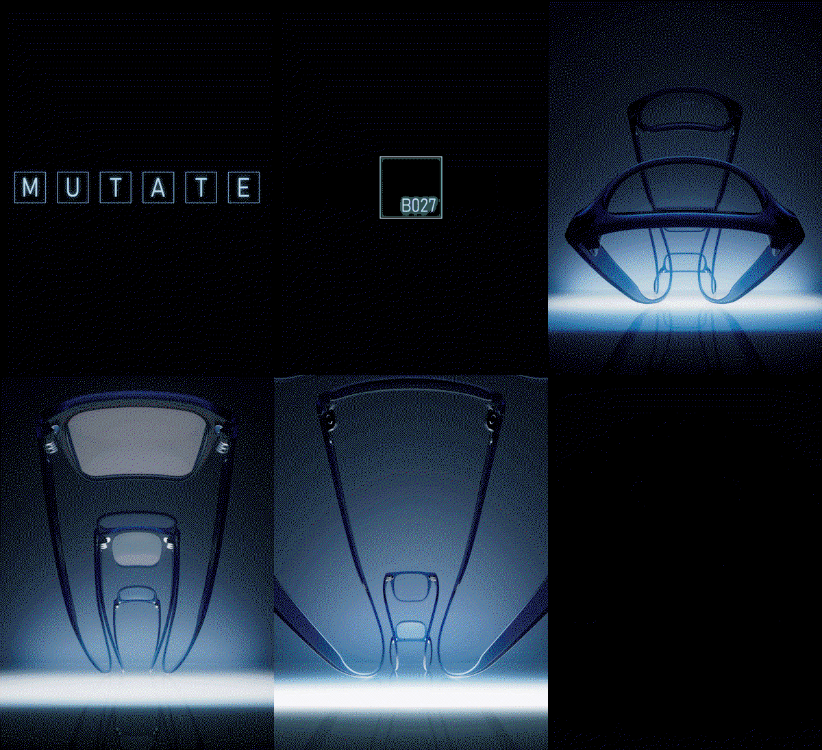
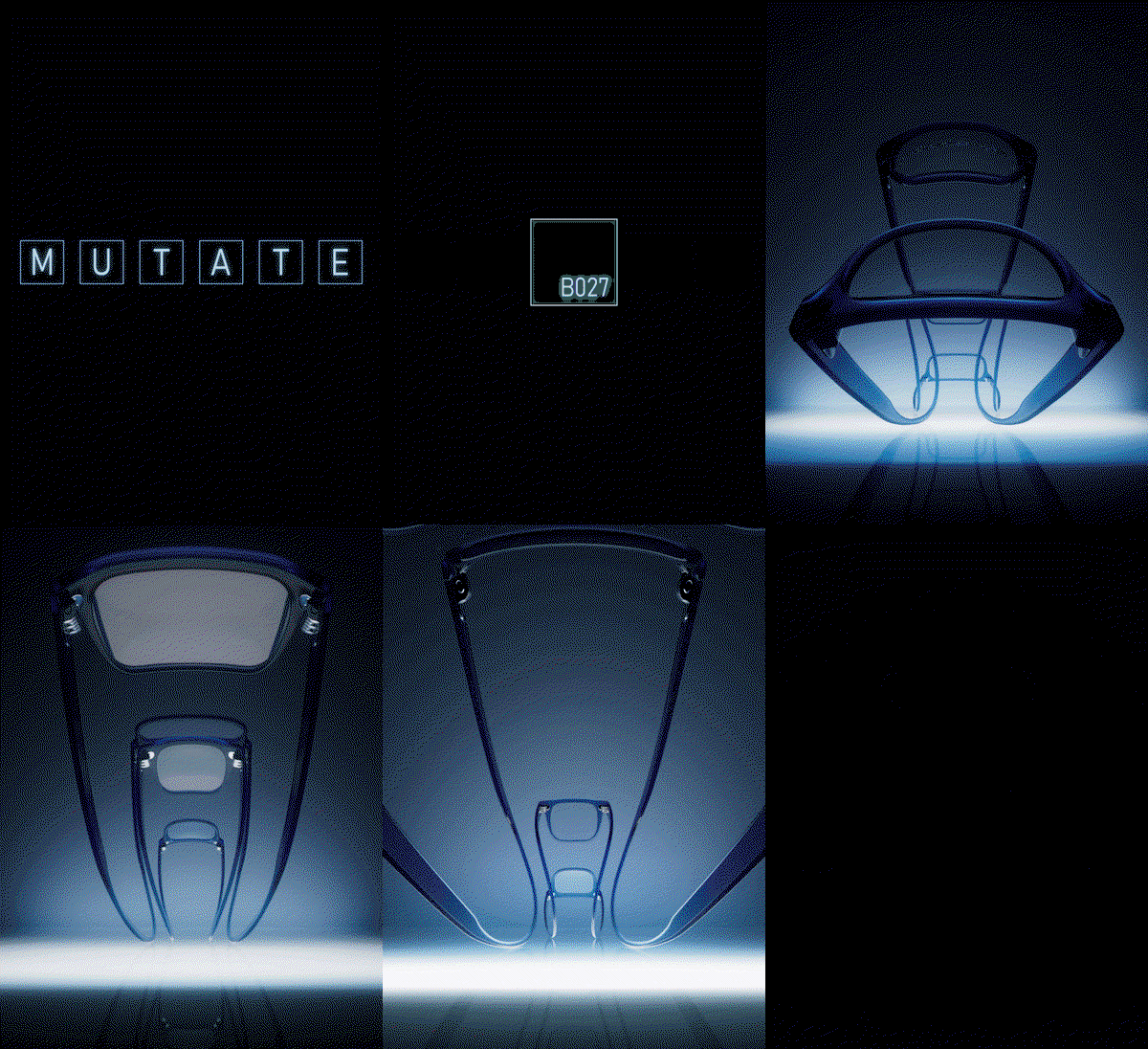
Optical Arts: Mutate (Copyright © Optical Arts, 2026)
Share Article
Further Info
About the Author
—
Paul M (He/Him) is a Junior Writer at It’s Nice That since May 2025. He has a strong interest in graphic design, digital kitsch, multimedia painting, collage, nostalgia, analogue technology and all matters of strange stuff. pcm@itsnicethat.com
To submit your work to be featured on the site, see our Submissions Guide.