Launch Recite Me assistive technology
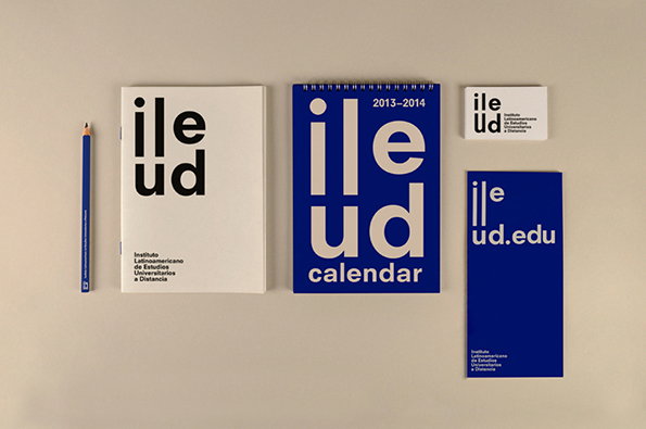
A blue and white stationery set for the “Instituto Latinoamericano de Estudios Universitarios a Distancia”. The collection includes a notebook, a spiral-bound calendar, a business card and a brochure.

Barcelona-based P.A.R studio create neat identity for academic institution

—
Date
25 November 2014

There’s a whole heap of great design studios in Barcelona with which we’re very familiar but it’s always a joy to discover talent we haven’t come across before. Such is the case with P.A.R, a graphic design and art direction studio run by Iris Tarraga and Lucía Castro. The way they talk about their approach eschews any kind of bullshit, as they write on their website: “Our methodology is simple: We listen to our clients, we understand their needs and we solve them. Our style is clear and direct, we take care of the balance and harmony in our designs, we use typography and colour accurately, we believe in functional design.”

There’s a whole heap of great work on their site but their branding really stands out. This identity for the Instituto Latinoamericano de Estudios Universitarios a Distancia, a new kind of distance learning institution, is bold and memorable, with the wordmark built around the elongated “il” and great-looking posters that are much better than the vast majority of educational collateral we see.

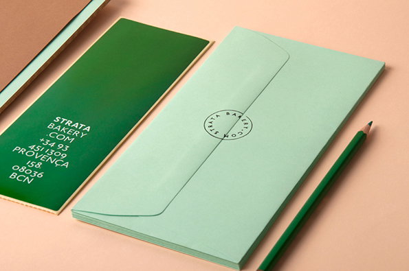
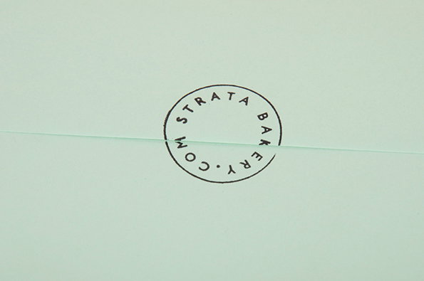
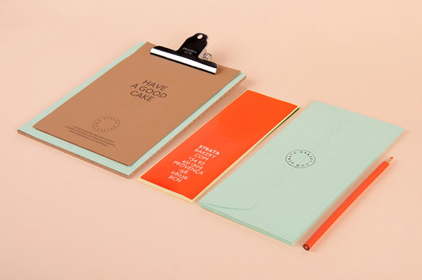
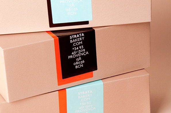
A slightly older project, the Strata artisan bakery work takes an area beset with some well-worn hipster cliches and acknowledges their strengths while navigating a well-considered path through them.
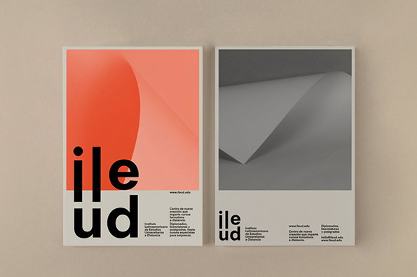
Two brochures side by side against a neutral background. The left features a red gradient curve and bold black typography reading “ile ud”, while the right shows a grey 3D render of a folded sheet of paper.
Above

P.A.R: Instituto Latinoamericano de Estudios Universitarios a Distancia
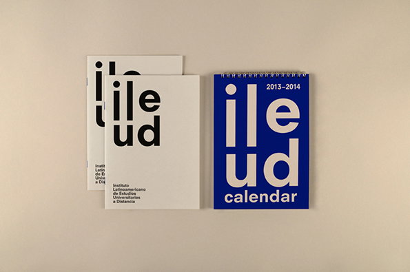
Two white notebooks and a blue spiral-bound calendar are laid out against a plain background. The items feature bold, lowercase typography reading “ileud” and the full name “Instituto Latinoamericano de Estudios Universitarios a Distancia”. The calendar is dated “2013–2014” and includes the word “calendar” at the bottom.
Above

P.A.R: Instituto Latinoamericano de Estudios Universitarios a Distancia
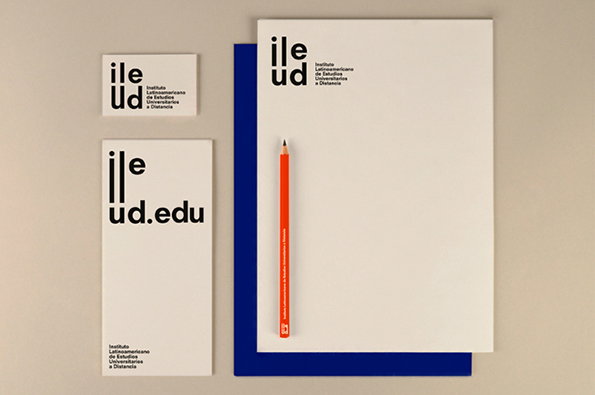
A stationery set for the “Instituto Latinoamericano de Estudios Universitarios a Distancia”, featuring a business card, letterhead and envelope. The branding uses a bold, black typographic logo that reads “ileud”. An orange pencil rests on the white paper against a deep blue background.
Above

P.A.R: Instituto Latinoamericano de Estudios Universitarios a Distancia
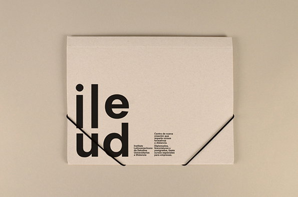
A beige paper folder is tied shut with a thin black string. Bold black typography on the left reads “ileud”, with a block of smaller Spanish text to the right.
Above

P.A.R: Instituto Latinoamericano de Estudios Universitarios a Distancia
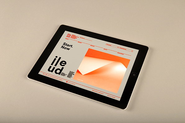
A tablet lies on a plain surface, displaying a website with a minimalist layout. The screen features a bold “Start. Now.” headline and a large, orange abstract image of folded paper.
Above

P.A.R: Instituto Latinoamericano de Estudios Universitarios a Distancia
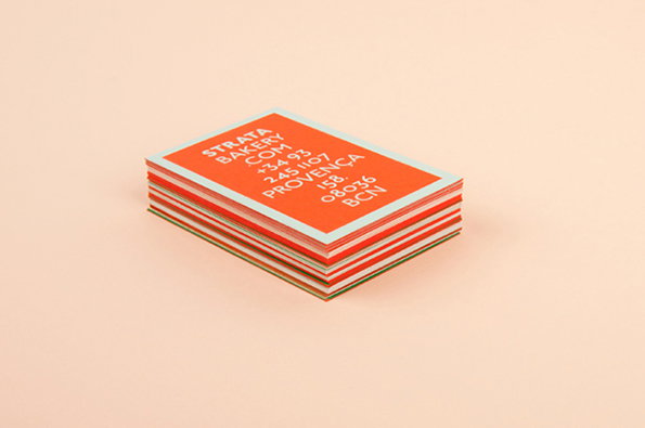
A stack of business cards on a pale pink background. The top card is bright orange with white text that reads “STRATA BAKERY COM”, followed by a phone number and the address “PROVENCA 158, 08036 BCN”.
Above

P.A.R: Strata

Stationery for “Strata Bakery” laid out on a pale pink surface. A dark green card lists the bakery’s contact details and Barcelona address, alongside a stack of mint green envelopes and a matching green pencil.
Above

P.A.R: Strata

A circular black stamp on a pale mint green background reads “STRATA BAKERY” and “STRATA.COM”. The stamp is positioned across a subtle horizontal fold in the paper.
Above

P.A.R: Strata

Stationery for Strata Bakery in mint green, orange and brown. A clipboard holds a brown card that reads “HAVE A GOOD CAKE”, alongside a matching envelope and a business card.
Above

P.A.R: Strata

Three stacked beige cardboard boxes, each with a colourful label. The middle label is black with white text that reads “Strata Bakery .com” followed by a phone number and address.
Above

P.A.R: Strata

Share Article

Further Info

About the Author

Rob Alderson

—

Rob Alderson is a freelance writer, editor and strategist. He was previously editor-in-chief of It’s Nice That and WePresent, and editor of Design Week. He publishes the newsletter Undo, which tries to make sense of how AI is changing design work, the design process and the design industry.


It's Nice That Newsletters

Fancy a bit of It's Nice That in your inbox? Sign up to our newsletters and we'll keep you in the loop with everything good going on in the creative world.