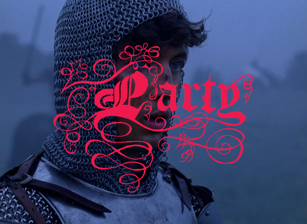
Multi-talented Paul Sahre is a man on a mission to produce quality design
Intrigued as to whose voice it was narrating the design work over on karlssonwilker’s portfolio site, I was reminded of the very established graphic work of Paul Sahre. Operating a small design studio “fondly” referred to as O.O.P.S (Office of Paul Sahre), a quick look will reveal a plethora of great book works, regular illustration spots, music visuals and a sense of humour. A closer look, will uncover a number of satellite sites for his dedicated sidelines which are occasionally random but absolutely worth your time.
A case in point are Paul’s illoops! illustrations, in fact. A clever’n’sharp style that uses design tactics with photography and found imagery to create visual one-liners for The New York Times Op-ed, Book Review and Week-In-Review pages, Freakenomics and Bloomberg Businessweek (to name a few.)
It’s a vast, all round and continuously surprising body of work and, most importantly, as honest as it is great – just see the regrets section on his site.
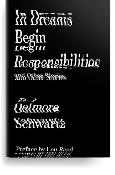
Paul Sahre: In Dreams Begin Responsibilities 2012, book cover design. Publisher: New Directions

Paul Sahre: Why America Needs A Left 2012, book cover design. Publisher: Polity

Paul Sahre: 2011, book cover design. Publisher: New Directions
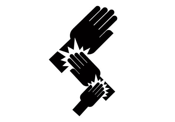
Paul Sahre: Punishing Wrongdoing on Wall Street 2011, Op-Ed letters Illustration, The New York Times

Paul Sahre: Does Washington Need Fixing? 2010, The New York Times Week In Review
Share Article
Further Info
About the Author
—
Bryony was It’s Nice That’s first ever intern and worked her way up to assistant online editor before moving on to pursue other interests in the summer of 2012.