




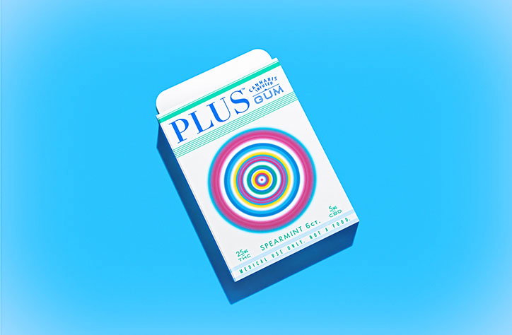
Slick, clean and colourful packaging designs for Plus cannabis-infused gum
Contrary to what your mum might think, cannabis isn’t just the preserve of rappers, ska punk fans and Camden-bound French exchange students: it’s a booming market, and a legal one too, in places. Last year, Pentagram branded Snoop Dogg’s line of weed-based products, and now Brooklyn-based designer Phillip Fivel Nessen has got in on the sweet Mary Jane action, with his lovely and colourful packaging designs for Plus Gum. The chewy stuff is infused with cannabis, dubbed “high-end medical and legal recreational marijuana gum.”
Phillip explains: “As a bunch of former developers, they brought some mad science to bear on their product, creating an edible that won’t leave you debilitatingly toasted for 15 hours, melting into your futon, but could act as a replacement for a beer or two.
“I was approached to create an identity and package design that would express the brand’s healthy, sophisticated values.”
The structural packaging was designed alongside Dale Trigger, and the look and feel is one that’s fresh, fun and distinctly different to the leaves and murky tones we’d usually associate with all things ganja-based.
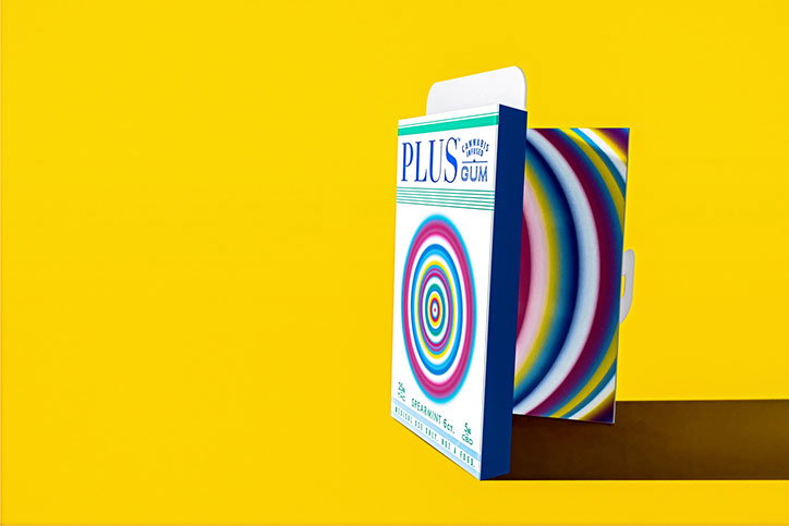
Phillip Fivel Nessen: Plus Gum
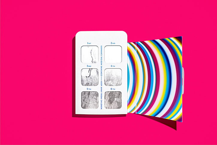
Phillip Fivel Nessen: Plus Gum
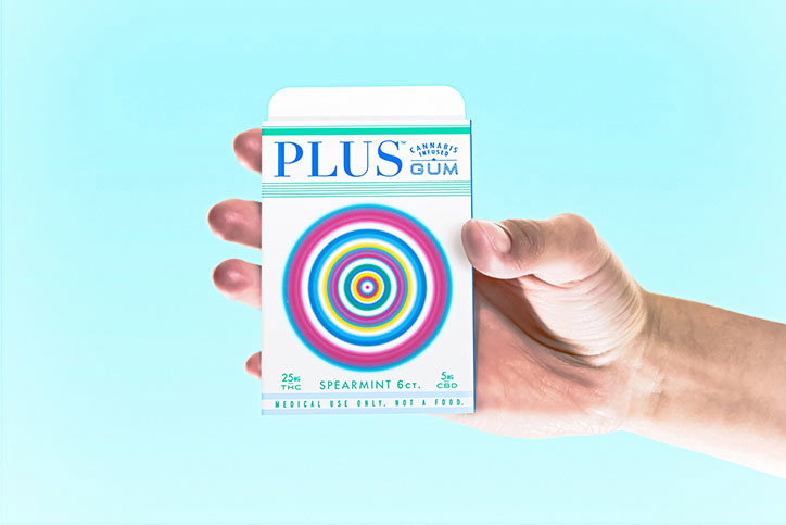
Phillip Fivel Nessen: Plus Gum
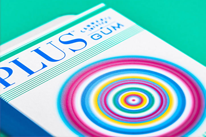
Phillip Fivel Nessen: Plus Gum
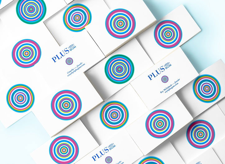
Phillip Fivel Nessen: Plus Gum
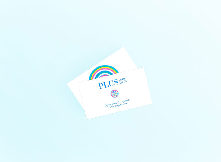
Phillip Fivel Nessen: Plus Gum
Share Article
Further Info
About the Author
—
Emily joined It’s Nice That as Online Editor in the summer of 2014 after four years at Design Week. She is particularly interested in graphic design, branding and music. After working It's Nice That as both Online Editor and Deputy Editor, Emily left the company in 2016.

