Launch Recite Me assistive technology
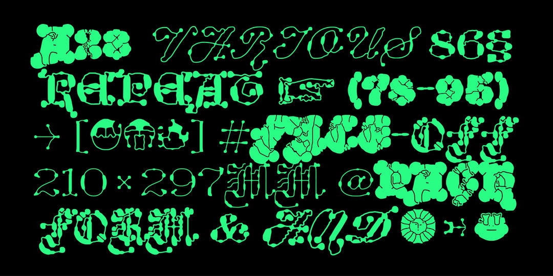
A digital illustration of neon green, fluid typography and abstract shapes set against a black background. The stylised text includes the words “VARIOUS”, “FORM & FUNCTION” and the numbers “210 x 297mm”.

Meet Plain Form, the foundry whose type families are far from plain

The foundry’s founder Lucas Descroix takes a multi-faceted approach when designing classic and abstract letterforms.

For many type designers, one of the everlasting battles is deciding whether you want to pursue a more classic type design or something more abstract. Plain Form is a foundry that has firmly set itself on doing both. The recently formed outfit run by Lucas Descroix is one that prioritises making “eclectic family constructions” of letterforms. Prior to finding his niche in type design, Lucas practised more broadly as a graphic designer, a fact he still sees as influencing his work; he cites the “adventurous” editorial designs of SpMillot and the “amazingly rich and generous” posters of Félicité Landrivon as still providing him great inspiration.

Through Plain Form’s families, Lucas explains that he loves to “search for the magical moment when a form switches from pure abstraction to being recognised as a letter and vice-versa”. Lucas continues: “There’s something of a ‘mad scientist’ feeling when it comes to giving life to a letter, a vessel for content, meaning and culture, particularly when dealing with extreme shapes such as organic complexities or, on the contrary, stripped-down geometric surfaces.” Here at It’s Nice That, we can’t get enough of Plain Form’s recent family Ready. Made in collaboration with long-term friend Benjamin Dumond, the glitchy, varied family is truly an indication of Plain Form at its best.
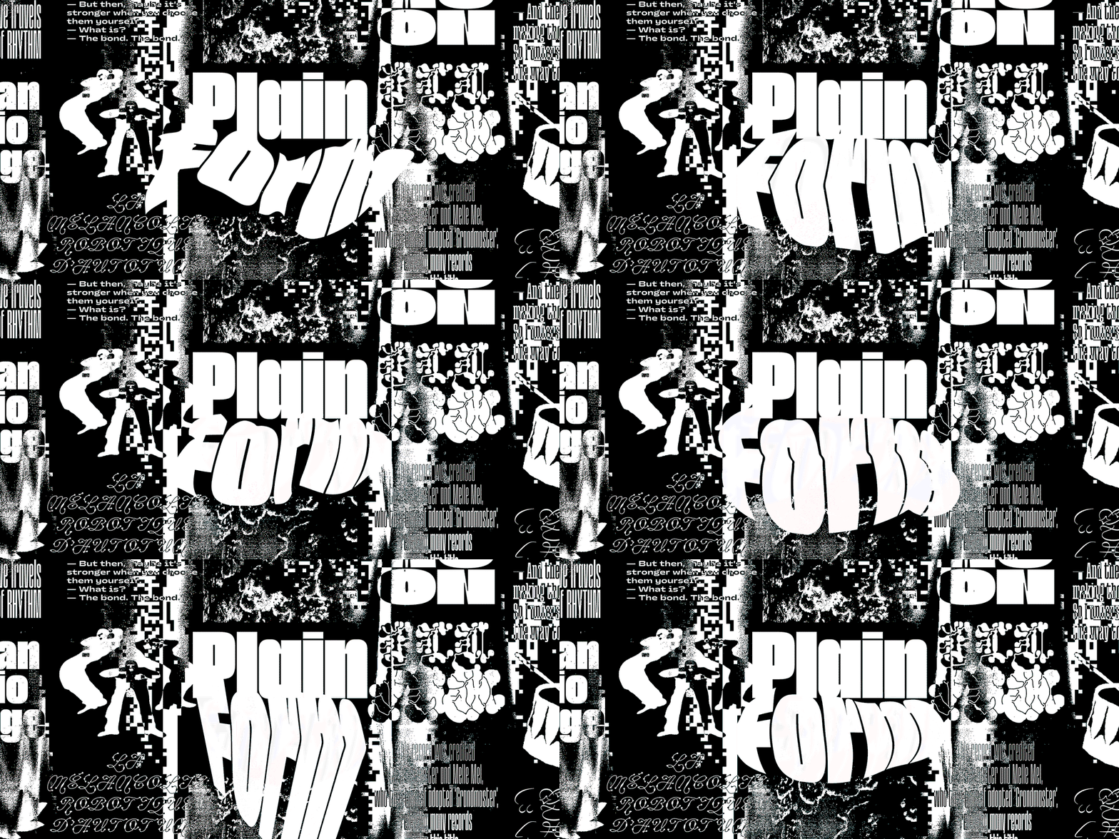
An animation in which the words “Plain Form” appear in bold, white typography over a high-contrast black and white collage. The word “Form” constantly morphs and shifts its shape against a backdrop of distorted figures, textures and fragmented text.
Above

Copyright © Plain Form, 2023

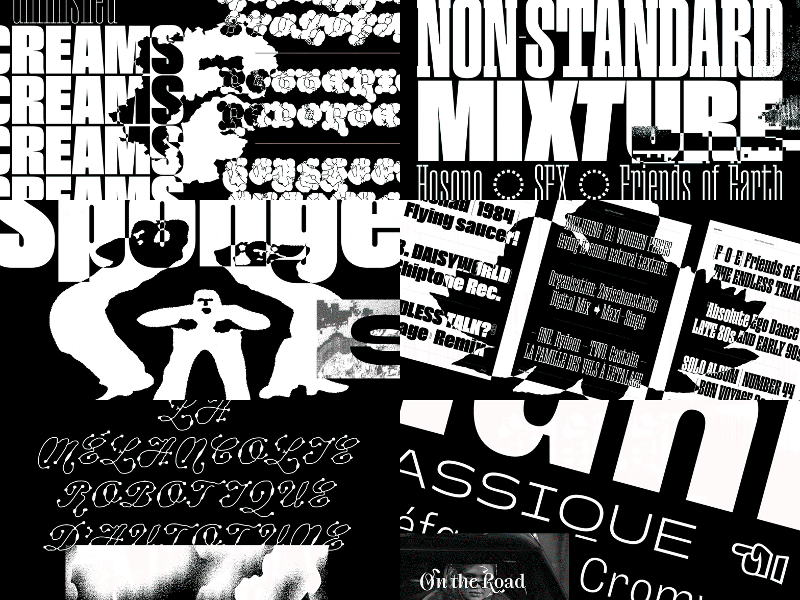
An animation in high-contrast black and white that rapidly cuts between various typographic experiments and graphic layouts. It features bold, distorted lettering and phrases including “NON-STANDARD MIXTURE”, “LIFE AS A SHOW”, and “THE GREAT INDOORS”, alongside images of record sleeves and design specimens.
Above

Copyright © Plain Form, 2023

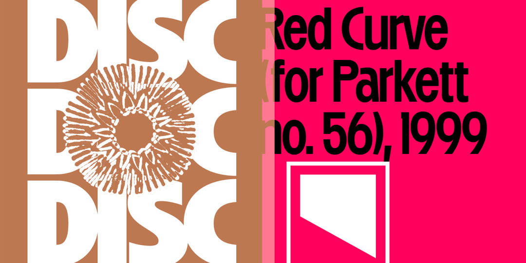
A graphic design piece split into two panels. The left side shows the word “DISC” repeated in white on a brown background, overlaid with a white circular pattern. The right side is bright pink with black text that reads “Red Curve (for Parkett no. 56), 1999” above a white square logo.
Above

Plain Form: Disc (Copyright © Plain Form, 2023)
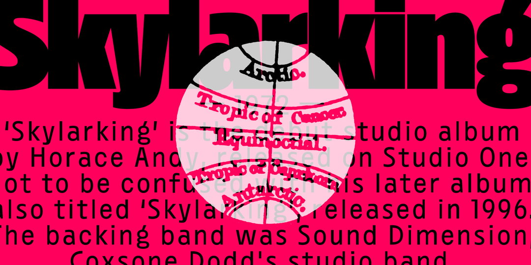
A graphic design in bright pink and black. The word “Skylarking” appears in large black type across the top, with a descriptive paragraph about the album below. A white circular diagram is laid over the centre, featuring red lines and labels for the “Tropic of Cancer”, “Equinoctial”, “Tropic of Capricorn” and “Antarctic”.
Above

Plain Form: Disc (Copyright © Plain Form, 2023)
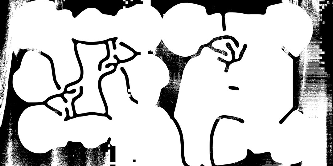
A high-contrast black and white abstract illustration. Organic, fluid white shapes are outlined in black, creating a distorted, cellular pattern against a dark, textured background.
Above

Plain Form: Ready (Copyright © Plain Form, 2023)
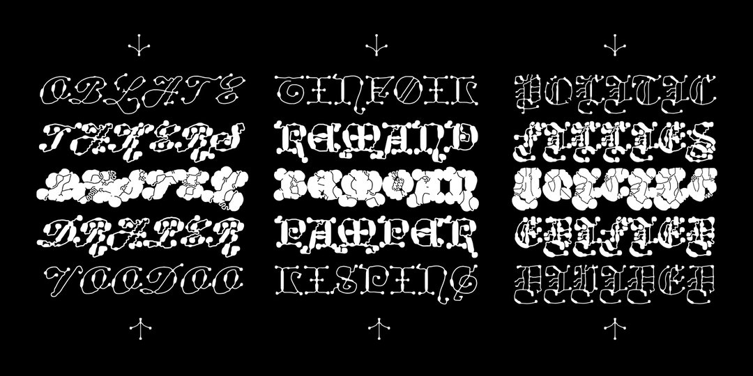
A collection of white, highly stylised typographic samples set against a black background. The distorted, gothic-inspired lettering is arranged in three columns and five rows.
Above

Plain Form: Ready (Copyright © Plain Form, 2023)
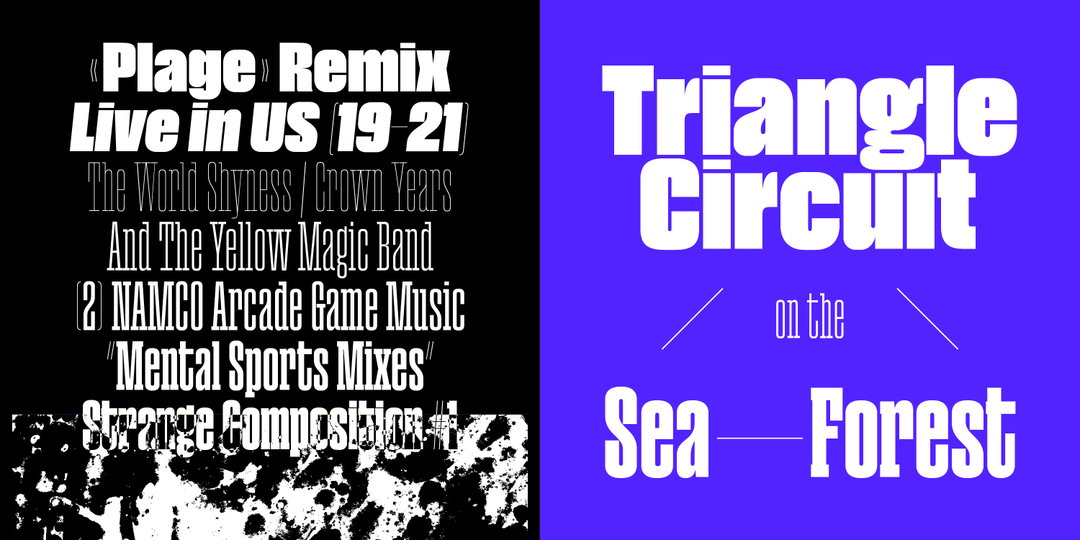
A graphic split into two panels. The left is black with white text reading “Plage Remix Live in US 19–21” and a list of artists including “The Yellow Magic Band”. The right is bright purple with bold white text that reads “Triangle Circuit on the Sea Forest”.
Above

Plain Form: Paraiso (Copyright © Plain Form, 2023)
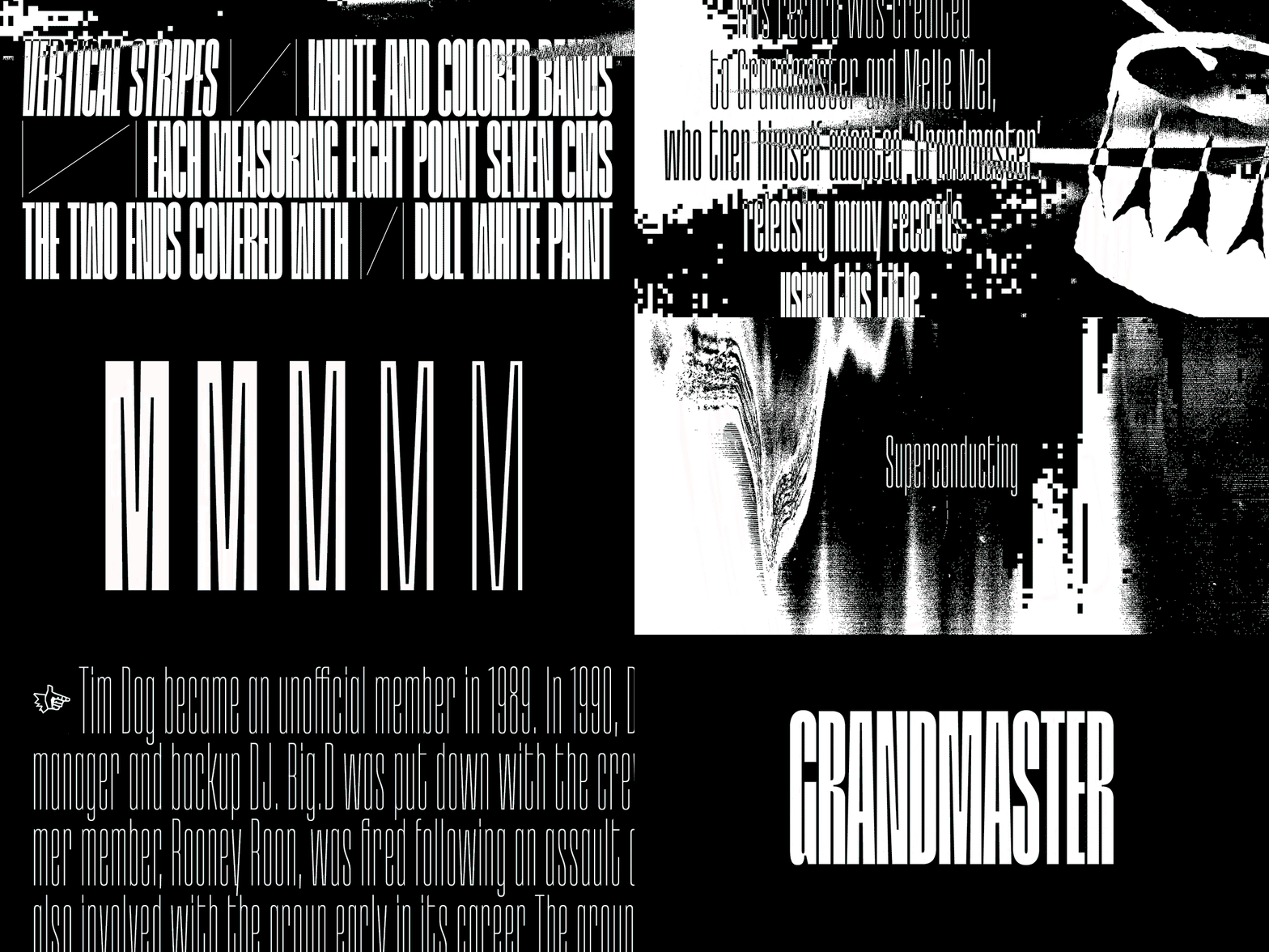
An animation in high-contrast black and white featuring glitchy, distorted typography and abstract shapes. Text flashes across the screen including “Repetition and Ostinato”, “People’s Instinctive Travels & the Paths of Rhythm” and “Grandmaster”.
Above

Plain Form: Grandmaster (Copyright © Plain Form, 2023)
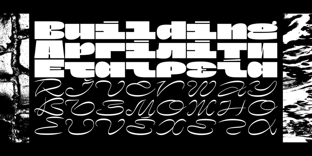
A typographic study in white on a black background. The top half features bold, distorted block lettering, while the bottom half shows a fluid, cursive script.
Above

Plain Form: Nostra (Copyright © Plain Form, 2023)
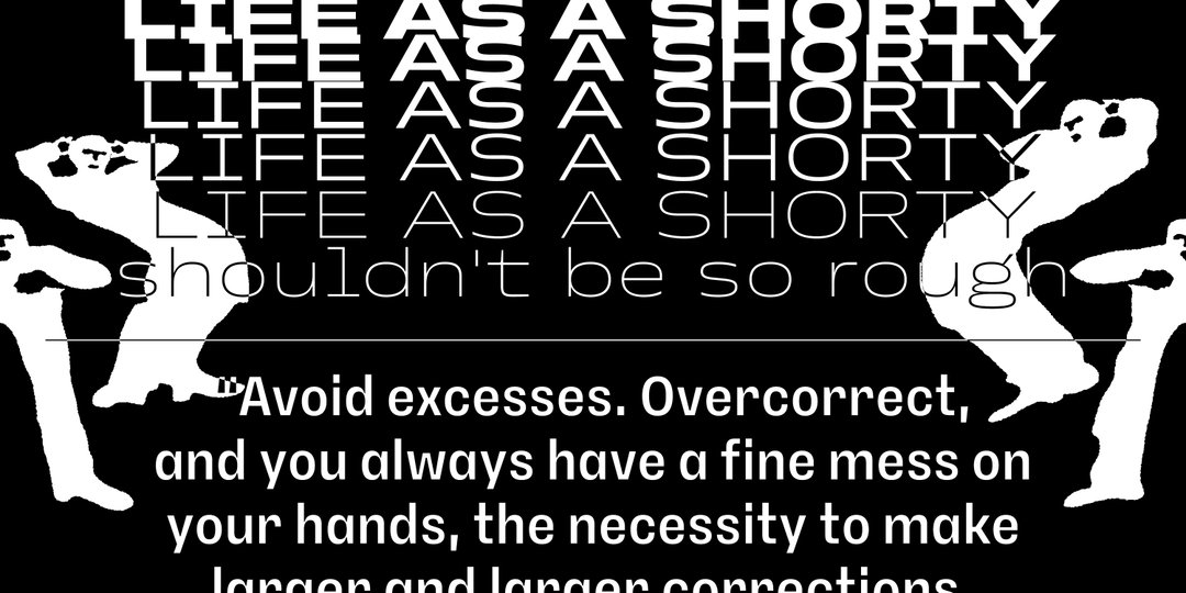
A black and white graphic featuring white silhouettes of figures in dynamic poses. Bold text at the top reads “LIFE AS A SHORTY” repeated five times, followed by “shouldn’t be so rough”. Below a horizontal line, a block of text begins “Avoid excesses. Overcorrect, and you always have a fine mess on your hands”.
Above

Plain Form: Petit Frère (Copyright © Plain Form, 2023)

Hero Header

Plain Form: Ready (Copyright © Plain Form, 2023)

Share Article

About the Author

Olivia Hingley

—

Olivia (she/her) is associate editor of the website, overseeing the day-to-day editorial projects as well as Nicer Tuesdays events. She joined the It’s Nice That team in 2021. [email protected]

To submit your work to be featured on the site, see our Submissions Guide.

It's Nice That Newsletters

Fancy a bit of It's Nice That in your inbox? Sign up to our newsletters and we'll keep you in the loop with everything good going on in the creative world.