Launch Recite Me assistive technology
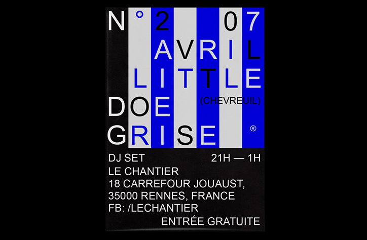
A blue and white typographic poster for a DJ set. The top half features bold text reading “N° 2 AVRIL LITTLE DOE GRISE” and “(CHEVREUIL)”. The bottom half lists the event details: “DJ SET”, “21H — 1H”, “LE CHANTIER” and an address in Rennes, France. The bottom line reads “ENTRÉE GRATUITE”.

Superb updates from plus mûrs showcase slick design and 90s net-art influences

—
Date
6 May 2016

plus mûrs has previously impressed us with its graphic design work that has the ability to “shift its aesthetic according to context”, and the Nantes-based studio’s recent updates don’t disappoint.

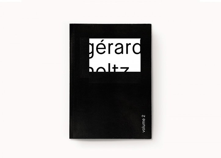
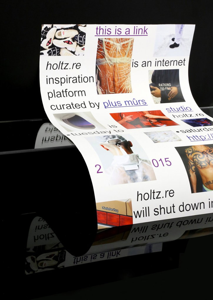
Showcasing the studio’s considered approach and knack with typographic layouts, we love the monochrome stylings of its designs for its book and “internet inspiration platform” Holtz, a collection of images found on the internet that include a rather saucy snap of a very tan-lined nudey lady. Elsewhere we see a range of web-inspired poster designs that merge simple typography with 90s net art-like graphics and shading.
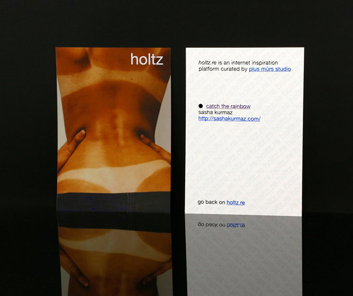
Two printed cards stand side by side against a black background. The left card shows a close-up of a person’s lower back with the word “holtz” at the top. The right card contains text describing an internet inspiration platform curated by “plus murs studio” and a link to “sashakurmaz.com”.
Above

plus mûrs: holtz

A black book cover features a white rectangular cutout in the centre. Inside the cutout, the text “gérard holtz” is visible in a bold, black serif typeface. The words “volume 2” are printed vertically in small white type along the bottom right edge.
Above

plus mûrs: holtz

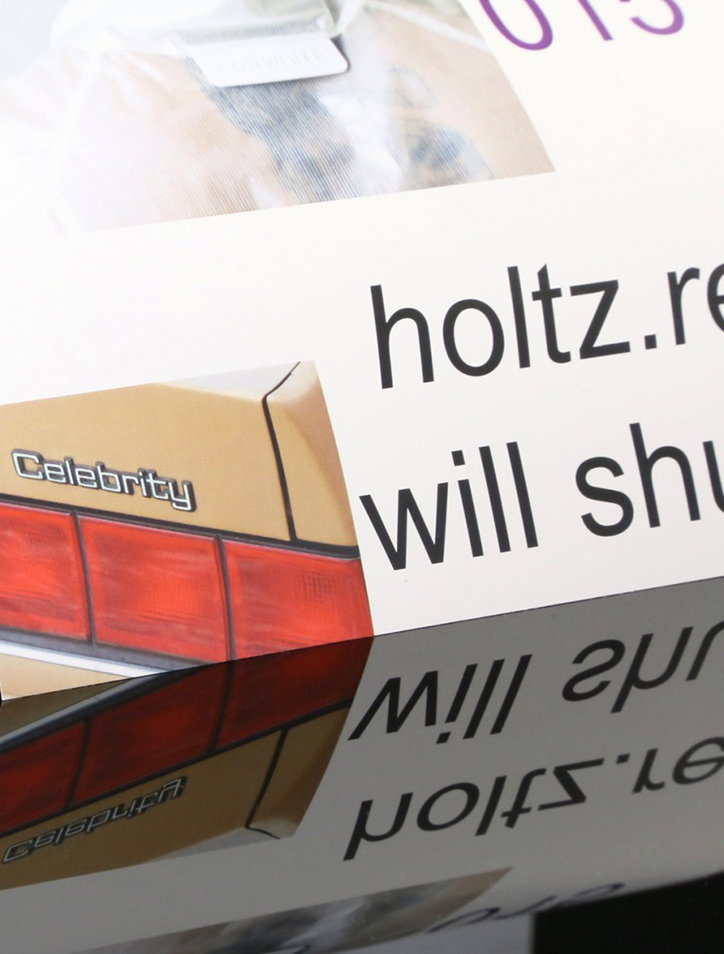
A close-up of a printed page featuring a graphic of a gold-coloured object with the word “Celebrity” on it. Beside the graphic, black text reads “holtz.re” and “will shu”. The page is reflected in a dark, glossy surface below.
Above
Left

plus mûrs: holtz

A collage of images and text printed on a curved piece of white paper. The text reads “holtz.re inspiration platform curated by plus murs” and “holtz.re will shut down”.
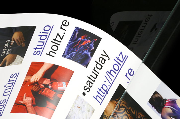
A close-up of a printed publication featuring a grid of images and blue text. The layout includes the words “studio holtz.re” and “saturday http://holtz.re”.
Above

plus mûrs: holtz

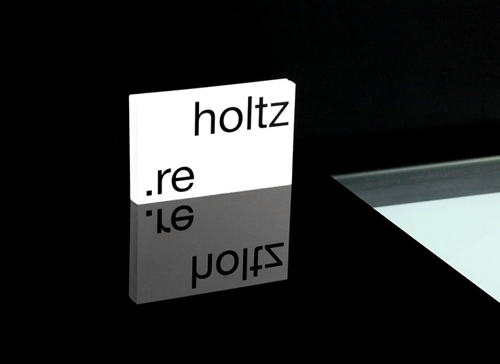
A small white card stands on a reflective black surface, showing the words “holtz” and “.re” in a black sans-serif typeface. The text is mirrored in the glossy surface below.
Above

plus mûrs: holtz

Share Article

Further Info

About the Author

Emily Gosling

—

Emily joined It’s Nice That as Online Editor in the summer of 2014 after four years at Design Week. She is particularly interested in graphic design, branding and music. After working It's Nice That as both Online Editor and Deputy Editor, Emily left the company in 2016.


It's Nice That Newsletters

Fancy a bit of It's Nice That in your inbox? Sign up to our newsletters and we'll keep you in the loop with everything good going on in the creative world.