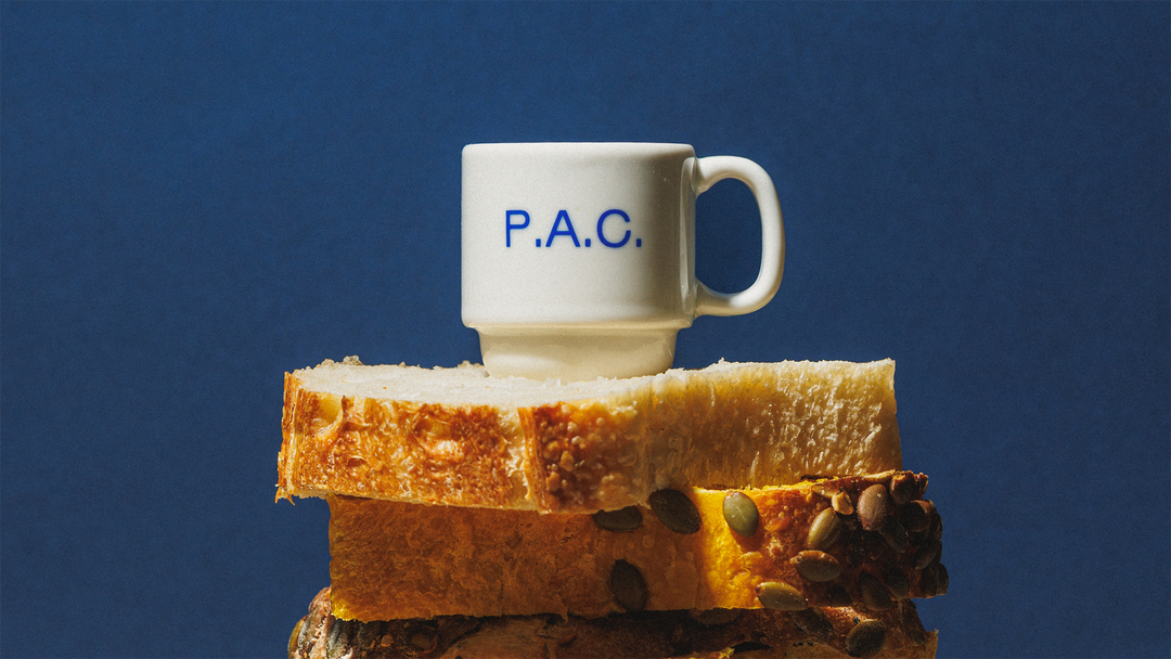
Polar’s logo for bakery P.A.C. is just typed out, and all the better for it
Using a purposefully limited typographic toolkit, the intuitive, reactive identity from Polar directly embodies the fast-paced nature of bakeries.
While the design studio Polar is based in São Paulo, Brazil, it’s worked on projects across the world. For the bakery P.A.C., however, the design studio stayed close to home… very close; two of Polar’s four founders are partners in the bakery. Due to this proximity, Polar saw the project as an opportunity to examine and experiment with its practice, which is rooted in scalable visual systems. “For us, there’s always an interest in building identities that are structured enough to scale, yet open enough to remain expressive and unexpected,” Bruno Ribeiro, Polar partner and partner at P.A.C tells It’s Nice That. The subsequent P.A.C brand is distinct and interpretive, built from a typographic toolkit that allows the identity to breathe – something that came from Polar’s closeness to the bakery. It’s an agile, unprecious brand that lives alongside the bakery’s workers each day.
“Because Polar was so close to the day-to-day operation and to the customers, the distance between noticing a need and responding to it as designers was very short,” Bruno says. This allowed the identity to evolve day-to-day, application-to-application. “The bakery started in a very small space, and has since moved to a much larger space. Each of those changes brought new needs, and the identity was able to respond to them rather than having to be redesigned from scratch,” continues Bruno. The continued success of the brand’s evolution is perhaps due to Polar’s closeness with the identity, meaning the studio can design instinctively. “A lot of the learning happens more intuitively,” Bruno explains, “it has been an opportunity to experiment and see where the identity wants to go as the business changes.”
Nani Rodrigues and Marcos Lôndero/Brejo: P.A.C. (Copyright © Polar Ltda., 2026)
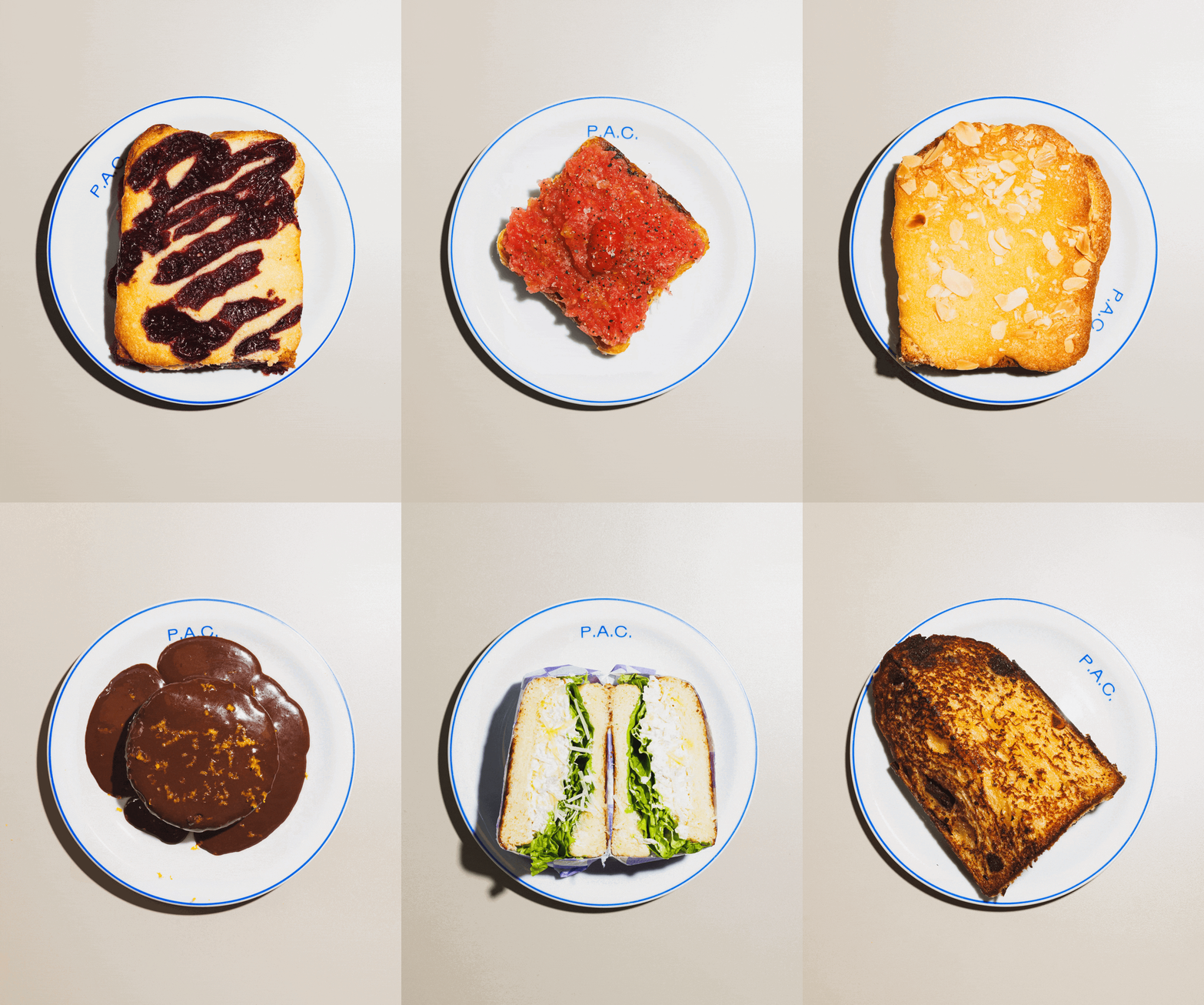
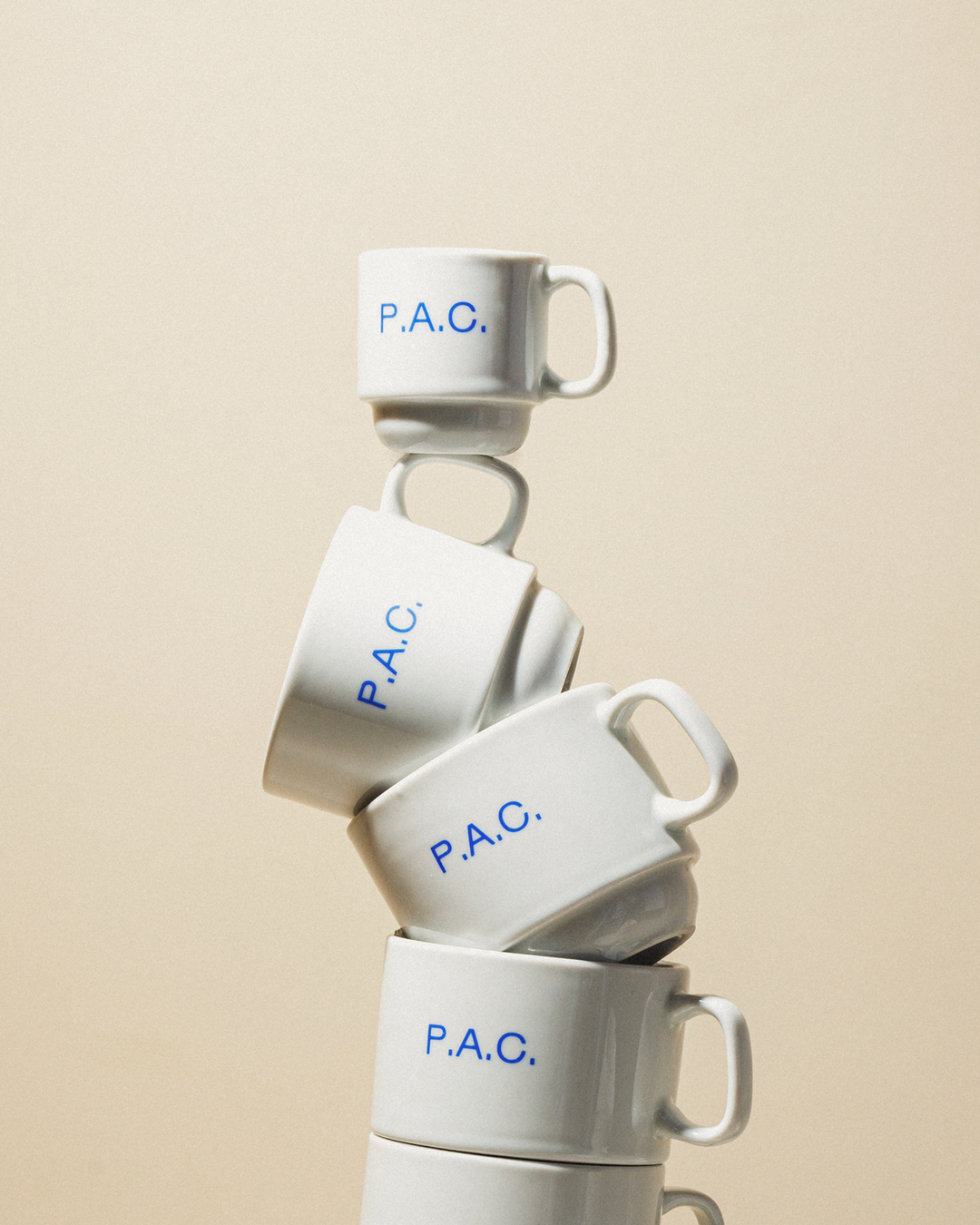
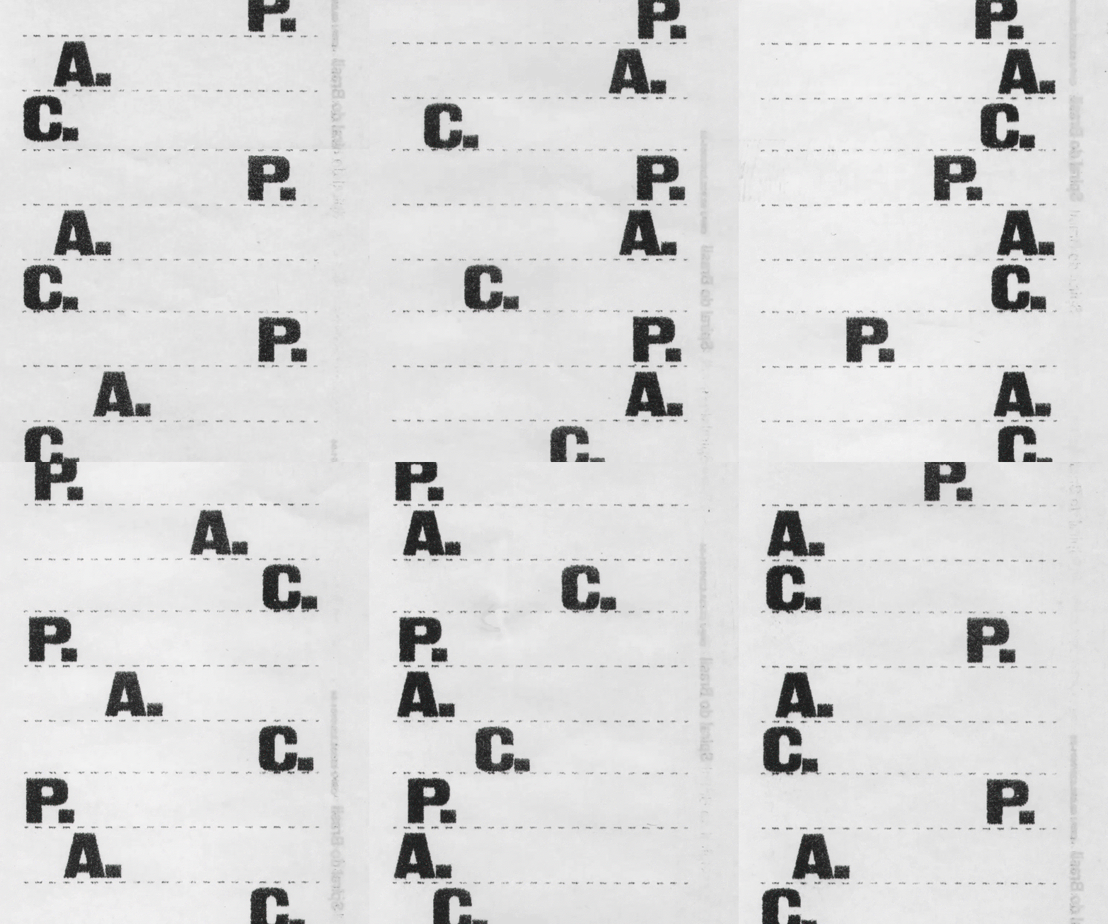
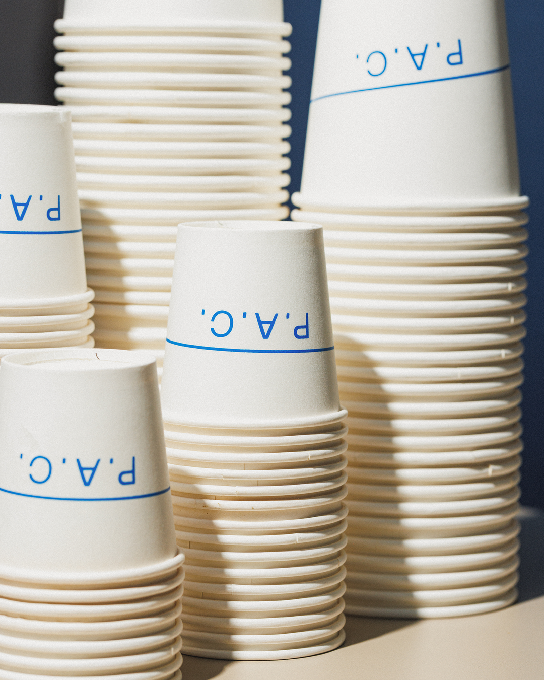
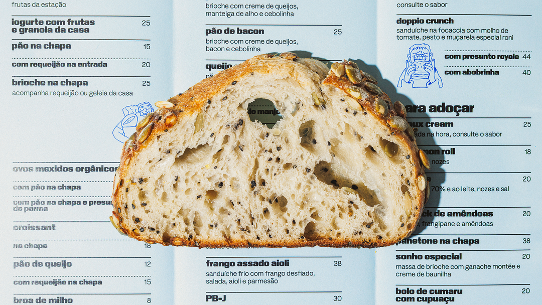
At the centre of the brand is a meticulous toolkit of typography, led by its primary typeface Gronland from Studio Muhittin Güneş, alongside the more recent inclusion of Rublena by Kyiv Type Foundry. The system prides itself on being bare-bones – the logomark isn’t even necessarily formalised; it’s just typed out. “Because P.A.C. is a three-letter name, the letterforms and punctuation already give it enough character to hold on its own,” Bruno explains, and the repeated use of Gronland and Rublena together makes for a distinctive, recognisable visual space. “The freedom to make something specific for that moment is more important than making every piece look exactly the same,” Bruno adds.
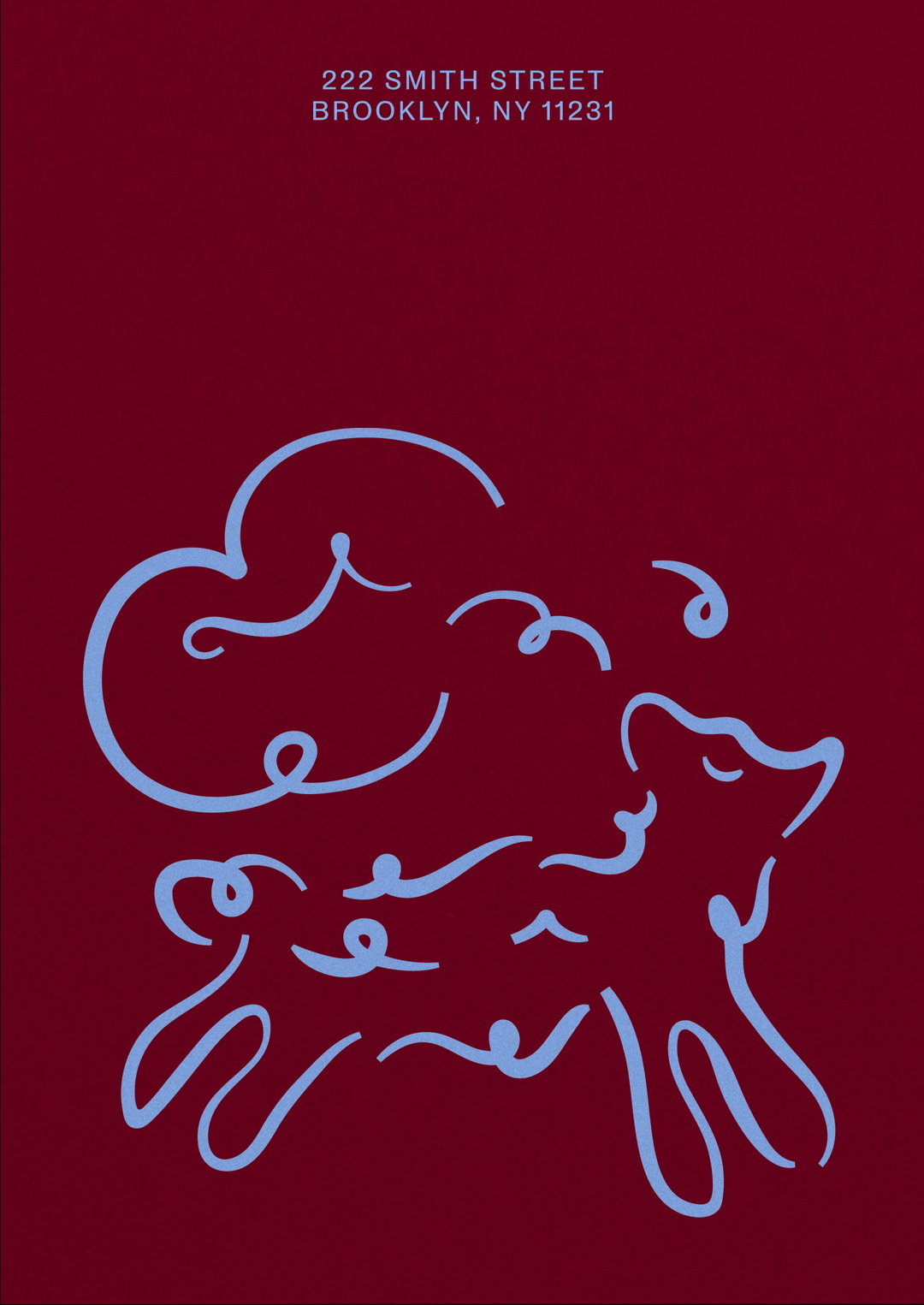
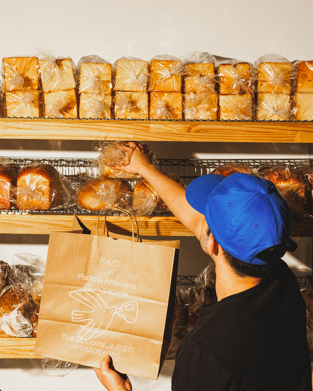
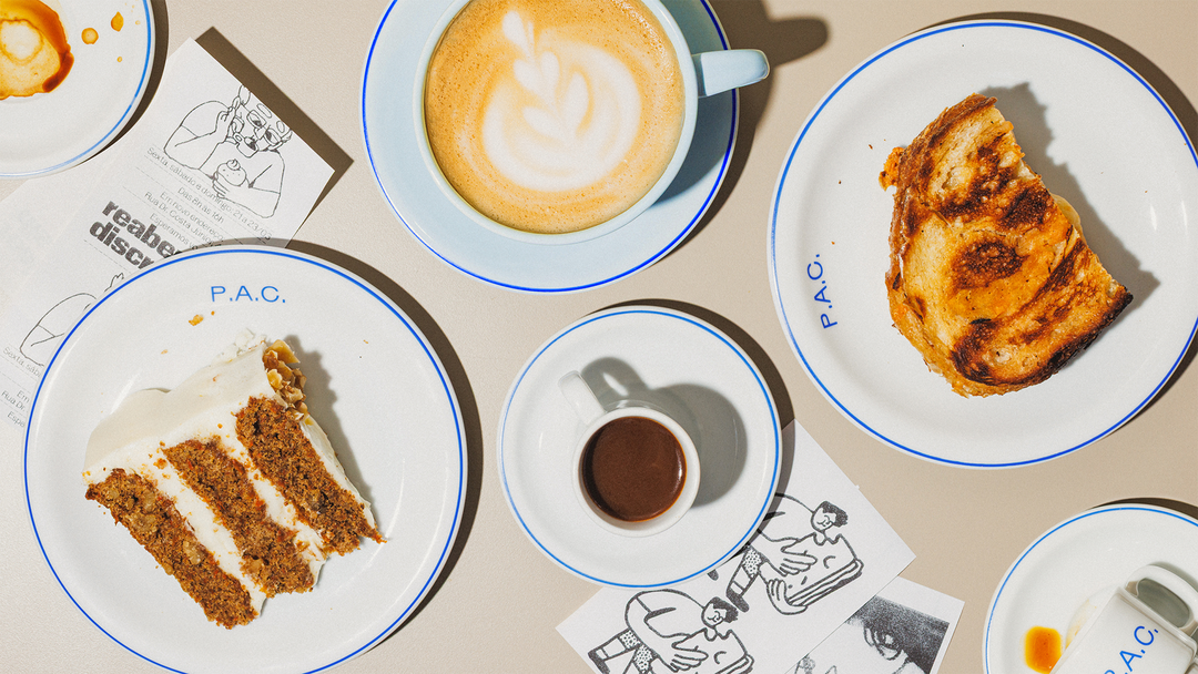
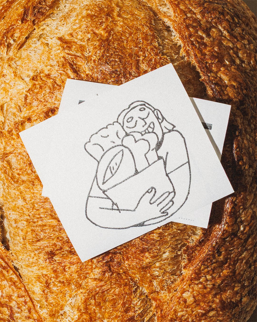
That’s also where illustration comes in, courtesy of illustrator Beatriz Batisteli, who’s long been a part of the bakery. “Her drawings are very much about capturing what she feels about the community around P.A.C.” Bruno says, especially since she’s part of said community. “The illustrations bring something that the typography doesn’t necessarily have,” They’re warm, often humorous flair connects the brand applications to what its audiences are actually experiencing. Her playful linework, in stark contrast to the type, welcomes a feeling of spontaneity to the identity and, importantly, keeps it feeling analogue. “That felt appropriate for an artisanal bakery, where the process itself is physical and tactile,” Bruno explains, “we wanted the identity to have some of that same quality rather than feeling overly polished or removed from the craft behind the products.”
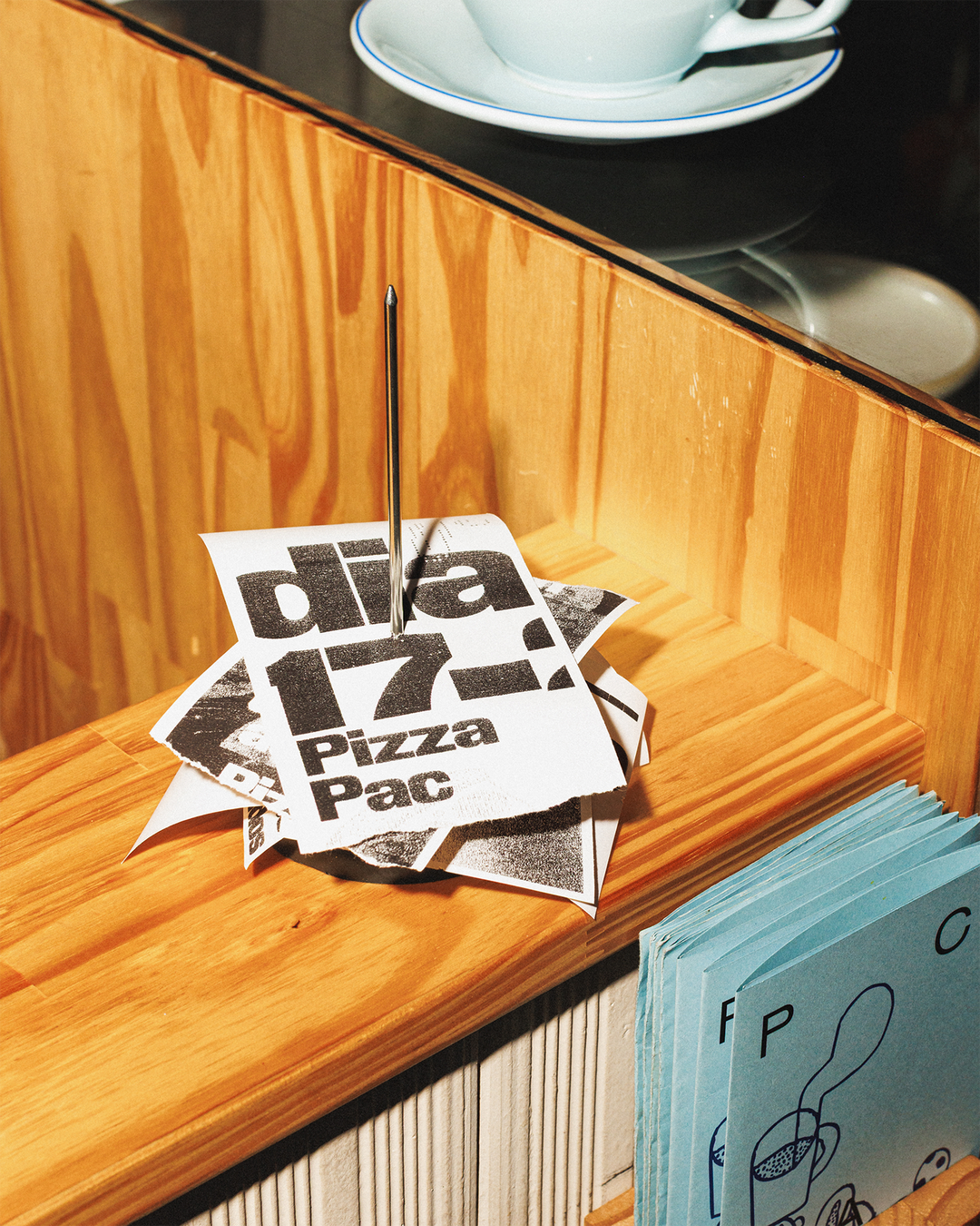
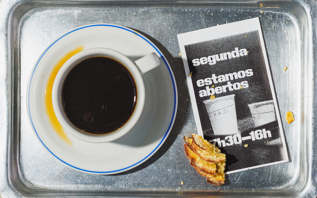
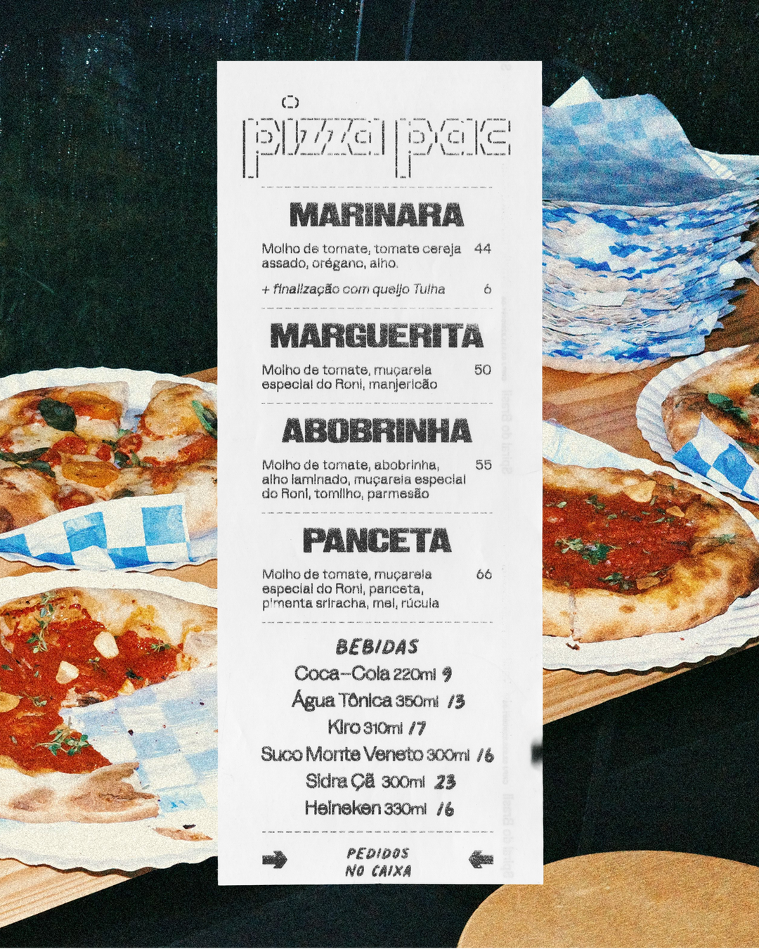
An equally important part of P.A.C.’s brand is the tools at the bakery’s everyday disposal, all of which contribute to its evolving identity. The receipt printer, for example, has since been used for printing weekly and daily menus, on top of it’s normal job: allowing Polar to explore the limitation that the printer imposes, all of which feeds into the brand’s tone. But that can change, and probably will, because very little of the brand is fixed, by design. It’s an unfinished system that will continue to evolve as the bakery does too, driven more by the potential for novelty than consistency. “Ultimately, the aim is for the design to feel like it’s coming from people who are genuinely enjoying making things,” Bruno ends, “rather than from a brand trying too hard to tell you what it is.”
GalleryNani Rodrigues and Marcos Lôndero/Brejo: P.A.C. (Copyright © Polar Ltda., 2026)
GalleryNani Rodrigues and Marcos Lôndero/Brejo: P.A.C. (Copyright © Polar Ltda., 2026)
Hero Header
Nani Rodrigues and Marcos Lôndero/Brejo: P.A.C. (Copyright © Polar Ltda., 2026)
Share Article
Further Info
About the Author
—
Hailing from the West Midlands, and having originally joined It’s Nice That as an editorial assistant in March 2020, Harry is a freelance writer and designer – running his own independent practice, as well as being one-half of the Studio Ground Floor.