Corporate branding logic is taking the soul out of football clubs
Art director and lifelong Newcastle fan Will Knight dissects the wind tunnel effect on football club rebrands, and why it leaves them devoid of the personality that made fans love them in the first place.
Share
For most football-mad kids, their first awareness of a ‘brand’ is the same: their football club. It’s a cliche, but most spent hours perfecting the ability to draw their club’s crest onto any available surface: school books, homework, birthday cards, icing on cupcakes. For me, that was trickier than some. As a Newcastle United fan, our badge was more complicated than most. It’s irregular and imperfect, it has lots of unnecessary detail, it’s difficult to draw, it’s difficult to explain (what the hell is a Hippocampus?), it’s traditional, it’s historic, it’s a little bit messy. But that was exactly what made it great. So when Newcastle United announced its rebrand with an updated club crest, I was left feeling a little bit cold.
When the topic of branding in football comes up, it’s tempting to jump straight to the disasters: Leeds United’s infamous ‘salute’ crest, seemingly lifted from a budget football management game, or Cardiff City’s ill-advised switch from blue to red in pursuit of new markets. But while examples like those serve as cautionary tales of just how badly a club can get things wrong, this piece is not about that type of headline-grabbing PR disaster. Instead, I’m more interested in the smaller, seemingly harmless changes. The little tweaks, the smoothing of an identity’s edges, the gradual loss of the quirks and imperfections that made it distinctive in the first place.
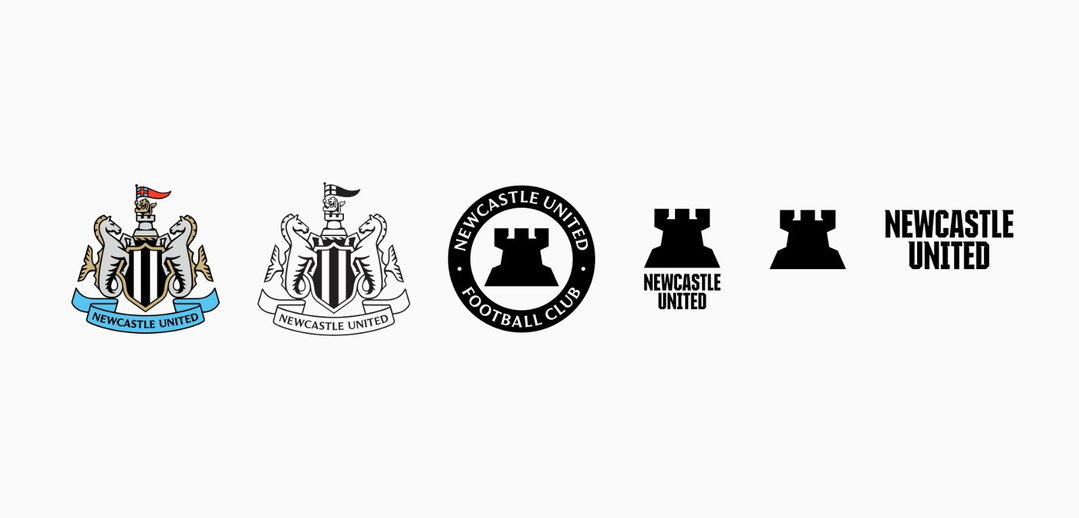
Which brings me to Newcastle’s update, which included an updated crest, a new secondary mark, and all the other shiny trimmings you might expect from a mega rebrand today. It all felt rather familiar. Some of the detail had gone. Many of the eccentricities and irregularities had been tidied up. Everything was cleaner, smoother, easier to reproduce and altogether a little more sensible. All the things you’re generally supposed to applaud in a modern rebrand, and yet somehow I couldn’t help feeling like I preferred things when they were a little less ‘perfect’.
© Newcastle United FC
Football fans, never exactly a shy bunch when it comes to sharing their opinions, were quick to weigh in. Much of the positive reaction seemed to centre on the fact that, at first glance, it didn’t look too different from the original (if you squinted). Others were less convinced, with the nickname ‘TemuCastle United’ circulating around various online forums. And then there was the new secondary mark, a rather stock-image-esque castle stamp replacing the beloved magpie Newcastle has used as part of its identity for years. An interesting decision for a club nicknamed the Magpies… someone might want to check on Monty.
But Newcastle is just the latest in a long line of redesigns following this familiar approach: reducing complexity, smoothing the edges, and plenty of talk about flexibility, versatility and digital optimisation. There’s something of the tech industry's Corporate Memphis era about it, when seemingly everyone arrived at the same idea of what ‘modern’ should look like. Clean, functional and perfectly capable of working everywhere, but somehow feeling less connected to anywhere at all.
“There’s something of the tech industry’s Corporate Memphis era about it, when seemingly everyone arrived at the same idea of what ‘modern’ should look like.”
Will Knight
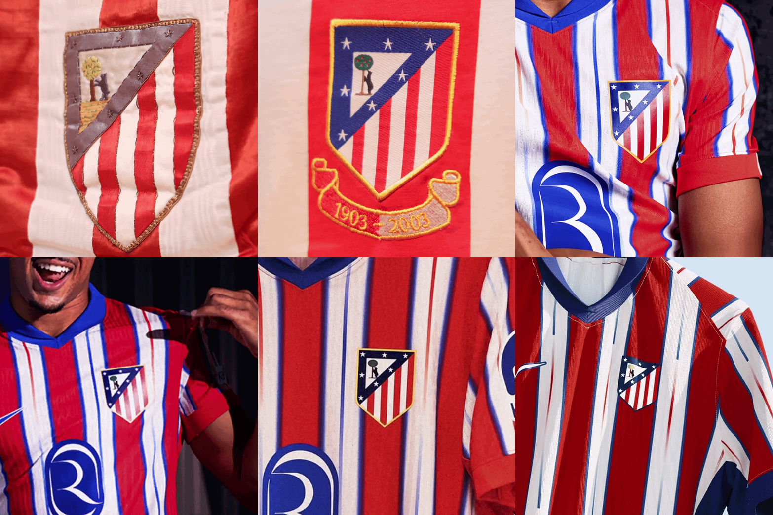
Take Everton, which announced its move to a more ‘modern, cleaner and dynamic design’, or Atlético Madrid and its short-lived refresh. To anyone without an attachment to these clubs, the changes probably seemed relatively minor, and the intentions were clear: cleaner, more balanced, optimised for a digital landscape. All the usual words. But supporters disagreed, with Atlético fans even adopting the chant “¡El escudo no se toca!” (the badge is not to be touched), and eventually both clubs backtracked.
And perhaps that’s where the disconnect lies. Increasingly, football clubs are beginning to look, speak and behave like every other big corporate brand, adopting the same visual languages, terminology and ideas of what makes a successful brand identity. Of course, football clubs are enormous global brands, with all the commercial and practical demands that come with that. But they’re also an incredibly unusual type of brand.
Vasava: Atlético Madrid rebrand (Copyright © Atlético Madrid)
It’s hardly a hot take that Newcastle, Everton or Atlético mean more to people than Barclays, Deloitte or Meta. Put plainly, nobody is walking around with the Amazon logo tattooed on their calf (other than Jeff Bezos, presumably), and I doubt we’ll be hearing chants about the digital adaptability of a club’s brand mark on the terraces any time soon. But that’s what makes the desire to apply the same corporate branding logic to football feel so misguided, and what makes creating anything new for a football club such a delicate balancing act. Football clubs already have what most brands spend millions desperately trying to manufacture: heritage, history, community, loyalty, advocacy, emotional attachment. Pick your favourite word from a brand strategy deck and football clubs had it long before somebody put it on a slide. And that’s part of what makes rebranding a football club such a difficult task. The things that make football club identities awkward, complex, historic, and occasionally a bit weird aren't problems standing in the way of creating a great modern brand, they’re the things most brands would kill to have.
But all of this points towards something I’ve been thinking about more broadly: how do so many individually reasonable and seemingly minor decisions end up producing something that feels less distinctive than where you started? It reminded me of a recent conversation I had with Iain Tait about the concept of the ‘wind tunnelling of design’. Think of it as the process by which every awkward edge, eccentricity and point of friction gets smoothed away until you’re left with something perfectly aerodynamic and completely anonymous.
“I doubt we’ll be hearing chants about the digital adaptability of a club’s brand mark on the terraces any time soon.”
Will Knight
And that’s the strange thing about the wind tunnel: almost every individual decision made along the way probably makes perfect sense. Improve the legibility. Make it easier to reproduce. Tidy up that awkward bit. Make the colours more consistent. Give the seahorse a little haircut. Nobody has walked into the meeting and demanded they make it more boring. But keep going long enough and eventually there’s not much awkwardness left. Everything gets cleaner, smoother and safer, and everything starts looking kind of the same. The end result isn’t necessarily bad, it’s worse than that, it’s perfectly competent. It’s clean, considered, scalable, but with a little less soul.
And technically, in Newcastle’s case, all the important bits are still there. All of the elements supporters loved have survived, so surely that’s enough? But it feels a little like a team of record execs scratching their heads over why Hilary Duff’s cover of My Generation doesn’t elicit quite the same reaction as The Who. Same lyrics, same melody, all the relevant parts technically present. But different. It’s possible to keep all of the components and somehow lose something along the way.
“Pick your favourite word from a brand strategy deck and football clubs had it long before somebody put it on a slide.”
Will Knight
Which raises the question: what if some of the awkward bits don’t need fixing in the first place? Take Ajax, which returned to its historic crest as part of its rebrand in 2025. The lines are irregular, the construction is awkward and you don’t have to search far to find forums with designers pointing out its dodgy kerning and imperfections. By the standards of the increasingly polished, simplified identities we’re seeing across football, the badge is a complete pain in the arse. But you know who didn’t seem particularly bothered by any of that? Ajax fans. When the club announced its return, supporters weren’t celebrating its flexible adaptability across digital touchpoints, they were celebrating because it looked and felt like Ajax.
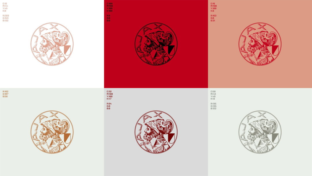
Smörgåsbord: AFC Ajax rebrand (Copyright © AFC Ajax)
“When the club announced its return, supporters weren’t celebrating its flexible adaptability across digital touchpoints, they were celebrating because it looked and felt like Ajax.”
Will Knight
Looking outside of football, Burberry offers an interesting example of how embracing character can become a starting point for something new. The return of its intricate heraldic knight logo is hardly the sort of thing you’d design if your starting point was ‘how do we make this work as a tiny app icon?’ And rather than acting as a creative restriction, that heritage has become a launchpad, with recent campaigns leaning into Britishness, locality and the slightly odd bits of the brand’s history, building a much richer world around an identity that feels unmistakably Burberry. Maybe that’s the bit some football clubs are getting backwards. History isn’t something you need to simplify your way out of, it’s often the most interesting thing you’ve got to work with.
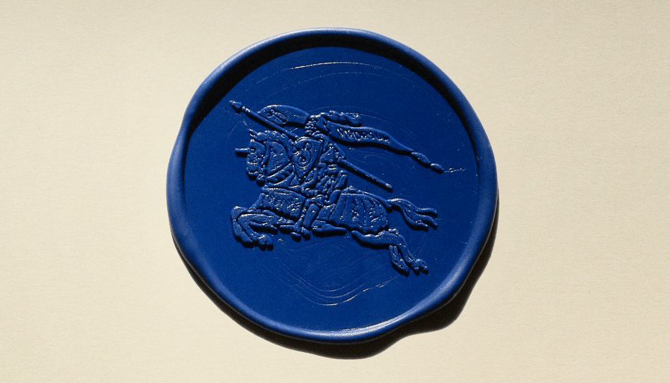
© Burberry
American sport has already been through its own period of tidying everything up. But what’s interesting is how many of its most recognisable identities resolutely refuse to behave themselves. If you were designing the Boston Celtics from scratch today, would anyone seriously suggest a detailed winking leprechaun spinning a basketball on his finger? Probably not. Which is precisely why we should be thankful nobody is starting from scratch. Compare that with the Utah Jazz, which recently tried stripping its identity back to something altogether cleaner and simpler, only to bring back its recognisable mountains, purple gradients and general excess not long afterwards. Or the Brooklyn Nets and Washington Wizards, which simplified their identities, including homogeneous’ badges designed to look clean on a mobile app, which have left many fans longing for a return to something with a little more personality.
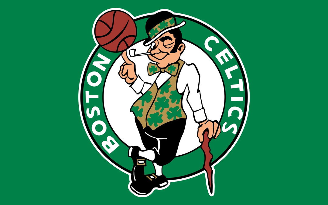
© Boston Celtics
Baseball is a sport which seems to understand that personality is an asset. Strange mascots, ridiculous team names, ugly characters, local jokes, old typography, heritage marks, and teams called the Rocket City Trash Pandas and Hartford Yard Goats, seemingly designed around the precise things a conventional branding process might try to remove. And even at the very top of the sport, teams seem to understand the emotional (and, let’s be honest, commercial) value of something with a bit of character. Take the Boston Red Sox, one of the sport’s biggest names, whose identity is built around wonderfully peculiar things. Two red socks for a logo, traditional letterforms, a ballpark full of quirks and oddities. All the sorts of things that might raise a few eyebrows if you were pitching them in a branding presentation today, and yet nobody seems particularly desperate to tidy them away.
There’s something strangely ironic about European football chasing a version of American corporate professionalism when some of American sport’s most compelling brands are the ones that embrace precisely the things football seems so keen to clean up. But there are encouraging examples closer to home, too. Numerous clubs have returned to older, more complicated crests on their shirts recently, to overwhelmingly positive reactions. Wolves swapped its famously simple wolf-head badge for the considerably more complicated city coat of arms on its 150th-anniversary shirt, while Fulham’s new bespoke typeface by F37 takes its cues directly from the imperfections of Craven Cottage. There’s also been some consistently lovely work coming out of Arsenal’s creative team in recent years, featuring large-scale supporter collaborations and commissions. That same willingness to embrace character and complexity runs through its wider visual identity, drawing on Art Deco and Gothic influences, including Rocastle, a beautifully intricate new Gothic typeface by David Rudnick set to become a key part of the club’s identity going forward.
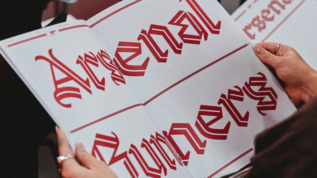
Rocastle – designed in terrain by David Rudnick with Léa Bruneau
Photography: Josh Upton
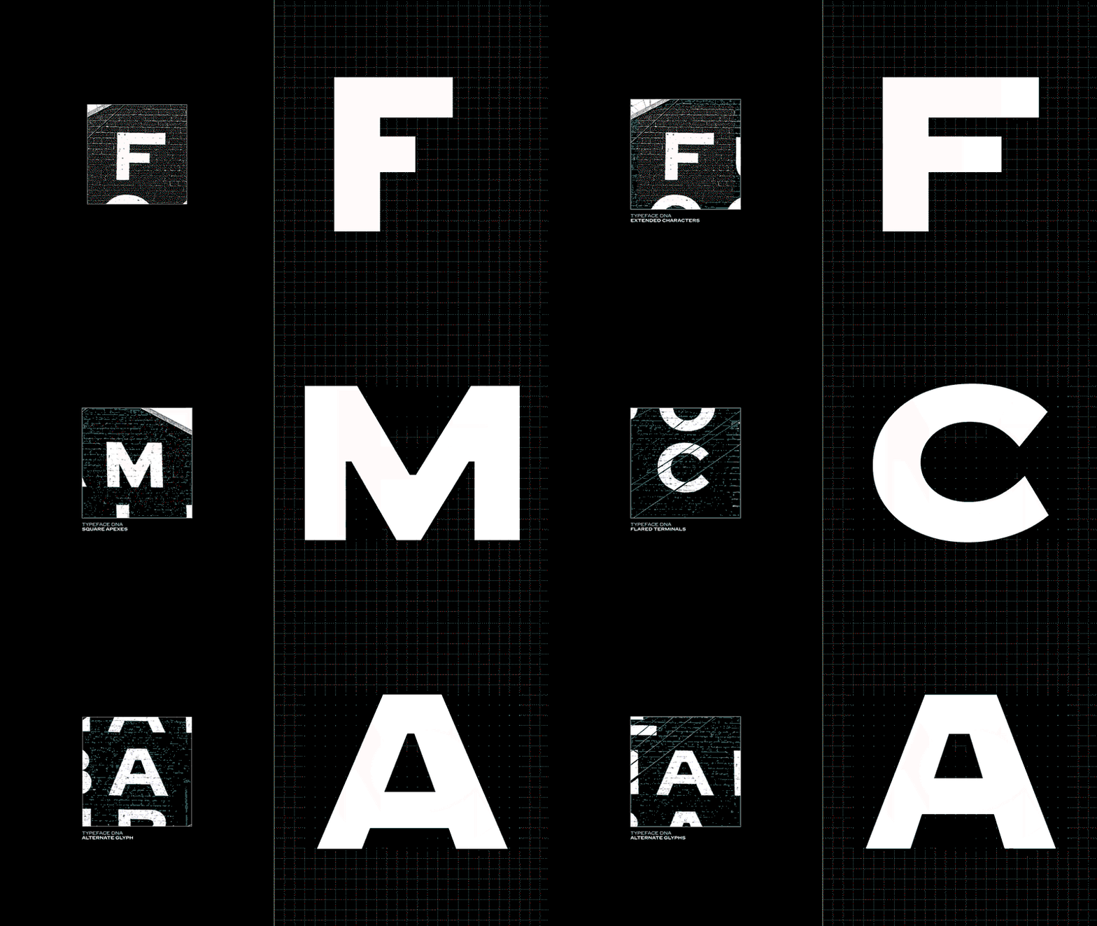
Music & F37 Foundry: Fulham FC (Copyright © Fulham FC, 2026)
None of this is to say that football clubs should never change, or that every crest needs another lion, ship, Latin motto or mythical sea creature squeezed into it. But perhaps the starting point shouldn’t always be what can we simplify? Maybe it should be what can we make more of? Because the complexity, awkwardness, local references, old quirks and sometimes unnecessary details aren’t baggage standing in the way of a modern identity. They’re often what makes those identities valuable. And in an age where AI can churn out flat, polished, frictionless visuals in seconds, perhaps those awkward details are more valuable than ever.
Which brings me back to that Newcastle badge I spent hours trying to draw as a kid. Maybe I didn’t love it despite the fact it was complicated, irregular and hard to draw. Maybe I loved it partly because of those things. So by all means modernise football, just don't try and make it too ‘perfect’.
Share Article
Further Info
About the Author
—
Will Knight is an independent creative director and educator. He has worked with brands including Google, Spotify, Lego and Universal Music, and previously led the creative team at It’s Nice That. He also teaches and advises on creative courses at institutions including Falmouth University, London College of Communication, University of Hertfordshire and LABASAD (Barcelona School of Art & Design).