




Sensitive and striking graphic design for Bill Viola and Peter Blake by Praline
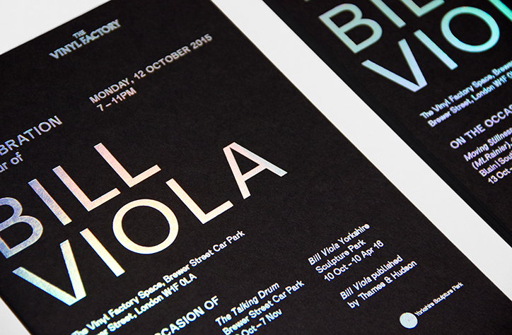
Two equally beautiful projects but with very different approaches here from Praline, which has created designs for video artist Bill Viola and pop artist Peter Blake. The Bill Viola project saw Praline create the graphic identity for the video artist’s Frieze week show at London’s BlainlSouthern gallery. Praline has been working with the gallery for around 18 months now on exhibition graphics, catalogue designs, show invites and other collateral; and the Viola show opened up a new challenge – how to represent an artist with little in the way of imagery from past works. “With BlainlSouthern we had to have a common thread between all the show identities but also express the individual artists,” says Praline founder David Tanguy.
“With the Bill Viola show we had to express the artist typographically and graphically. So much of his work is about things being projected in a dark space, so we wanted to play with that. That’s why we used iridescent foil and a typeface that was a classic sans serif without shoutout elements.”
However, it was all about celebrating colour and honing in on impactful imagery for another recent Praline project, designing the book for Peter Blake’s recent Portraits and People exhibition in London. Al Rodger, Praline designer, explains: “We wanted to celebrate that there were lots of different elements to [Blake’s] work. The approach for the overall concept was to make the images feel very personal by enlarging them and making them fill the page. We played a lot with the colour to make it feel bright and energetic, and used different paper stocks for the different types of artwork.”
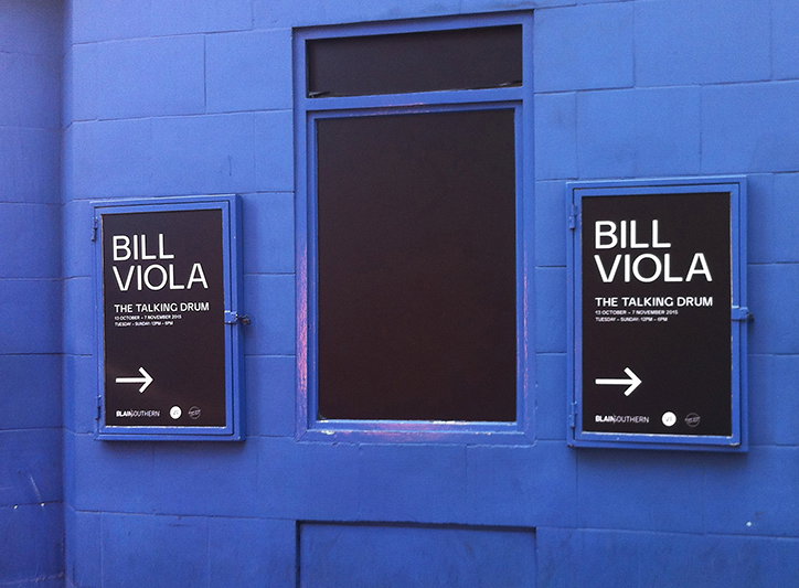
Praline: Bill Viola graphics
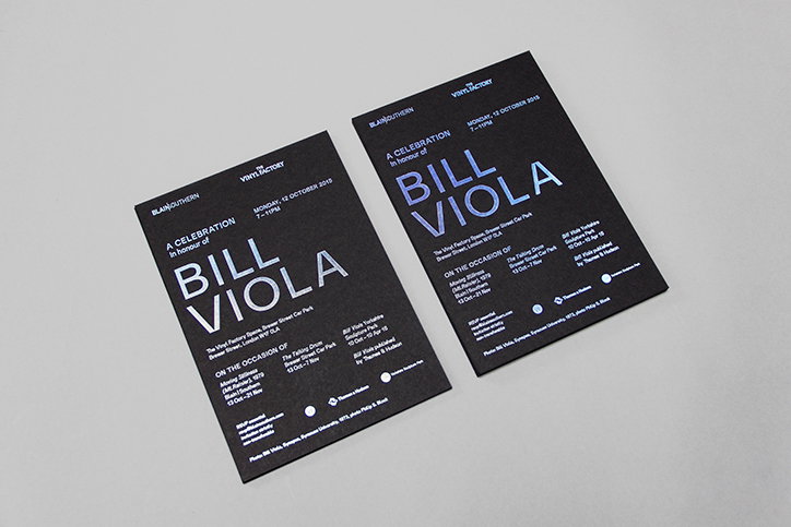
Praline: Bill Viola graphics
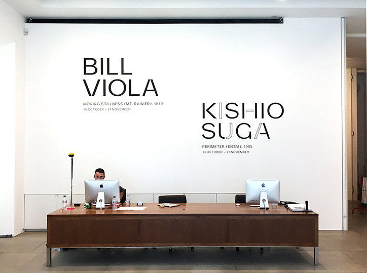
Praline: Bill Viola graphics
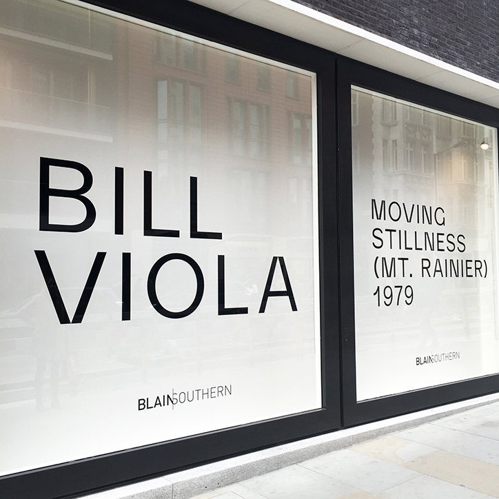
Praline: Bill Viola graphics
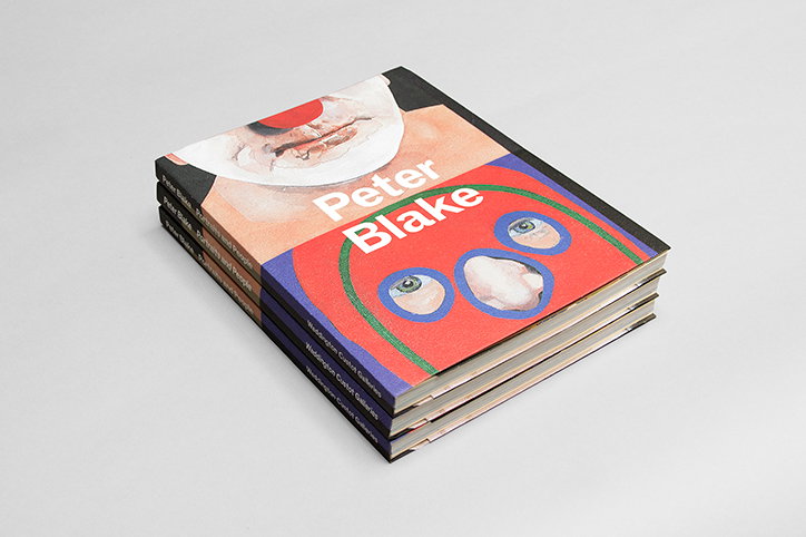
Praline: Peter Blake book design
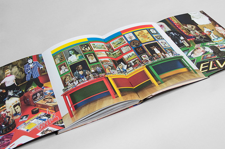
Praline: Peter Blake book design
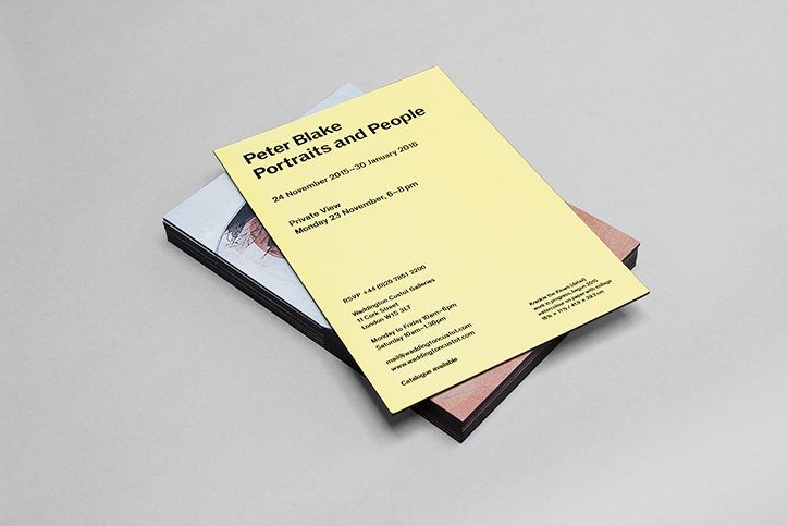
Praline: Peter Blake invites design
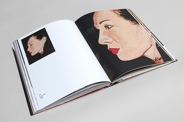
Praline: Peter Blake book design
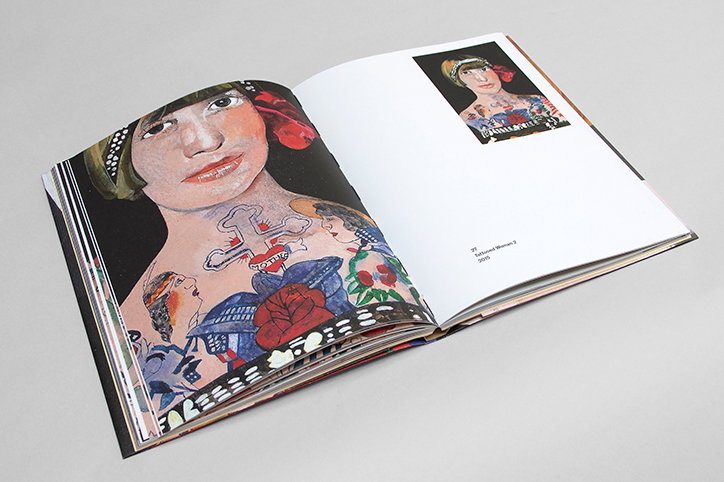
Praline: Peter Blake book design
Share Article
Further Info
About the Author
—
Emily joined It’s Nice That as Online Editor in the summer of 2014 after four years at Design Week. She is particularly interested in graphic design, branding and music. After working It's Nice That as both Online Editor and Deputy Editor, Emily left the company in 2016.

