Project 3 Agency rebrands the ArtScience Museum, around the concept of convergence
For the Singapore Museum, the global agency has created an expressive and adaptable brand system inspired by its uniquely hybrid remit.
Located at Singapore’s Marina Bay Sands, ArtScience Museum sits as the city’s lotus-shaped artistic hub. It previously housed artworks from surrealist Salvador Dali to the wonders of particle physics. Now, it gets a new makeover courtesy of Project 3 Agency, a full service company offering creative direction, design, content, event, and production services. Project 3 Agency’s creation is the result of pgLang (Kendrick Lamar and Dave Free) acquiring longtime collaborator Frosty, a global creative studio. Project 3 Agency’s latest venture takes on ArtScience Museum – serving fun days out for the family, centred around art, technology, and everything in-between.
Project 3 Agency saw a visual opportunity in the museum’s mission of convergence, described by agency’s design director Ali Hanson as the emulsifier between the “meeting of ideas, disciplines, people, community, and culture”. For ArtScience Museum’s vice president Honor Harger, it’s simple; “bringing people together at the intersection between art and science”.
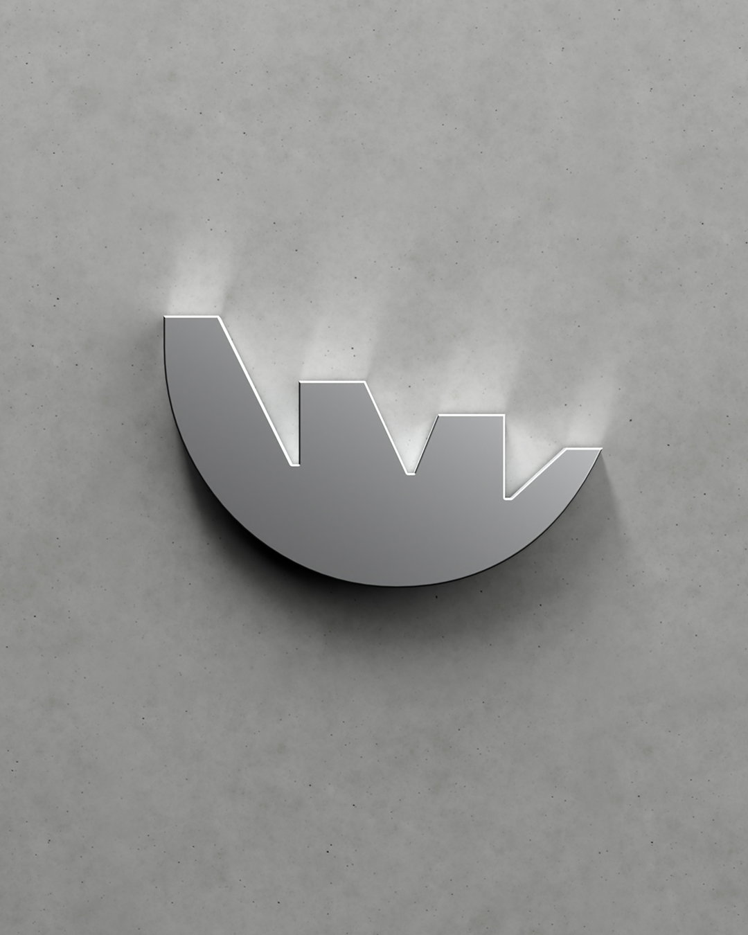
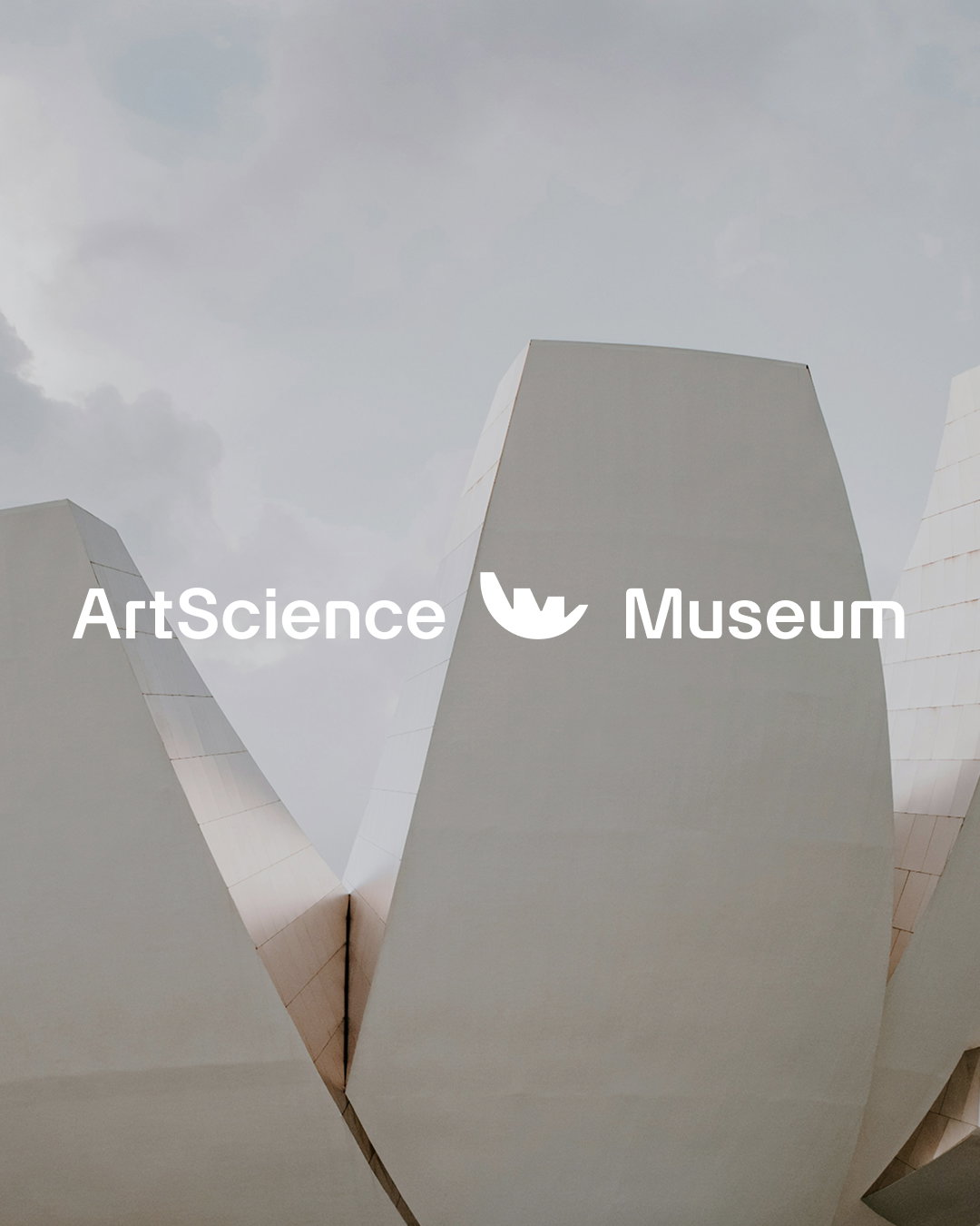
This core idea of convergence is seen throughout the identity, in its dynamic grids and broad colour palette but most visibly through the logo and type. The typography itself (a custom version of Artex by Optimo foundry) sits as a meeting point between more organic bevels and curves, and more industrial cut-offs – the museum’s new wordmark mirroring the curves and lines of the iconic museum building itself. The whole identity astutely works well within both artistic and scientific contexts. This approach can be seen in the logo and permeates into the wider identity.
ArtScience Museum (Copyright © Project 3 Agency, 2025)
ArtScience Museum (Copyright © Project 3 Agency, 2025)
ArtScience Museum’s graphic language of convergence can be distilled into three pillars: intersections, overlays, and dynamic forms. In honouring the museum’s architecture, typography maintains a characterful clarity across exhibition imagery, film and digital content, and more. Ali says the typography needed to feel “identifiable without being overstylised”.
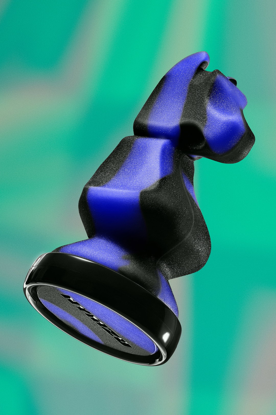
The inspiration of the natural lotus flower lends well to rendering ArtScience Museum’s logo in 3D. The lotus’ bulbous yet sharp shape stands out from afar. The curves bend light, reflecting a halo effect around the object. The logo in motion assets features variations like a stacked lock-up for dynamic vertical motion, alongside primary lock-ups across the museum’s other segments of cinema, VR gallery, store, the ongoing encounters series, and laboratory.
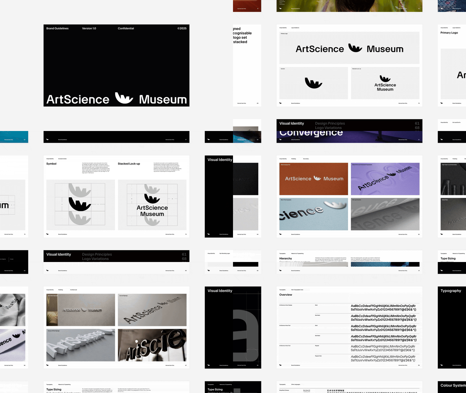
Paired with the museum’s brand colour system, refined yet unrestricted, ArtScience Museum’s identity presents a contemplative approach to design. Colour is used across a wide gradient from earthy to vibrant, with every colour split further into three cohesive shades to account for boldness and accents, and to offer a complementary tone for every artwork in the museum. Each colour is drawn from the natural and scientific worlds, for example, floral yellows, leafy greens, electric purples, and earthy neutrals. This forms part of a huge, 300-page brand identity guideline document which Project 3 Agency has given to the museum, covering all bases from grid guidance to asset libraries and how its robust system should show up in merch, signage and everything else imaginable.
These convergencies definitely bleed into this new visual identity, launched in conjunction with the museum’s latest exhibition Another World is Possible, in celebration of Singapore’s 60th anniversary. Rarely is there an opportunity to refresh the identity of a space like ArtScience Museum. Project 3 Agency’s work is a demonstration of just how important design can be in impacting the public space experience.
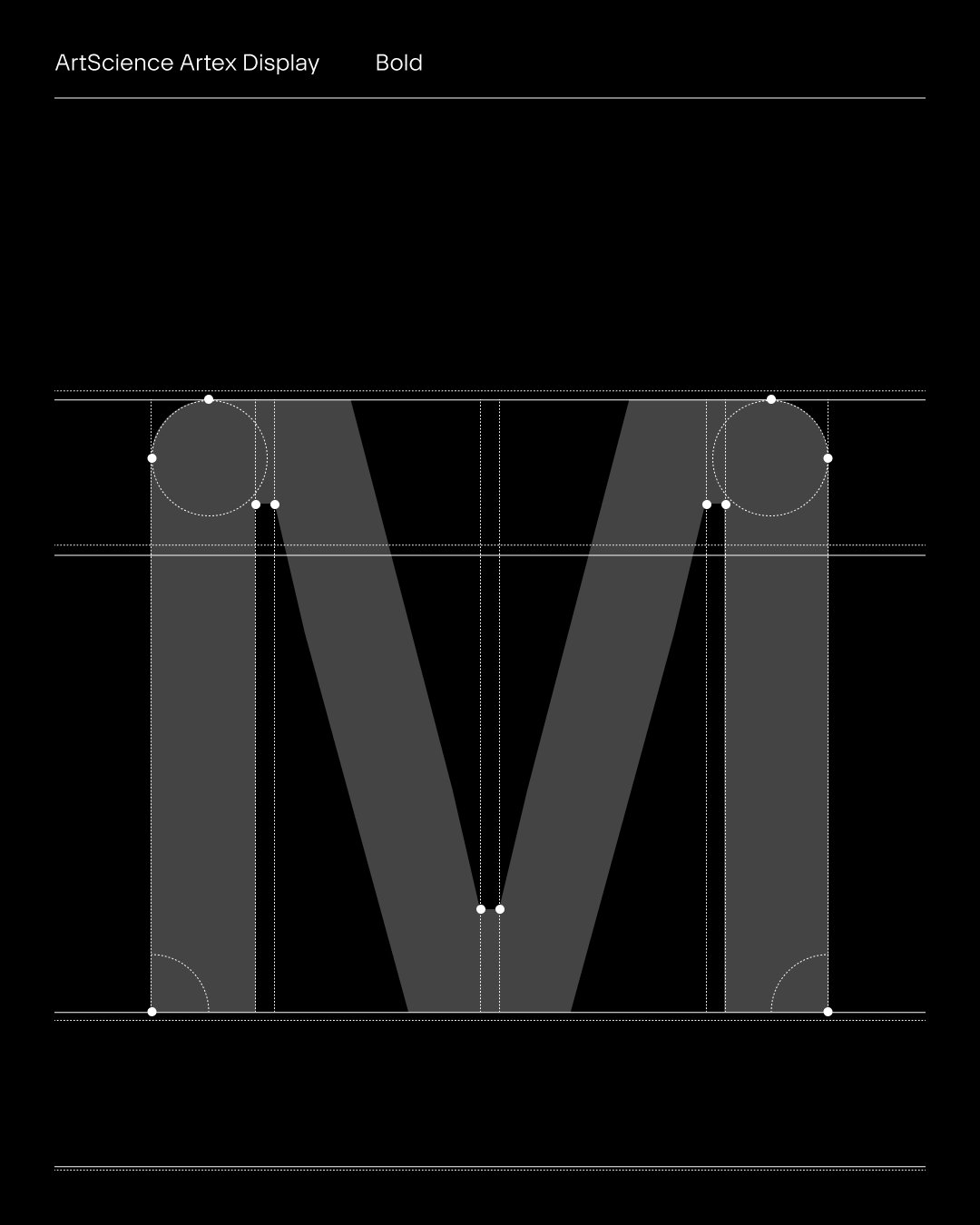
ArtScience Museum (Copyright © Project 3 Agency, 2025)
ArtScience Museum (Copyright © Project 3 Agency, 2025)
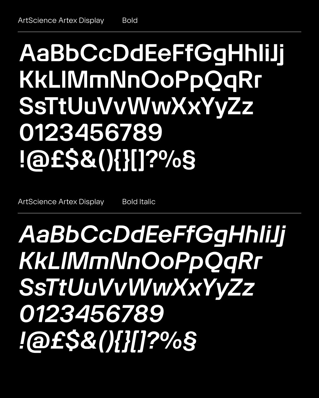
ArtScience Museum (Copyright © Project 3 Agency, 2025)
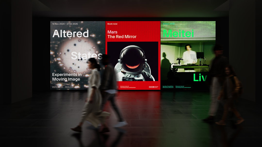
ArtScience Museum (Copyright © Project 3 Agency, 2025)
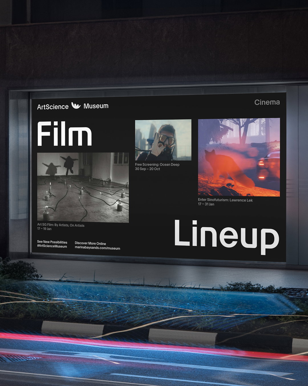
ArtScience Museum (Copyright © Project 3 Agency, 2025)
ArtScience Museum (Copyright © Project 3 Agency, 2025)
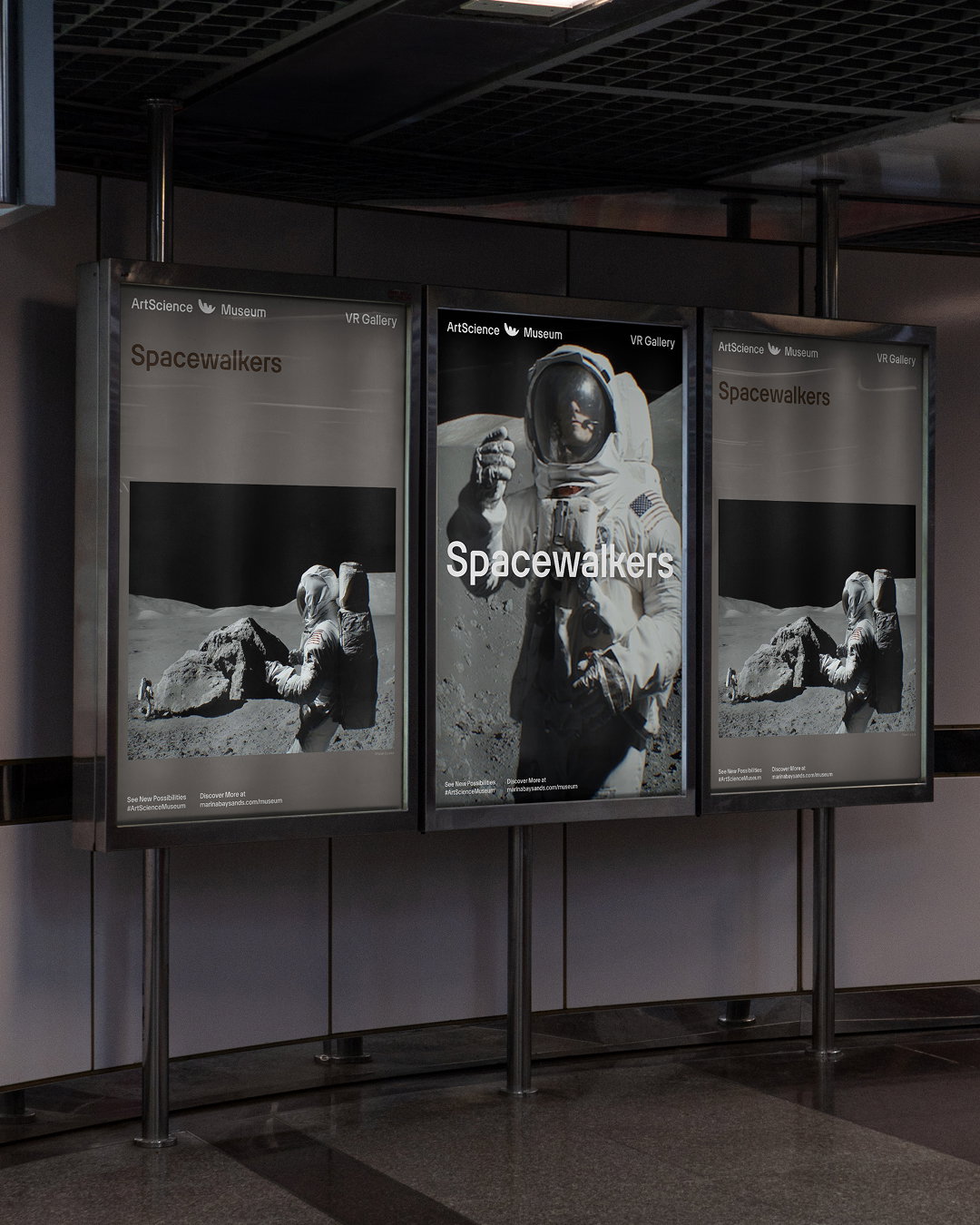
ArtScience Museum (Copyright © Project 3 Agency, 2025)
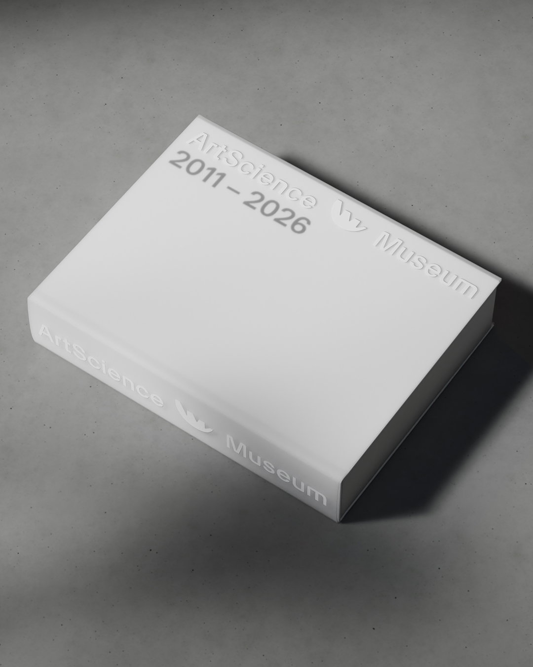
ArtScience Museum (Copyright © Project 3 Agency, 2025)
Hero Header
ArtScience Museum (Copyright © Project 3 Agency, 2025)
Share Article
Further Info
About the Author
—
Sudi Jama (any pronouns) was a staff writer at It’s Nice That from April 2025–January 2026, and is now a freelance writer. They have a keen interest and research-driven approach to design and visual cultures in contextualising the realms of film, TV, and music.