Reesaw Studio treads the line between tradition and modernity in its charming packaging designs
We chat to the co-founder of the Nigbo/Shanghai-based studio about some recent projects and how they’re engaging a younger audience with traditional Chinese culture.
It’s always satisfying to discover a commercial project in the graphic design world which feels fresh and modern but also incorporates elements of the past, personal histories or traditional cultures. It can be a fine line to tread – avoiding a twee and ersatz “vintage” feel, whilst making sure the historical element of the design does not become over-commercialised or lost entirely. One young design studio which is hitting the balance with true grace is Reesaw Studio. The team is made up of three core members – co-founders Zhou Xin and Yin Songhua and art director Guo Fapan. Yin Likes to compare the core team to “the NBA Big Three” – like this trio of basketball heroes, Yin says “we share the same values and goals, and this makes our team closer.”
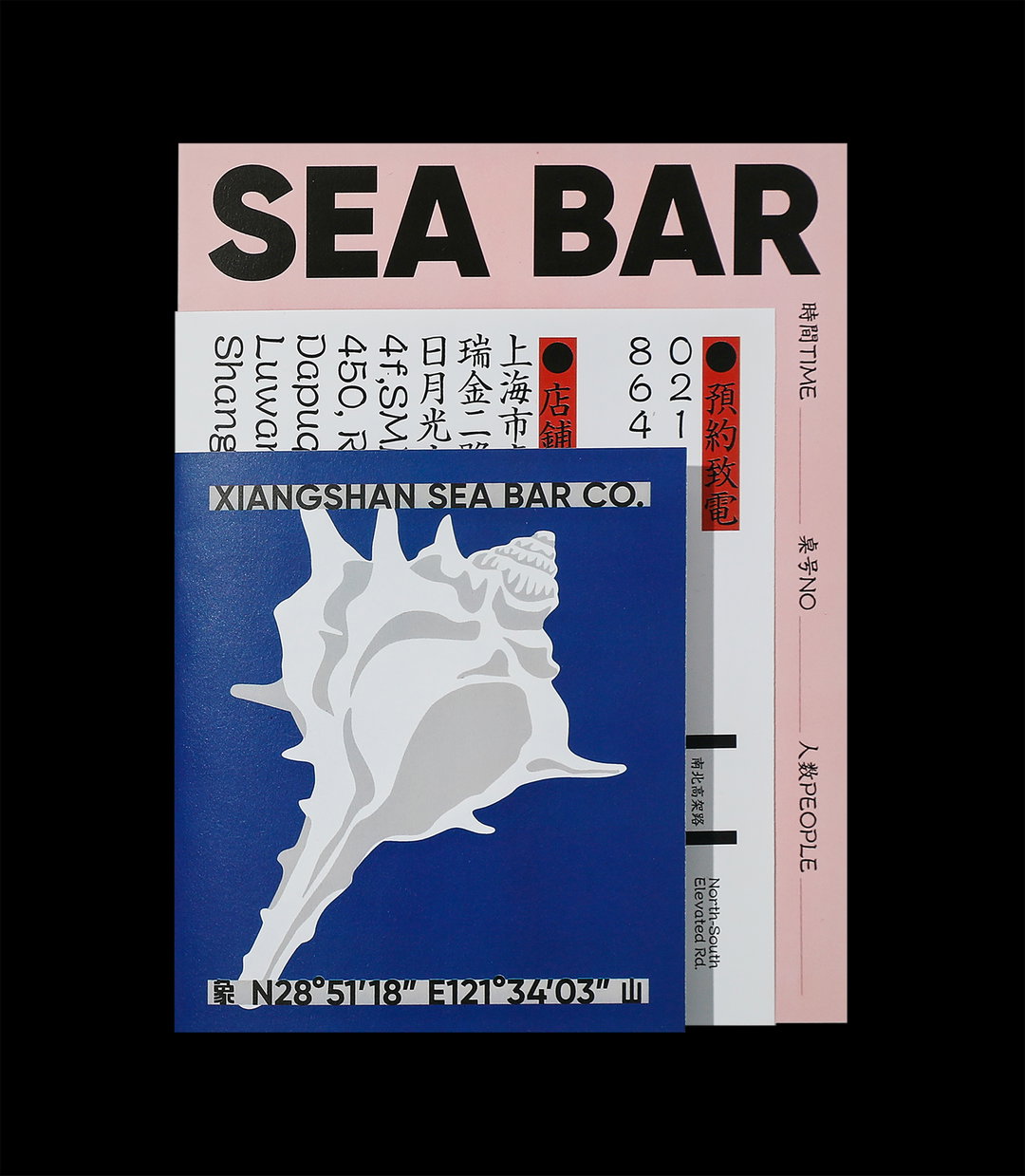
The studio prides itself on making traditional Chinese culture “resonate with younger people” through its designs. The studio’s visual identity for Sea Bar is a lovely example of how it does this. Sea Bar is a restaurant based in Shanghai which specialises in stewed seafood. Yin tells us that the owner was born in the 80s and grew up in a little fishing village by the seaside. “We took the fishing village of the 1980s as the theme,” he continues. Exploring the personal link between the owner’s childhood and the food at the restaurant became a key principle for the visuals. Sifting through “a large number of magazines, textbooks and posters, etc.”, the studio gathered a collection of photographs, objects and design styles that felt uniquely 80s and used these as a guide for the design.
Aiming to achieve a “clever conflict” between tradition and modernity, the studio embellished the food packaging with charming illustrations of crabs and seashells, their simple forms offering a quaint yet modern atmosphere to the design. For the posters, the studio used a vintage photograph of a fisherman which recalls the owner’s childhood memories. The old photograph is contrasted with bold, clean typography. Overall the beautiful designs have the effect of whisking the restaurant punter away from the bustling streets of Shanghai, transporting them to the peaceful 80s seaside town. The pale, delicate colour palette is the cherry on the cake of this whimsical visual identity.
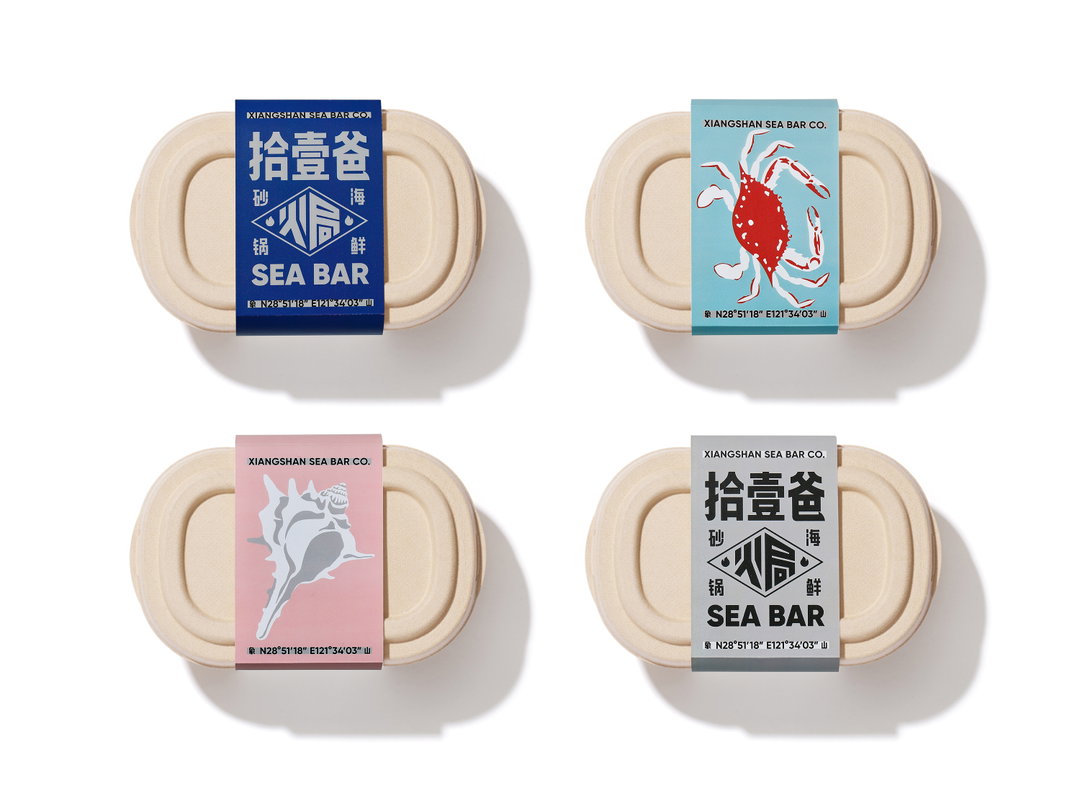
Reesaw Studio: Sea Bar (Copyright © Reesaw Studio, 2021)
Turning to another food-related project in their portfolio, Yin points us to Reesaw’s identity for G.L.Z market. Grand Liz is a dessert brand based in Shanghai – a well known and respected company that has become particularly popular among “senior” customers, Yin explains. The idea for G.L.Z market was to make the dessert company more attractive to younger people, whilst maintaining its older clientele. So Grand Liz opened its own store in Shanghai and approached Reesaw to create the new identity.
For the project the team decided to look to the Chinese local market for inspiration. “The local market is the most vivid place of every city in China,” says Yin. “However, under the impact of the internet, the local market has been gradually forgotten by consumers of the new generation, and become just an impression in their mind.” Aiming to revitalise the traditional Chinese market for their young target market, Reesaw worked to summon the general atmosphere of the marketplace rather than directly “duplicating” the style of bags, packaging and posters you see there. “Unique symbols of the Chinese market were abstracted and refined,” says Yin. A jolly and familiar colour palette of red, white and blue was chosen, and eye-catching illustrations to “upgrade the brand in a vibrant way” and “create the exclusive culture of G.L.Z Supermarket”.
Looking to the future, this young team is aiming to hone its visual language to be ever more “unique, systemic and targeted”. With a growing collection of commercially successful yet sensitively designed projects, we can’t wait to see what they’ll come up with next.
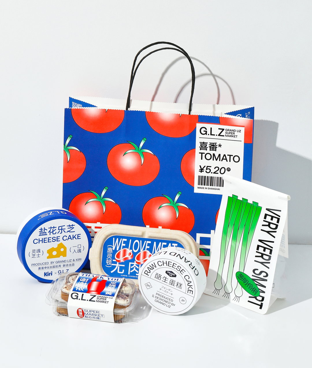
Reesaw Studio: G.L.Z Super Park (Copyright © Reesaw Studio, 2021)
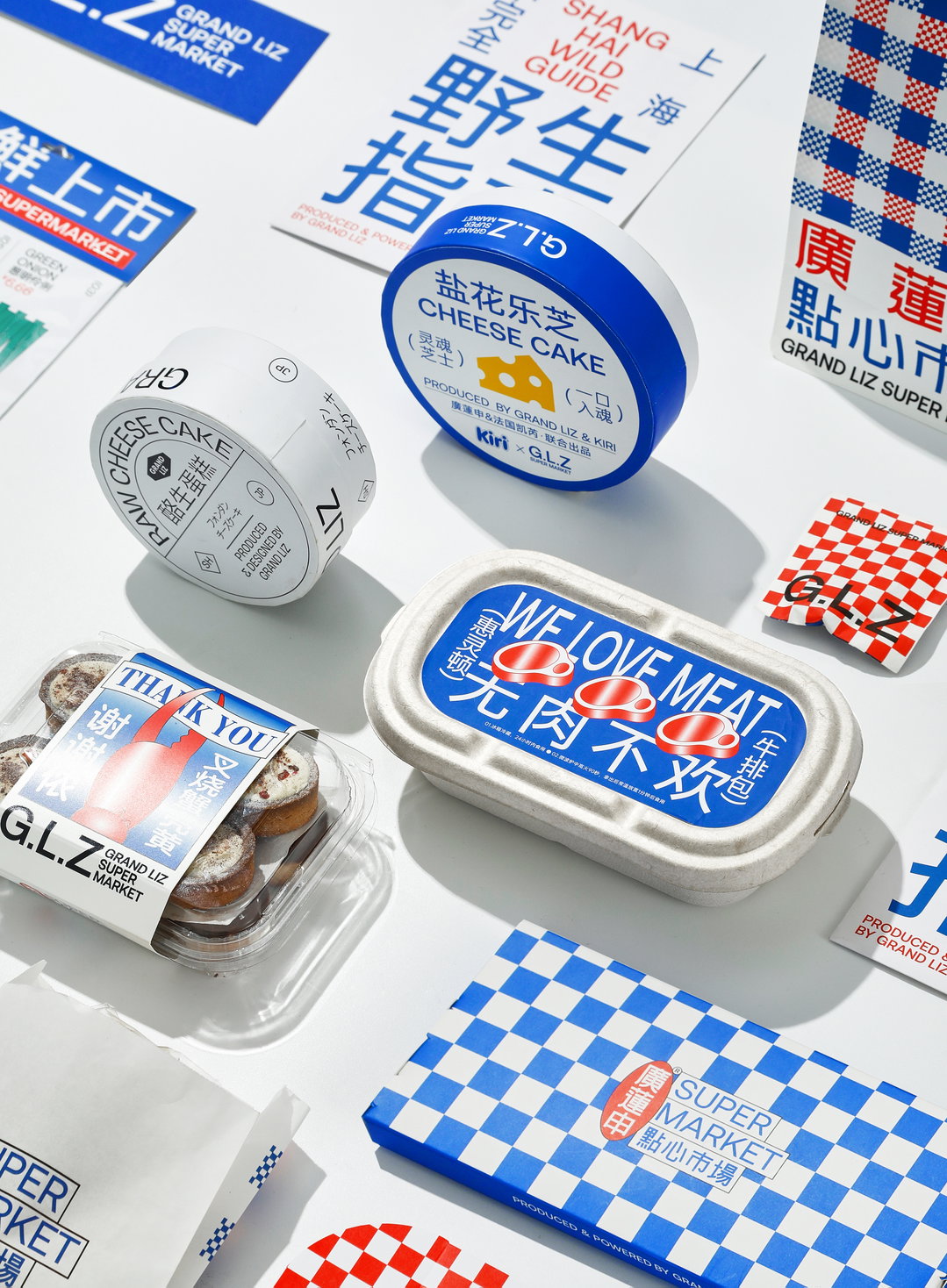
Reesaw Studio: G.L.Z Super Park (Copyright © Reesaw Studio, 2021)
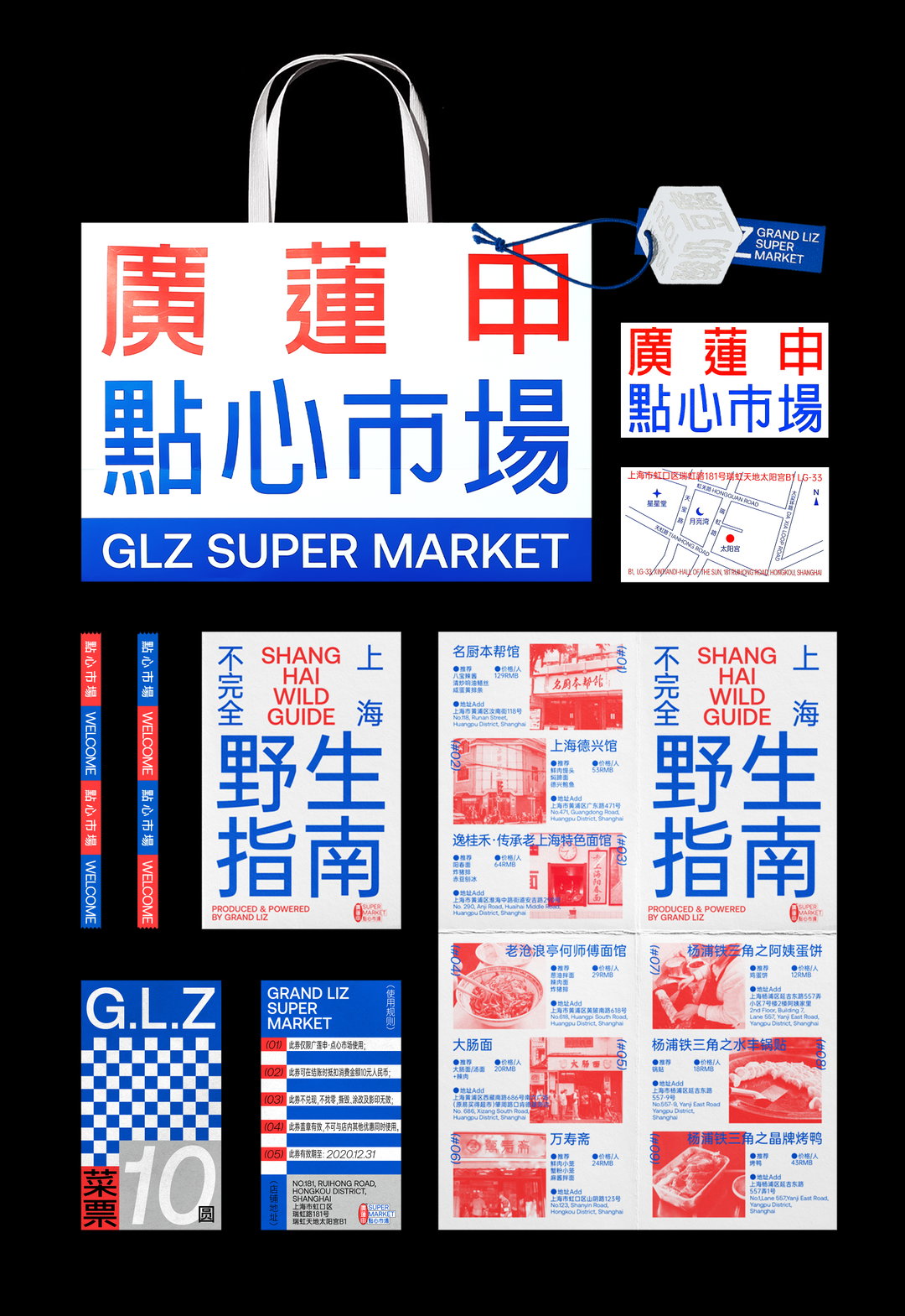
Reesaw Studio: G.L.Z Super Park (Copyright © Reesaw Studio, 2021)
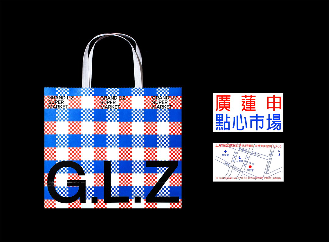
Reesaw Studio: G.L.Z Super Park (Copyright © Reesaw Studio, 2021)
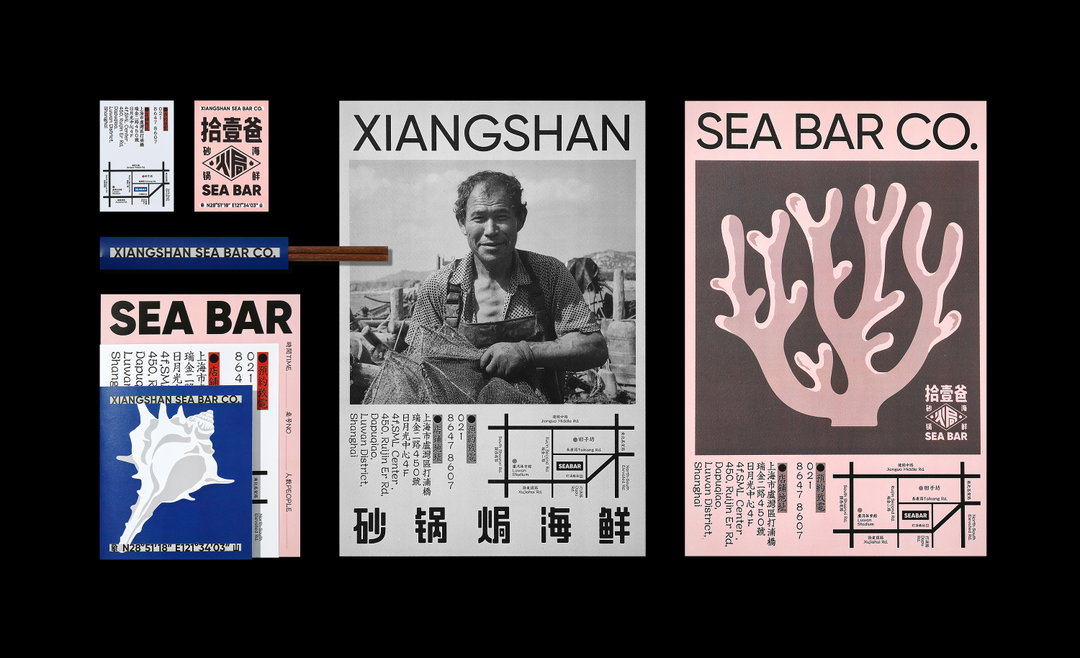
Reesaw Studio: G.L.Z Super Park (Copyright © Reesaw Studio, 2021)
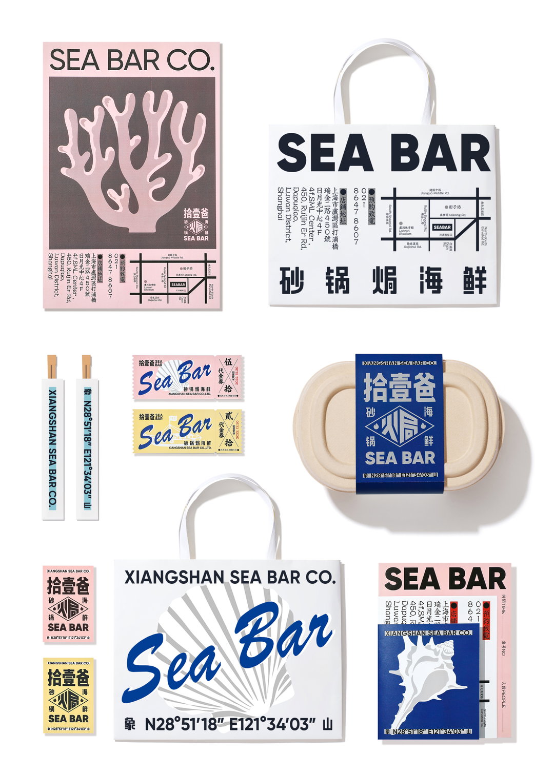
Reesaw Studio: Sea Bar (Copyright © Reesaw Studio, 2021)
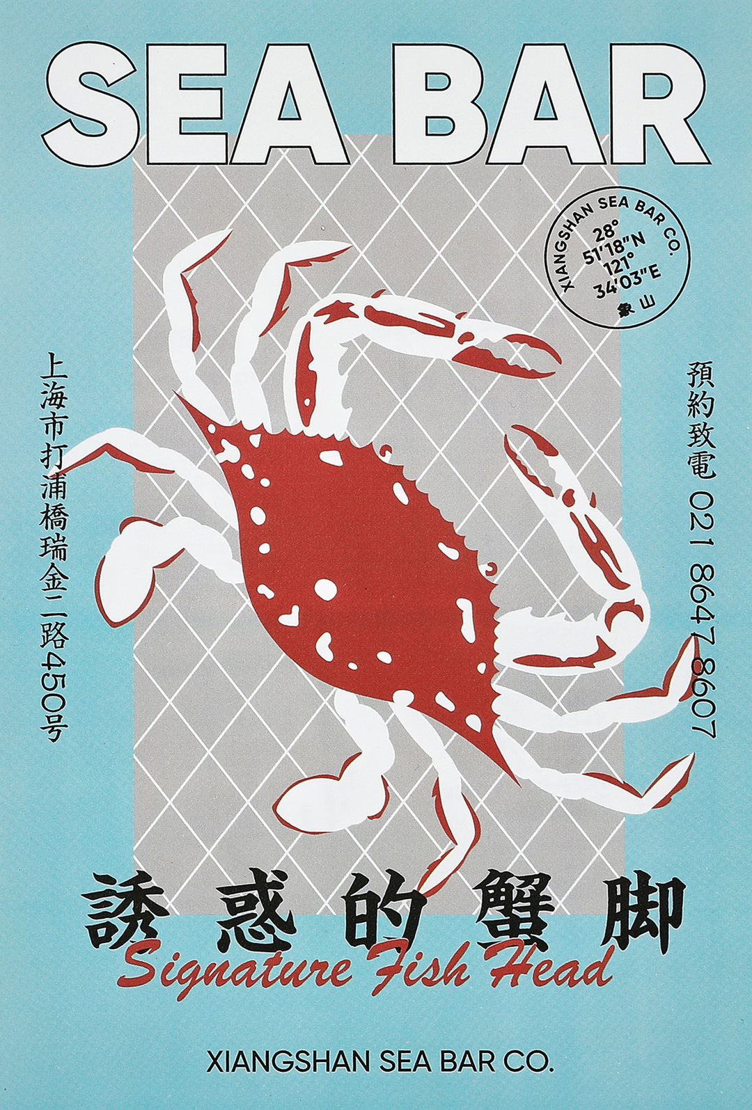
Reesaw Studio: Sea Bar (Copyright © Reesaw Studio, 2021)
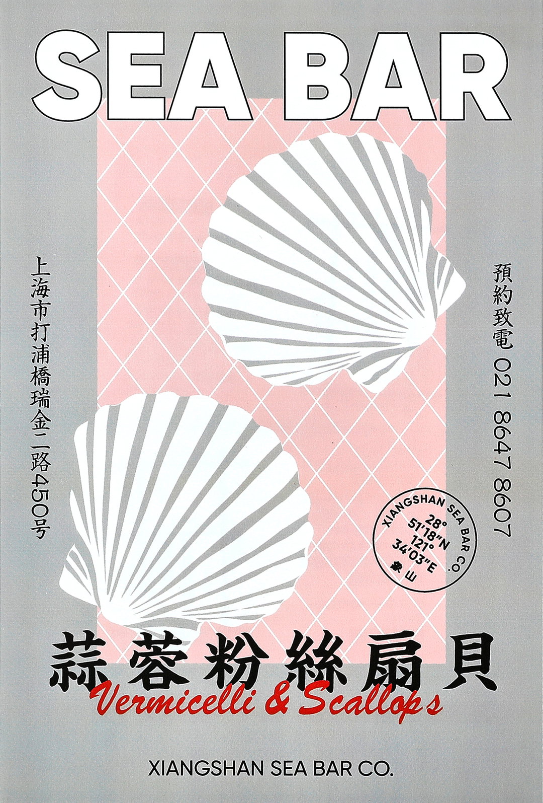
Reesaw Studio: Sea Bar (Copyright © Reesaw Studio, 2021)
Hero Header
Reesaw Studio: Sea Bar (Copyright © Reesaw Studio, 2021)
Share Article
Further Info
About the Author
—
Elfie joined It’s Nice That as an editorial assistant in November 2021 after finishing an art history degree at Sussex University. She is particularly interested in creative projects which shed light on histories that have been traditionally overlooked or misrepresented.