Adoratorio Studio takes a new lens on eyewear with a soft but technical rebrand for Indice
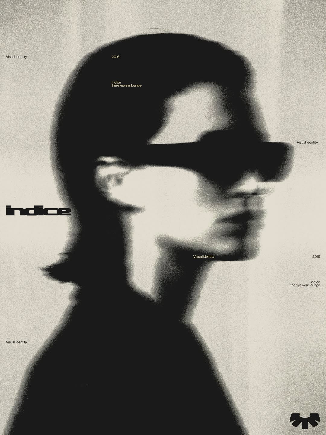
By creating a visual world around the brand that positions it away from anything conventional in the category, the agency have made the label feel more like a lifestyle brand than luxury retail.
What interests independent creative agency Adoratorio Studio when it comes to building visual identities for brands is not their size, field or discipline, instead, the studio is often drawn to “those who care deeply about how things are made and communicated, and who believe design can do more than support growth; it can shape culture and contribute meaningfully,” shares co-founder Camilla Zampolini. Working across strategy, identity and communication, the studio takes on multidisciplinary projects across their two bases in Brescia and Amsterdam that allow them to shape “not just how a brand looks but how it behaves and speaks”, Camilla adds. One brand that had been on the studio’s radar for quite some time was the designer eyewear brand Indice, and, in line with the label’s tenth anniversary, the studio recently got the chance to partner up with the shop to build both a fresh design identity and a campaign surrounding its relaunch.
Each project starts by understanding the particularities of a brand at Adoratorio, and Indice was no different. To find the most “compelling way to make its character visible, tangible and memorable”, says Camilla, the agency dug into the stores ambition to move beyond being simply labelled a retailer and establish themselves “as a distinctive cultural reference within the niche luxury-eyewear landscape”, Camilla says – “not simply a place where glasses are sold, but a brand people want to enter, experience and belong to”.
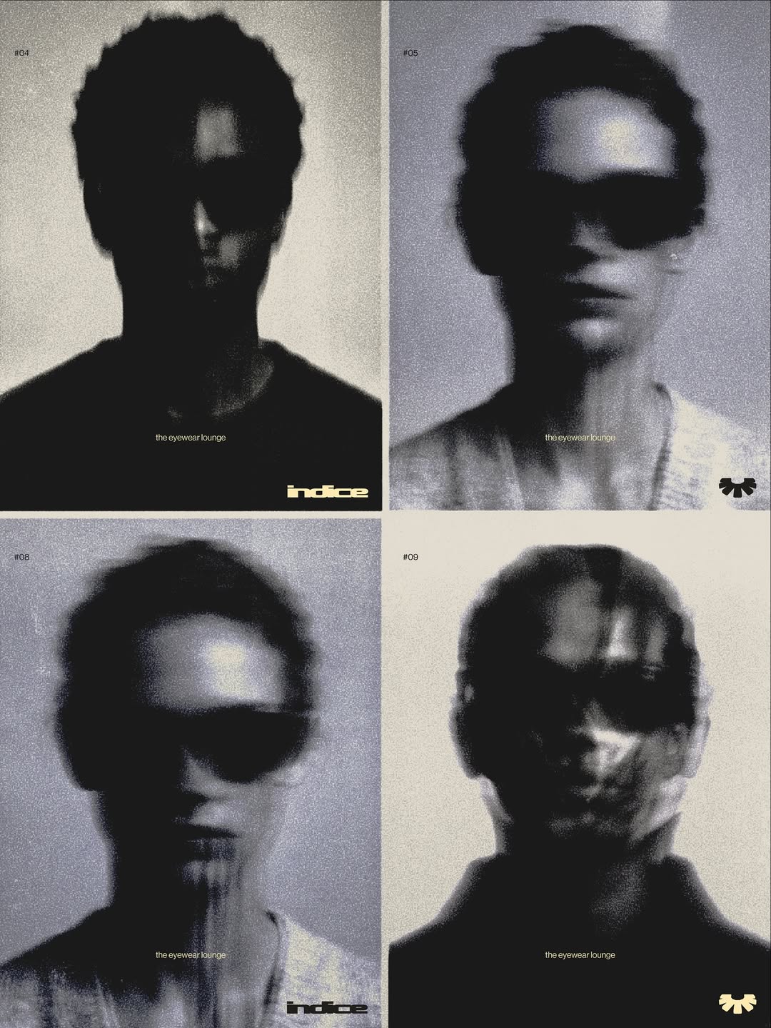
Adoratorio®️Studio: Indice Rebranding (Copyright ©️ Adoratorio®️ Studio, 2026)
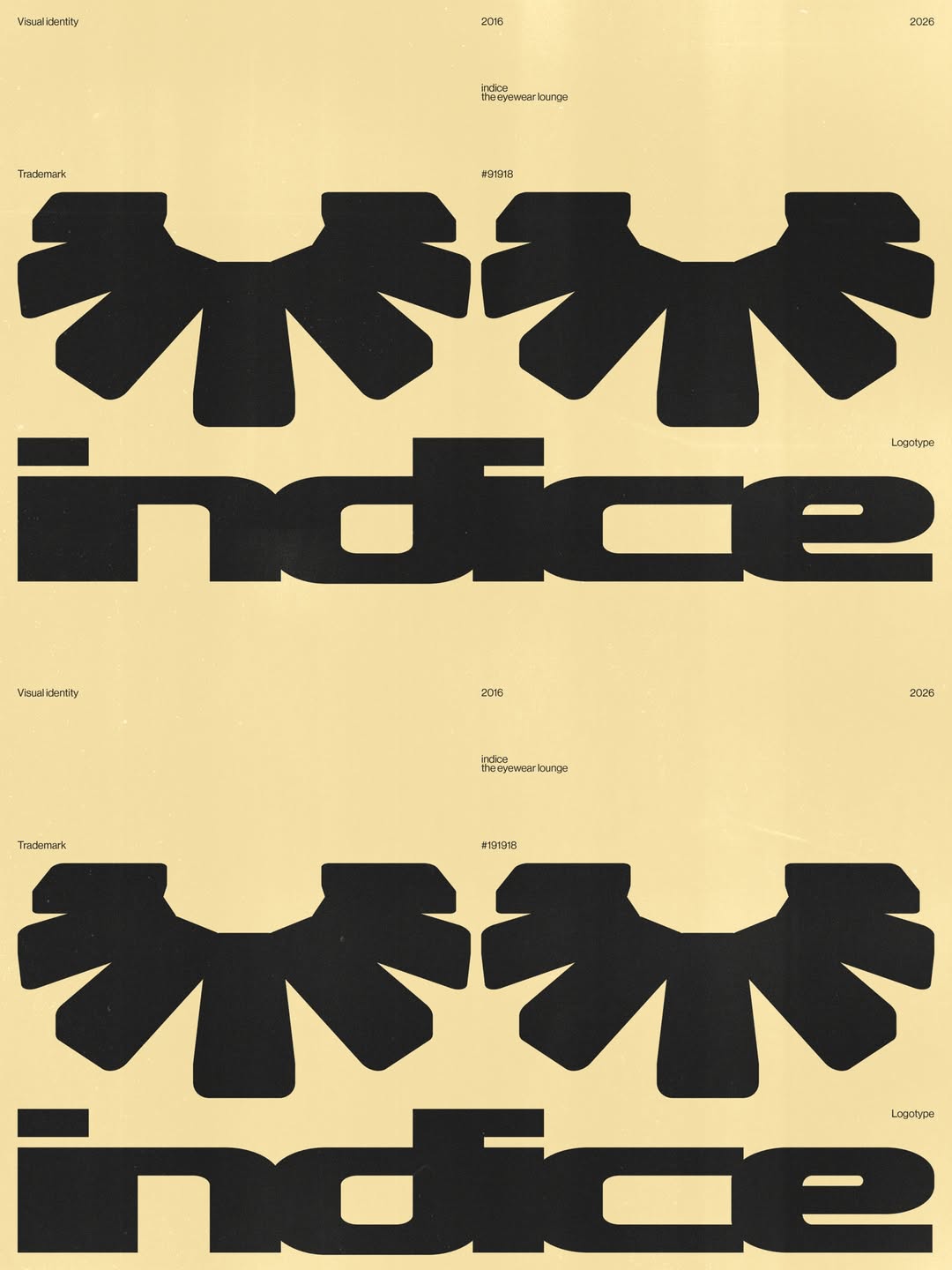
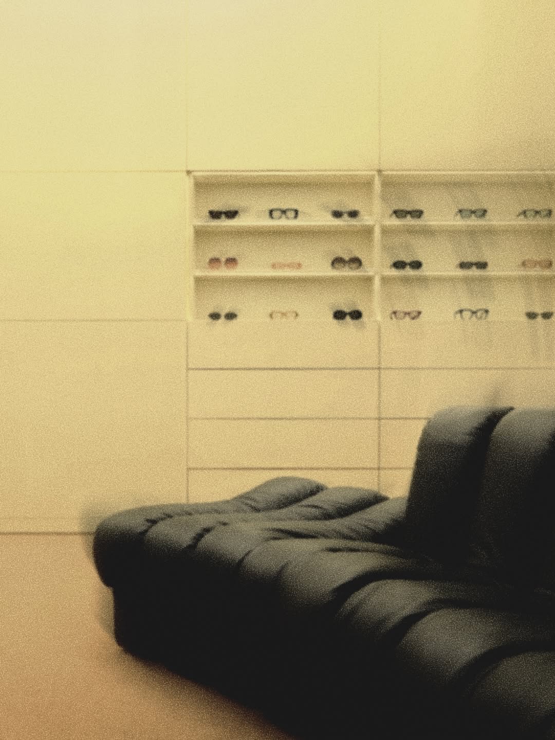
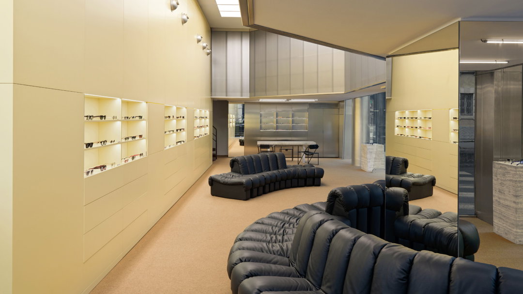
By renaming the brand’s location as The Eyewear Lounge, the agency positioned Indice away from the conventional, sterile or even medical language that traditionally surrounds eyewear or luxury, which then allowed it to step into a new visual world. Tying it to a slow space in the home suggested “time, intimacy and conversation” a place whose collection displays a “deep knowledge of materials, craftsmanship and production”, says Camilla, sitting away from the regular rush of retail. This approach naturally led Adoratorio to draw from the soft interiors that define the inside of the store for a new visual language. That’s why the new logo takes from the very sofa you sit on when picking out your new frames, designed by De Sede – it also coincidentally looks like an eyelash.
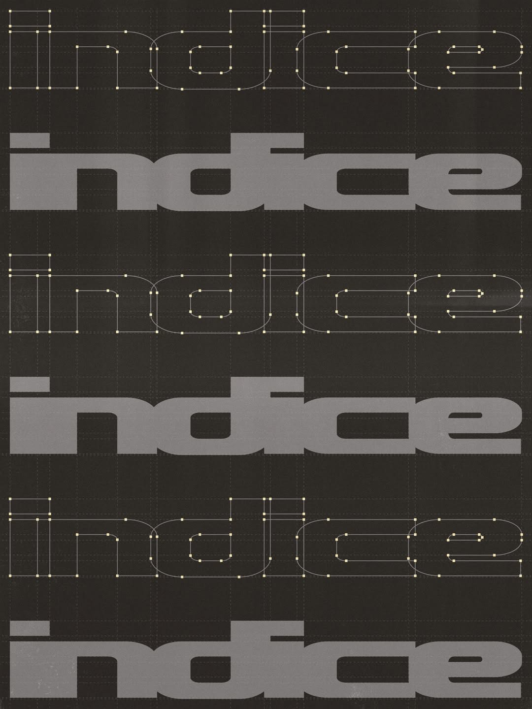
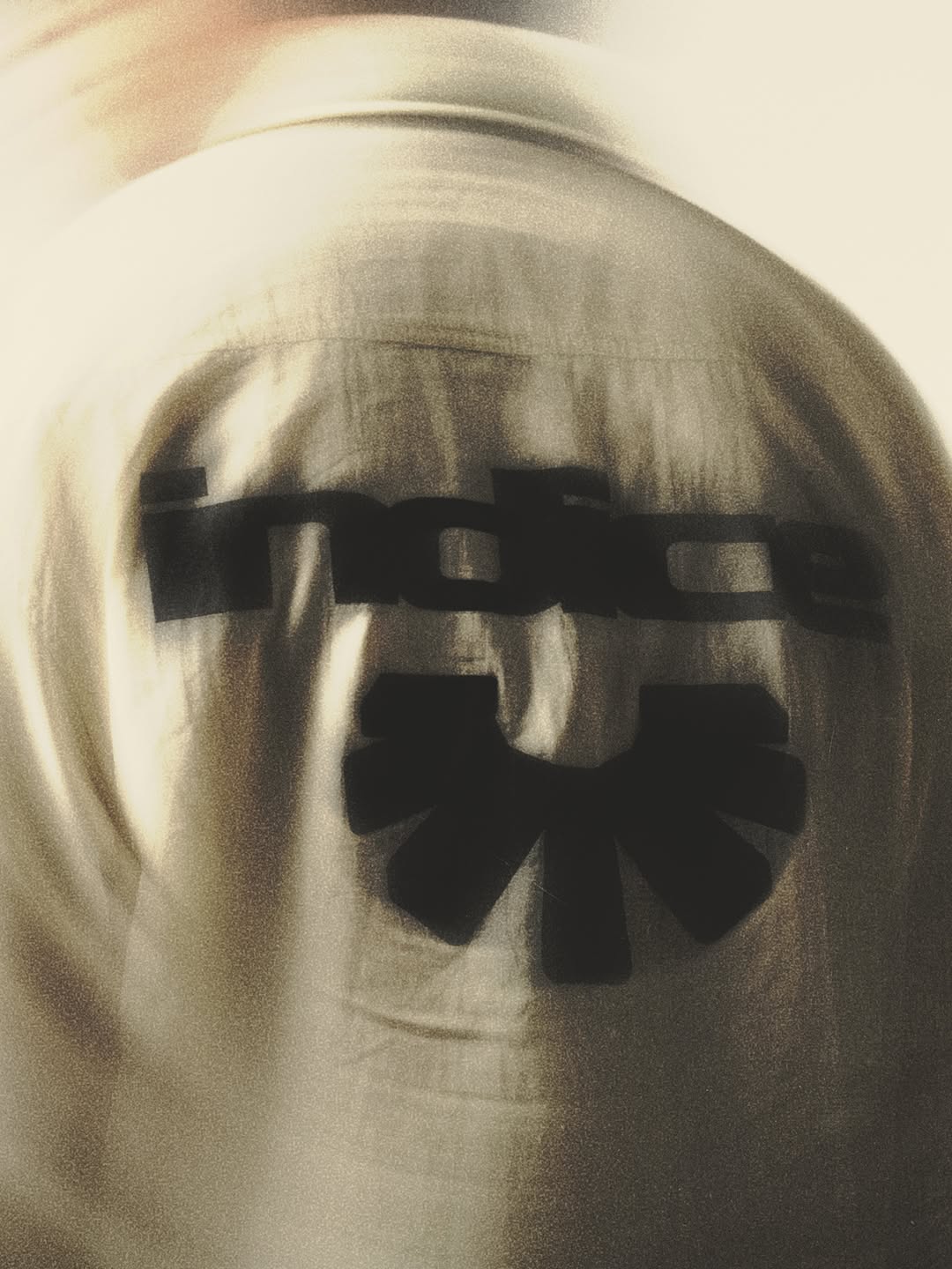
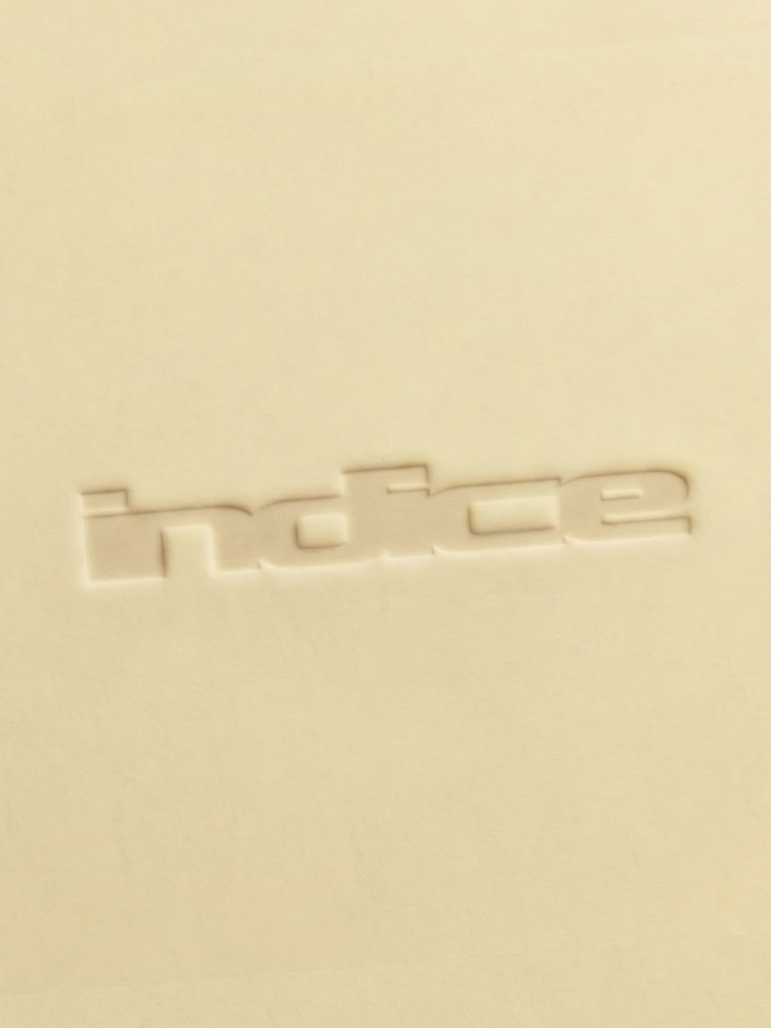
“The logotype reflects the store’s sensual, sophisticated curves. The letterforms merge and flow into one another, creating a distinctive silhouette that prioritises feeling and personality over immediate legibility. Rather than simply spelling out a name, the logo was designed to evoke softness, movement and a certain visual seduction,” Camilla tells us. The colour palette for the visual system also draws directly from the interior from the soft butter yellow of the walls to the metallic grey of the stores shelves and panels.
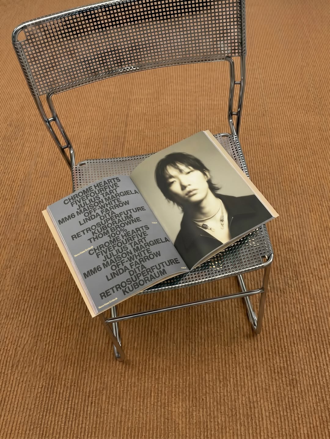
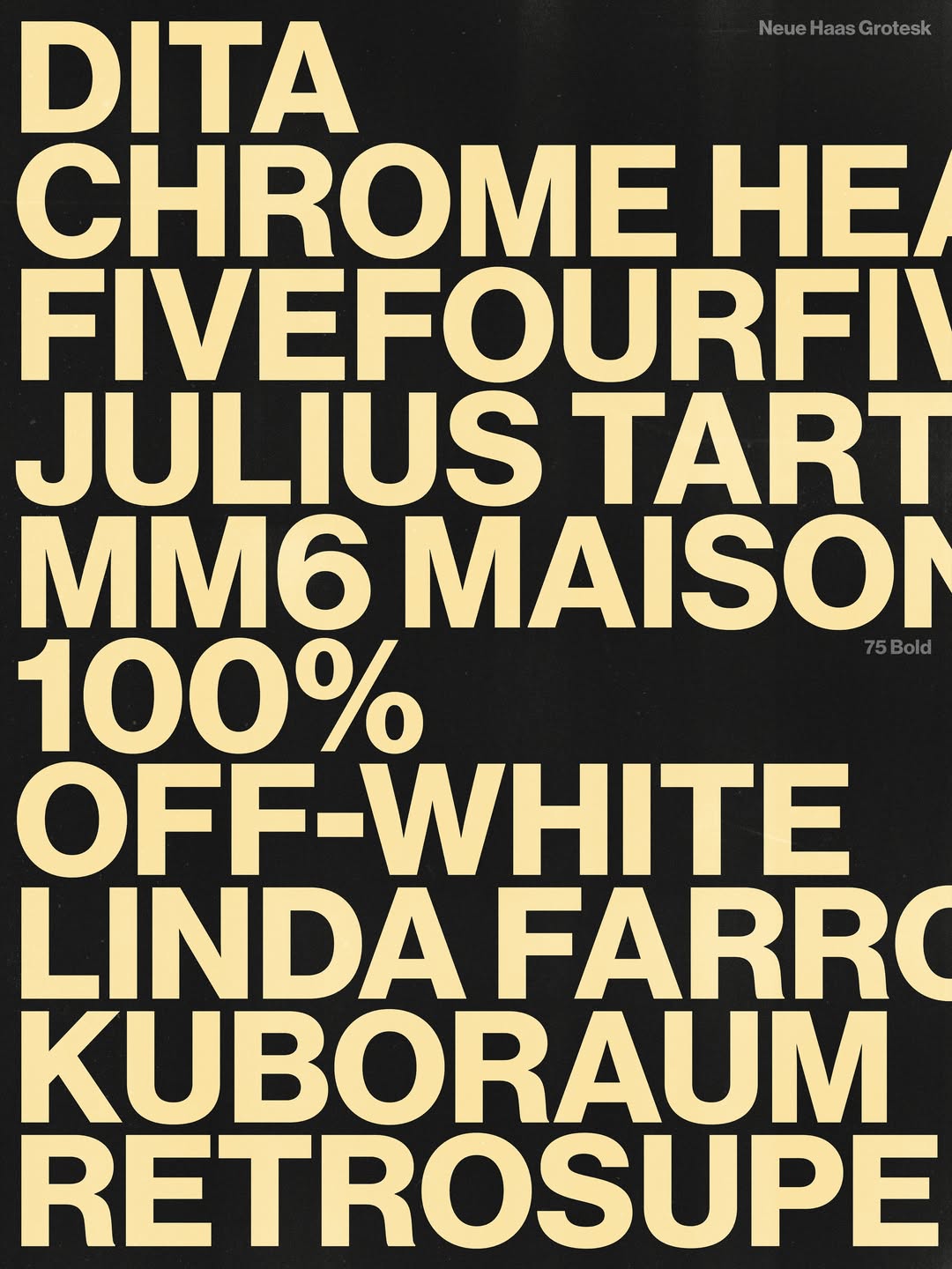
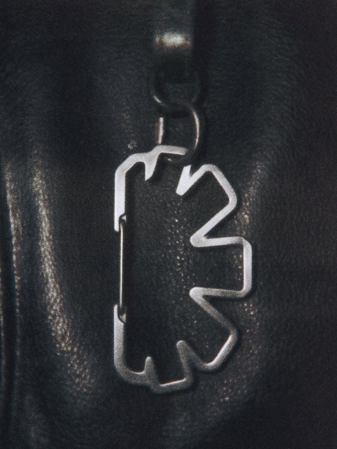
Technical and restrained, this new face for Indice doesn’t push a singular graphic stamp but combines this abstract logo shape with bold condensed typography, pastel colours and photos with the soft grain of film to convey the same welcoming allure that defines an in person browse. “Together, these elements create a visual identity that feels like a natural extension of the store rather than something applied to it,” Camilla ends.
GalleryAdoratorio®️Studio: Indice Rebranding (Copyright ©️ Adoratorio®️ Studio, 2026)
Hero Header
Adoratorio®️Studio: Indice Rebranding (Copyright ©️ Adoratorio®️ Studio, 2026)
Share Article
About the Author
—
Ellis Tree (she/her) is a staff writer at It’s Nice That. She joined as a junior writer in April 2024 after graduating from Kingston School of Art with a degree in Graphic Design. Across her research, writing and visual work she has a particular interest in printmaking, self-publishing and expanded approaches to photography. ert@itsnicethat.com
To submit your work to be featured on the site, see our Submissions Guide.