In Requena Office’s identity for Garden Pizza, words look like plants and letters like flowers
In a new design system for the restaurant, the studio looked to the slow and quiet processes of the natural world for inspiration.
This year Requena Office is celebrating its tenth anniversary. To mark the occasion, the team is going to throw a party with “a lot of French cheese and toast with Catalan Cava”, creative director Andrés Requena tells us, and we’re just a little bit sad that we can’t get to Barcelona in time to join.
The studio certainly has a lot to toast. Over the last decade it’s created projects across branding, packaging, art direction, editorial and web design, and more, with a rigorous and authentic approach that expresses the visual nuances of a subject in a wonderfully vibrant way. Its latest identity project for independent eatery Garden Pizza is no exception.
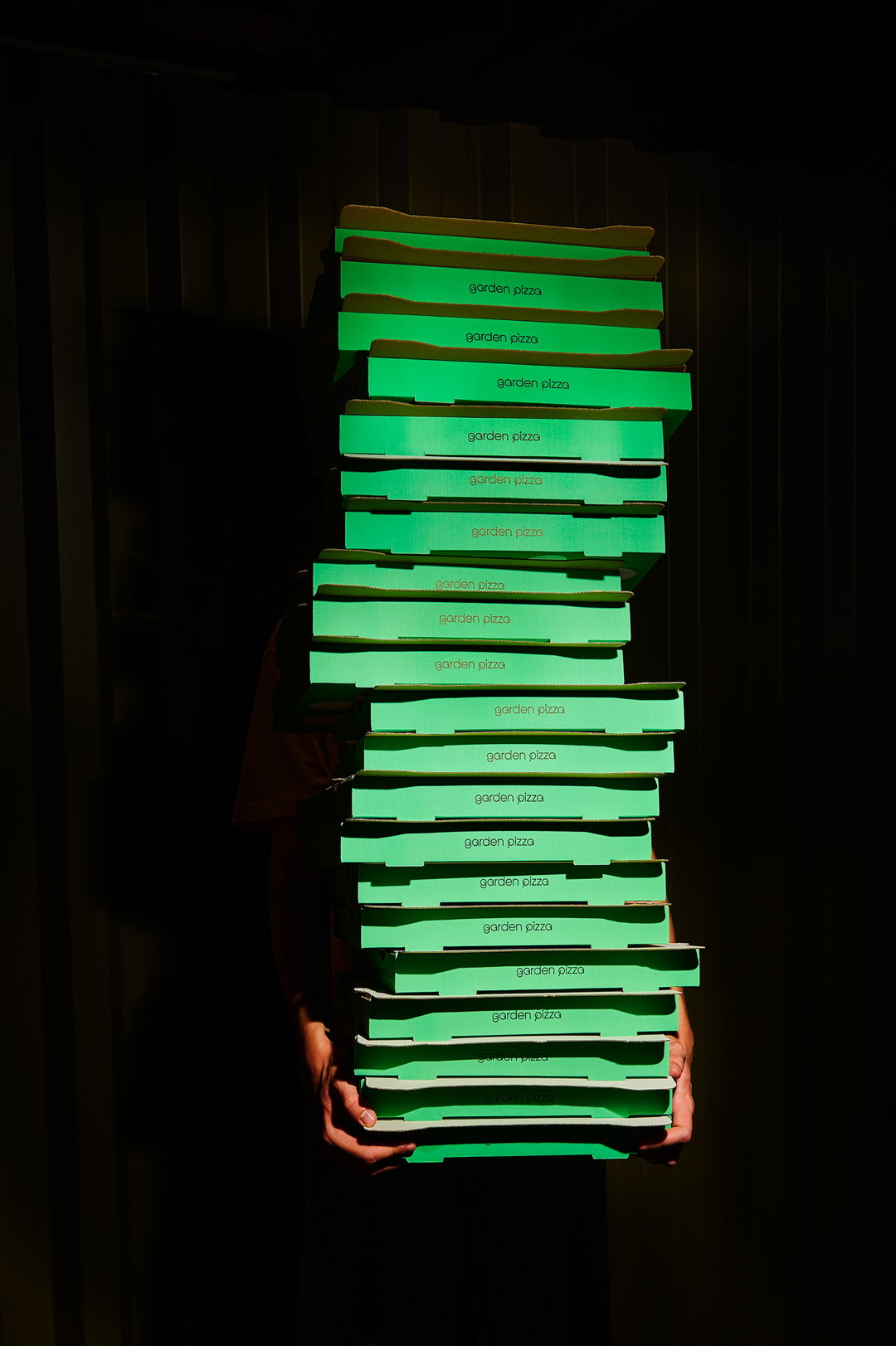
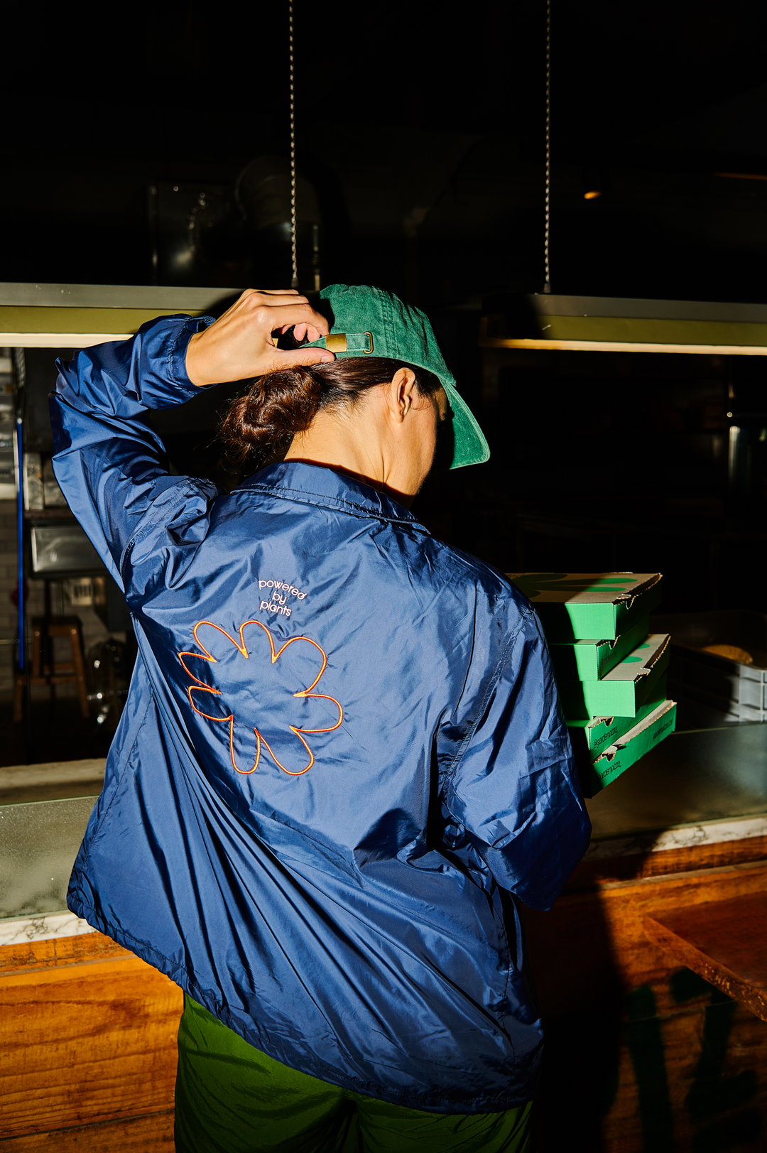
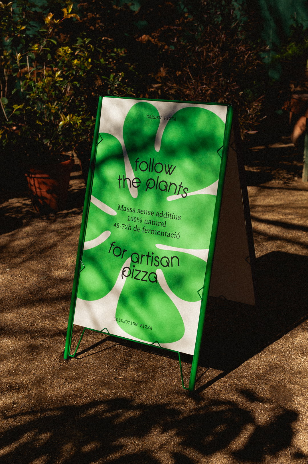
The eatery offers up artisanal pizzas in environments immersed in nature, and its name derived from the pizzeria’s very first location – a former garden at the foot of Collserola Natural Park in Barcelona. An affinity for the restaurant’s food and location was Requena’s starting point for a visual vernacular that translated aspects of planting, harvesting and cultivating produce into a blooming identity. Following nature’s cycles of change as a pathway to creating an evolving design system, the studio “leveraged the symbolic richness of the name to create a narrative language linking the growth associated with a garden and the natural fermentation of pizza”, shares Andrés.

Requena Office: Garden Pizza (Copyright © Requena Office, 2025)
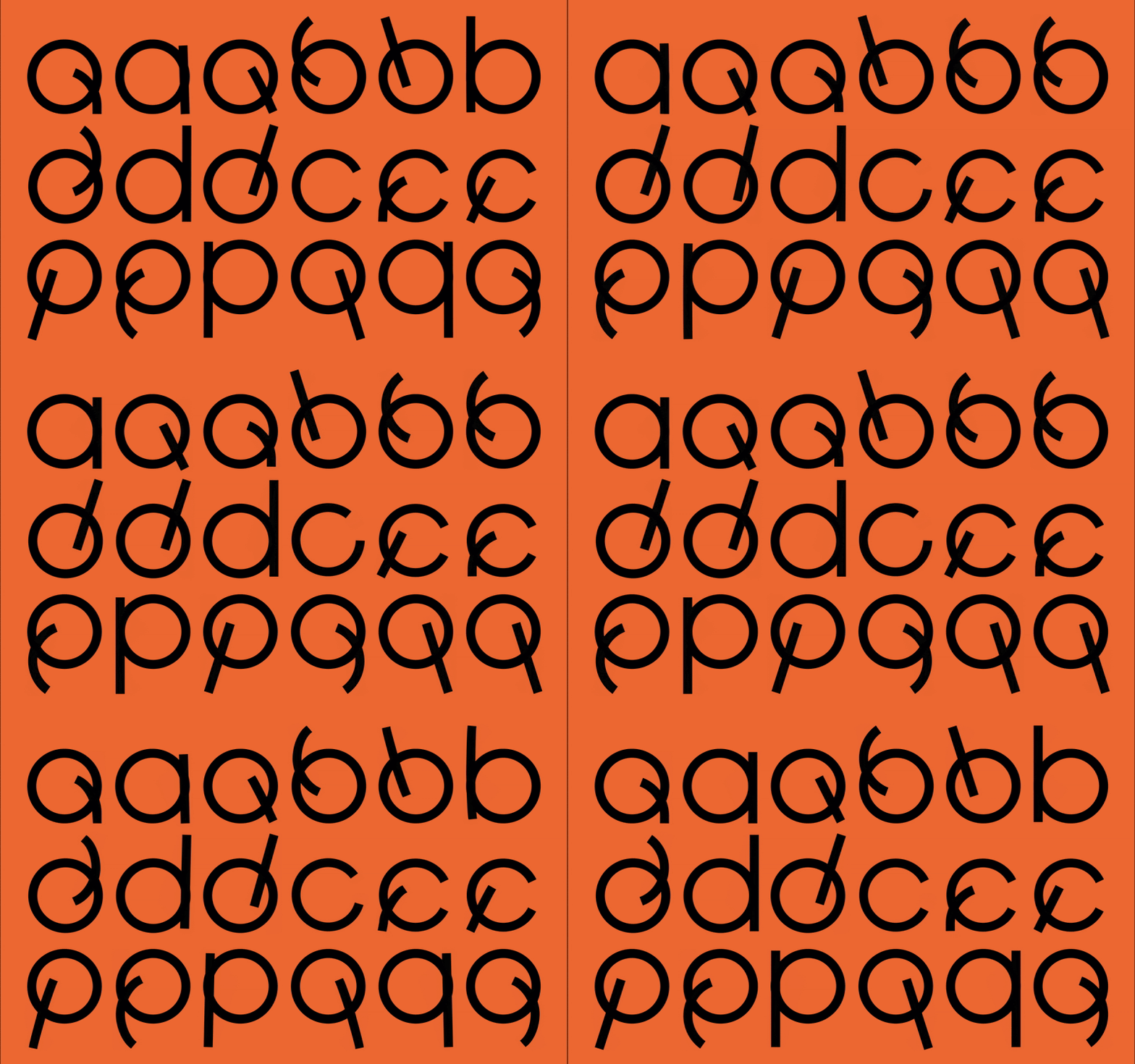
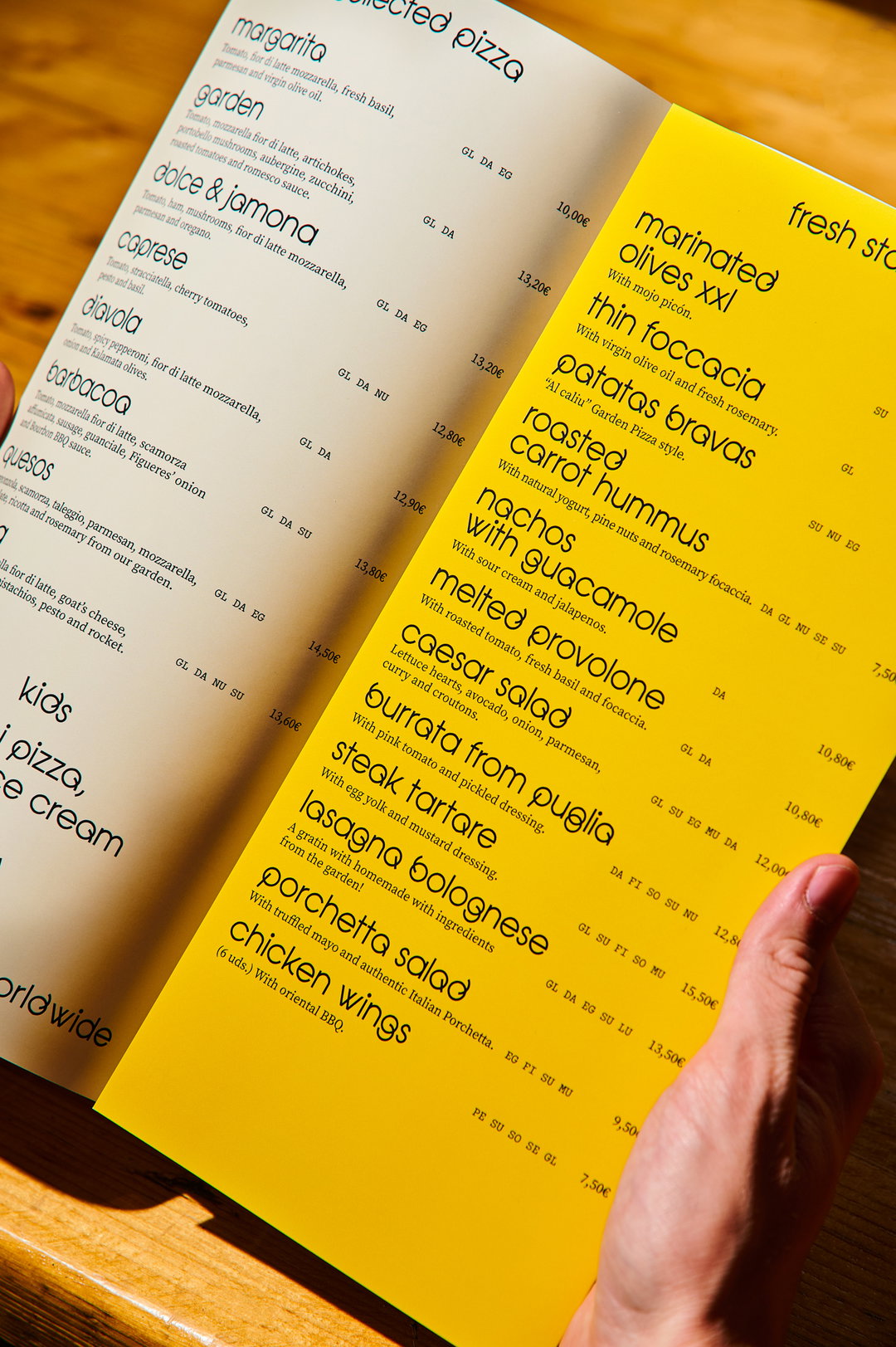
The team is currently fond of revisiting some of the most important figures in design. Their recent work on a refresh for the face of Requena saw Paul Renner’s Futura transform into a custom typeface for the studio. The Garden Pizza project also has a hidden historical twist. Requena began the project using Herb Lubalin’s Avante Garde, a post modern typographic classic that they carefully redrafted into “a much more expressive, joyful and affectionate” letterset, fittingly named Avant Garden.
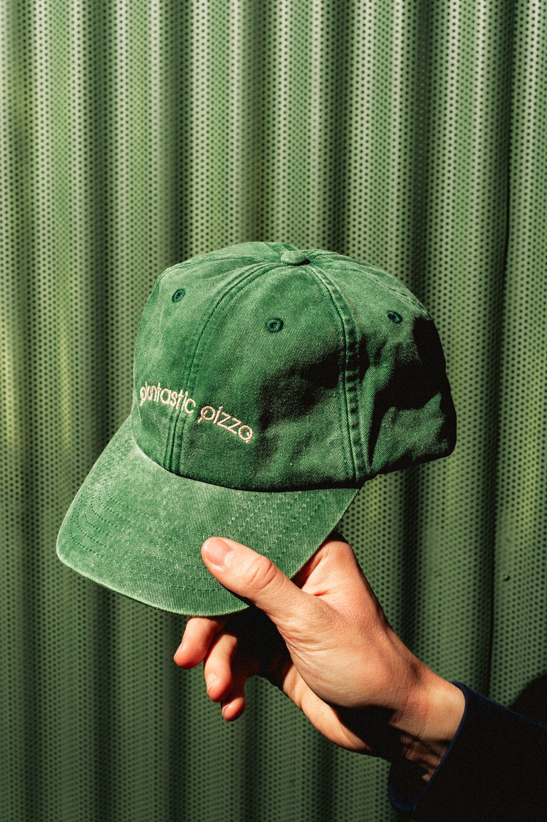
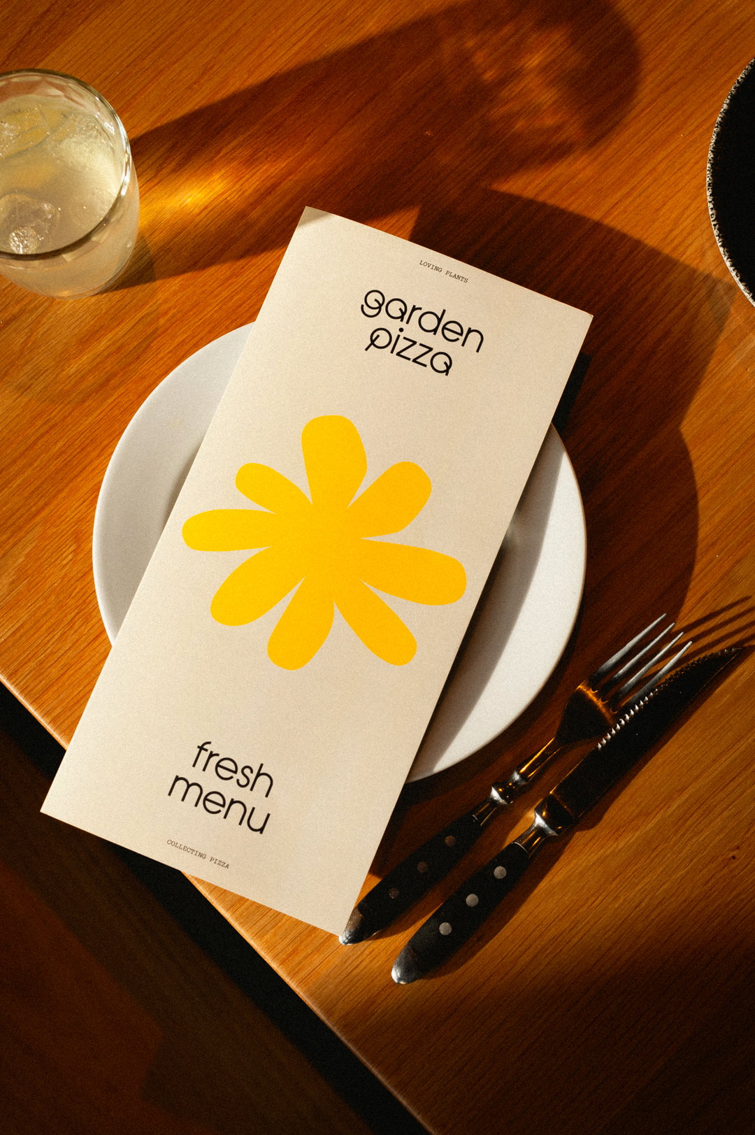
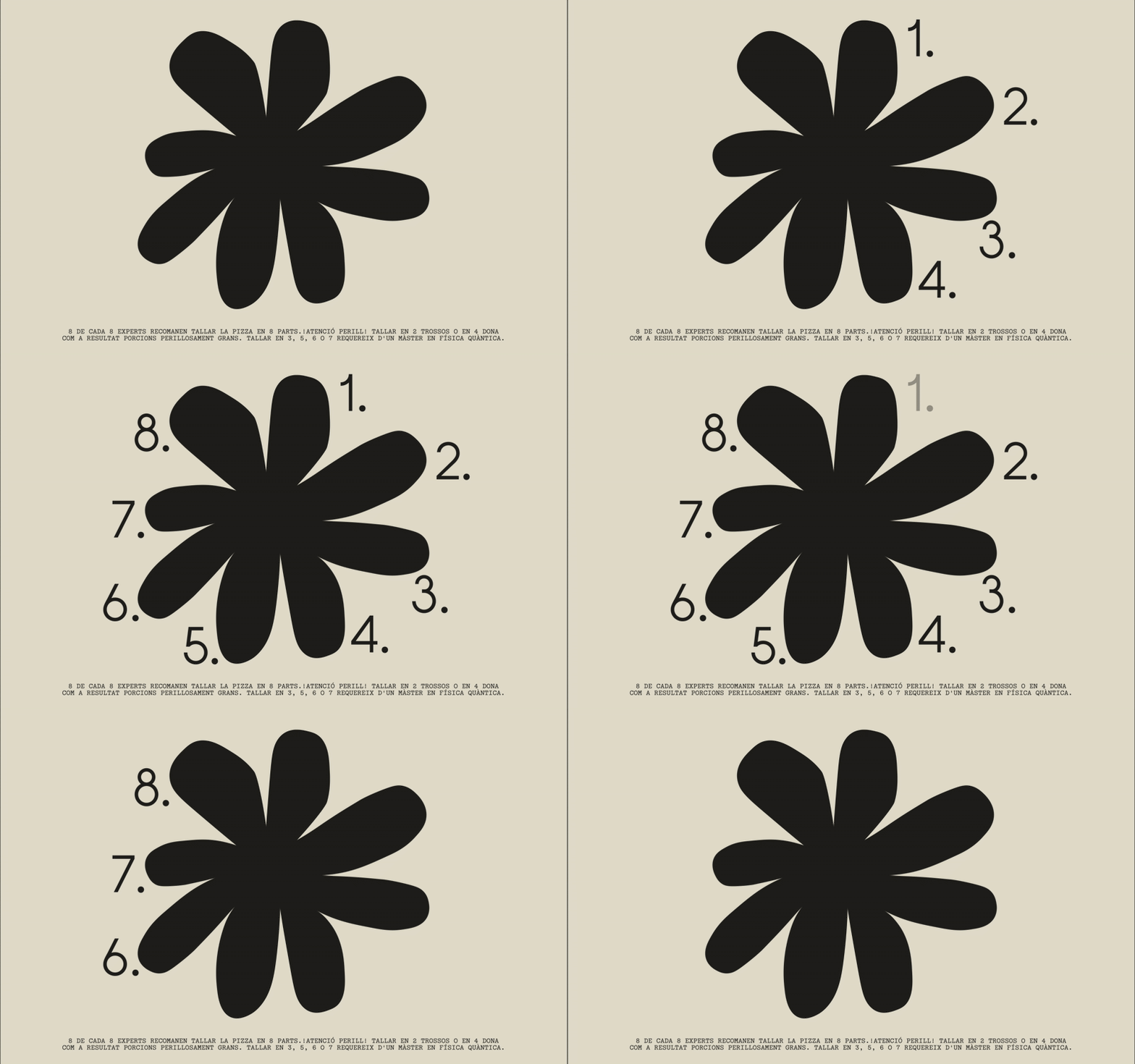
Created through the lens of sprouting seeds and evolving elements, this new typeface turns the 20th century typeface’s circles and straight lines “into curves that weave in and out” and transforms the font through clever motion design to make “words like plants, letters like flowers”, explains Andrés. A curved and abstract ‘g’ from this typographic experiment now sits as the pizzeria’s new logo mark – its descender animated to slowly detract from a whole circle, like a steadily disappearing plate of pizza.
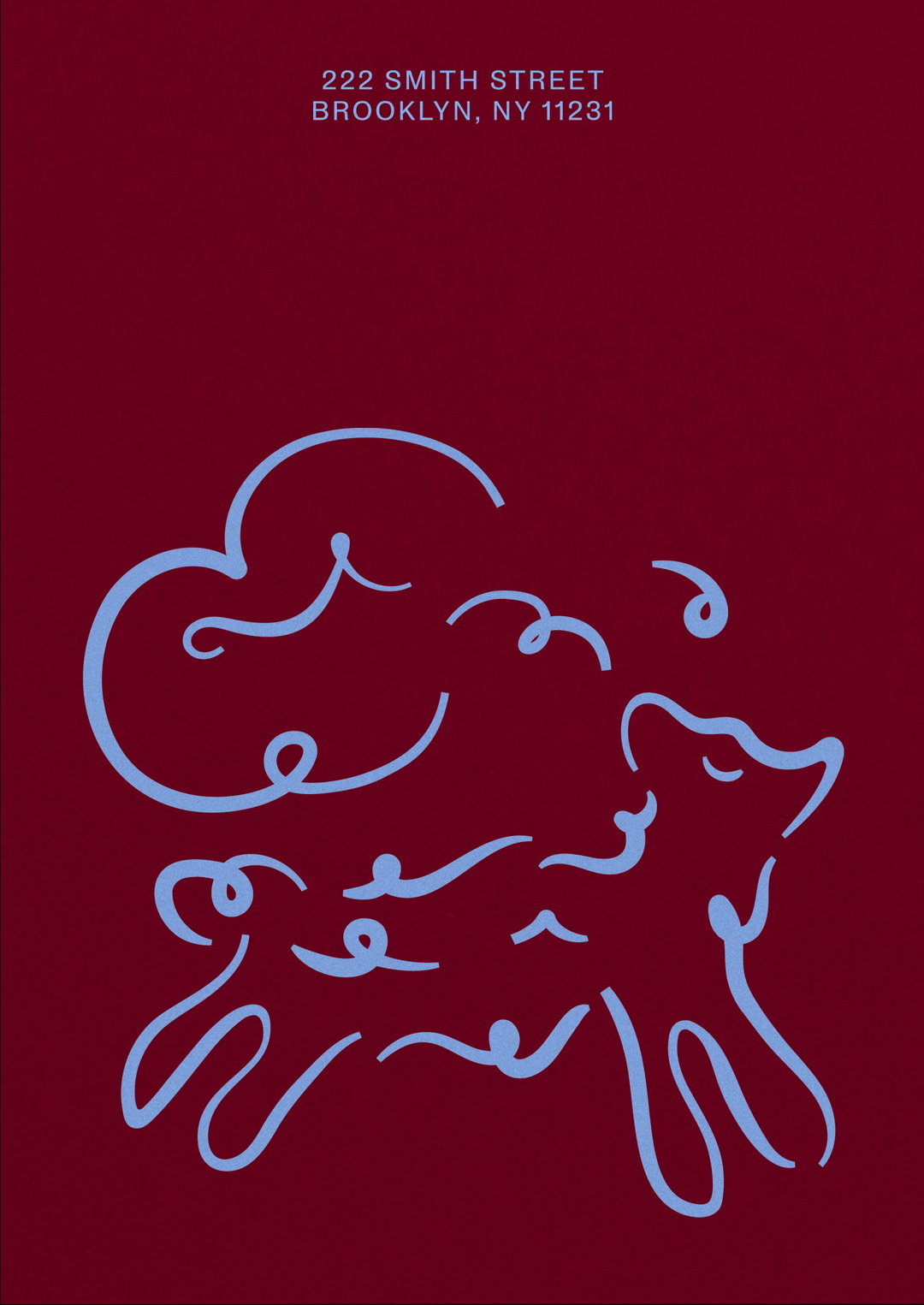
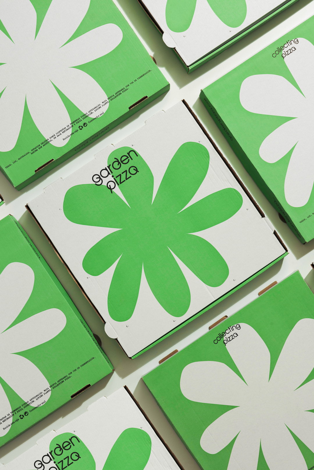
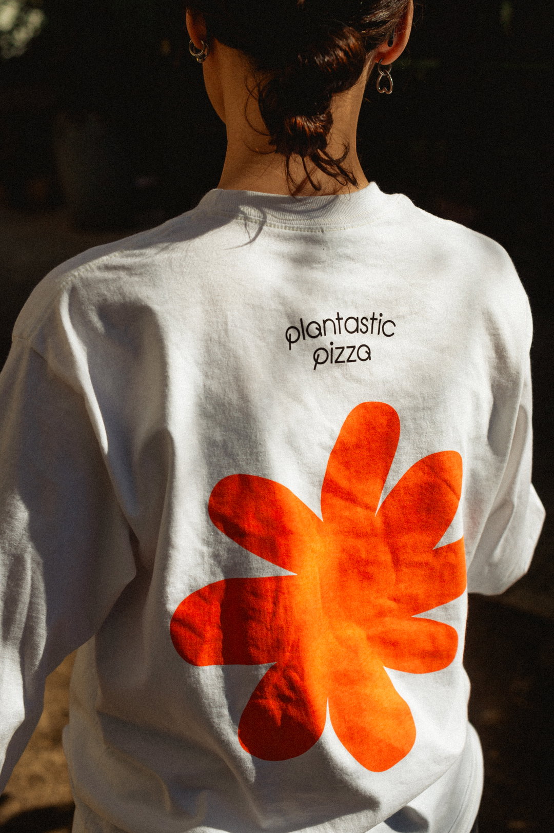
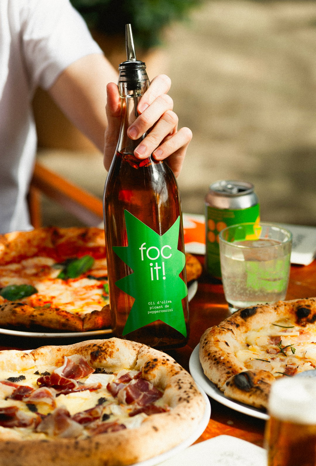
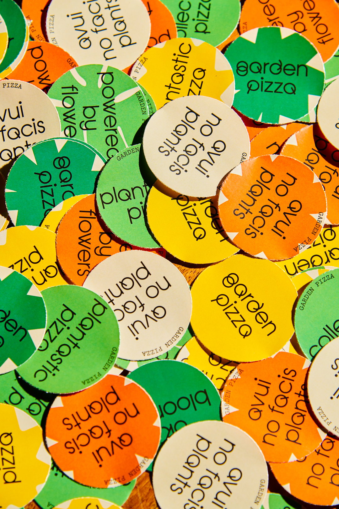
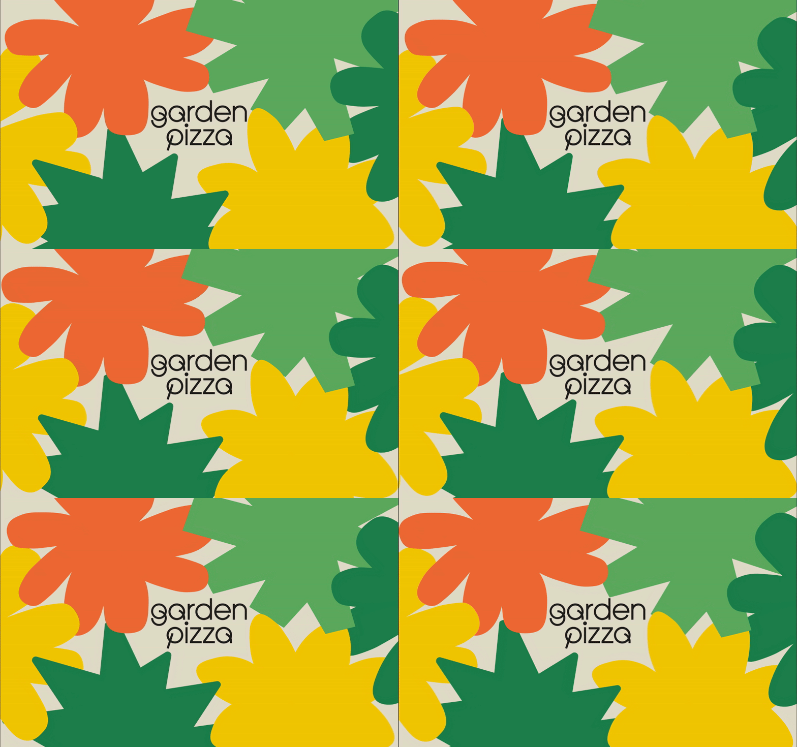
Motion became a device for playfulness in the identity across applications. Alongside the typography, graphic cut-out shapes sway across digital assets like shadows from trees and make for colour stamps on t-shirts, menus and restaurant bottles alike. This library of forms allowed Requena to adapt the design system to the many digital and physical forms the brand would take. Something that was important to Requena was that everything had the room to evolve, that the identity system mirrored the ongoing excitement of a garden in bloom. “Our communication is nourished by logical processes based on the very nature of imperfection, progress, evolution, improvement, and change,” ends Andrés.
GalleryRequena Office: Garden Pizza (Copyright © Requena Office, 2025)

Hero Header
Requena Office: Garden Pizza (Copyright © Requena Office, 2025)
Share Article
Further Info
About the Author
—
Ellis Tree (she/her) is a staff writer at It’s Nice That. She joined as a junior writer in April 2024 after graduating from Kingston School of Art with a degree in Graphic Design. Across her research, writing and visual work she has a particular interest in printmaking, self-publishing and expanded approaches to photography. ert@itsnicethat.com
To submit your work to be featured on the site, see our Submissions Guide.