Review of the Year 2013: Rob Alderson picks his wildcards of the year
Another 12 months gone by and hundreds of articles later, picking five was nigh on impossible. In fact it was impossible; as you’’ll see I’ve abused my position and to sneak in references to two extra posts as I just couldn’t whittle it down. So sue me yeah? (Please don’t sue me.) Anyway enough of my prattling on here are my picks of 2013…
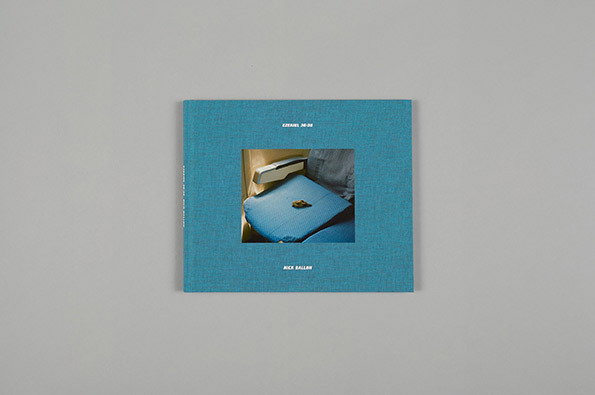
Nick Ballon & Studio Thomson: Ezekiel 36:36
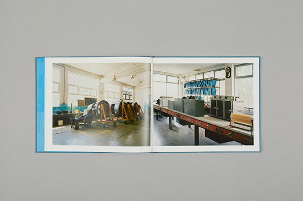
Nick Ballon & Studio Thomson: Ezekiel 36:36
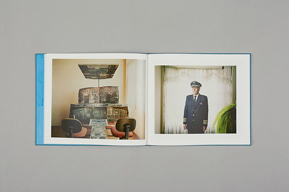
Nick Ballon & Studio Thomson: Ezekiel 36:36
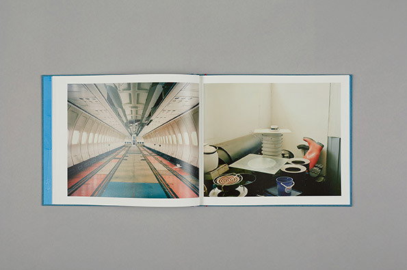
Nick Ballon & Studio Thomson: Ezekiel 36:36
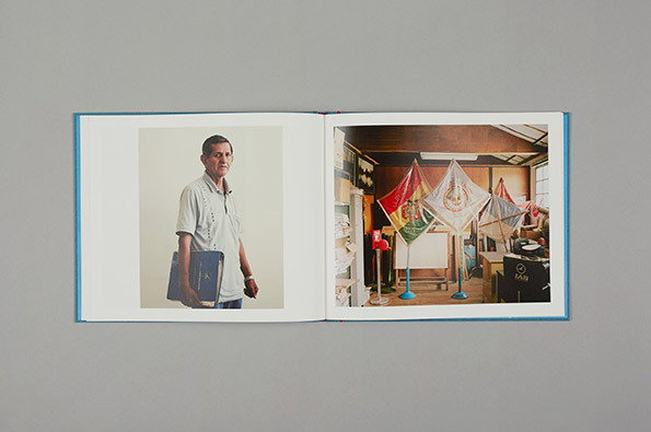
Nick Ballon & Studio Thomson: Ezekiel 36:36
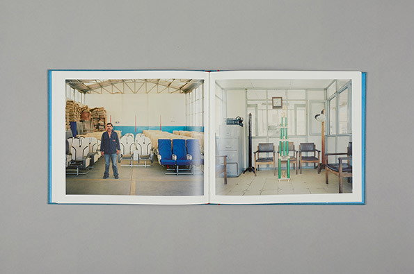
Nick Ballon & Studio Thomson: Ezekiel 36:36
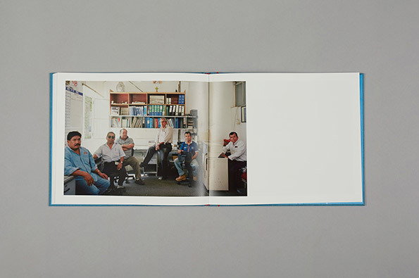
Nick Ballon & Studio Thomson: Ezekiel 36:36
Nick first showed me these images of the Lloyd Aéreo Boliviano some time ago and so it was a treat to sit down with him and go through the sumptuous book of the project come the summer. The airline was once a great source of national pride in Bolivia but chronic mismanagement has seen it fall into near-terminal (no pun intended) decline. Nick told a much bigger story through this singular study and did so with respect and restraint. Studio Thomson did a killer job designing the book as well; the inset of LAB’s retro airline graphics symptomatic of the excellence at work.
www.itsnicethat.com/articles/nick-ballon-ezekiel-3636
It was some flats of Joe Sparkes’ animation that first caught my eye on then Kingston University stand at D&AD’s New Blood, but when I saw the final piece I was really blown away. I’m not someone necessarily inclined to sentimentalism, but I found this almost unbearably sad and poignantly beautiful. I was solo tempted to include the Troy McLure super-cut in this list but that would do Joe a disservice.
www.itsnicethat.com/articles/joe-sparkes-heavyweight
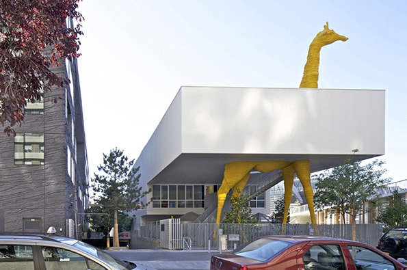
Hondelatte-Laporte: The Giraffe Children’s Centre
Sometimes it can be hard to explain the It’s Nice That approach to covering those areas like architecture, fashion and product design where being quite serious appears to be the order of the day. I tend to fall back on a rather lame “We know what works for us when we see it,” but there is no better example of this idea in practice than this. If I was a Parisian youngster a) I’d probably be better dressed but b)I could imagine nothing more exciting DANS LE MONDE than going to nursery every day at a building that has a giant yellow giraffe sticking out the top. It’s exactly this combination of playful idea and technical excellence that makes this our kind of architecture.
www.itsnicethat.com/articles/hondelatte-laporte-the-giraffe-childcare-centre
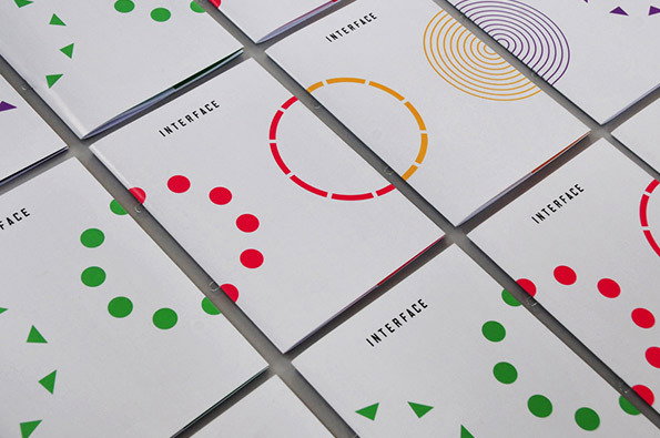
Patrick Fry: Shakespeare’s Globe Interface
As a point of full disclosure I know Patrick and enjoyed at least seven beers with him over the course of 2013. If anything though it grated me when I realised he was responsible for one of my favourite graphic design projects of the past year. Trying to combine the history and cultural heritage of Shakespeare’s Globe theatre with a cutting-edge contemporary digital networking event is a pretty tall order, but Patrick smashed it out the park. Clean, colourful and communicative with a nice composite approach that mirrors the very notion of networking. Splendid stuff.
www.itsnicethat.com/articles/patrick-fry-shakespeares-globe-interface
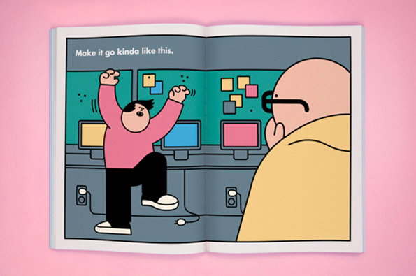
Rami Niemi: Art Directors Club 2013 Annual
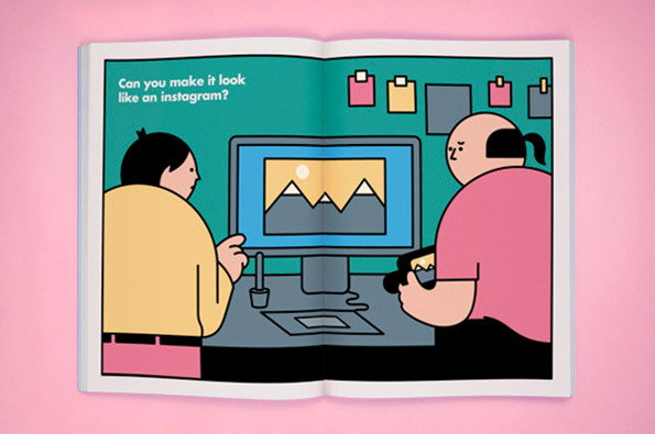
Rami Niemi: Art Directors Club 2013 Annual
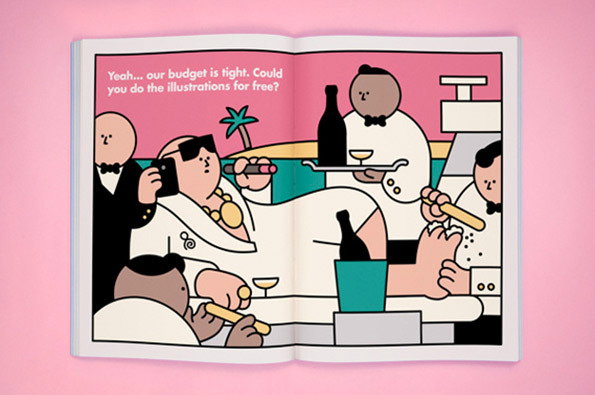
Rami Niemi: Art Directors Club 2013 Annual
When it came to illustrators, two articles from the past 12 months were in the running for this list, both of whom provided work with bags of personality for big-name clients. I loved Olly Moss’ poster for this year’s Oscars which saw him reimagine the famous statuette as all the Best Picture Nominations right back to 1927, but Olly is just edged out of this selection by the irrepressible Rami Niemi. The Finn was commissioned by DDB New York to put his stamp on the Art Directors Club 2013 Annual and Rami delivered in some style, with some brilliant lampoonery of the frustrations surrounding the creative process.
www.itsnicethat.com/articles/rami-niemi-adc-annual
Share Article
About the Author
—
Rob Alderson is a freelance writer, editor and strategist. He was previously editor-in-chief of It’s Nice That and WePresent, and editor of Design Week. He publishes the newsletter Undo, which tries to make sense of how AI is changing design work, the design process and the design industry.