Launch Recite Me assistive technology
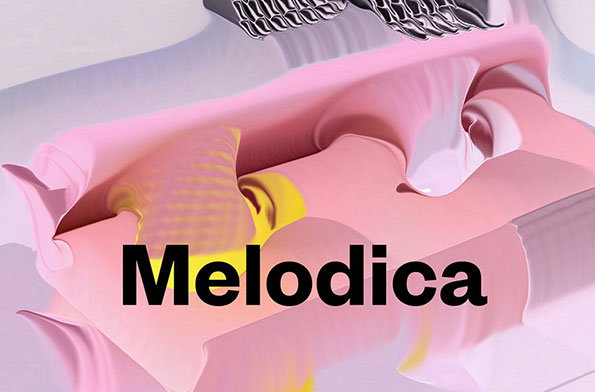
A 3D render of fluid, swirling shapes in shades of pink and yellow. The word “Melodica” is written across the centre in a bold, black sans-serif typeface.

Bright, polished and inventive graphic design from Swedish agency Ritator

—
Date
6 January 2015

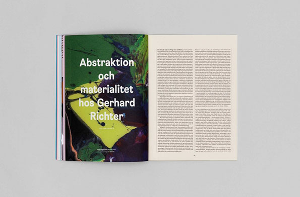
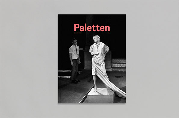
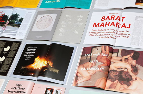
We last featured Ritator’s work back in 2012, and since then the studio’s been busy making some impressive, diverse graphic design. There’s a considered, polished feel to Ritator’s work, and one project that exemplifies that perfectly is the redesign of Paletten Art Journal. According to the agency, the redesign was about “reflecting the new [editorial] team’s desire for more written content, without marginalising the images.”

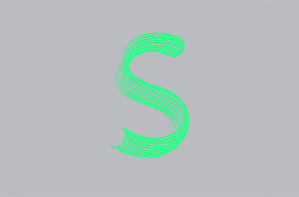
This was achieved with a slick typographic approach and a playful use of colour that pops without drowning out the magazine’s content. Another arts-based project that uses a clever look-and-feel is Ritator’s 2013 identity for Public Art Agency Sweden, created using a custom-made 12-tip pen-like tool applied to create a dynamic, painterly word-mark: “an ode to Jan Tschichold’s hand drawn alphabet Switzerland, ” according to Ritator.

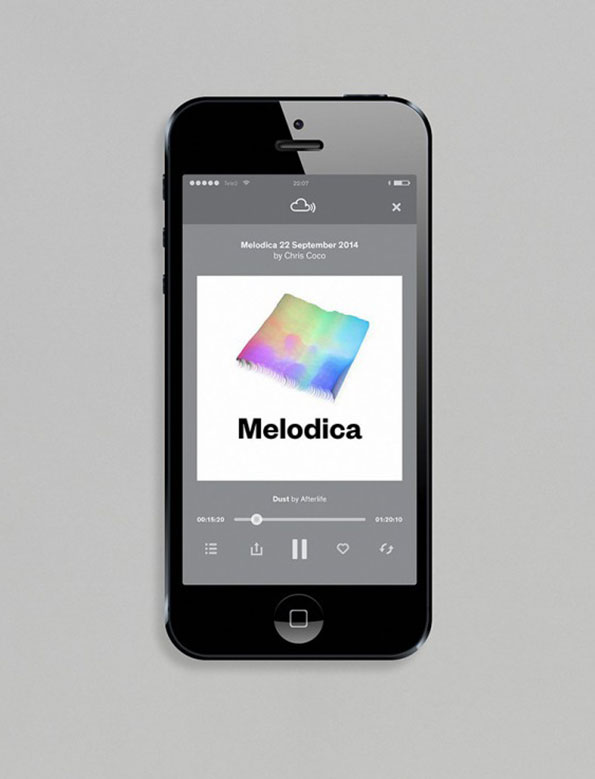
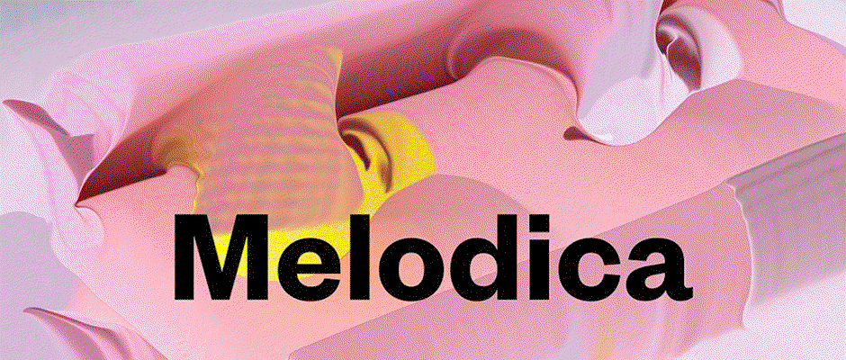
Finally, to Ritator’s most recent project, the identity for Melodica – an electronic music radio-show and record label founded by DJ and producer Chris Coco. It’s all about strange, bright, deliciously confusing imagery that feels at once psychedelically futuristic and oozingly organic.
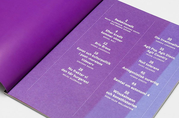
An open magazine with purple pages shows a table of contents. White text lists various articles and authors, including “Brio Bravo” and “Noll tolerans”.
Above

Ritator: Paletten redesign

An open book shows a spread featuring a vibrant abstract painting in green, yellow and purple. Bold white text laid over the image reads “Abstraktion och materialitet hos Gerhard Richter”.
Above

Ritator: Paletten redesign

The cover of a magazine titled “Paletten” in bold pink text. A black and white photograph shows a person in a long, draped white garment standing on a plinth, while another person in a white shirt and tie looks on.
Above

Ritator: Paletten redesign

An overhead shot of several open magazines and brochures laid out on a grey surface. One spread features a large red headline reading “ Sarat Maharaj”, while another shows a photograph of a bonfire against a black background.
Above

Ritator: Paletten redesign

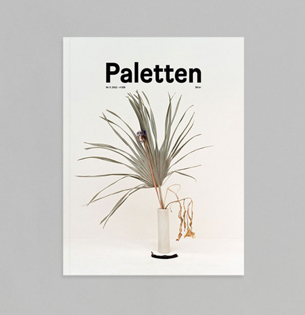
The cover of a magazine titled “Paletten”. A single, spindly green plant with long leaves sits in a slender white vase against a plain white background.
Above

Ritator: Paletten redesign

A graphic of a lime green letter “S” formed by a series of parallel, flowing lines. The shape is set against a plain grey background.
Above

Ritator: Public Art Agency Sweden identity
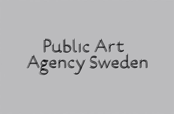
The words “Public Art Agency Sweden” are centred on a plain grey background. The text is rendered in a 3D style with a metallic, textured finish.
Above

Ritator: Public Art Agency Sweden identity
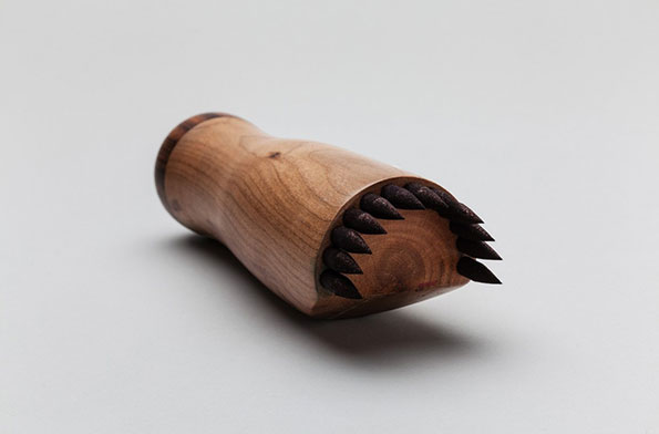
A carved wooden object with a smooth, rounded body. One end is fitted with a row of sharp, dark wooden spikes.
Above

Ritator: The bespoke 12-tipped pen used to create the Public Art Agency Sweden identity
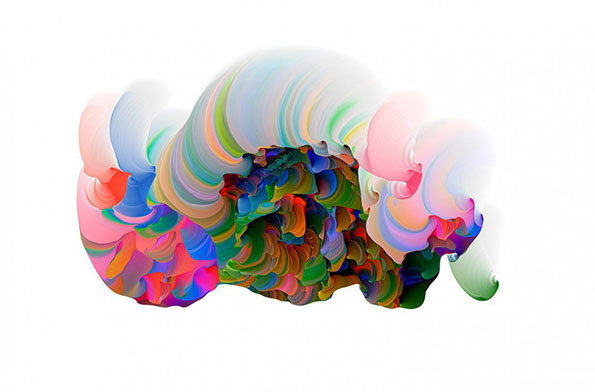
A 3D render of a fluid, abstract shape in a spectrum of vibrant colours against a white background. The form consists of swirling, ribbon-like layers that curve and fold into a dense, organic mass.
Above

Ritator: Melodica identity work

A smartphone displays a music player app. The screen shows a white album cover with a colourful, blurred square and the word “Melodica”, with the track title “Melodica 22 September 2014 by Chris Coco” listed above.
Above

Ritator: Melodica identity work

A 3D render of fluid, swirling shapes in shades of pink and yellow. The word “Melodica” is written across the centre in a bold, black sans-serif typeface.
Above

Ritator: Melodica identity

Share Article

Further Info

About the Author

Emily Gosling

—

Emily joined It’s Nice That as Online Editor in the summer of 2014 after four years at Design Week. She is particularly interested in graphic design, branding and music. After working It's Nice That as both Online Editor and Deputy Editor, Emily left the company in 2016.


It's Nice That Newsletters

Fancy a bit of It's Nice That in your inbox? Sign up to our newsletters and we'll keep you in the loop with everything good going on in the creative world.