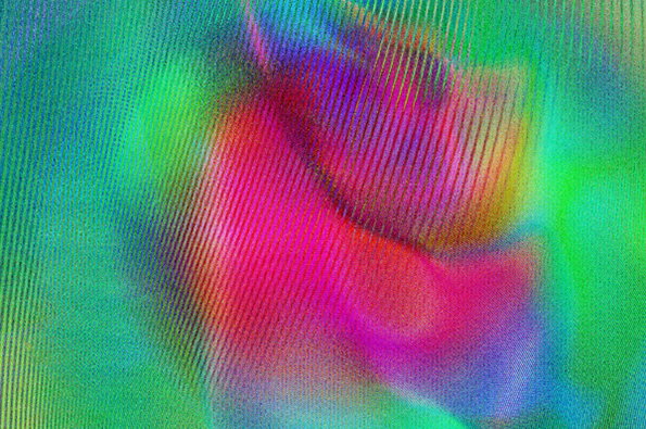
Do not adjust your screen, Sam Coldy's stunning lenticulars will delight your eyes
Graphic artist Sam Coldy has a way with colour that we’re not sure we’ve come across before. Yes, yes, we know there’s a lot of brightly-coloured art out there at the moment, but has anyone else ever combined those colours to create a lenticular effect from flat artwork? We think not. But that’s exactly what Sam does, overlaying patterned vectors to create textures that shimmer on screen and in print. He’s even managed to use the effect within typefaces, creating fonts that leap from the page.
Sam mostly works for musical clients, his colour-saturated abstracts lending themselves naturally to album artwork and promo materials. With a client list that already includes big-name labels like Columbia, EMI, Polydor and super-cool indy label Moshi Moshi we’re expecting to see a huge amount of Sam’s work adorning the shelves of record stores for years to come. Good luck to you Mr Coldy.
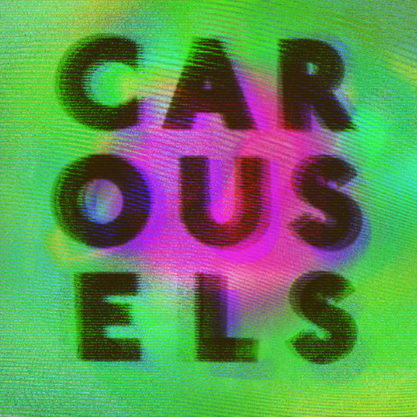
Sam Coldy: Carousels
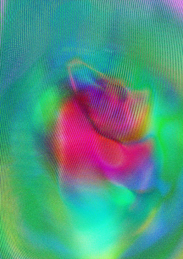
Sam Coldy: Carousels
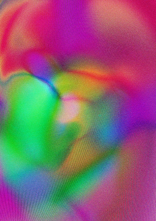
Sam Coldy: Carousels
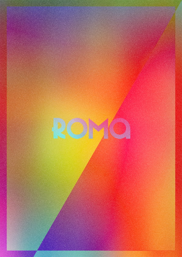
Sam Coldy: Roma
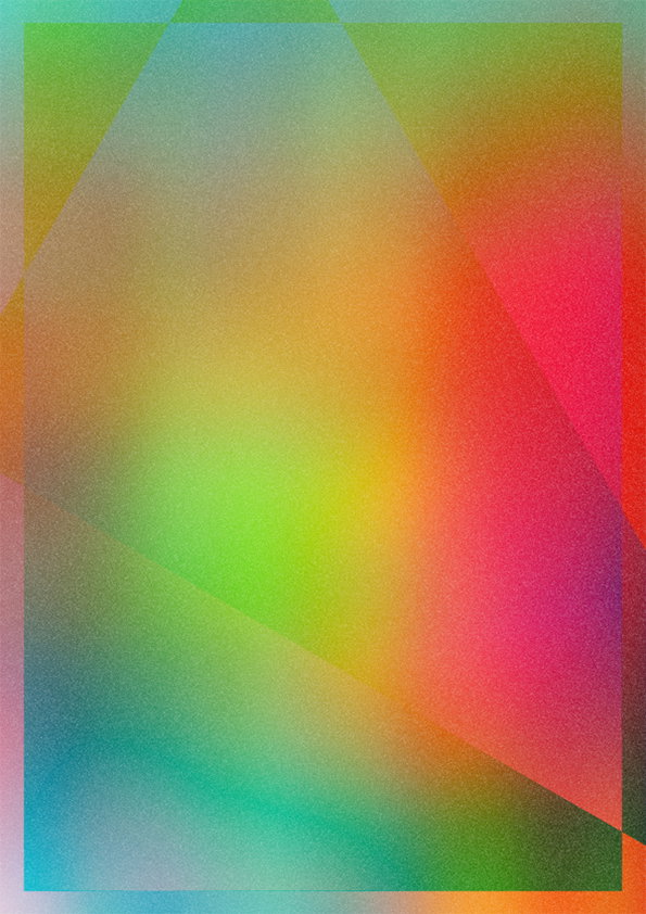
Sam Coldy: Roma
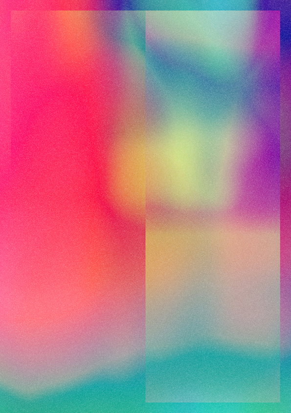
Sam Coldy: Roma
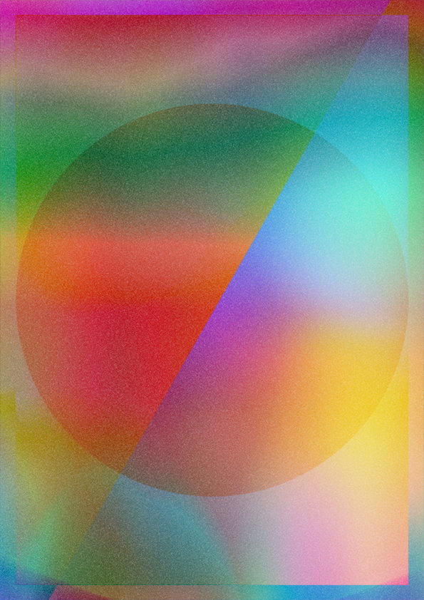
Sam Coldy: Roma
Share Article
Further Info
About the Author
—
James started out as an intern in 2011 and came back in summer of 2012 to work online and latterly as Print Editor, before leaving in May 2015.