



Launch Recite Me assistive technology
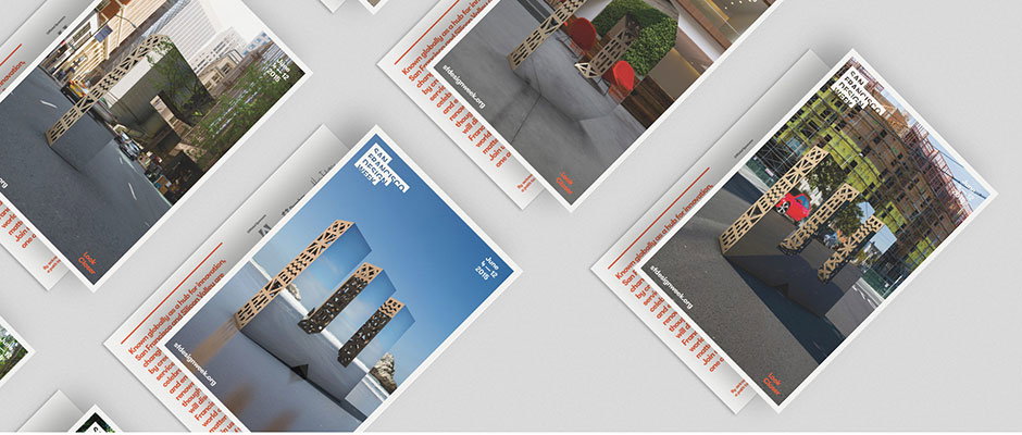
A collection of printed brochures scattered across a white surface. The covers feature architectural photography and the text “Can Graphic Design Week”.

San Francisco Design Week identity uses huge monolithic letterforms

—
Date
9 June 2015

Designing for a design show requires an innovative solution – a standard identity that looks slick for an iPad and a compliment slip sometimes won’t cut it through numerous venues, on signage and outdoors. This identity for San Francisco Design Week manages to overcome all this using enormous 3D shapes, placed around the city and acting as a transparent window to the environment. Local agency Character created the 2015 campaign with the goal of “highlighting the uniquely diverse ecosystem that makes up this hub of creativity we call home,” it says.

The campaign is called Look Closer , and uses the huge sculptural letters to show that “design is all around us, shaping our world and all of its structures,” says Character. “Sometimes we just need a peek behind the scenes to really appreciate and understand it.” The campaign’s very physical bias reminds us of Kent Lyons’ identity for the Jarman Awards, which has no digital format and exists only as huge letterforms taken to different sites and photographed for each year’s awards identity.

The monolithic forms were placed around the city to frame noteworthy sites or natural beauty spots that inform and inspire the San Francisco design community. “The designs we make as designers reach far and wide as do their implications for the future,” says Character. “While small geographically, what San Francisco’s design community creates is massive in scale.”
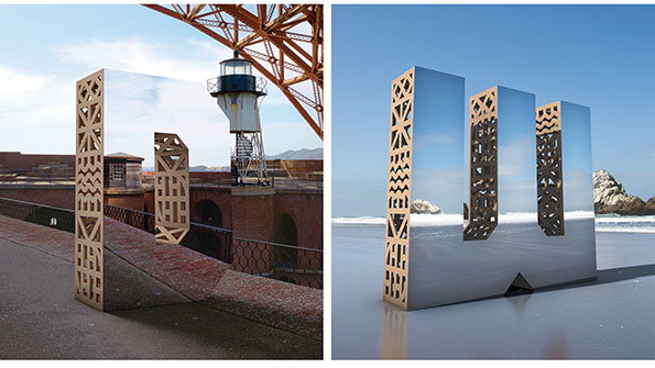
Two 3D renders of a mirrored sculpture with geometric cut-outs. In one, it stands on a paved walkway near a lighthouse; in the other, it sits on a sandy beach.
Above

Character: San Francisco Design Week identity
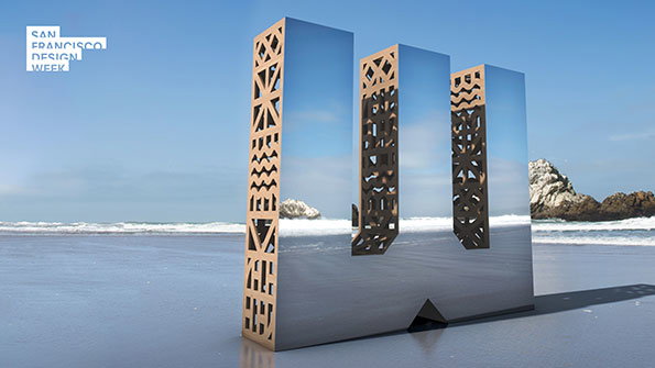
A 3D render of a large, mirrored sculpture on a sandy beach. The structure consists of three vertical pillars with intricate geometric cut-outs, reflecting the blue sky and ocean. In the top left corner, a white logo reads “San Francisco Design Week”.
Above

Character: San Francisco Design Week identity
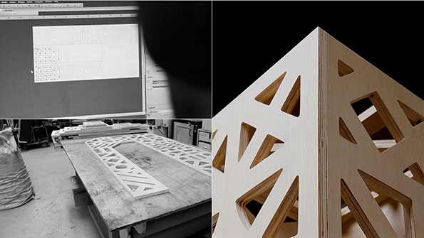
A split image showing the design and build of a wooden structure. On the left, a digital technical drawing is displayed above a workshop table with a cut plywood panel. On the right, a close-up of the finished plywood structure shows a series of geometric, angular cut-outs.
Above

Character: San Francisco Design Week identity
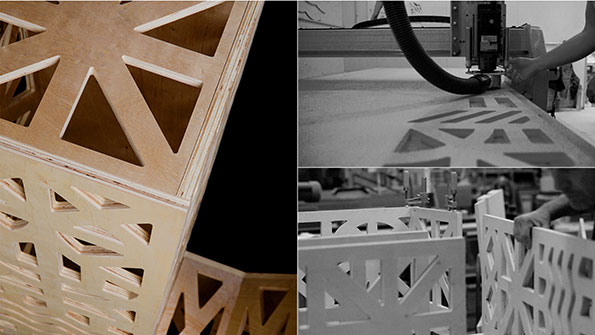
A triptych of images showing the creation of a wooden structure. A CNC machine cuts geometric patterns into a sheet of plywood, while another shot shows the finished panels being assembled.
Above

Character: San Francisco Design Week identity
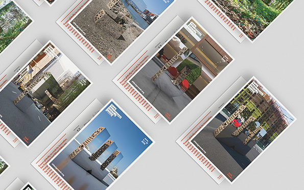
A collection of postcards scattered across a white surface. Each card features a different photograph of a wooden structure in various outdoor settings.
Above

Character: San Francisco Design Week identity
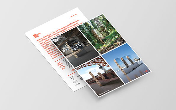
Two printed brochures lie side by side on a plain grey background. One page features red and black text, while the other displays a grid of four photographs showing architectural structures and landscapes.
Above

Character: San Francisco Design Week identity
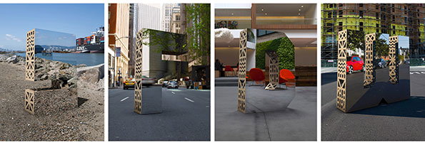
Four images show a mirrored sculpture in different settings. The reflective object is placed on a rocky shoreline, a city street, a modern courtyard and a paved urban area.
Above

Character: San Francisco Design Week identity
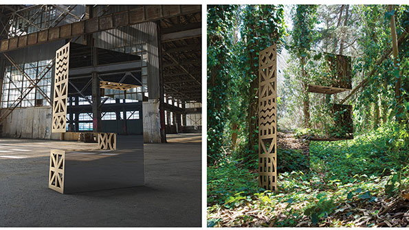
Two views of a large-scale sculpture consisting of interlocking, carved wooden panels. One image shows the piece in a cavernous industrial warehouse, while the other shows it nestled among dense green foliage in a forest.
Above

Character: San Francisco Design Week identity
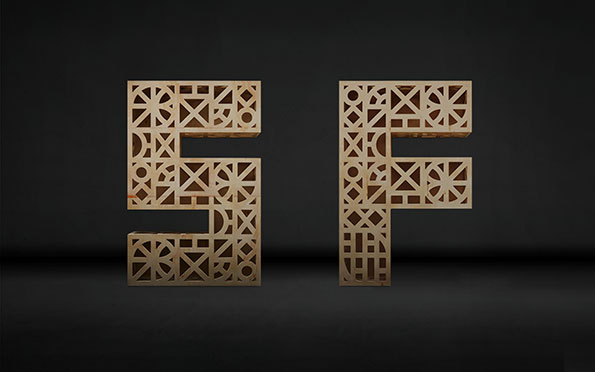
Two large 3D letters, “S” and “F”, crafted from light-coloured wood. Each letter is filled with an intricate, geometric lattice of intersecting lines and circles.
Above

Character: San Francisco Design Week identity
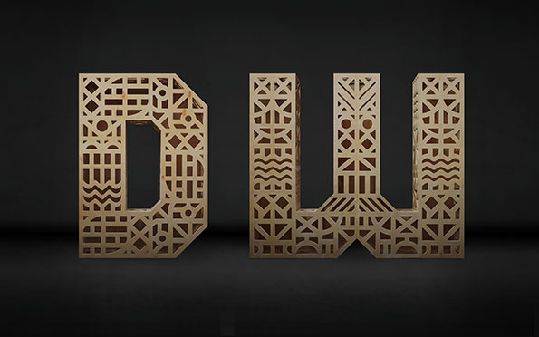
A 3D render of the letters “DW” crafted from light-coloured wood. The letters are filled with intricate, laser-cut geometric patterns and lattices against a dark background.
Above

Character: San Francisco Design Week identity
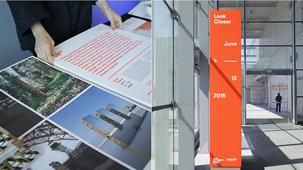
A split image showing a design exhibition. On the left, a person arranges large printed boards featuring architectural photography and text. On the right, a tall orange banner in a bright gallery reads “Look Closer”, “June 4 – 12 2015”.
Above

Character: San Francisco Design Week identity
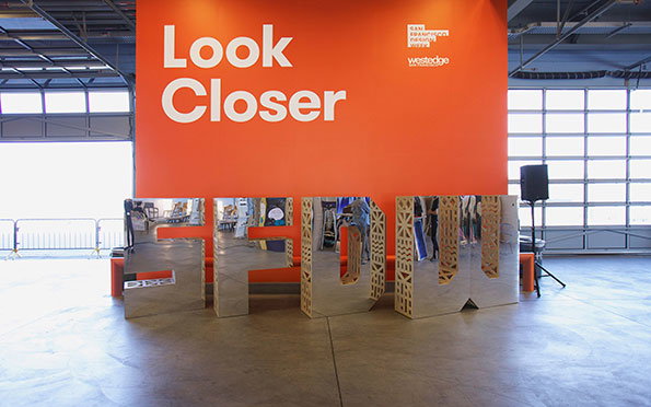
Large mirrored letters spell out “SFDW” in front of a bright orange wall. The wall features the text “Look Closer” in bold white lettering.
Above

Character: San Francisco Design Week identity

Share Article

About the Author

Emily Gosling

—

Emily joined It’s Nice That as Online Editor in the summer of 2014 after four years at Design Week. She is particularly interested in graphic design, branding and music. After working It's Nice That as both Online Editor and Deputy Editor, Emily left the company in 2016.


It's Nice That Newsletters

Fancy a bit of It's Nice That in your inbox? Sign up to our newsletters and we'll keep you in the loop with everything good going on in the creative world.

