




Minimalism, connection and culture: the influence of emotional and physical spaces across Shivani Parasnis’ practice
With her personal journey from East to West bleeding into Shivani’s work, we discuss the variety of her interests, sense of place and her new love of pottery.
Share
Having worked for five years in the public health sector, following her master’s degree in biotechnology, Baltimore-based typographer and graphic designer Shivani Parasnis thought it was time to mix things up. Having gone on to study at the Maryland Institute College of Art, Shivani has since worked with the likes of the New York Times, Adobe, Wired and WeTransfer, to name a few, recently settling as a creative at Spotify.
Discussing the definition of her practice, Shivani takes us all the way back to her childhood spent between Mumbai and Panjim. “I was surrounded by the abundance of multilingual culture, deep-rooted traditions, and delicious home-cooked food,” she recalls, noting the contrast when she moved to the USA. “The sense of ‘home’ transitioned and deepened the perception of the world around me,” she adds, not-so-subtly bleeding into Shivani’s beautiful, bold and vibrant typographic work.
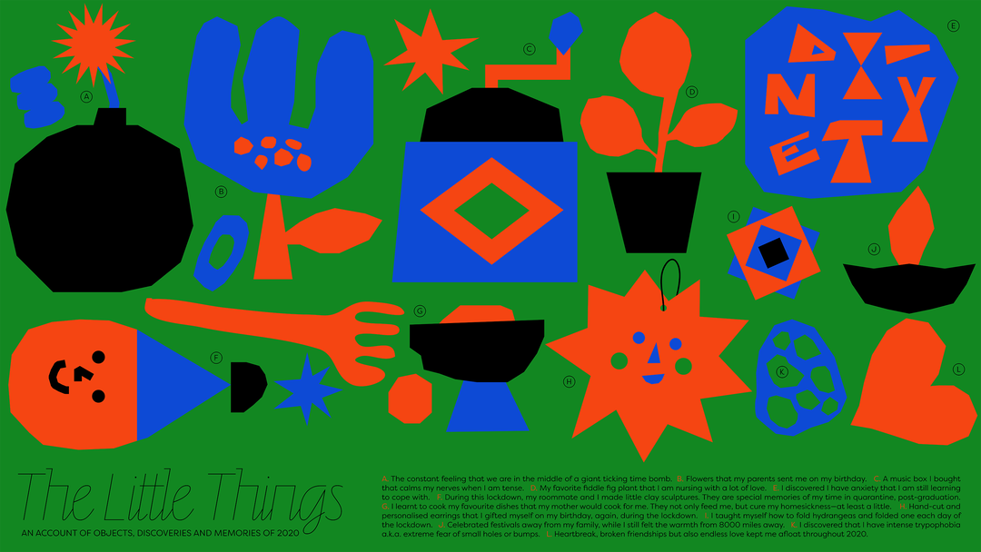
Shivani Parasnis: The Little Things (Copyright © Shivani Parasnis, 2021)
The combination of East and West is one dutifully captured across Shivani’s work, heavily influenced by her own “physical and emotional” environments. “I wouldn’t say I conform to one particular visual style,” she adds, “but my design thinking is primarily grounded in minimalism, connections and culture,” a selection of sensibilities clearly demonstrated in the variety and versatility of Shivani’s interests.
“I love observing all things bold, bright and thoughtfully placed,” she tells us, noting anything from geometric, monochrome cutlery and Donald Judd furniture, to 50s and 60s Indian patterns and hand-drawn signboards, as remarkable sources of potent inspiration. “On the other hand,” Shivani adds, “my designer brain also constantly hunts for order and similarities in non-design related things,” she remarks, finding enthusiasm for woven textures, organic gradients and handwriting. “In short, I am a design nerd,” Shivani claims, “a proud one.”
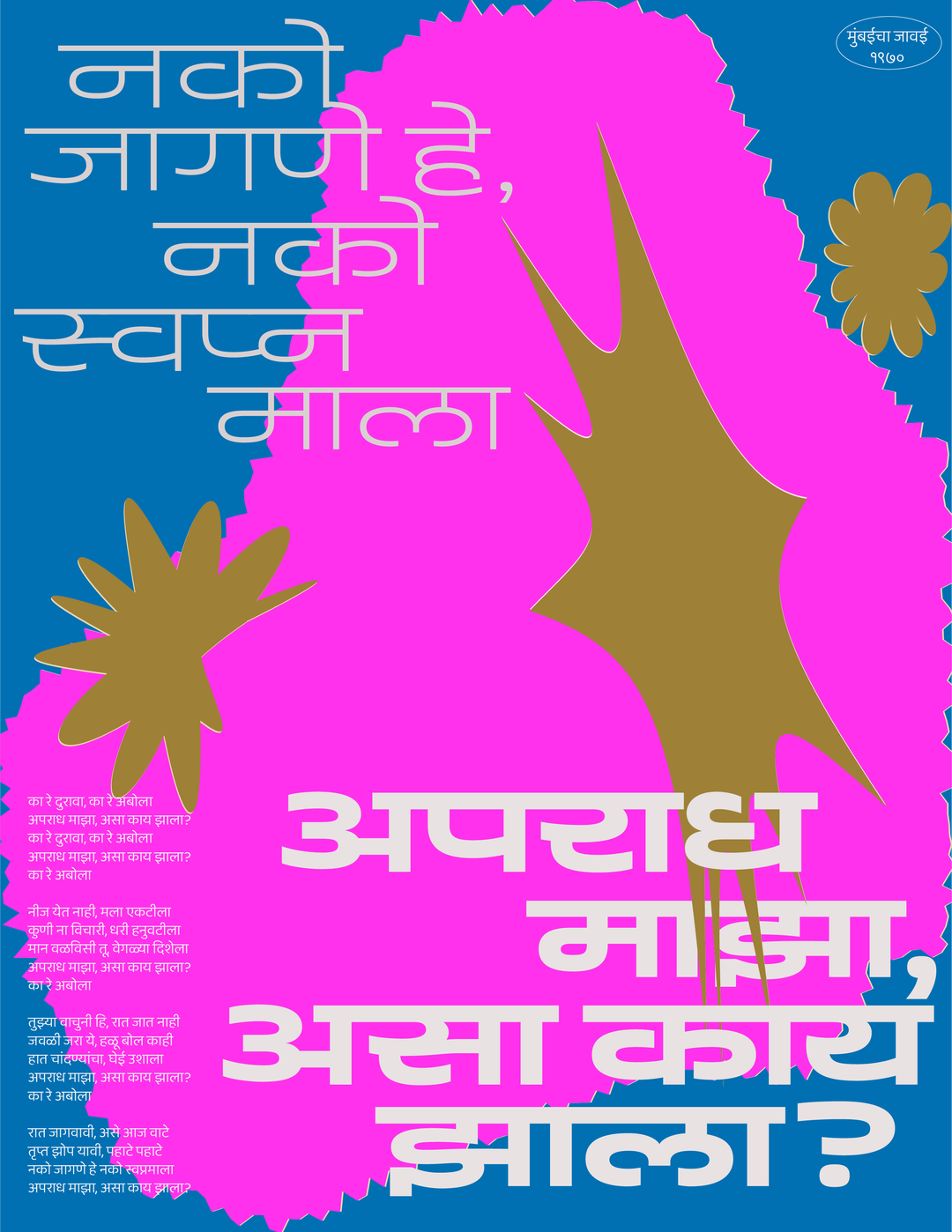
Shivani Parasnis: Marathi Bhavgeet (Copyright © Shivani Parasnis, 2021)
Shivani Parasnis: Christmas Haus (Copyright © Shivani Parasnis, 2021)
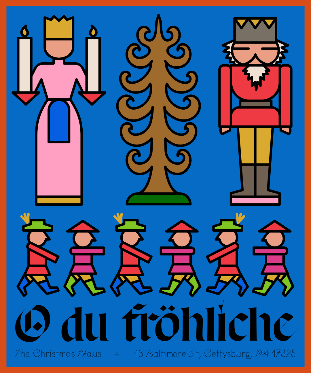
Shivani Parasnis: Christmas Haus (Copyright © Shivani Parasnis, 2021)
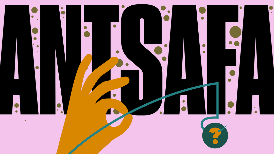
Shivani Parasnis: The New York Times – Departures (Copyright © Shivani Parasnis, 2021)
This eclecticism came into play in Shivani’s recent project with the New York Times, in collaboration with T-brand Studio, that saw her creating 14 compositions for its Undefinables series. As part of its sister magazine Departures, Shivani tells us, “every month, this section of the magazine highlights words from non-English languages,” specifically words that are difficult to translate into a single English term.
“A lot convey feelings rather than facts,” she explains, finding the premise creatively intriguing and at the same time incredibly challenging. “I was invited to interpret the words in any visual style I wanted to,” Shivani recalls, “but the process of landing on a concept for some of them was arduous,” needing to translate such intricate words through static means. Always finding the solutions, however, Shivani utilised her pragmatic command for composition and type to craft poignant and insightful explorations of typography and tension. “As a designer, I believe one’s work is never linear,” Shivani summarises. “The learning curve for every project continues to surprise me (sometimes scare me even),” whilst simultaneously teaching her how design and inspiration can be found everywhere. “All you need to do is observe, admire and let it enlighten you,” she adds.
“While I try to crawl out of my six-month creative block,” Shivani recalls, “I am trying to reconnect with how design and typography started for me as a child who was learning calligraphy,” doing so through appreciation and practice. “The pandemic made me realise the value of slow design,” Shivani explains, encouraging her to visit creative outlets that weren’t confined to typography and illustration – manifesting in a newfound love of pottery. “The mere feeling of touching and working with clay is so meditative and therapeutic,” she tells us, “spending the time, energy and attention over making one perfect piece of pottery is so fulfilling that it made me realise the value of personal work,” Shivani notes. “What’s next, you ask?” she concludes. “More pottery, more design and endless joy.”
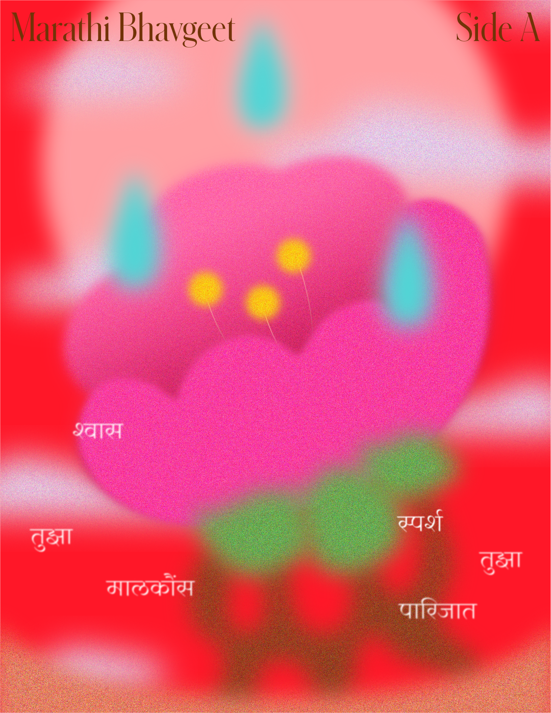
Shivani Parasnis: Flowers in the Rain (Copyright © Shivani Parasnis, 2021)
Shivani Parasnis: Dobbin House (Copyright © Shivani Parasnis, 2021)
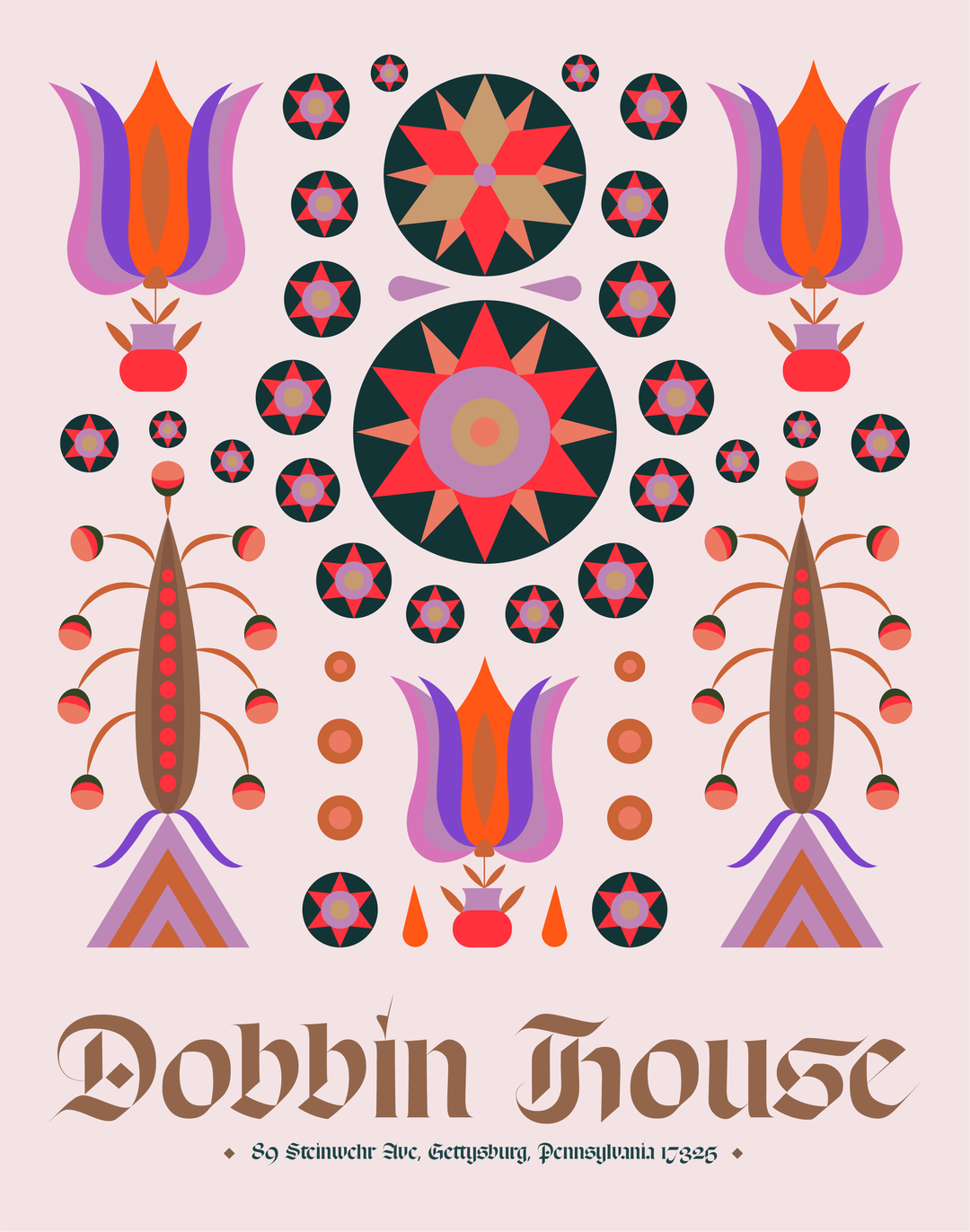
Shivani Parasnis: Dobbin House (Copyright © Shivani Parasnis, 2021)
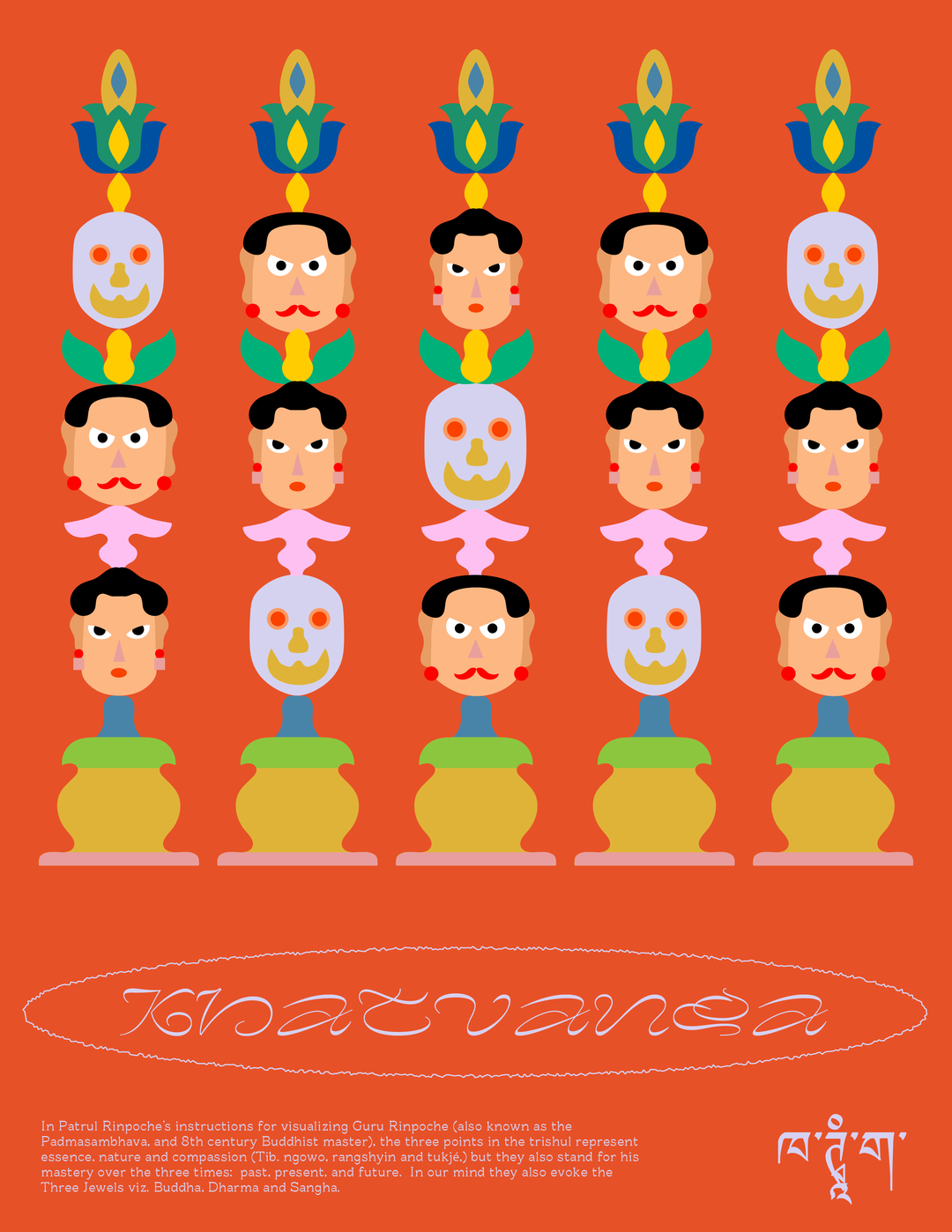
Shivani Parasnis: Khatvanga (Copyright © Shivani Parasnis, 2021)
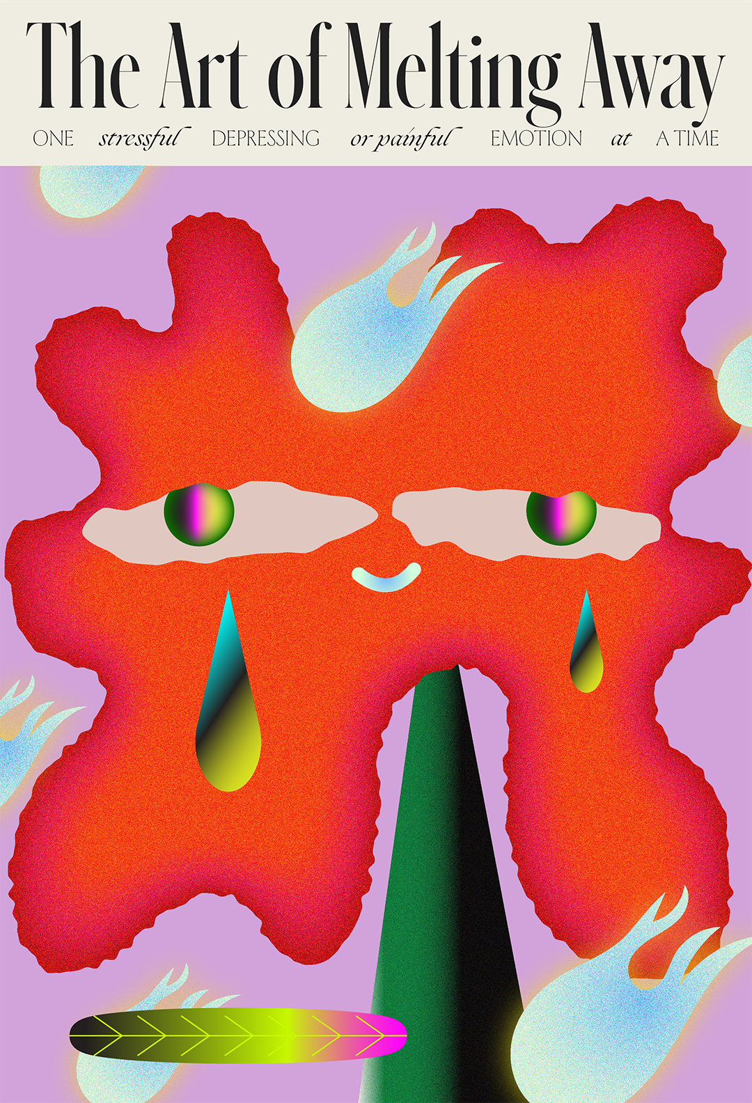
Shivani Parasnis: The Art of Melting (Copyright © Shivani Parasnis, 2021)
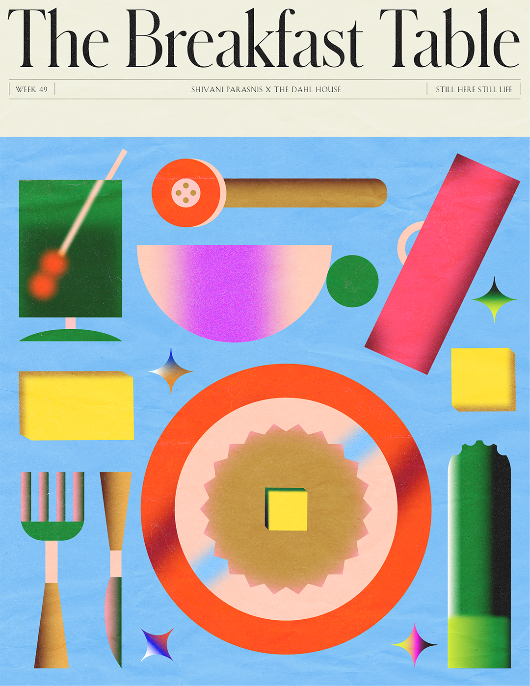
Shivani Parasnis: The Breakfast Table (Copyright © Shivani Parasnis, 2021)
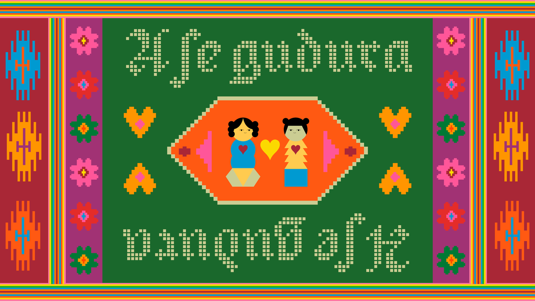
Shivani Parasnis: The New York Times – Departures (Copyright © Shivani Parasnis, 2021)
Hero Header
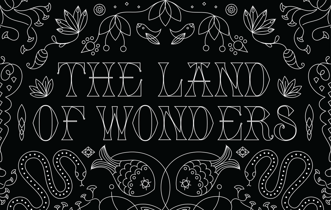
Shivani Parasnis: Land of Wonders (Copyright © Shivani Parasnis, 2021)
Share Article
About the Author
—
Hailing from the West Midlands, and having originally joined It’s Nice That as an editorial assistant in March 2020, Harry is a freelance writer and designer – running his own independent practice, as well as being one-half of the Studio Ground Floor.
