Launch Recite Me assistive technology
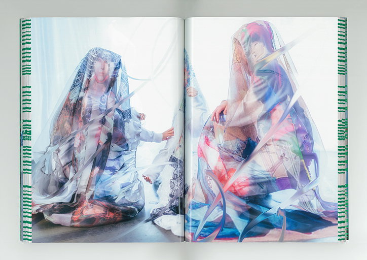
An open book shows two pages of a photograph featuring people draped in translucent, iridescent plastic sheets. The figures are partially obscured by the shimmering material, which reflects a spectrum of colours.

Shun Ishizuka's designs combine Western design influences for a Japanese context

—
Date
6 December 2018

Shun Ishizuka never trained in graphic design. While studying literature at Tokyo’s Waseda University Shun started making flyers for his friends. Since this springboard into print, he’s worked in commercial design making paraphernalia such as cards, invitations and envelopes, and currently works as a freelance designer in the cultural sector. “Now I’m working with musicians, artists, curators and theatre companies”, Shun tells It’s Nice That. “I’m lucky that my clients are all interesting creatives. We collaborate very closely which means I’m free to work in an experimental way," tackling most of the supporting visuals for his client’s work.

For Shun, influence comes in the form of Western aesthetics such as Soviet propaganda posters, Freemasons’ secret symbols and graffiti. He merges these influences with Japan’s rich design context which results in culturally-rich material uniting European grid systems with Japanese type. “I like classic, traditional things but I’m also interested in futuristic stuff”, says Shun, “we need to respect the cultural past but also need to go forward.” In turn, his design mixes genres of graphic design and obscures the boundaries between aesthetic schools of thought, often considering how stories and motions are composed which then informs Shun’s design treatment.
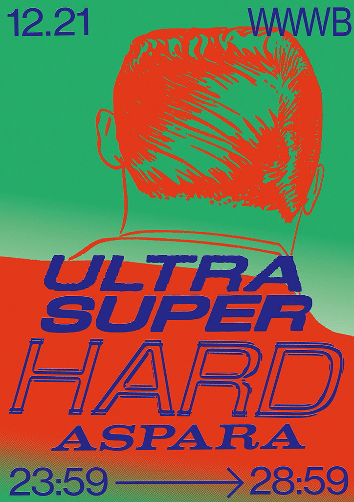
A graphic poster featuring a high-contrast orange illustration of a person’s head and shoulders from behind against a green background. Bold blue text reads “ULTRA SUPER HARD ASPARA”, with the date “12.21” and the letters “WWWB” at the top. At the bottom, a blue arrow points from “23:59” to “28:59”.

“I think I have a strong style but I also struggle to define it," explains the designer. “Some people find it beautiful and others think it’s ugly. Love and hate. Balance and imbalance. When I’m designing, my emotions are ambivalent as I want to create variable meanings.” Predominantly working in poster design, Shun has been working with the Kyoto performance venue Soto for the past two years. A famously cultural city, Kyoto used to be Japan’s capital city, and Shun’s designs reflect the breadth of international artists that come from all over the world to perform at the venue.

Additionally, Shun often collaborates with the Japanese art-fashion label, Pugment. The creative duo behind Pugment make conceptual clothing as well exhibit artwork at their gallery in Tokyo and Shun recently designed a book showcasing its latest collection 1XXX–2018–2XXX. “The collection is about how people enjoy or manage the images of modern fashion trends in dystopian, future Japan”, explains Shun. The book’s design is “like a dictionary”, curating images of past fashion trends inside minded pages and printed on thin paper. The pages are sealed together but because the paper is so thin, the viewer can see the images of past trends through the pages. The book’s fore-edge (that’s the side of the book showing the edges of all pages) are covered with dates from past years which represent the layers of history that fashion transcends. Published internationally on Newfave and photographed by Kenta Cobayashi, the book’s thoughtful design frames Pugment’s striking images within a beautifully considered book.
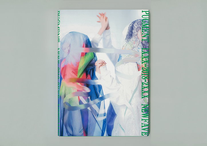
The cover of a book featuring two figures holding hands against a pale blue background. One person wears a colourful, translucent blue and red veil, while the other is in white with a patterned head covering. Green text runs vertically along the edges, including the words “Pugment” and “New Fave”.
Above

Shun Ishizuka: Pugment, 1XXX–2018–2XXX
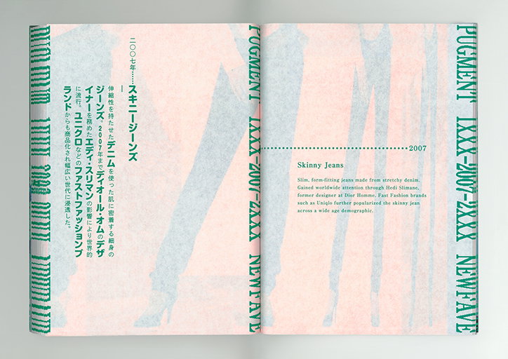
An open book showing a double-page spread with a pale pink background and abstract, blurred figures. The right page features the heading “Skinny Jeans” and a short paragraph describing their rise in popularity in 2007.
Above

Shun Ishizuka: Pugment, 1XXX–2018–2XXX
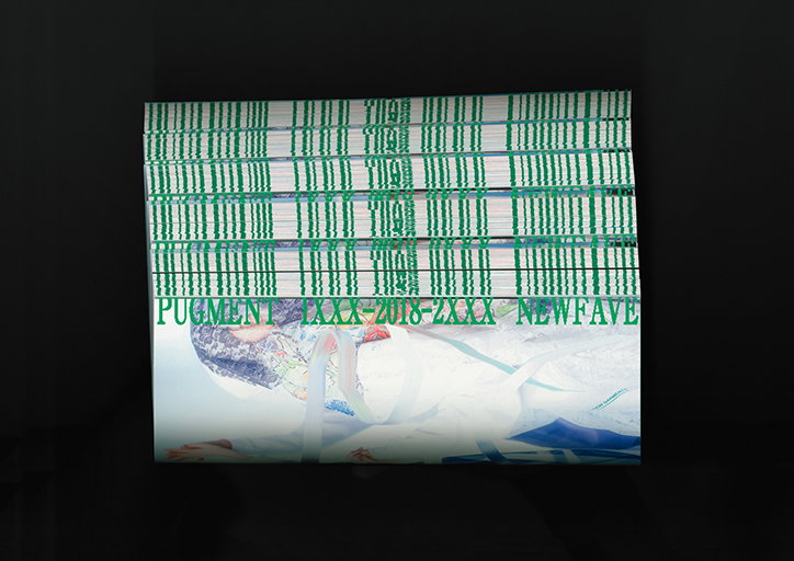
A stack of booklets with green vertical lines and text on the covers. The visible cover reads “PIGMENT XXX 2018-2XXX NEWFAVE” above a pale, abstract image.
Above

Shun Ishizuka: Pugment, 1XXX–2018–2XXX
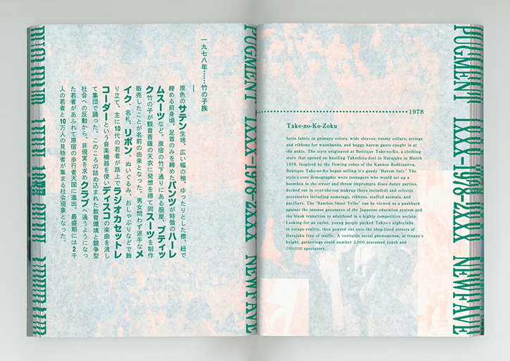
An open book showing a spread from a publication. The left page features Japanese text and a green graphic border, while the right page contains an English text titled “Take-no-Ko-Zoku” and the year “1978”.
Above

Shun Ishizuka: Pugment, 1XXX–2018–2XXX
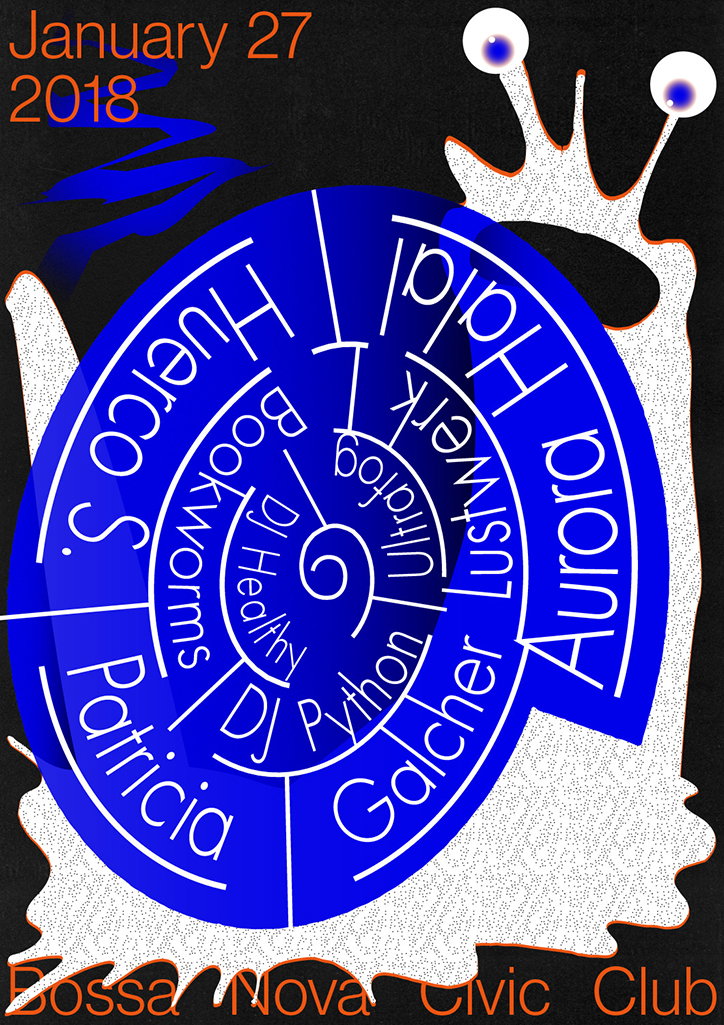
A blue circular poster with white text reads “January 27 2018” at the top and “Bossa Nova Civic Club” at the bottom. The central blue disc contains a spiral of names including “Aurora”, “Halal”, “Huerco S.” and “Patricia”. A white, textured figure with two eyes looks over the top of the circle.
Above

Shun Ishizuka

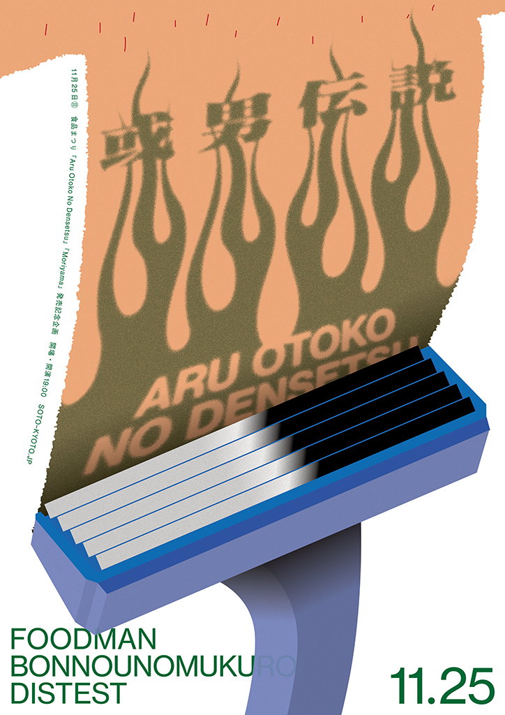
A graphic poster featuring a blue 3D render of a razor blade holder. A peach-coloured slip of paper is tucked into the blade, featuring dark brown flame shapes and the text “ARU OTOKO NO DENSETSU”. The bottom of the poster reads “FOODMAN BONNOUNOMUKURO DISTEST” and the date “11.25”.
Above

Shun Ishizuka: Soto

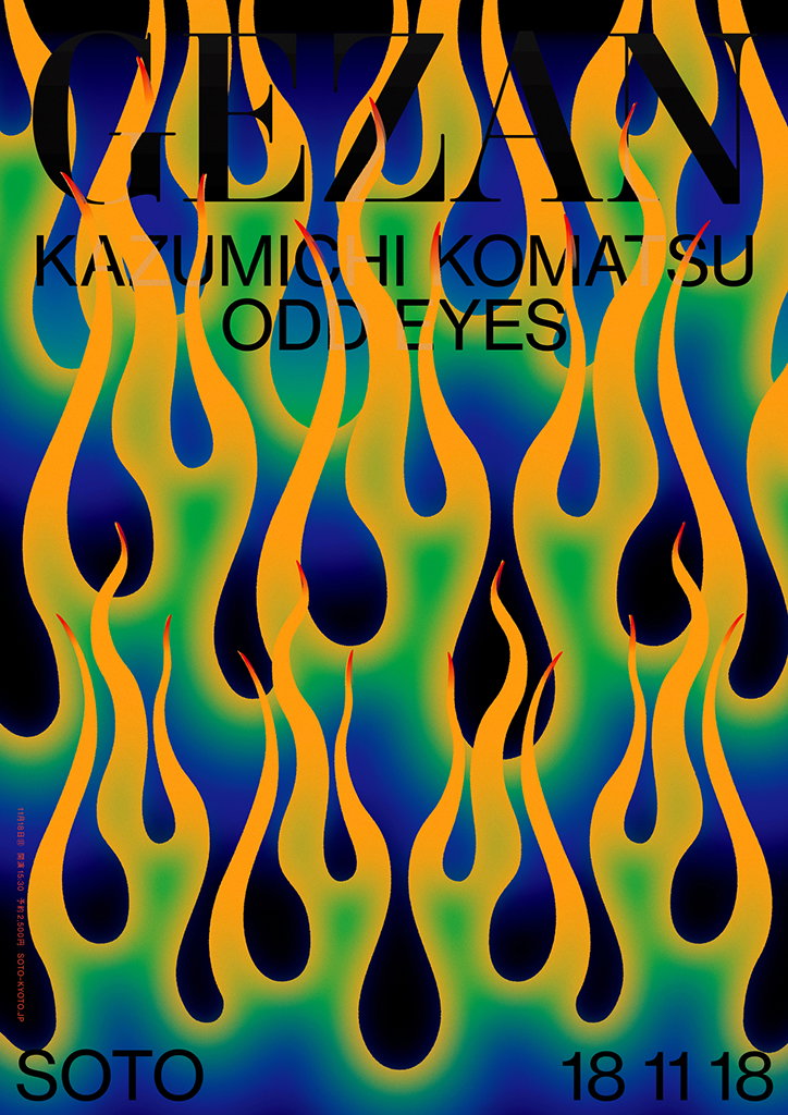
A graphic poster featuring vibrant, flowing flame shapes in gradients of yellow, green and blue against a black background. Bold text across the top reads “CEZAN”, “KAZUMICHI KOMATSU” and “ODD EYES”, with “SOTO” and the date “18 11 18” at the bottom.
Above

Shun Ishizuka

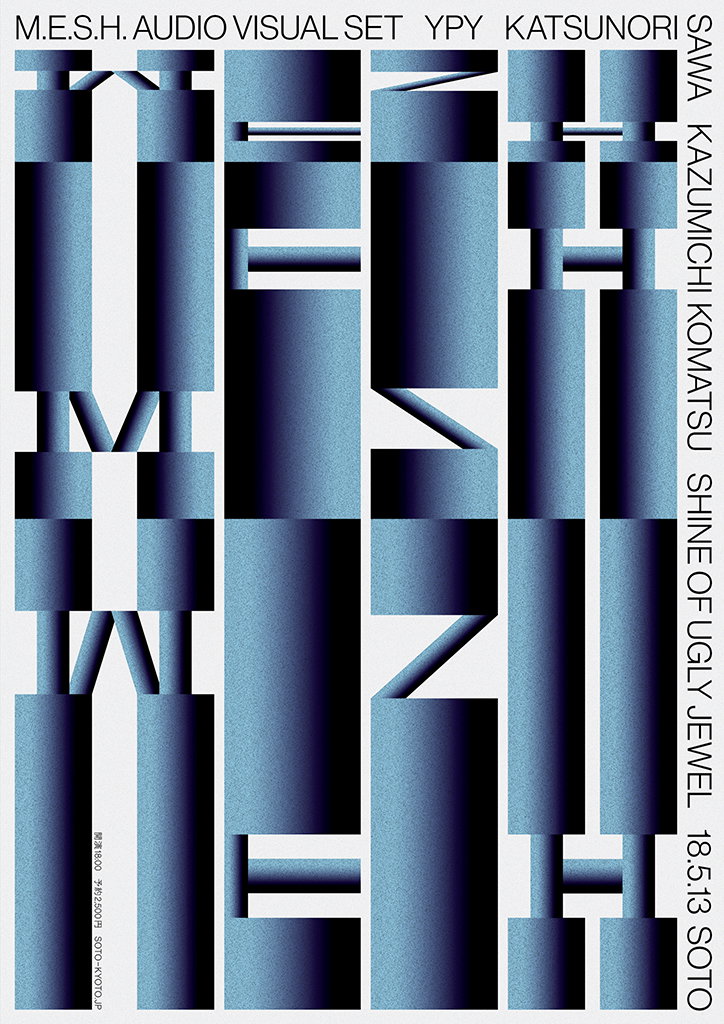
A typographic poster featuring large, abstract blue gradients that form fragmented letters. Text along the top and right edges reads “M.E.S.H. AUDIO VISUAL SET”, “YPY”, “KATSUNORI SAWA”, “KAZUMICHI KOMATSU”, “SHINE OF UGLY JEWEL” and “18.5.13 SOTO”.
Above

Shun Ishizuka: Soto

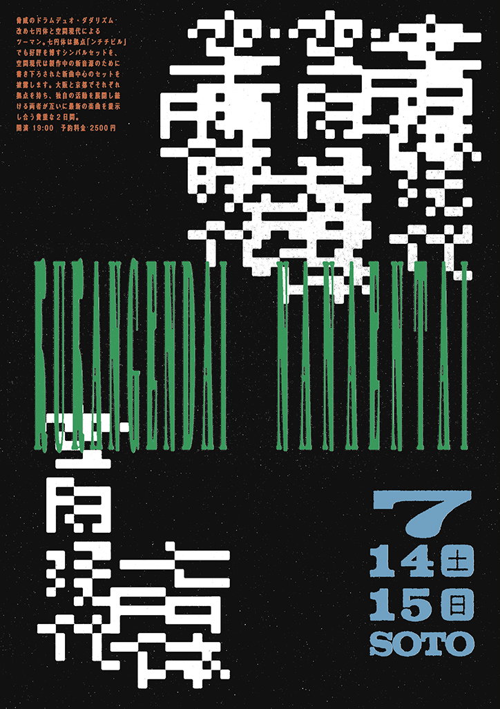
A graphic poster with a black background and a grainy texture. Green distorted typography is layered over white pixelated shapes, with the word “SOTO” and the dates “14” and “15” in the bottom right.
Above

Shun Ishizuka: Soto

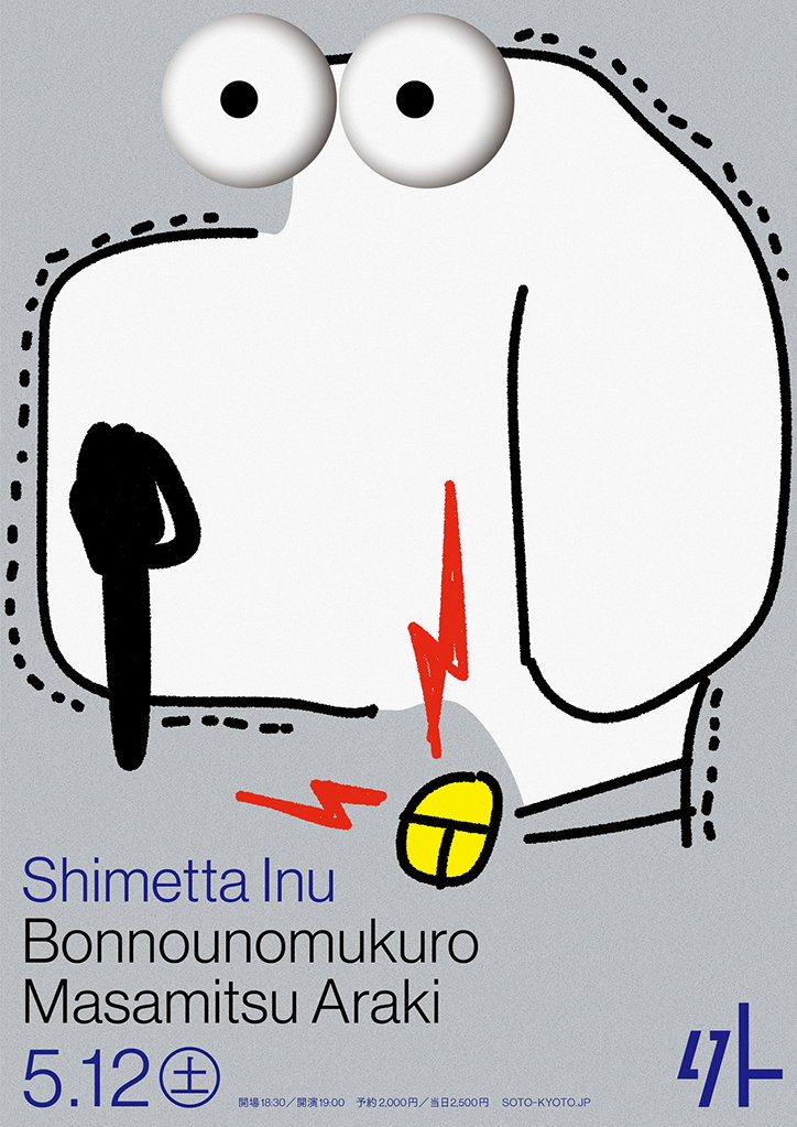
An illustration of a white, cartoonish dog with large, bulging eyes and a black nose. A yellow circle with a cross inside sits at the bottom, with red lightning bolts striking it. Text below reads “Shimetta Inu”, “Bonnounomukuro” and “Masamitsu Araki”, followed by the date “5.12”.
Above

Shun Ishizuka: Soto

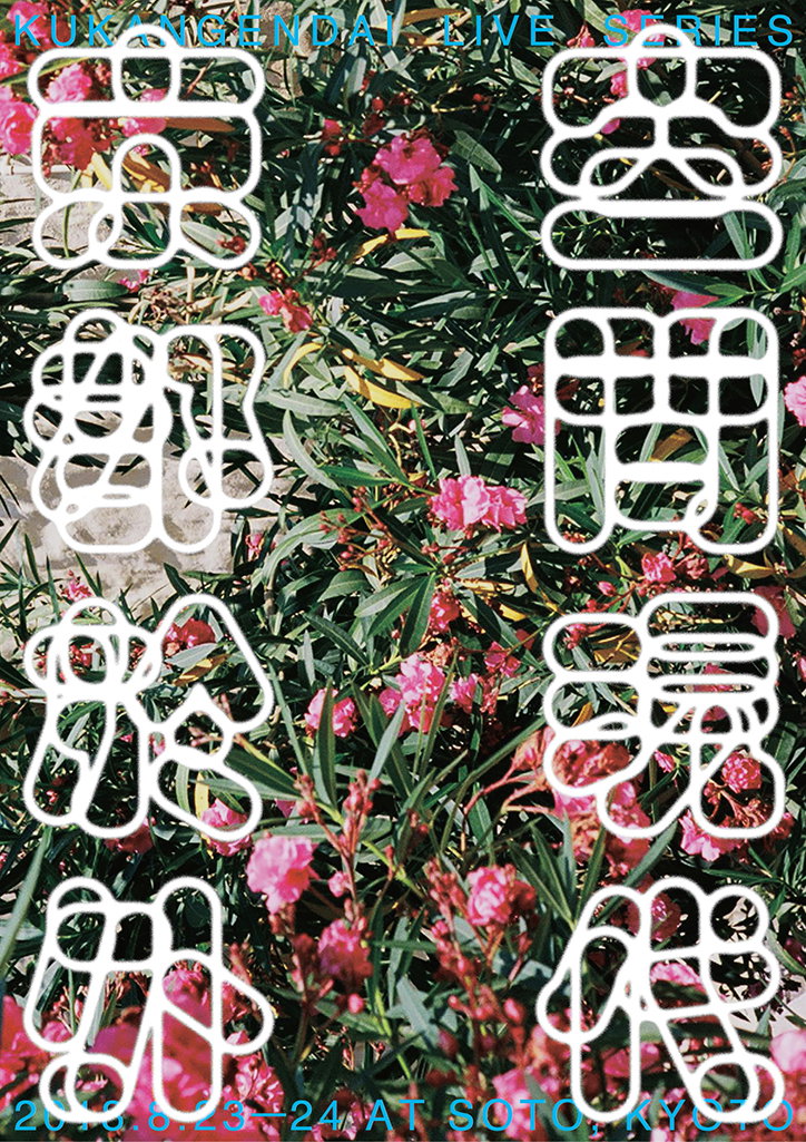
A poster featuring white, rounded Japanese characters laid over a dense thicket of green leaves and pink flowers. Text at the top reads “KUN NAGENDAY LIVE SERIES” and the bottom reads “2018.6.23–24 AT SOTO KYOTO”.
Above

Shun Ishizuka: Soto

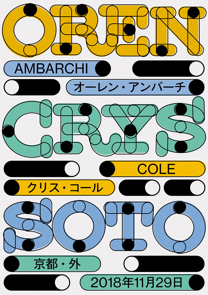
A typographic poster featuring three names in a bold, rounded style with black dots at the joints. The names “Oren Ambarchi”, “Chrys Cole” and “Soto” are stacked vertically in yellow, green and blue. Japanese text and the date “2018年11月29日” appear in pill-shaped banners throughout the layout.
Above

Shun Ishizuka: Soto

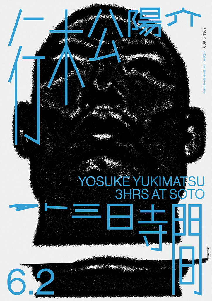
A high-contrast black and white portrait of a person looking upwards, overlaid with bold blue Japanese characters. White text reads “YOSUKE YUKIMATSU 3HRS AT SOTO” and “6.2”.
Above

Shun Ishizuka: Soto

Share Article

About the Author

Jynann Ong

—

Jynann joined It’s Nice That as an editorial assistant in August 2018 after graduating from The Glasgow School of Art’s Communication Design degree. In March 2019 she became a staff writer and in June 2021, she was made associate editor. She went freelance in 2022.


It's Nice That Newsletters

Fancy a bit of It's Nice That in your inbox? Sign up to our newsletters and we'll keep you in the loop with everything good going on in the creative world.