Stephanie Specht on renovations, collaboration and “running in a field” to create her best work
A year and a half has passed since we last heard from the Antwerp-based designer. So, it felt like a natural and necessary time to get an update.
Over the course of a year and a half, it’s safe to say that a lot has happened for Stephanie Specht, founder of Specht Studio and someone who we’ve featured widely across the site. To begin our catch up, she starts off with the news that she’s doing up a house, a place she bought with her boyfriend in Belgium the day before the initial lockdown in March 2020. A pivotal and somewhat lucky moment for them both, they began cracking on with the stripping, plastering and painting of their new home – joining the clad of lockdown renovators and set to move in next month. “Until today, we are still working in and on it,” she tells us. “It’s quite a project; it’s three houses in one and we had a fruit barn in the beginning with it as well.”
As soon as the work is complete, this means Stephanie will be able to enjoy her refreshed and tranquil workspace; featuring plenty of daylight, a view over the garden and orchard – it sounds like an idyllic setup to get started on some new and exciting projects. “Aside from being a graphic designer,” she adds,”I am also a construction worker now!” Not only is she continuing her wizardry with grids and systems, she’s also an expert at pouring concrete, masonry, laying floor heating and installing electricity – she’s even helped with fixing the roof. “It gave me a new perspective on what I do as a graphic designer. It feels so good to work with my hands and see results. These results are sometimes fast, sometimes slow and sometimes invisible.”
The past year or so has been a deep learning curve for Stephanie, who found an appreciation for professions other than her own. After working on the house for a few days, for example, she’d then switch things up and work at her computer; comparatively, while working on site, she’d visualise how to approach her upcoming graphic projects. It’s a harmonious balance: “It gave me time which felt like a luxury.” This realisation manifested in many ways, like noticing how she didn’t need to feel guilty for not being productive every day. As a result, she now feels healthy and happy about her progress, and her latest ensemble of projects is a pinnacle of that.
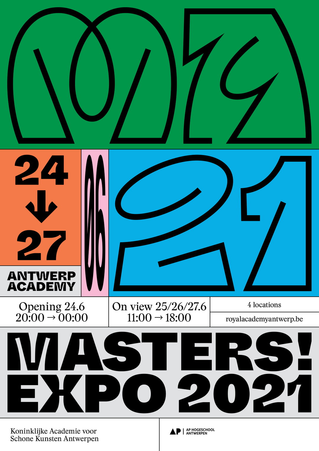
Specht Studio: Academy Antwerp, Masters Graduation Show (Copyright © Specht Studio, 2021)
“The work I have created in the last year and a half is different than the rest,” she continues. “It’s more vibrant and alive.” That of which includes a series of posters designed for Dazed, where Stephanie was briefed to join a community of artists, musicians and designers in creating artworks that “inspire and imagine the possibility of new worlds.” The posters she contributed were crafted from good intentions and in signature Specht style of colourful, illustrated shapes and striking typography. She also collaborated with Belgian human rights activist Anuna De Wever for A Future World, also hosted by Dazed, which resulted in a powerful, screen printed poster devised to wake up the world.
Elsewhere, she was commissioned by Nike and Dazed to work on the Issue Zero online publication, “reimagining the past to create the future”, and she also published her first book, Specht Notes Forms, featuring a collection of her best works and interviews. It doesn’t stop there either; during the summer of 2020, Stephanie realised that she wouldn't be teaching anymore (at the Royal Academy for Fine Arts Antwerp) and instead was offered a graphic design position at the university. After accepting, she was asked to recreate the identity of the academy, which is where the Year in Posters first started to take shape. The logo, typeface and grid was already designed by Vrints Kolsteren, so Stephanie was tasked to add in a few extra elements on top of that; “easy stuff” that would evolve with each and every poster she made.
The typography, too, plays a vital role throughout this series: “Typography creates a face for letters and I start every project looking for that face based on what or who the poster is about,” she adds. For this project, she collaborated with a mix of type designers including Margot Leveque, Julien Priez and Benoît Bodhuin, all of whom helped bring the project into fruition by giving each poster a sensibility of their own. But nothing too crazy or garish; the posters are designed for a young audience, after all, and Stephanie wanted a balance between fun, liveliness and communication. The posters will be enjoyed in the school, on the street and basically everywhere. “But the bottom line is that you need to recognise them quick.”
You'd assume the project to be a hefty challenge – no less than the hefty amount of renovations she’s doing on her house. But Stephanie admits that, to her, this job comes naturally, so the posters were something she enjoyed taking on thoroughly. “When I have my freedom and not too many people to work with (the Academy is just one person), I am at my best,” she concludes. “Leave me running in a field like a wild horse and I create the best things.”
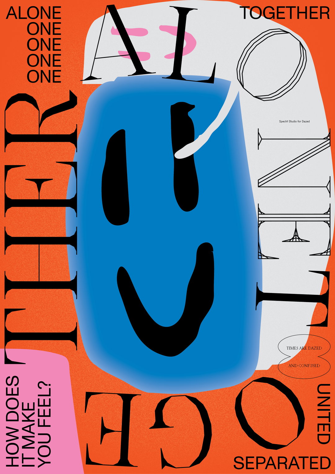
Specht Studio: Dazed, Post Pandemic (Copyright © Specht Studio, 2021)
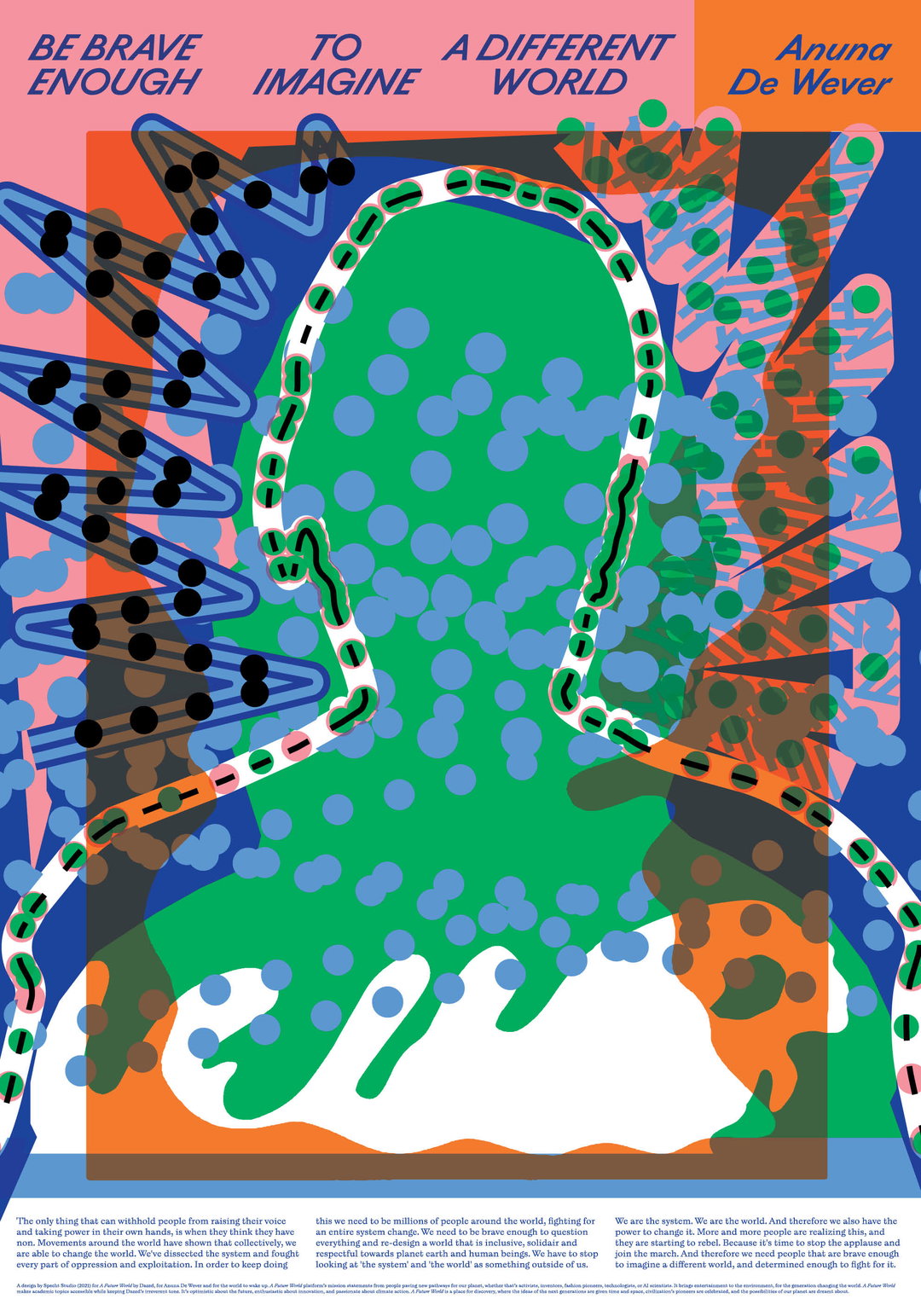
Specht Studio: Dazed, A Future World; collaboration with Anuna De Wever (Copyright © Specht Studio, 2021)
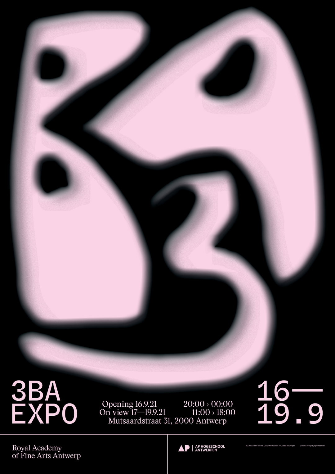
Specht Studio: Academy Antwerp, Bachelor 3 Graduation Show (Copyright © Specht Studio, 2021)
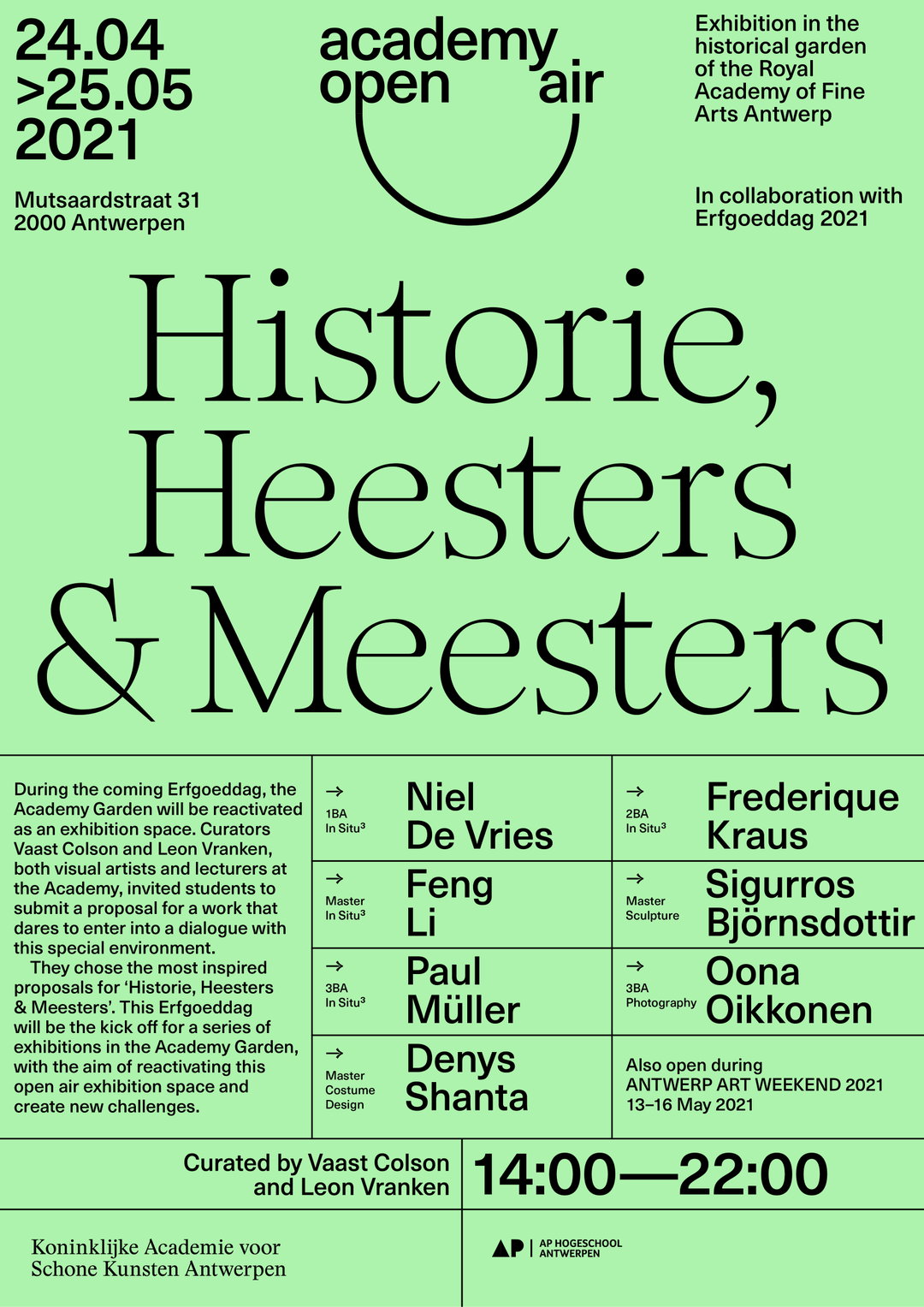
Specht Studio: Academy Antwerp, Academy Open Air Expo (Copyright © Specht Studio, 2021)
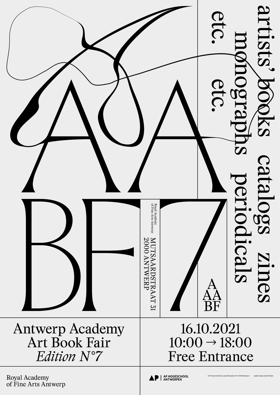
Specht Studio: Academy Antwerp, Art Book Fair (Copyright © Specht Studio, 2021)
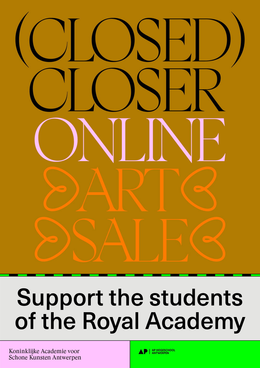
Specht Studio: Academy Antwerp, Closed Closer Online Art Sale (Copyright © Specht Studio, 2020)
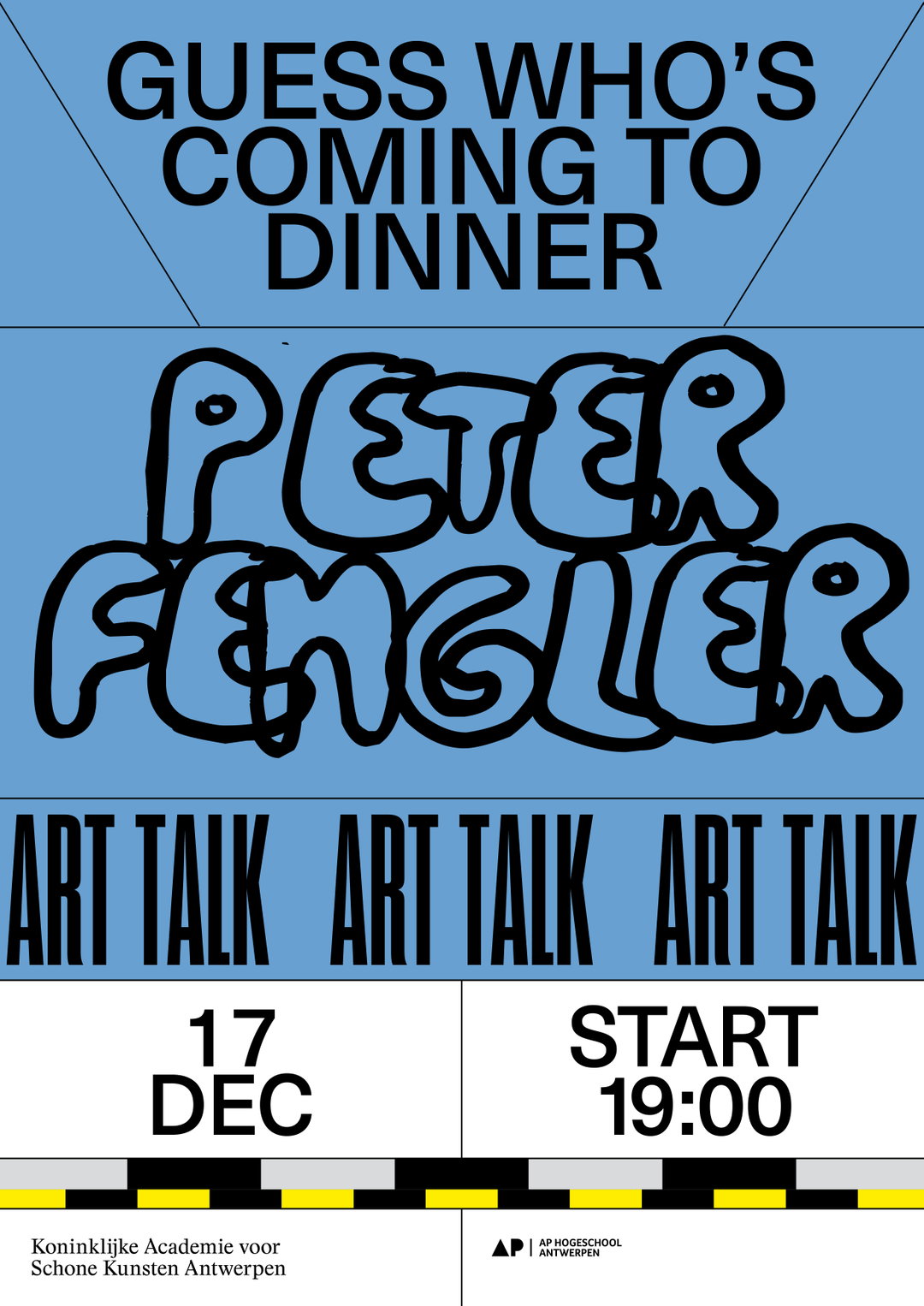
Specht Studio: Academy Antwerp, Guess Who's Coming To Dinner (Copyright © Specht Studio, 2021)
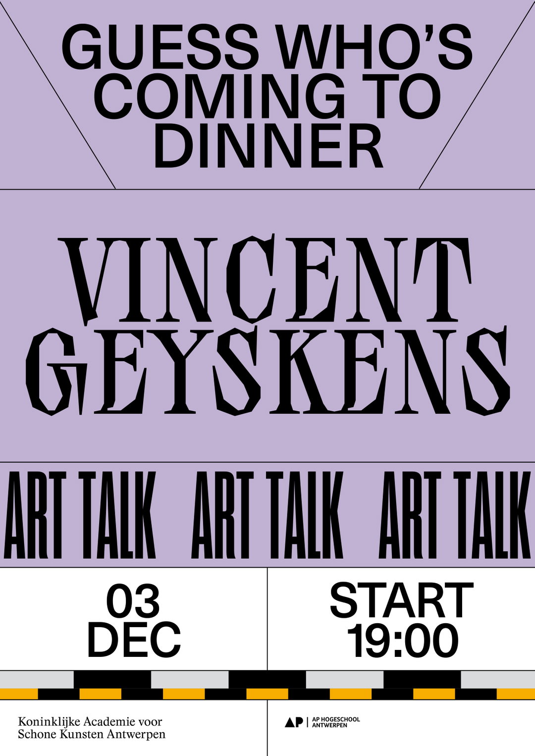
Specht Studio: Academy Antwerp, Guess Who's Coming To Dinner (Copyright © Specht Studio, 2021)
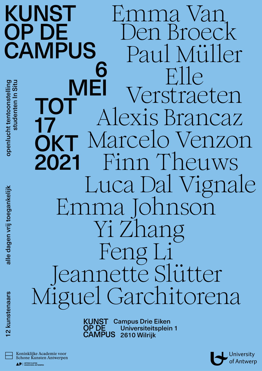
Specht Studio: Academy Antwerp, Kunst Op De Campus (Art on Campus) (Copyright © Specht Studio, 2021)
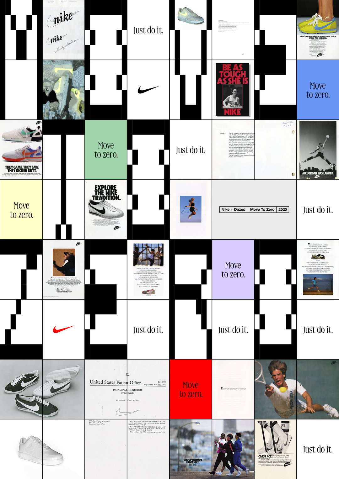
Specht Studio: Academy Antwerp, Kunst Op De Campus (Art on Campus) (Copyright © Specht Studio, 2021)
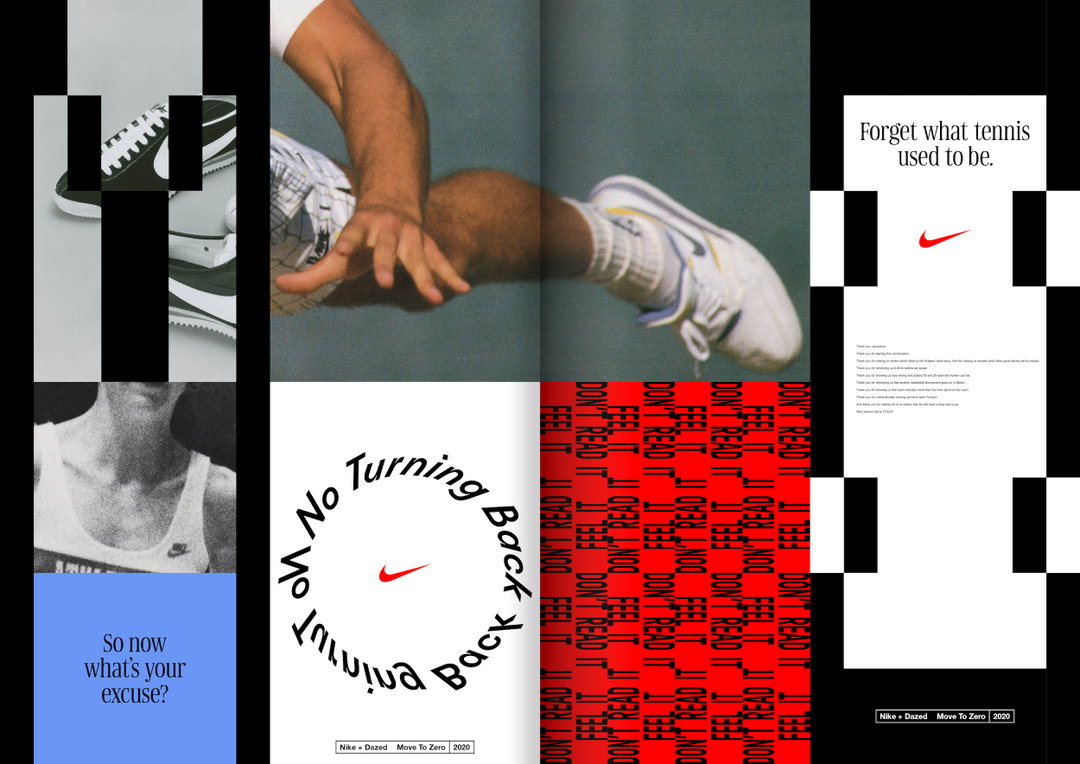
Specht Studio: Nike x Dazed, Issue Zerio (Copyright © Specht Studio, 2021)
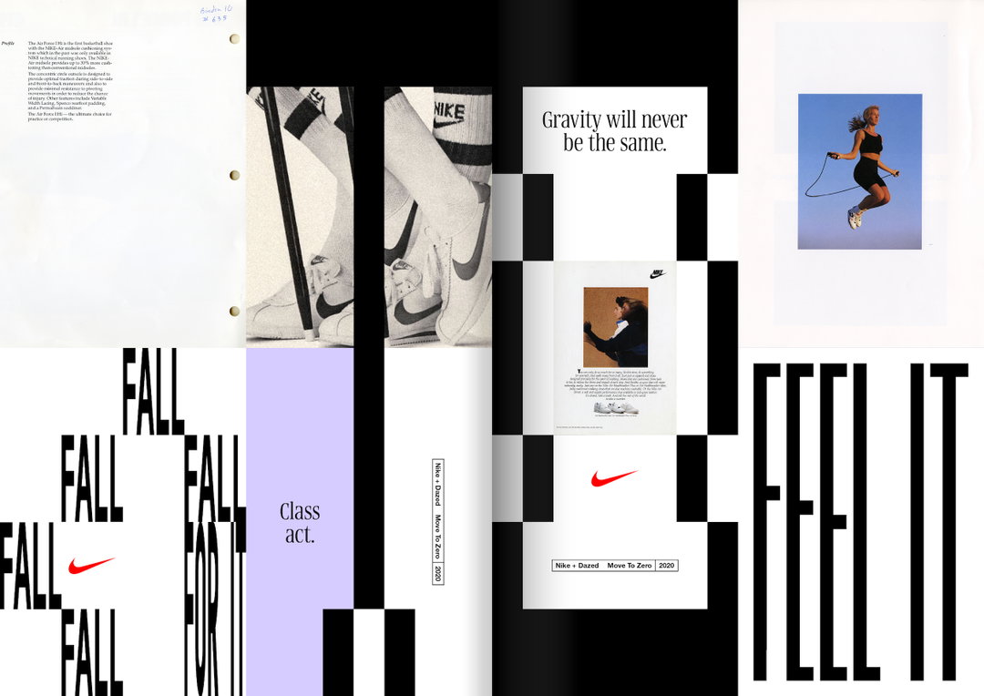
Specht Studio: Nike x Dazed, Issue Zerio (Copyright © Specht Studio, 2021)
Become an Extra Nice Supporter
Unlock an inspiring new way to explore It’s Nice That, get your hands on exclusive perks, and help bring meaningful creative projects to life.
Hero Header
Specht Studio: Academy Antwerp, Guess Who's Coming To Dinner (Copyright © Specht Studio, 2021)
Share Article
About the Author
—
Ayla is a London-based freelance writer, editor and consultant specialising in art, photography, design and culture. After joining It’s Nice That in 2017 as editorial assistant, she was interim online editor in 2022/2023 and continues to work with us on a freelance basis. She has written for i-D, Dazed, AnOther, WePresent, Port, Elephant and more, and she is also the managing editor of design magazine Anima.