Launch Recite Me assistive technology
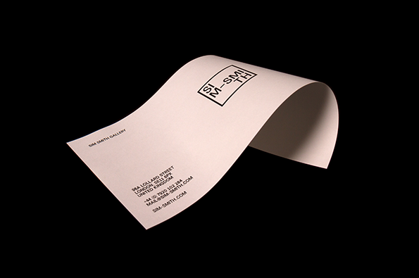
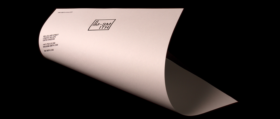
A piece of white stationery curves across a black background. It features a minimalist logo reading “SIM SMITH” and contact details for a London gallery.

Tony Brook and team give Sim Smith a slick identity

—
Date
13 October 2014

It’s a widely-acknowledged fact that Tony Brook and his Spin team can do no wrong – they just design cracking stuff. So imagine our surprise when… no, just kidding, their latest project’s a belter too. Commissioned by Sim Smith, a London-based gallery representing emerging British talent, Tony and his team went about producing a slick, simple, monochrome identity that’s as unfussy as the artists the gallery represents. The logo, website and print collateral are all pleasantly understated, meaning the Sim Smith name won’t ever get in the way of the most important thing – the artists’ work.
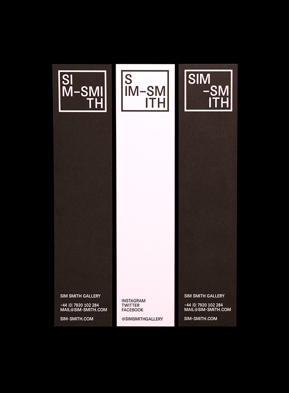
Three vertical bookmarks in black and white. Each features a fragmented “Sim Smith” logo at the top and contact details for “Sim Smith Gallery” at the bottom.
Above

Spin: Sim Smith indentity

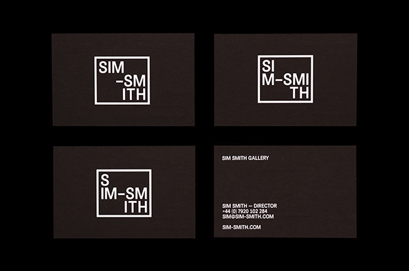
Four dark brown business cards featuring a white typographic logo. The logo arranges the name “Sim Smith” into a square grid, with the letters split across different lines. One card includes contact details for the “Sim Smith Gallery”, listing a director and a website.
Above

Spin: Sim Smith indentity

A white business card curves across a black background. It features a minimalist logo reading “SIM-SMITH” and contact details for the “Sim Smith Gallery” in London.
Above

Spin: Sim Smith indentity

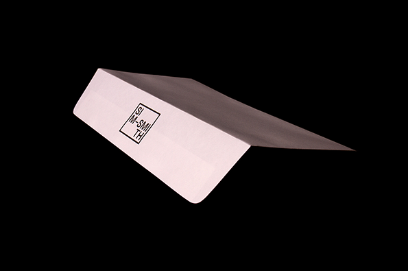
A white, L-shaped architectural sample or material swatch set against a black background. A small black square logo on the side contains the text “SIM SMITH”.
Above

Spin: Sim Smith indentity

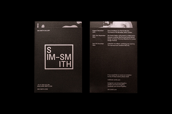
Two dark grey business cards with white text. The first features a square logo containing the words “SIM-SMITH” split across three lines. The second card lists a schedule of gallery events for 2014 and contact details.
Above

Spin: Sim Smith indentity

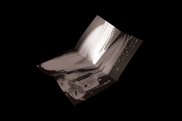
A folded brochure opens to reveal an abstract print in shades of white and grey. The design features fluid, sweeping brushstrokes and splattered paint across the pages.
Above

Spin: Sim Smith indentity

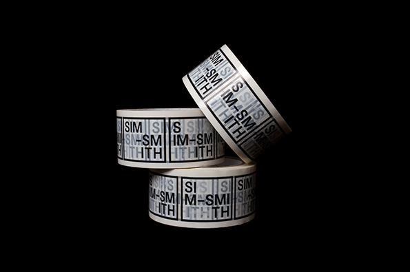
Three rolls of white adhesive tape are stacked against a black background. The tape is printed with a repeating black typographic pattern that includes the letters “SIM” and “TH”.
Above

Spin: Sim Smith indentity

Share Article

Further Info

About the Author

James Cartwright

—

James started out as an intern in 2011 and came back in summer of 2012 to work online and latterly as Print Editor, before leaving in May 2015.


It's Nice That Newsletters

Fancy a bit of It's Nice That in your inbox? Sign up to our newsletters and we'll keep you in the loop with everything good going on in the creative world.