Launch Recite Me assistive technology
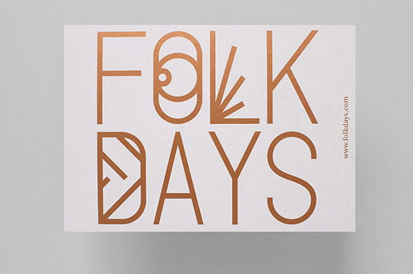
A copper-coloured typographic logo on a white background reads “FOLK DAYS”. The letters are stylised with geometric shapes and linear patterns.

Graphic Design: Berlin studio Stahl-R ace versatile new identity for Folkdays

—
Date
18 February 2014

It was a little over a year ago that we first posted the work of Berlin design studio Stahl-R, an agency with some serious graphic pedigree in the form of its founders and partners Susanne Stahl and Tobias Röttger. Checking back in with them now it appears they have gone from strength to strength in the intervening 12 months, as evidenced by this work for Folkdays, an organisation that curates and sells rare products.

The twin challenges Stahl-R faced were trying to reflect the eclectic breath of countries from which the products are sourced, and the celebration of traditional crafts in a very contemporary context.

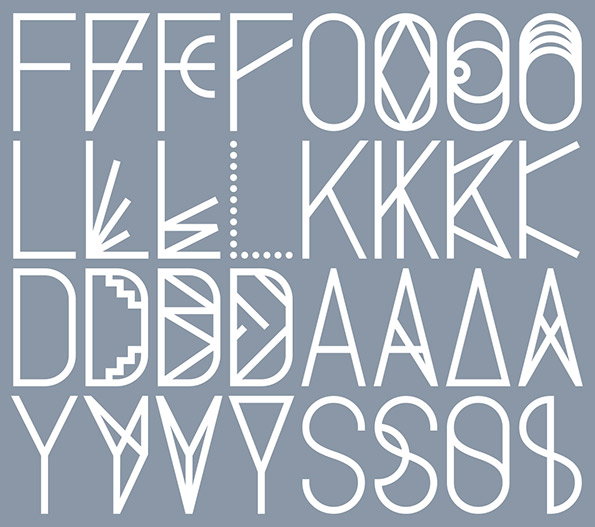
“We developed a visual identity that takes inspiration from traditional folk art forms and patterns,” the designers say on their website. “The resulting modular wordmark is versatile and every time unique.”
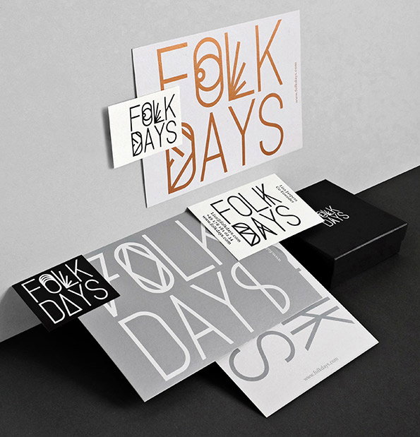
A collection of branding materials for “Folk Days” featuring a bold, stylized typeface. The set includes business cards, postcards and a small black box, all using a palette of white, black, grey and copper.
Above

Stahl-R: Folkdays

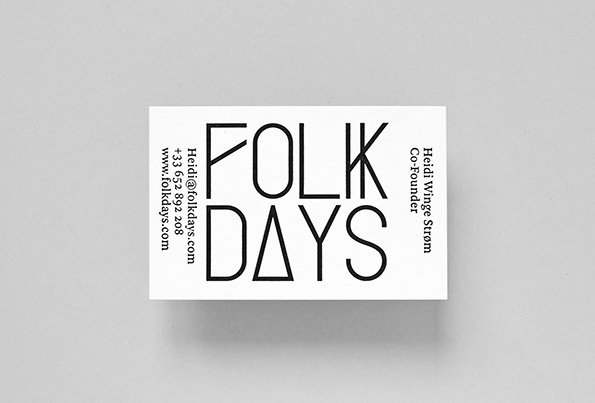
A white business card featuring the bold, black typographic logo “FOLK DAYS”. To the right, it reads “Heidi Winge Strøm Co-Founder”, with contact details listed on the left.
Above

Stahl-R: Folkdays

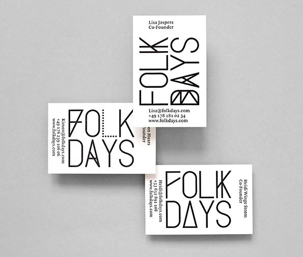
Three white business cards for “Folk Days” are scattered on a grey background. Each card features the brand name in a bold, minimalist black typeface alongside contact details and the name of a co-founder.
Above

Stahl-R: Folkdays

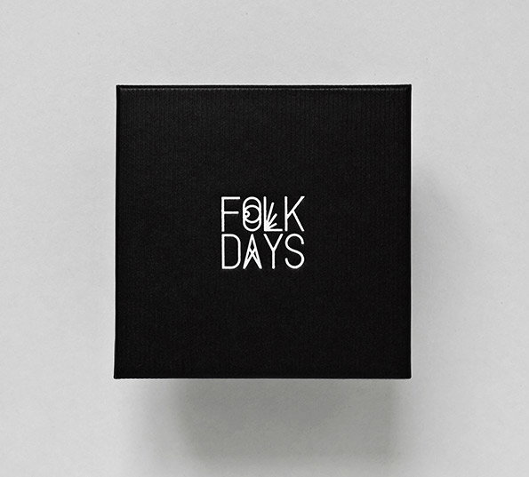
A square black box centered against a plain grey background. The white logo “FOLK DAYS” is printed in the middle.
Above

Stahl-R: Folkdays

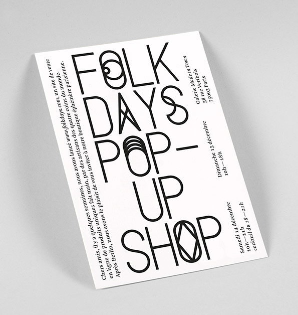
A typographic poster for a “Folk Days Pop-up Shop”. The bold, black lettering is arranged vertically on a white background. Additional text provides the dates 14 and 15 December, the opening times, and the address for Galerie Made in Town in Paris.
Above

Stahl-R: Folkdays

A minimalist logo on a black background. White sans-serif text reads “FOLK DAYS” across two lines.
Above

Stahl-R: Folkdays

An illustration of a grid of white letters on a grey background. Each row shows four different stylistic variations of the same letter, including “F”, “L”, “D” and “Y”.
Above

Stahl-R: Folkdays

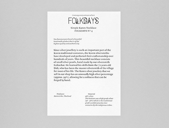
A white product information card with the brand name “Folkdays” at the top. It describes a “Simple Karen Necklace” and provides details about the Karen silversmiths of Thailand.
Above

Stahl-R: Folkdays

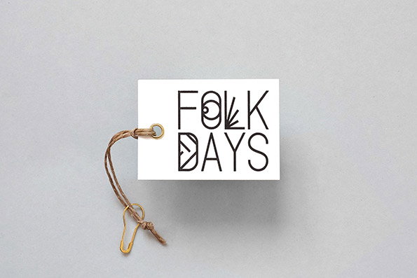
A white rectangular tag features a black typographic logo that reads “Folk Days”. A piece of brown twine is threaded through a gold eyelet, ending in a small gold safety pin.
Above

Stahl-R: Folkdays

Share Article

Further Info

About the Author

Rob Alderson

—

Rob Alderson is a freelance writer, editor and strategist. He was previously editor-in-chief of It’s Nice That and WePresent, and editor of Design Week. He publishes the newsletter Undo, which tries to make sense of how AI is changing design work, the design process and the design industry.

It's Nice That Newsletters

Fancy a bit of It's Nice That in your inbox? Sign up to our newsletters and we'll keep you in the loop with everything good going on in the creative world.