Launch Recite Me assistive technology
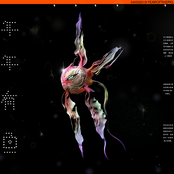
A 3D render of a surreal, iridescent fish floating against a black, starry background. The creature has a rounded, metallic body with a single eye and long, flowing fins in shades of purple, pink and green.

Steph Lau’s Hot Air envisions Cantonese phrases that are difficult to translate into English

—
Date
12 March 2019

“I feel like there’s a natural relationship that exists between illustration and graphic design” explains New York-based illustration graduate Steph Lau. For Steph, it feels natural to explore the overlapping boundaries between the two disciplines, creating work that utilises her technical drawing skills and design sensibilities. “Pursuing illustration felt like a natural course of action since I’ve always loved to draw” she tells It’s Nice That. Alternatively, “graphic design provides a nice switch of gear when I feel overwhelmed with the absolute freedom of pen to paper; it’s like drawing with a set of existing tools.”

Ethereal with a hint of the mystical, Steph’s most recent work comes in the form of the risograph printed zine Hot Air. “For the longest time, people would ask me if I sell zines after seeing my work” explains the illustrator. “So I finally decided to buckle down and make it a goal to publish my first zine.” Along with album artwork, poster design, not to mention designing her own clothing, Steph’s wide-ranging body of work consistently pairs a vibrant blend of colour with otherworldly illustrations.

“The zine is an exploration of the humour of my mother tongue, Cantonese” explains Steph. “There’s a concept in Chinese medicine called “hot air” which roughly translates to having an imbalance of energy in your body.” Consequently, Steph’s zine takes inspiration from this Cantonese term and lists a number of phrases the illustrator/designer “finds interesting or difficult to translate.” Working on the zine became a way for Steph to explicitly express her interest in beauty in fashion; a personal insight into that part of Steph’s personality that many creatives don’t get to reveal through commercial work.
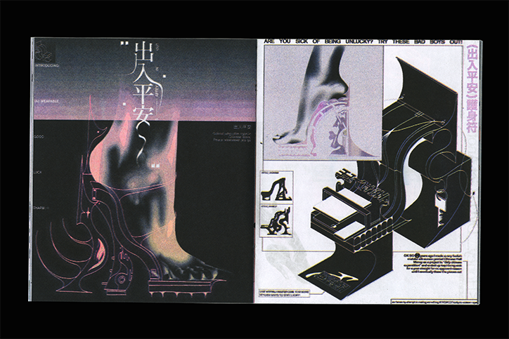
A two-page spread from a magazine featuring a futuristic shoe design. The left page shows a close-up of a foot in a sculptural, high-tech heel against a dark background with Japanese characters. The right page displays technical diagrams and a 3D render of the shoe, topped with the headline “ARE YOU SICK OF BEING UNLUCKY? TRY THESE BAD BOYS OUT!”.
Above

Steph Lau: Hot Air

In one dynamic spread, Steph draws out the saying 出入平安 meaning “peace wherever you go”. The phrase is usually used during the lunar new year celebrations, adorned on banners or other new year memorabilia as a symbol of good luck. In turn, Steph envisages a pair of high heels as good luck charms. The pretty whacky yet high fashion designs suitably come with keyring and key, dangling off the inside of the heel, while another design features dragon-like spikes and curves resembling flames. “The process came naturally after I devised the concept,” adds Steph. “Each spread has a respective keyword, so I started with a main image derived from the phrase, then continued to design around the main image.”

Printed by Txtbooks in Brooklyn, Hot Air marks a moment of creative accomplishment for Steph; “there’s something very satisfying about physically handling a collection of work you’re proud of. Currently concentrating on her freelance work, Steph is also preparing for her Visa application to stay in the US with the hopes of working more closely with clothes and ideas of beauty in the future. She ends our interview with, “I love to see my work applied to different mediums. I’m captivated by Isamaya Ffrench’s work, like what she’s doing with Dazed Beauty. But right now, I’m taking opportunities as they come and just going with the flow. I also want to make a mural!”
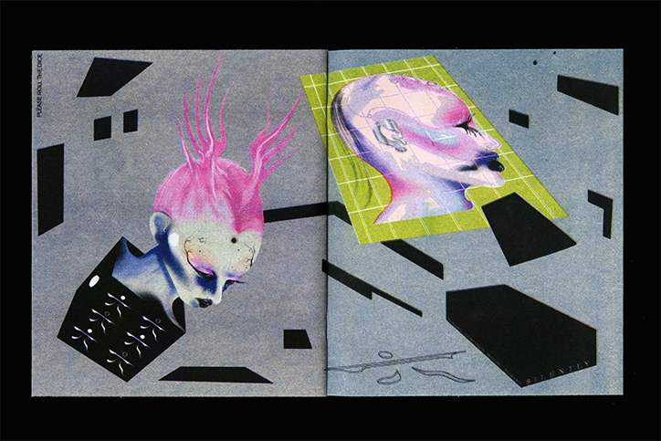
A digital collage across two pages featuring surreal, iridescent figures against a grey background. One figure has bright pink, flame-like hair and emerges from a black geometric shape, while another profile is framed by a lime green grid.
Above

Steph Lau: Hot Air

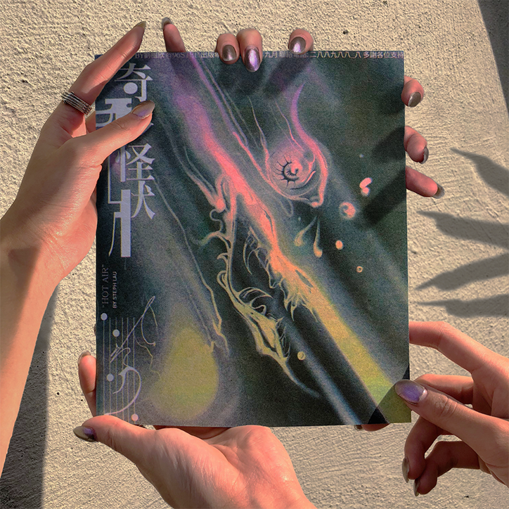
Two people hold a magazine cover featuring a surreal, colourful illustration of a swirling, ethereal figure. Vertical text on the left reads “HOT AIR” by Steph Lau.
Above

Steph Lau: Hot Air

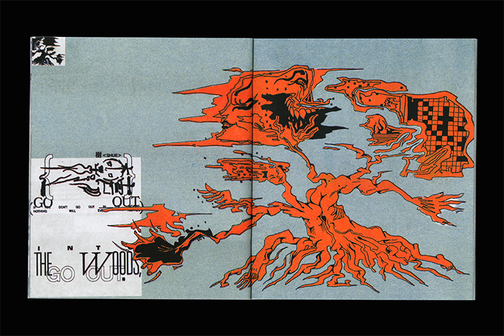
An illustration across two pages featuring a distorted, orange organic form that resembles a tree with roots and branches. To the left, a white rectangular insert contains a skeletal figure and the words “GO OUT” and “THE WOODS”.
Above

Steph Lau: Hot Air

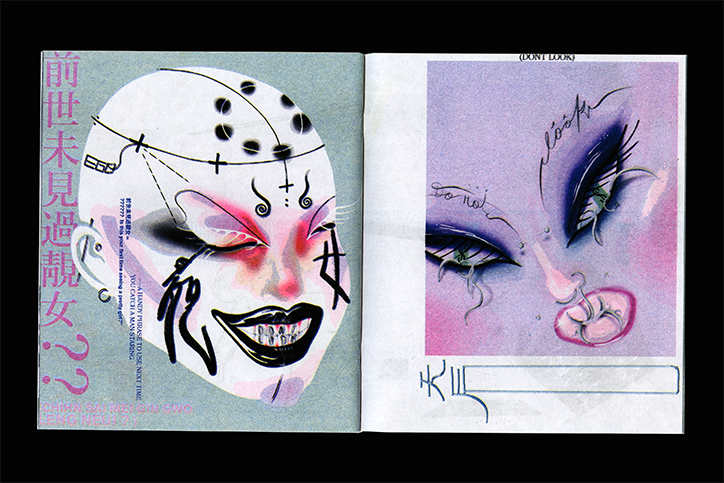
An open magazine spread featuring two surreal illustrations of faces. The left page shows a face with closed eyes and a wide, toothy grin, decorated with black symbols and the text “A HANDY PHRASE TO USE NEXT TIME.” The right page shows a close-up of eyes with long lashes and a stylized nose, topped with the words “(DONT LOOK)”.
Above

Steph Lau: Hot Air

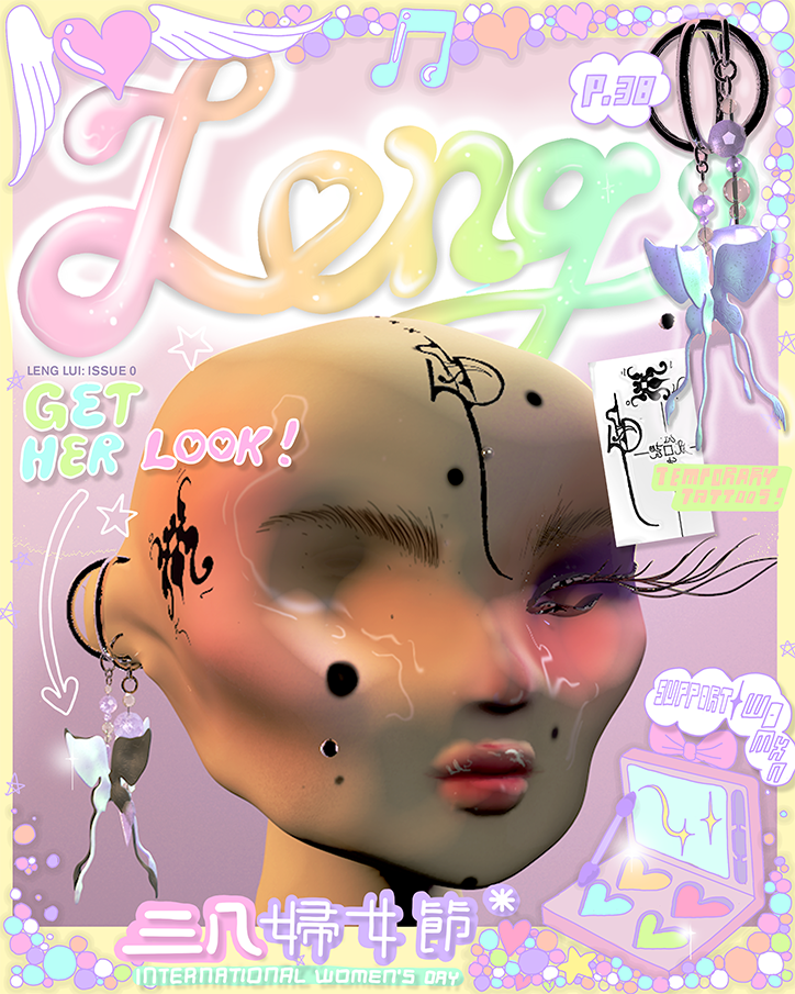
A 3D render of a stylised face with smooth, pale skin and black decorative markings. The image is designed as a magazine cover with a pastel aesthetic, featuring the word “Leng” in large, glossy letters at the top. Text on the cover includes “Get her look!” and “International Women’s Day”, alongside Chinese characters. Decorative elements like hearts, stars, and butterfly earrings surround the central figure.
Above

Steph Lau

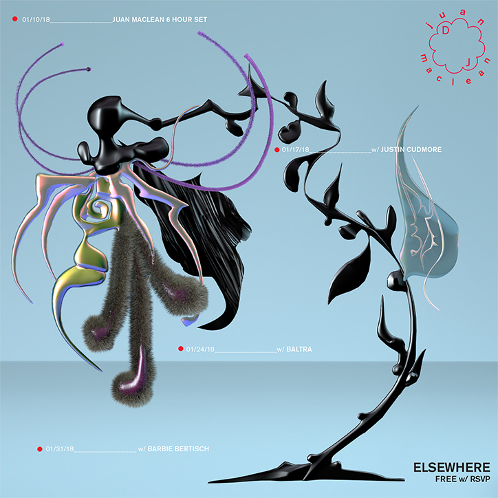
A 3D render of two abstract, glossy black sculptures set against a pale blue background. The figures feature fluid, organic shapes with iridescent accents and fuzzy, brown textures. Text across the image lists dates and names for a series of events, including “Juan Maclean 6 hour set” and “Elsewhere”.
Above

Steph Lau

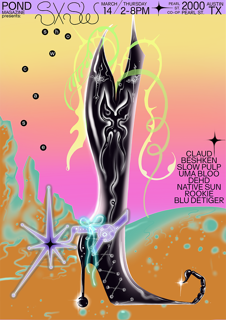
A digital illustration for a Pond Magazine event at Sxsw. A tall, glossy black boot with an organic, sculptural shape dominates the centre, surrounded by glowing neon swirls and a surreal landscape. Text at the top reads “Pond Magazine presents: Sxsw” with the date “March 14” and the location “Austin TX”. A list of names on the right includes “Claudi Beshken”, “Slow Pulp” and “Blu Detiger”.
Above

Steph Lau

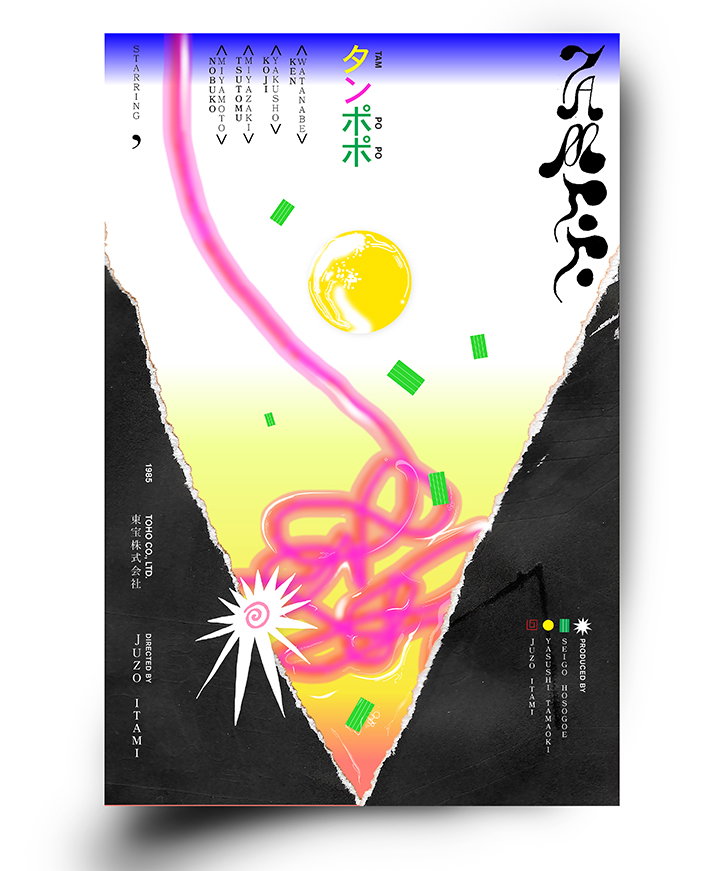
A movie poster for the film Tampoppo, featuring a bright yellow background and a stylized, swirling pink line. A yellow sun and a white starburst sit amidst floating green rectangles, framed by jagged black shapes. Text includes the title “タンポポ” and credits for director Junzo Itami.
Above

Steph Lau

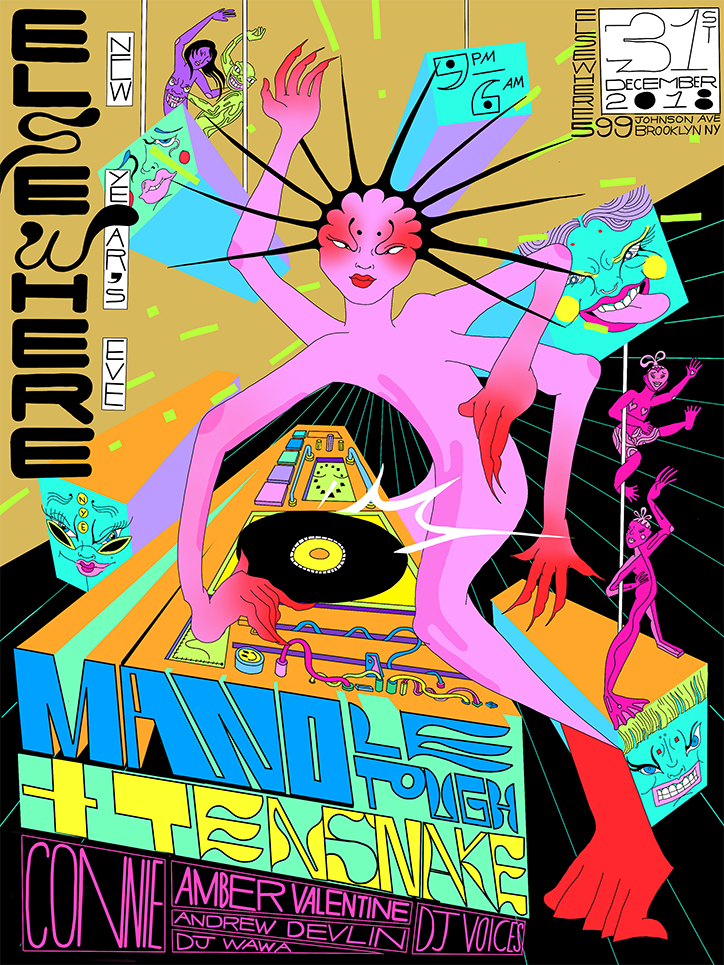
A psychedelic illustration for a party poster featuring a pink, multi-armed figure DJing at a turntable. Bold text on the left reads “Elsewhere New Years Eve”, while the bottom lists performers including “Mando”, “Tensnake” and “Connie”. The top right corner displays the date “31 December 2018” and a Brooklyn address.
Above

Steph Lau

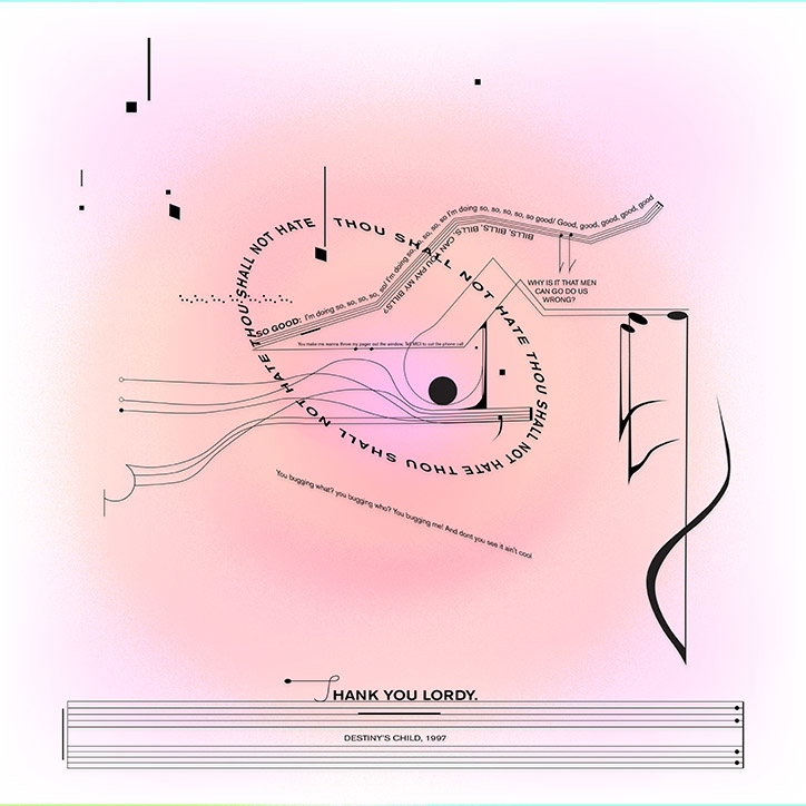
A graphic design piece featuring a circular arrangement of text and flowing black lines on a soft pink gradient background. The central text reads “THOU SHALL NOT HATE” in a repeating loop, surrounding smaller lyrics and the phrase “WHY IS IT THAT MEN CAN GO DO US WRONG?”. At the bottom, a line of text reads “THANK YOU LORDY.” above a musical staff that says “DESTINY’S CHILD, 1997”.
Above

Steph Lau

Share Article

Further Info

About the Author

Jynann Ong

—

Jynann joined It’s Nice That as an editorial assistant in August 2018 after graduating from The Glasgow School of Art’s Communication Design degree. In March 2019 she became a staff writer and in June 2021, she was made associate editor. She went freelance in 2022.
It's Nice That Newsletters

Fancy a bit of It's Nice That in your inbox? Sign up to our newsletters and we'll keep you in the loop with everything good going on in the creative world.