




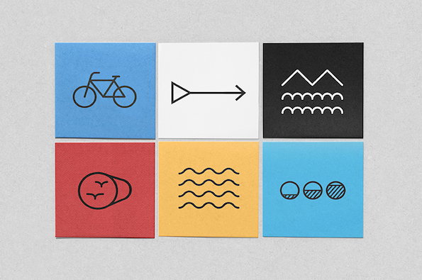
Beautiful, clean designs from Portuguese studio AH-HA
“Studio AH-HA started as an experiment. We never took ourselves too seriously, and we think that is why things have been working out,” say Carolina Cantante and Catarina Carreiras. For the last three years the Portuguese designers have been making lovely things out of their studio just a stone’s throw from the Lisbon City Museum and the university where they studied and met. Between them, Carolina and Catarina cut their teeth working with some of their heroes; Catarina at Fabrica with designer Sam Baron, who they still collaborate with, and Carolina at the renowned OMA led by “starchitect” Rem Koolhaas in Rotterdam.
With a large cast of collaborators, the duo’s wide-ranging creative pursuits have produced a body of work that sees packaging for a Portuguese blueberry producer next to signage projects for a bike lane in Aveiro, next to the identity for a design bienniale. “We don’t actually spend much time thinking about our own graphic signature. We try to select projects that show how far we can go, and also how simple the solution can be,” they tell us.
Their holistic approach to design is clear. For the rebranding of old Portuguese furniture company Fluxograma alone, Carolina and Catarina redesigned the shop, all its print material and made custom window installations before tackling the website and catalogue. While their briefs might be varied, their contemporary feel for simple patterns and a soft palette is earning them a strong and consistent reputation for brilliant, clean design.
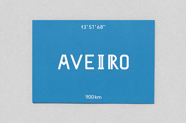
Studio AH-HA: Ciclovia de Aveiro
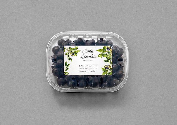
Studio AH-HA: Santa Leocadia
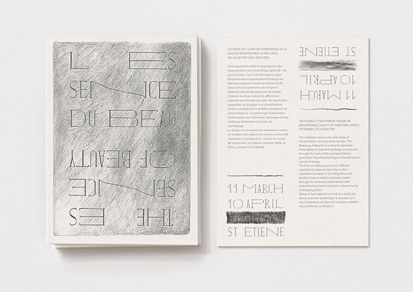
Studio AH-HA: L’essence du beau
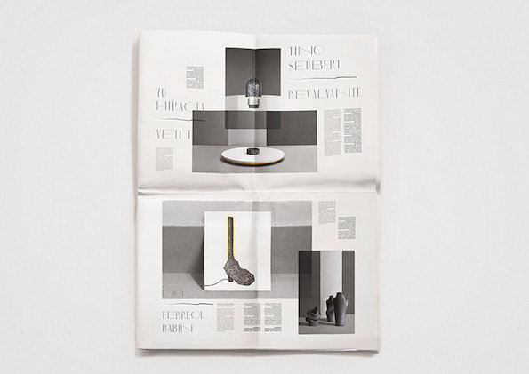
Studio AH-HA: L’essence du beau
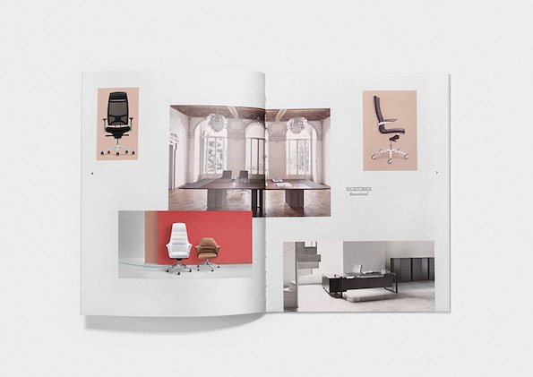
Studio AH-HA: Fluxograma
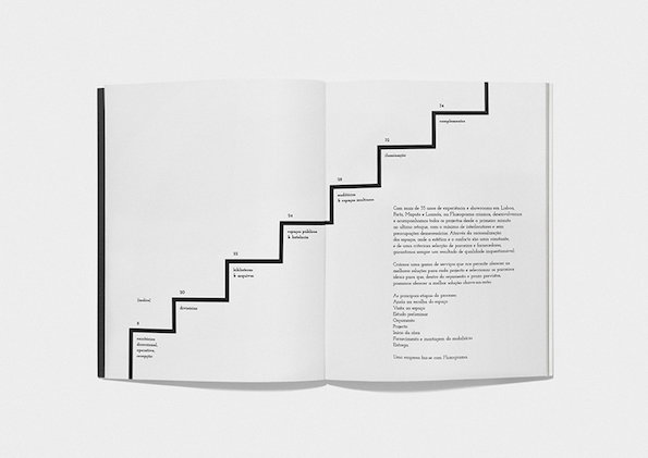
Studio AH-HA: Fluxograma



